I like that we’re happy you did their job for free that they did not do ![]()
2 « J'aime »
Sometimes the “push” has to come from outside the organization. It’s not impossible that some ARTM employees wanted to do the same and were not listened to or given the go… I don’t know.
10 « J'aime »
I wonder why they went with the older signage (like 2018 - 2023) style, the dot without the number in it? Technically they should be using the number for metro lines now
2 « J'aime »
Maybe the template of the number inside the circle was never sent to the printer ![]()
6 « J'aime »
Je ne suis pas certain mais je crois que les cercles avec le numéro de ligne sont uniquement lorsqu’il n’y a pas le nom d’une destination à côté.
Donc Ligne ![]()
![]() (imaginez le 5 dans le cercle)
(imaginez le 5 dans le cercle)
Et Direction ![]() Snowdon (sans chiffre)
Snowdon (sans chiffre)
I think it’s that often signs are produced months ahead of time, and these signs must have been produced at the moment they did the shift or just before.
On top of that, it could also be something with the printing shop not yet adapted/equipped to printing the new signs with numbers just yet.
The last reason, the one I believe the most probable, is that the STM does not want to mix signs with just the dot, and signs with a number inside the dot. This is because the signs along the quai perhaps are not ready yet to switch over to the new system with number + dot and perhaps other types of signs. They have currently done one station sign at Henri-Bourassa, and I bet you they are just testing to see how the new format holds up, before rolling out the dot+number to the rest of the network. I think they are still updating their existing sign design, updating the maps, and the next signage change that they could do, and all the different signage tools have been transferred over to the new format, then they would add the dot+number.
They just don’t want stations with many different era’s of signage.
EDIT: I notice that the signs are actually 2022’s version of the signs. It uses the wide arrow, versus the newer 2023+ design uses a thinner stroke arrow for dark background signs, as seen at Radisson:
Currently only Montmorency & Radisson have this newer signage format.
4 « J'aime »
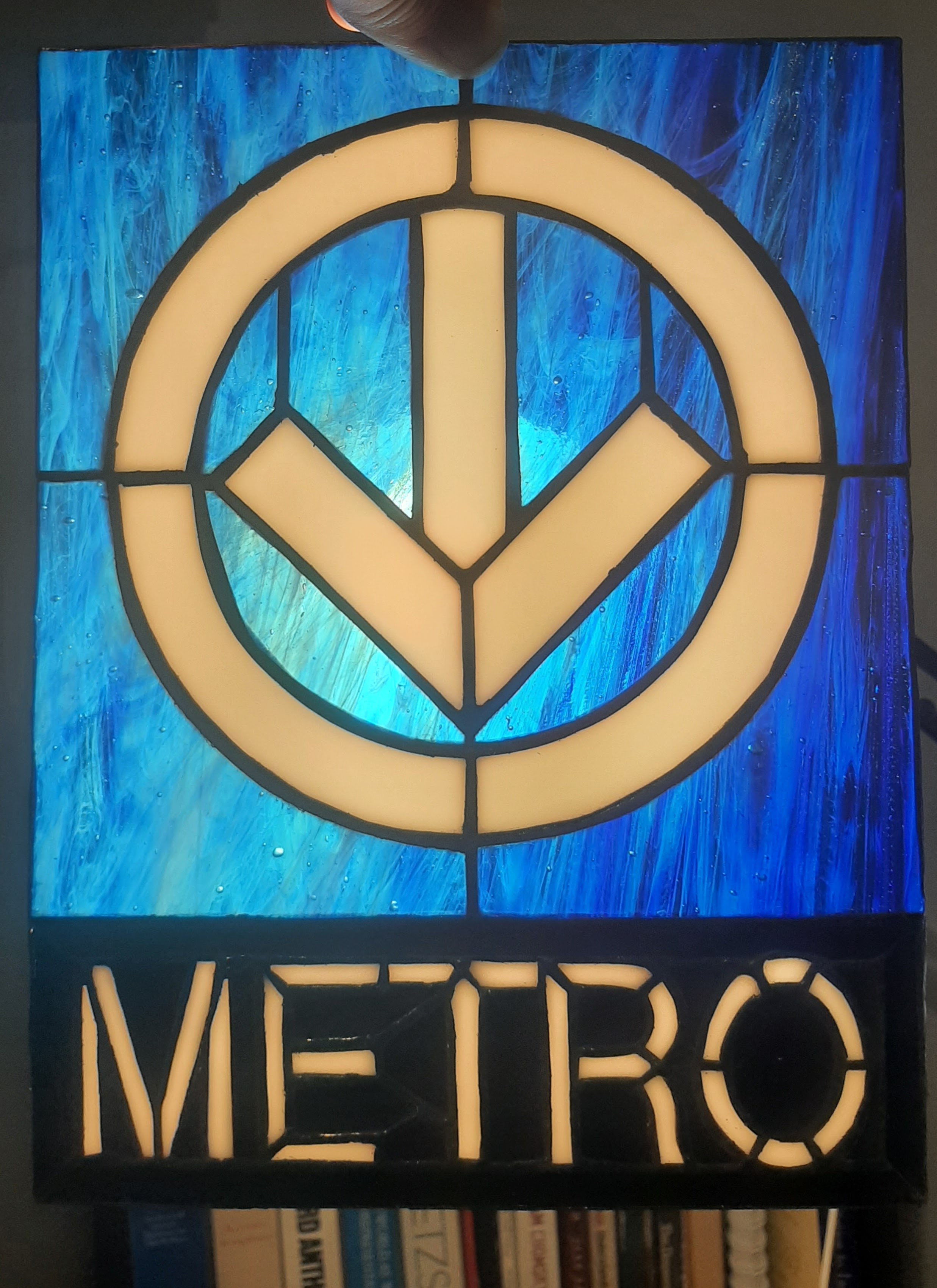
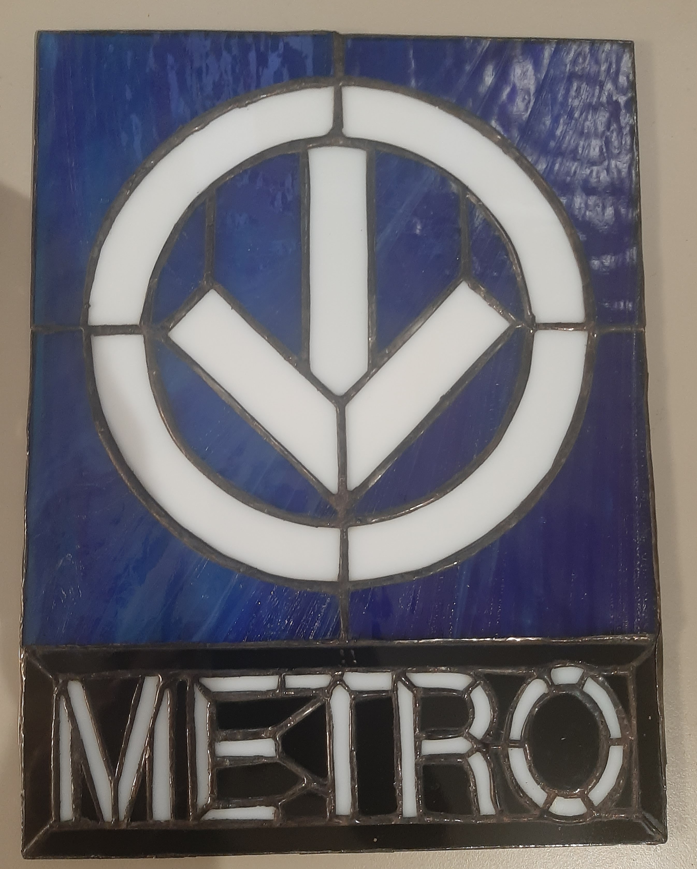
Je vous partage mon petit projet créatif des dernières semaines: un panneau de vitrail en hommage à l’enseigne du métro ![]()
42 « J'aime »
The ticket booth in Gare Centrale was updated and now shows the logo of the services instead of agencies.
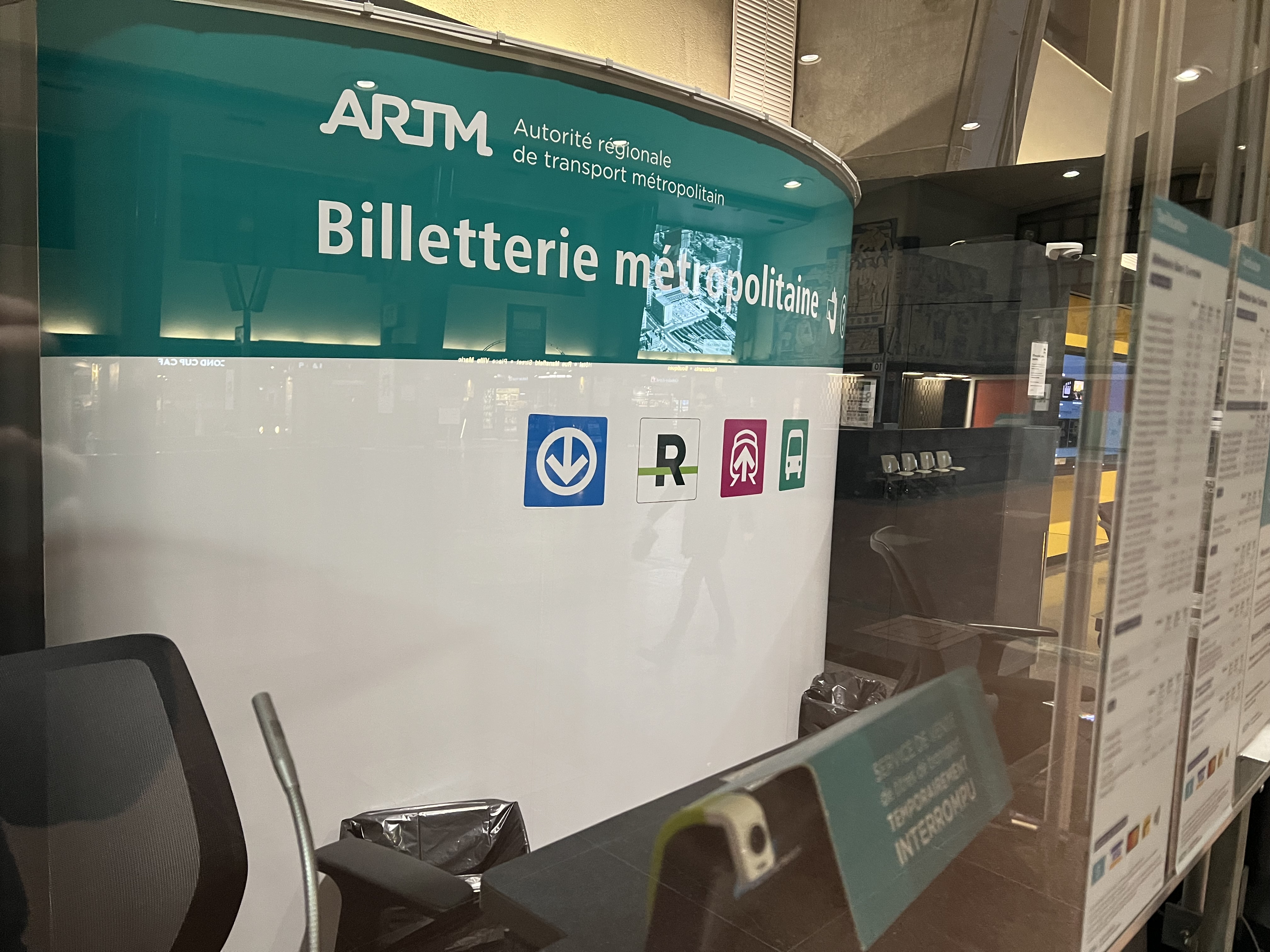
They’ve been doing this elsewhere, so this is a nice improvement. I hope people coming from VIA trains would see the metro logo and buy tickets right from here, instead of going to Bonaventure and waiting in line at the two ticket machines or lining up at the booth
16 « J'aime »
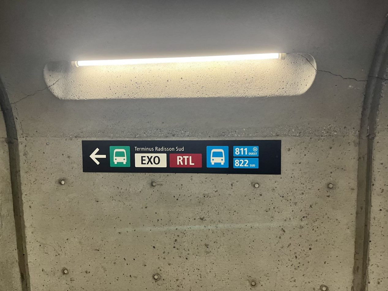
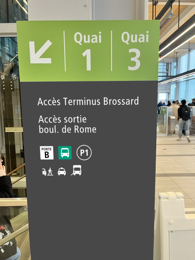
La dernière fois que je suis passée à Radisson, j’ai eu l’impression comme quoi la signalétique indique que tous les bus exo sont au terminus sud tandis qu’il y en a au terminus nord, mais je n’ai pas eu assez de temps pour vérifier.
1 « J'aime »
Non, la signalétique indique qu’il y a des autobus EXO des deux bords, mais il manque des autobus EXO du bord nord, et les autobus STL
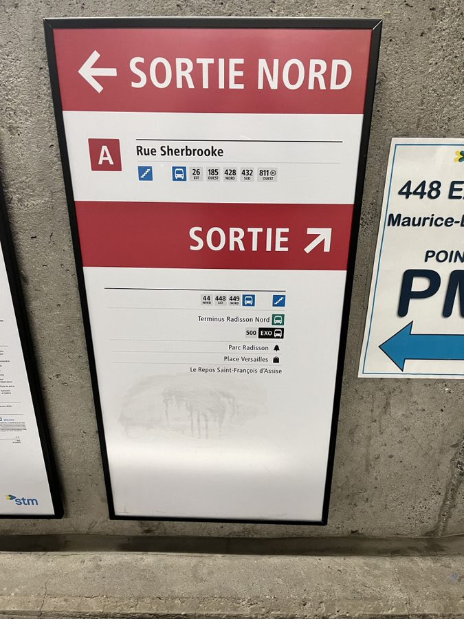
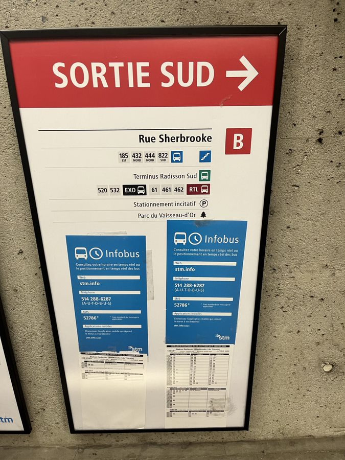
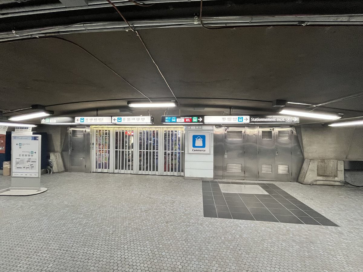
EDIT : Juste réalisé que 90% des autobus EXO du Terminus Nord n’est même pas indiqué et aucun autobus STL ![]() . Je me commence à me demander sérieusement qui fait la signalétique parfois… Ça me semble que la première étape quand tu fais de la signalétique c’est de faire des recherches. Cela s’ajoute déjà aux autres éléments de la signalétique défaillante à cette station, comme la signalétique de l’EXO 30G, une ligne qui était hors service depuis 1 année avant que cette signalétique à été installée. Je ne suis pas un expert dans la signalétique ni dans les transports en commun, mais quand même moi regardes ça et trouves des erreurs en le regardant moins qu’une minute, il y a une problème.
. Je me commence à me demander sérieusement qui fait la signalétique parfois… Ça me semble que la première étape quand tu fais de la signalétique c’est de faire des recherches. Cela s’ajoute déjà aux autres éléments de la signalétique défaillante à cette station, comme la signalétique de l’EXO 30G, une ligne qui était hors service depuis 1 année avant que cette signalétique à été installée. Je ne suis pas un expert dans la signalétique ni dans les transports en commun, mais quand même moi regardes ça et trouves des erreurs en le regardant moins qu’une minute, il y a une problème.
Par contre, la signalétique à Brossard est défaillante pour la terminus de bus. La première fois, j’ai sorti du mauvais bord, et j’avais du repayer encore (puisque j’avais seulement des titres unitaires), pour repasser vers la terminus de bus. J’ai revisité récemment, puisque je ne pensais pas qu’il avait de la signalétique pour indiquer en sortant, qu’il faut tourner à gauche et descendre les escaliers pour faire correspondance avec les bus, et voici ce que j’ai trouvé :
Pas de symbole d’autobus, ni c’est indiqué en grand qu’il faut sortir par la pour les autobus.
4 « J'aime »
I have had the urge to replace this sign with a more official looking one…
7 « J'aime »
Please do ![]()
![]() don’t tell anyone
don’t tell anyone ![]()
It’s being planned… I hope I could also get approval from the security staff there too
Et il manque aussi les autobus de la MRC de Joliette qui sont moins connus, mais qui ont leur terminus au terminus nord de Radisson depuis des années!
I went by to take measurements today, there were many many inspectors (like 8 for some reason), but I plan to still do it! Here’s the render of what I’ll be adding at some point I hope, I’ll do something similar on the other side too eventually:
All of this info is on the elevator, but they don’t add it to these signs for some reason…
9 « J'aime »
If possible, could you make the bus symbol & exit door box bigger? It would be much easier to see essential information farther away.
Yeah I might, this is just based on the elevator signage, but that is meant to be read close up, so I’ll probably adjust this
1 « J'aime »
Avec un gilet de sécurité orange fluo ![]() et un casque de construction jaune, c’est si facile de passer inaperçu
et un casque de construction jaune, c’est si facile de passer inaperçu ![]()
3 « J'aime »
Nous n’avons pas vraiment de variétés de carte du métro, donc j’ai décidé de créer des cartes linéaires (j’ignore le bon terme) du métro + REM. Si le temps le permettait, j’en ferais d’autres versions plus détaillées et conformes aux signalétiques de l’ARTM.
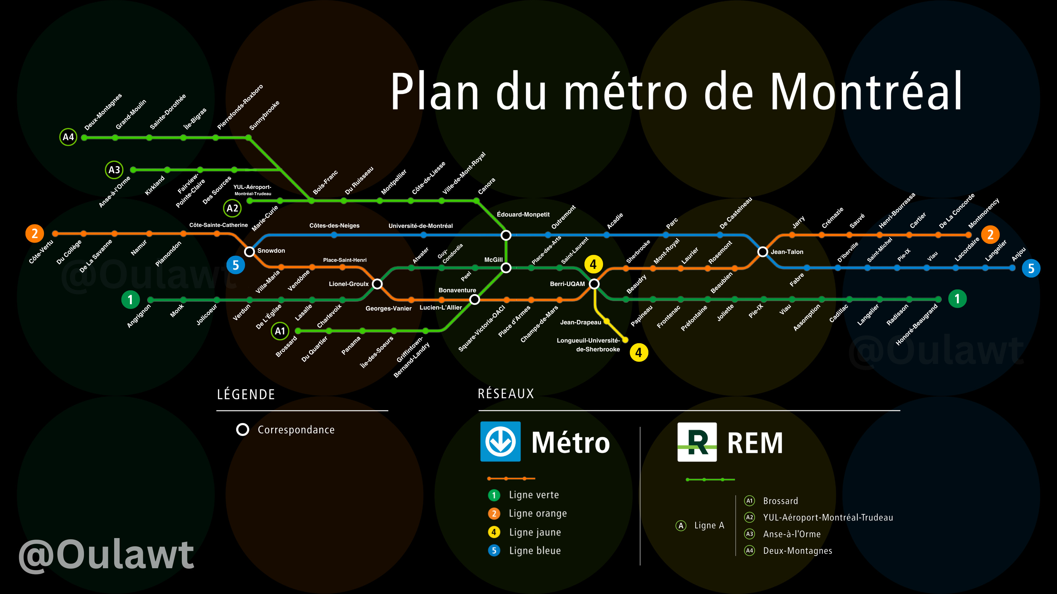
Voici une à la verticale:
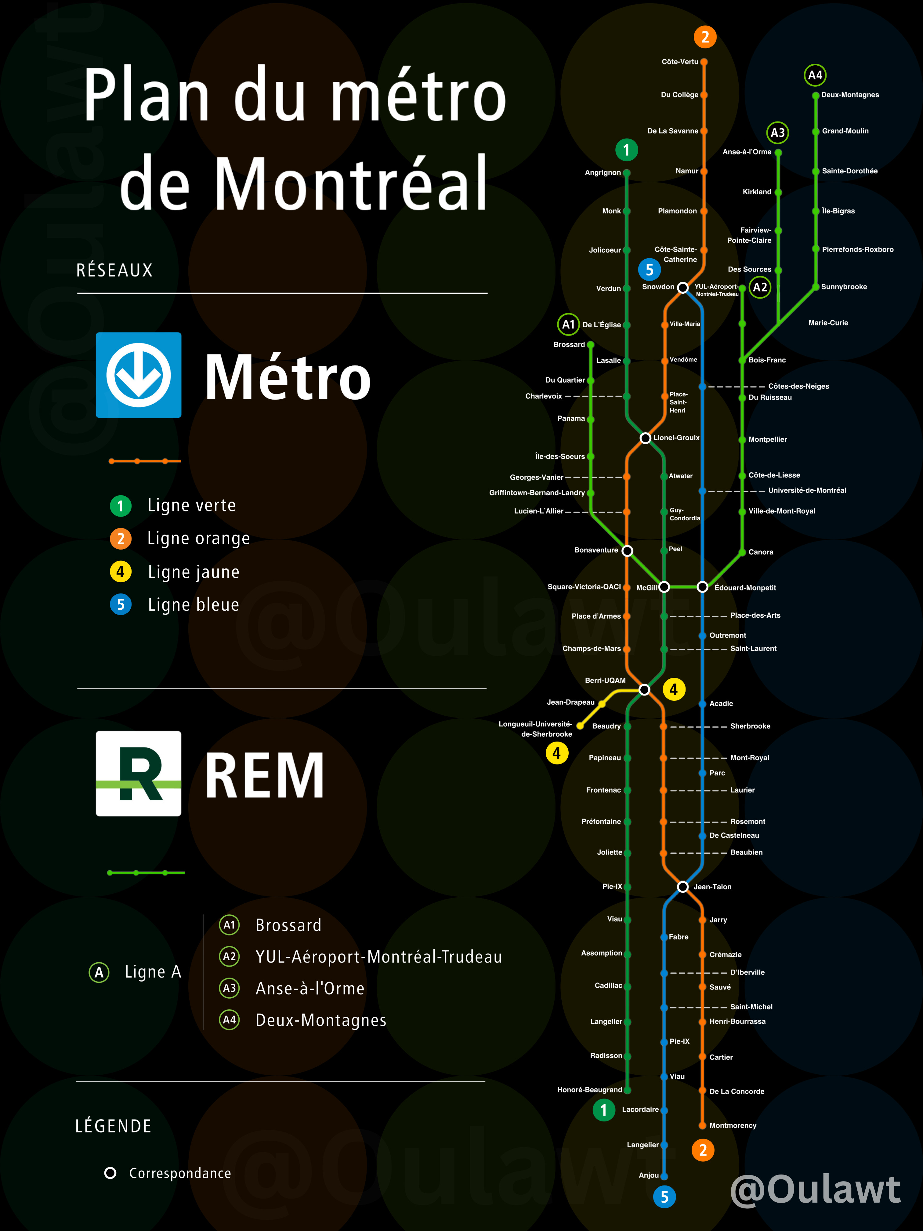
36 « J'aime »
stupid question … is #3 the REM ? ![]()
2 « J'aime »