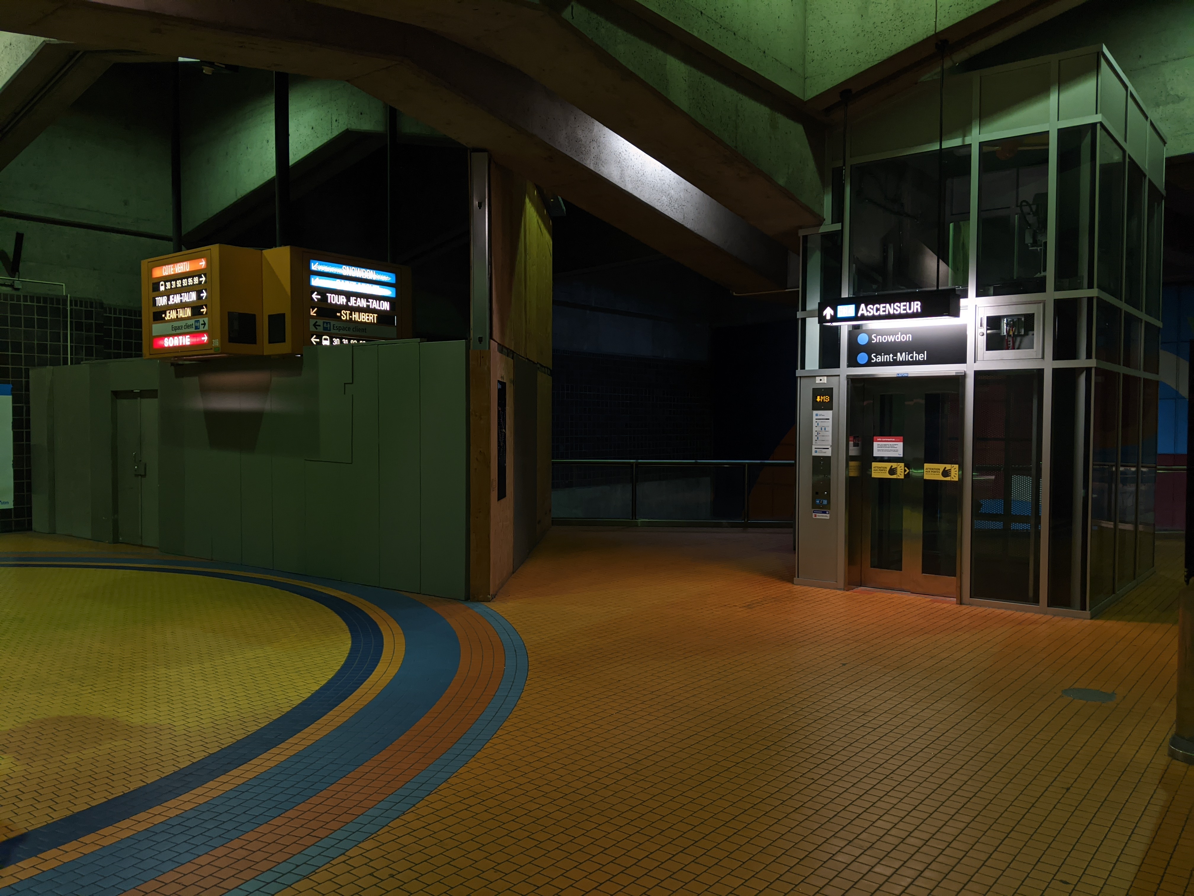
They don’t really have a choice. Changing the height to accommodate lowercase ascenders and descenders was absolutely the right call, but it leaves them with three options for Bonaventure, Jean-Talon, and Snowdon:
1 — Shrink the type to fit in the old standard. They tried this at Jean-Talon for the Espace client signs, but the type is so small that it’s not legible from any useful distance. I haven’t seen this done anywhere else, so I don’t think they’ll be pursuing it.
2 — Remove the feature signboxes and replace them with standard lightboxes. This would solicit outrage from the architects’ families and heritage orgs, like when the City proposed removing Daudelin’s Agora from Viger Square.
3 — Eventually shell out for new sign housings.
I’m optimistic that they wouldn’t rule it out. When it comes to capital works projects, the STM values adhering to the metro’s design principles, one of which has always been integrating signage into the stations’ architecture. The price difference isn’t as significant, but a recent example is how the updated signage at Acadie has lightboxes with red frames at platform level, respecting the architects’ original decision.
I think we’ll see more like the Berri mezzanine reno, which features something not far off from special signboxes, just without the height restriction.
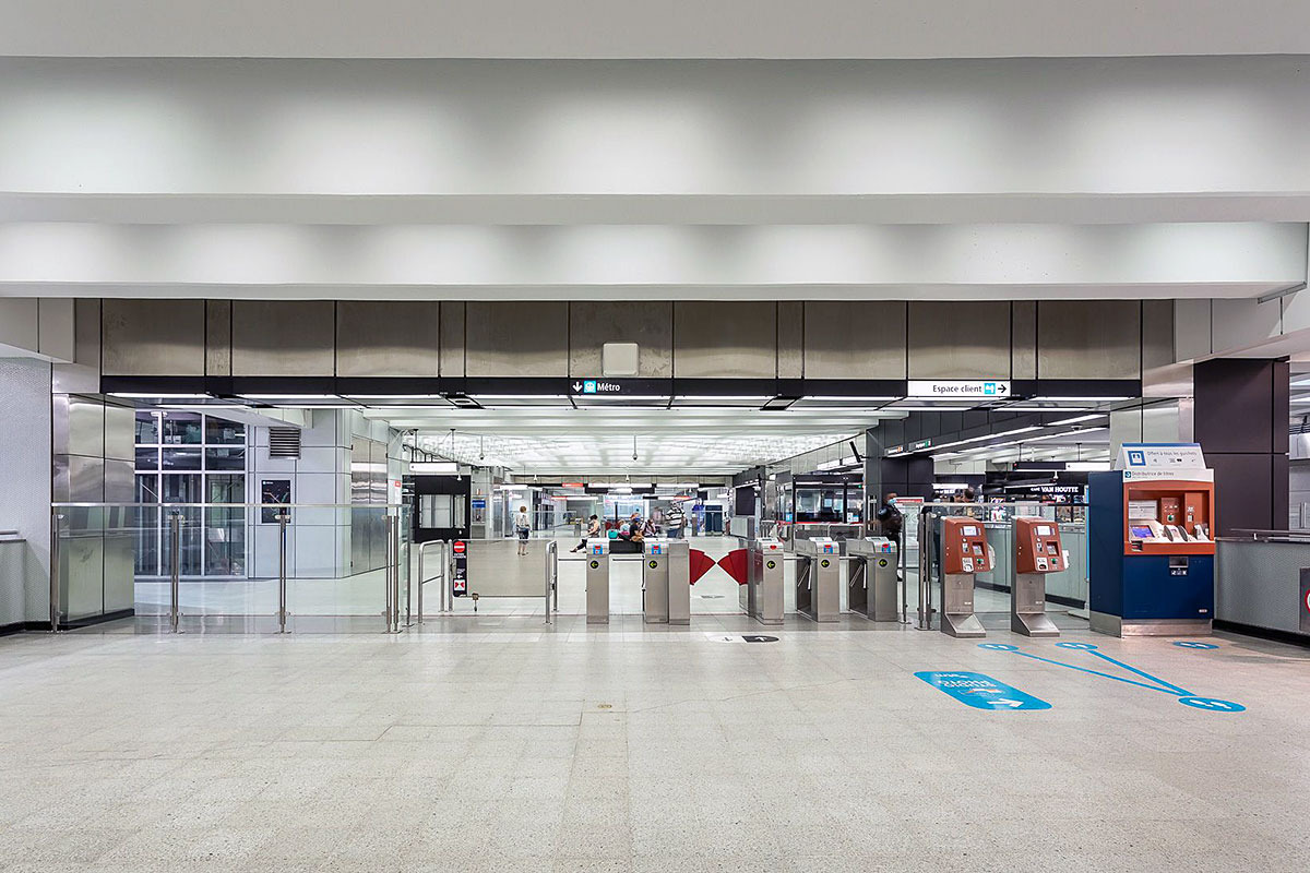
Parlant de la mezzanine à Berri. J’aimerais bien que la STM ajoute des panneaux de directions visibles à partir des corridors. Présentement, ils sont tous à l’intérieur de la zone de paiement et cachés par les poutres de support de la mezzanine.
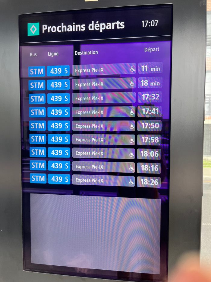
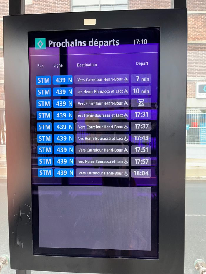
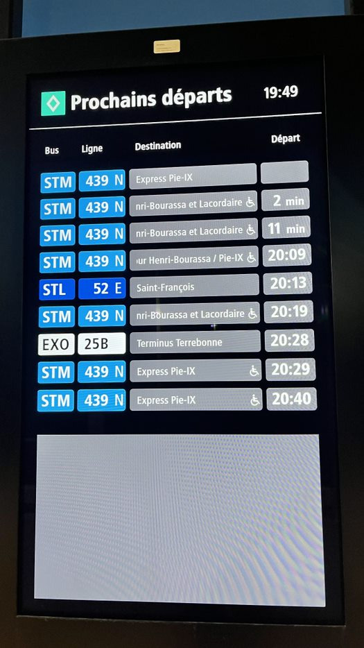
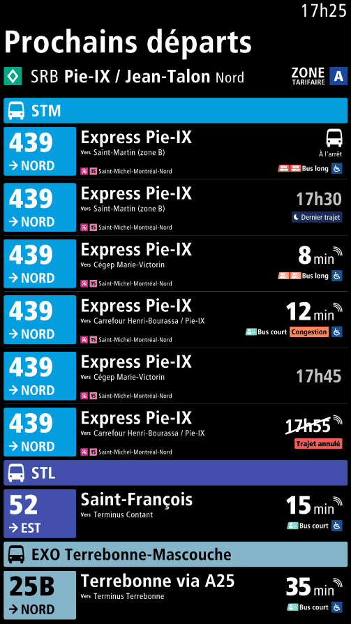
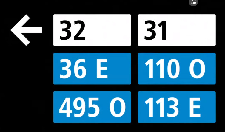
J’ai eu un peu de fun et j’ai refais le design pour les écrans du SRB Pie-IX.
Une problème majeure que je voulais rectifier c’est le fait que le nom de la ligne d’autobus et la destination de l’autobus sont dans la même case nommé destination et donc ils changent entre les deux tout le temps chaque quelques secondes. Plusieurs fois je regardes l’écran et j’attends pour que la destination apparaît.
De plus, il faut que j’attends encore plus long parce que la destination scroll.
Nom de la ligne affiché :
Destination de la ligne affiché qui scroll :
Plusieurs OPTC :
Donc, je les ai refait, et j’ai ajouté une fonctionalité quand l’autobus arrive et est en station, il affiche les prochaines arrêts (un design inspiré de MTA). Utile pour les gens qui ne sont pas habitués aux 3 destinations du 439 et des nouvelles utilisateurs qui ne sont pas familiers avec le transport collectif et veulent s’assurer qu’ils vont dans la bonne direction.
Apple has updated the exo, STL, and RTL logos, so now they match the STM bus icons, and are the network colour, which follow the signage in the stations!
C’est plutôt vide de paroles comme vidéo avec des faits manipulés pour impressionner la galerie. Est-ce la présidente en début pourrait être encore plus léthargique? Aucune énergie dans la présentation!
Et qui a approuvé les clips où on voit encore les logos et couleurs de l’AMT?
Que dire de Mr. Yelle à la fin qui ne fait que clairement lire un texte de gauche à droite de façon monotone?
Je ne sais pas ce que ce vidéo est censé faire mais ça ne me donne pas plus confiance envers nos institutions de gérance en transports en commun.
C’est un peu cringe comme vidéo, je suis d’accord.
Mais là, critiquer qu’un moment donné on voit les logos et couleurs de l’AMT dans le vidéo? Ils sont omniprésents encore dans la région!
Ensuite Sylvain Yelle qui lit le texte, c’est vraiment pas différent de la majorité de vidéos promotionnels où on voit des gestionnaires réciter des phrases vides de marketing.
Honnêtement, ta dernière phrase c’est vraiment chialer pour chialer. Et ça suit une tendance dans tes messages depuis un temps. C’est plate parce qu’à force de voir de l’incompétence partout et déchirer sa chemise sur des micro-détails, ça vient décrédibiliser les fois où il y a vraiment une raison de se plaindre.
Citation Et qui a approuvé les clips où on voit encore les logos et couleurs de l’AMT?
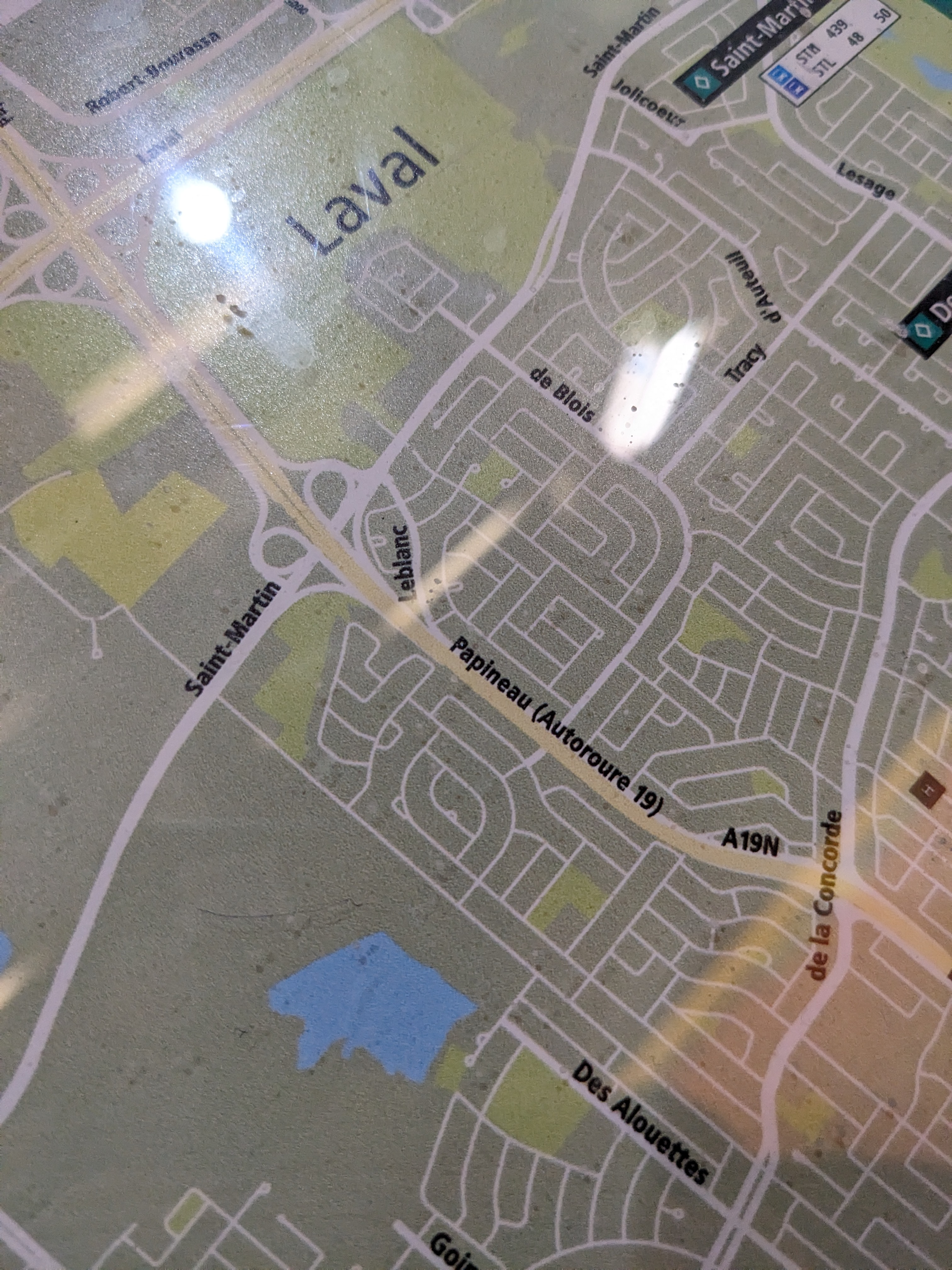
La gare Lachine a surement été choisis car elle intègre une station bixi ce qui est une nouveauté sur le réseau exo (l’affichage n’était surement pas une considération dans le choix des stations qui accueille une station bixi)
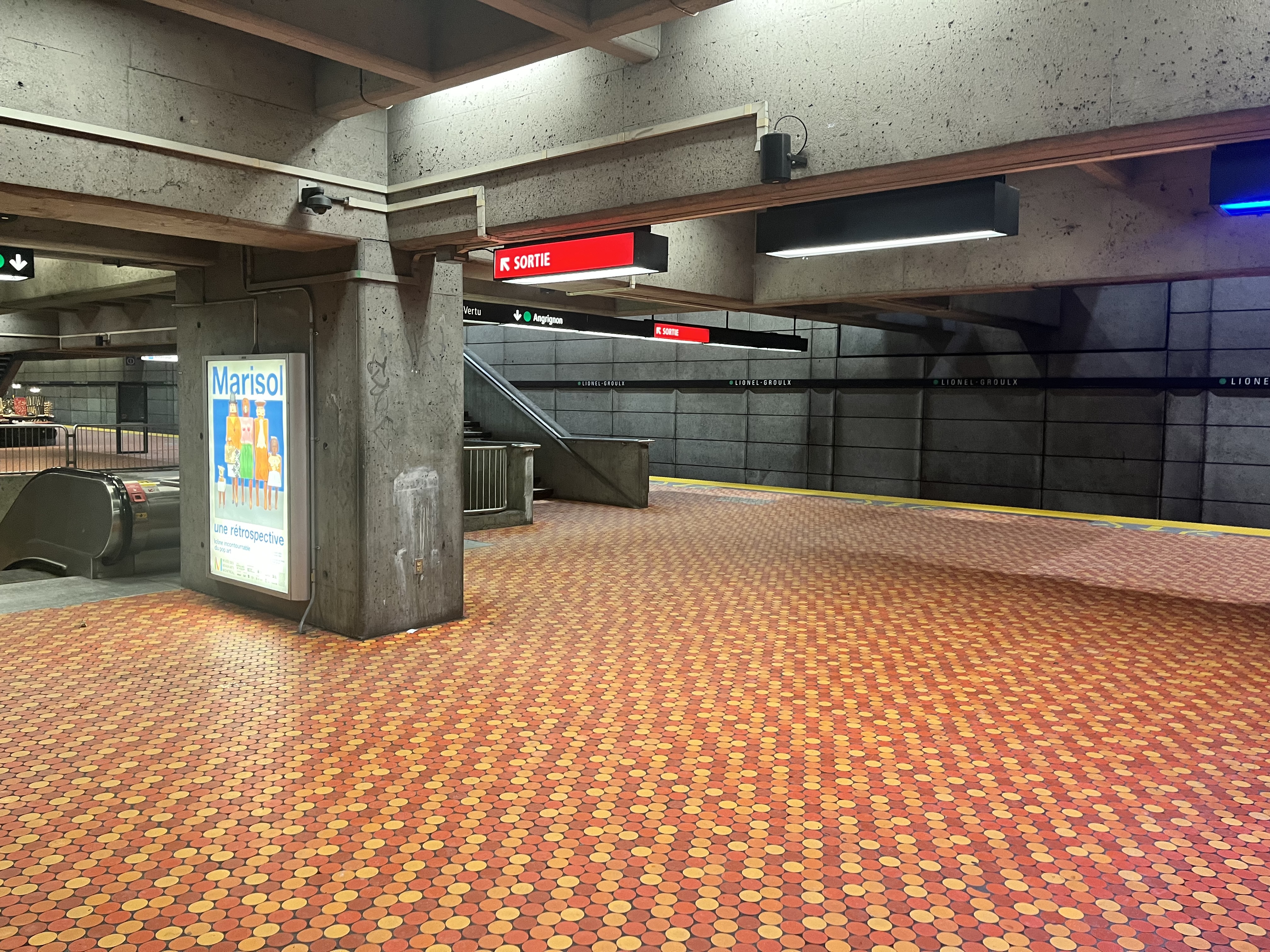
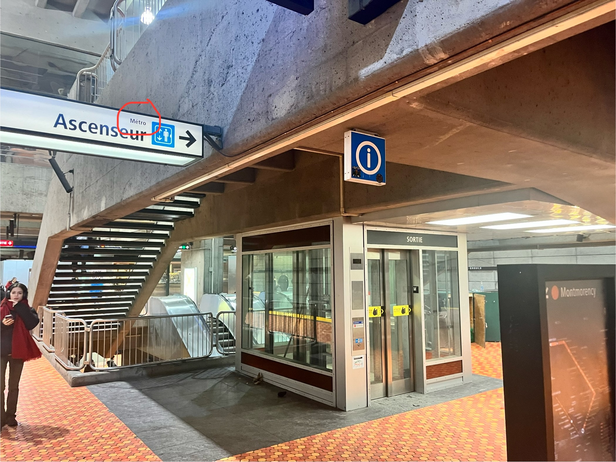
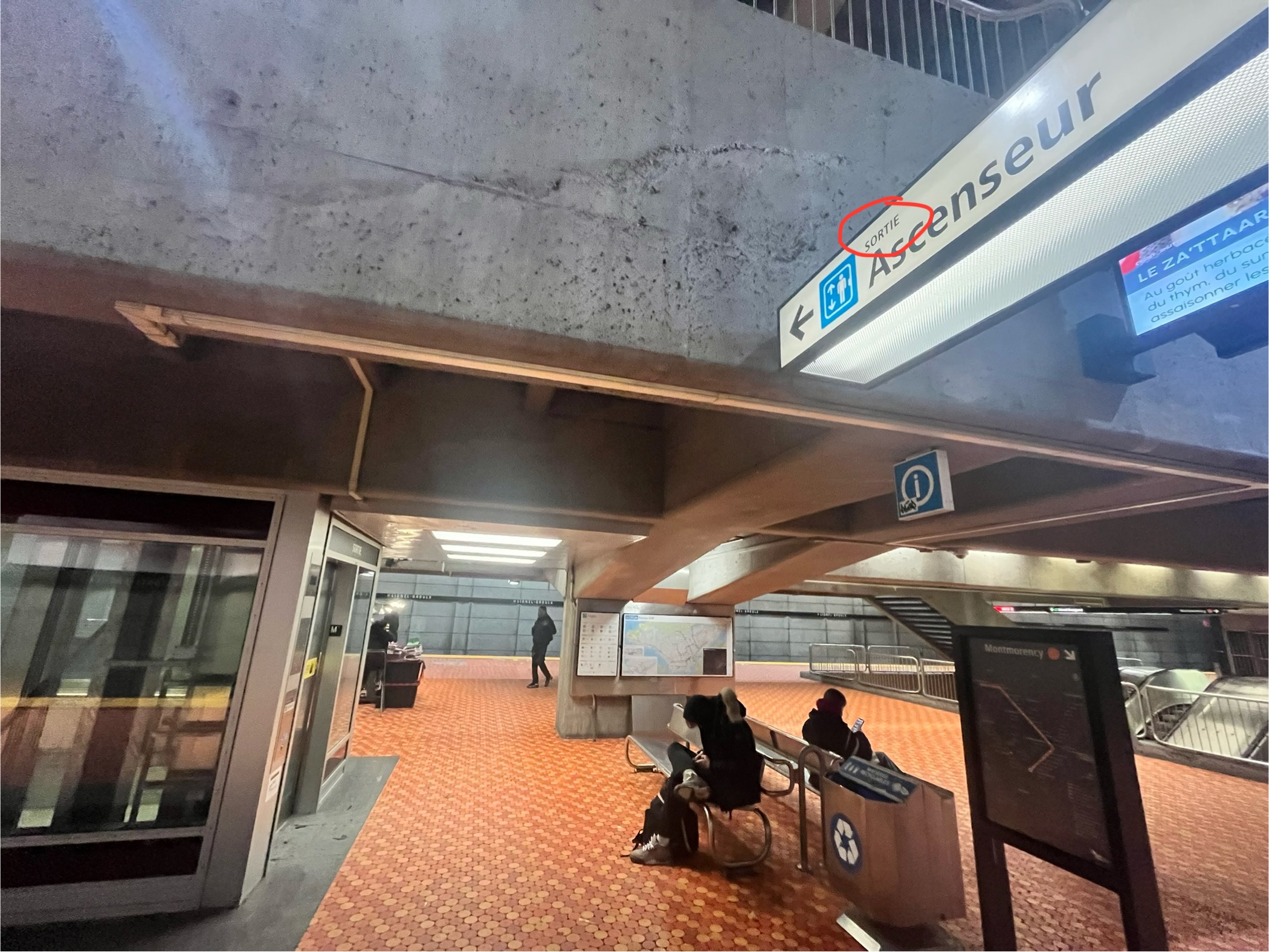
Lionel-Groulx signage is not properly placed on upper platform.
Incorrectly placed SORTIE sign (my guess is that the one pointing towards the track, is supposed to be on the other side of the sign like the Angrignon side)
I’ll send a comment to the STM, but I already sent a comment about an incorrect sign at Guy-Concordia station (it was missing a bus route), months (or perhaps a year) ago, and it has not yet been changed. So my hopes are pretty low on this one too.
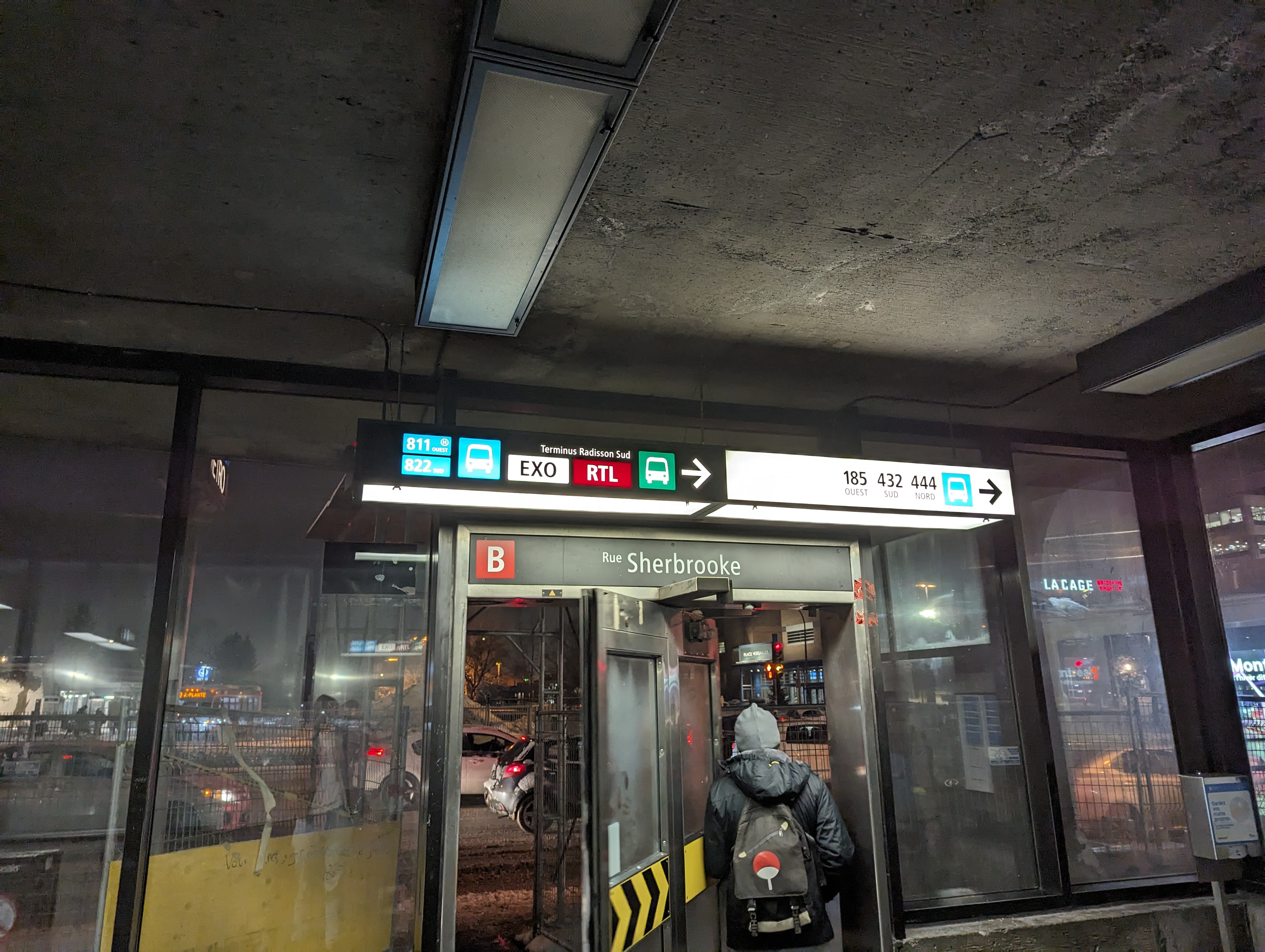
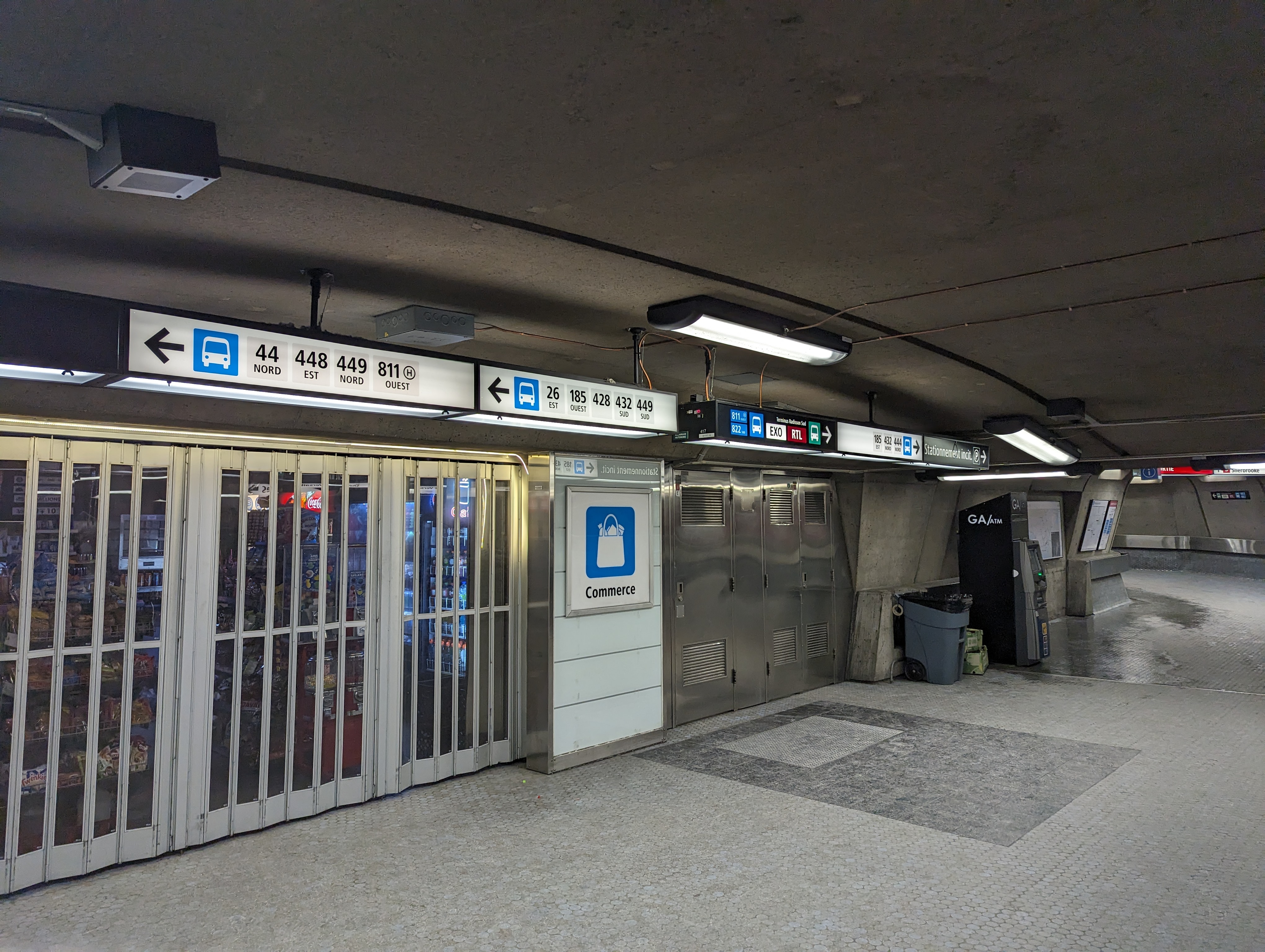
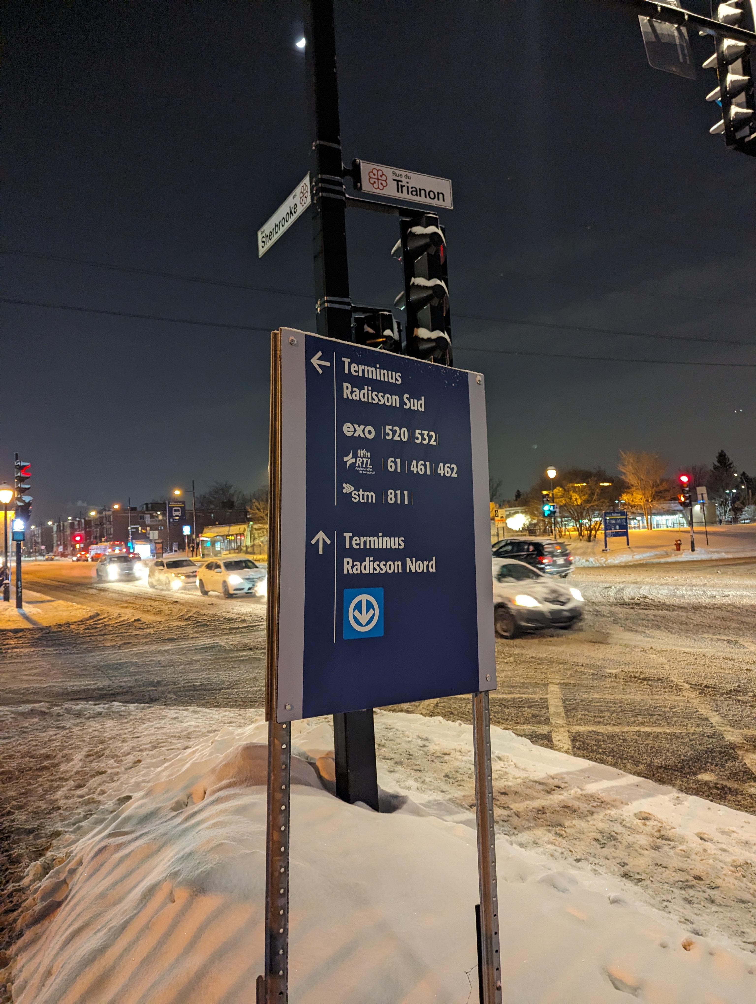
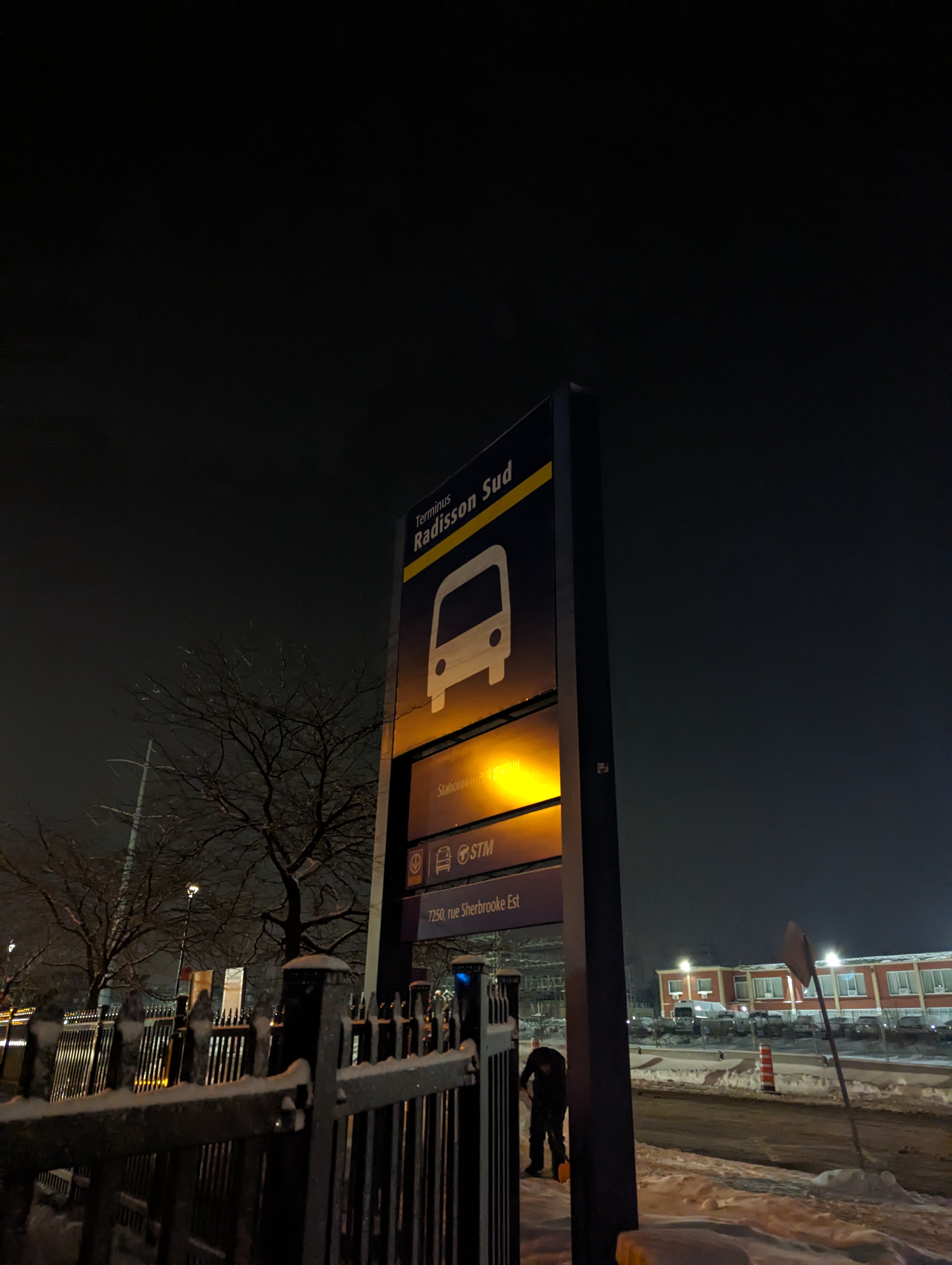
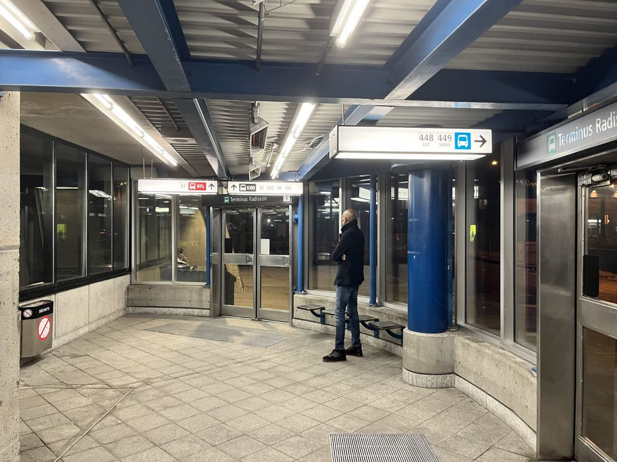
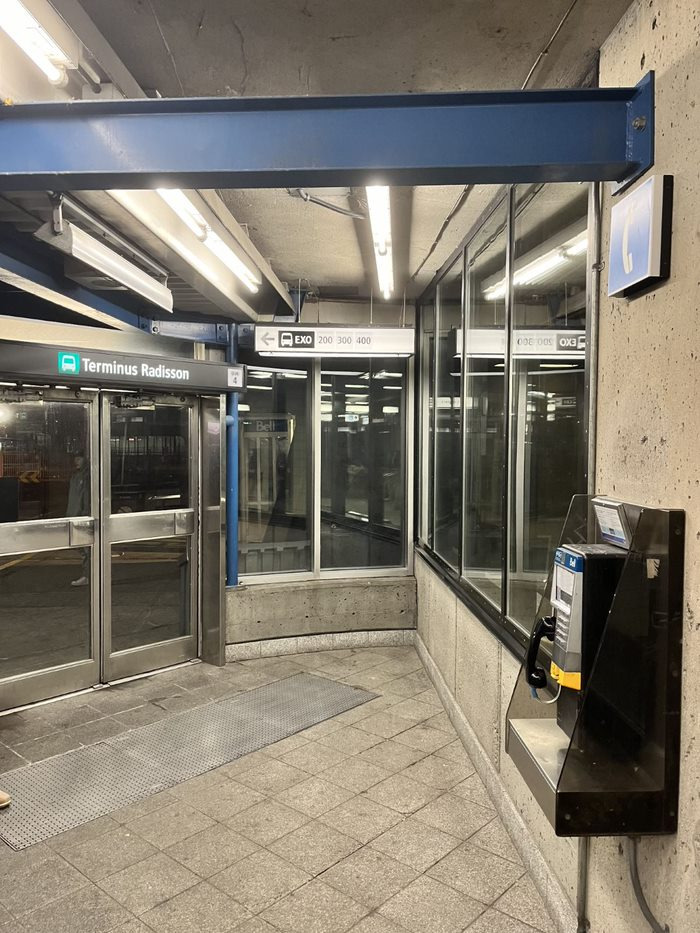
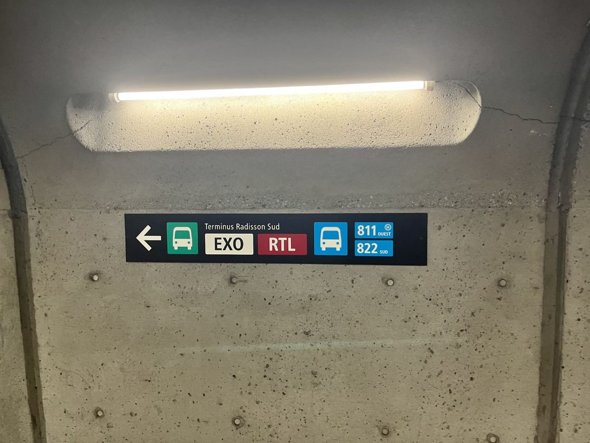
Radisson now has signs like the ones at Montmorency. I don’t think they were done by the STM, since they organize and present information in a completely different way from the actually-standardized Métro signage next to them. Same goes for the parking sign, which uses a different background colour and an awkward abbreviation (like Billetterie Métropo. at Vendôme).
Outside there’s some new signage following the old AMT norms to keep it consistent with what was already there. This is a temporary (?) terminal for the Lafontaine tunnel construction, so they stuck a new decal on the existing parking sign.
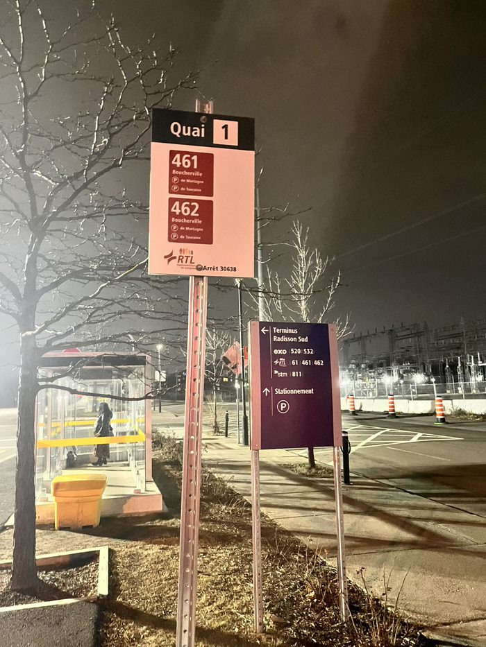
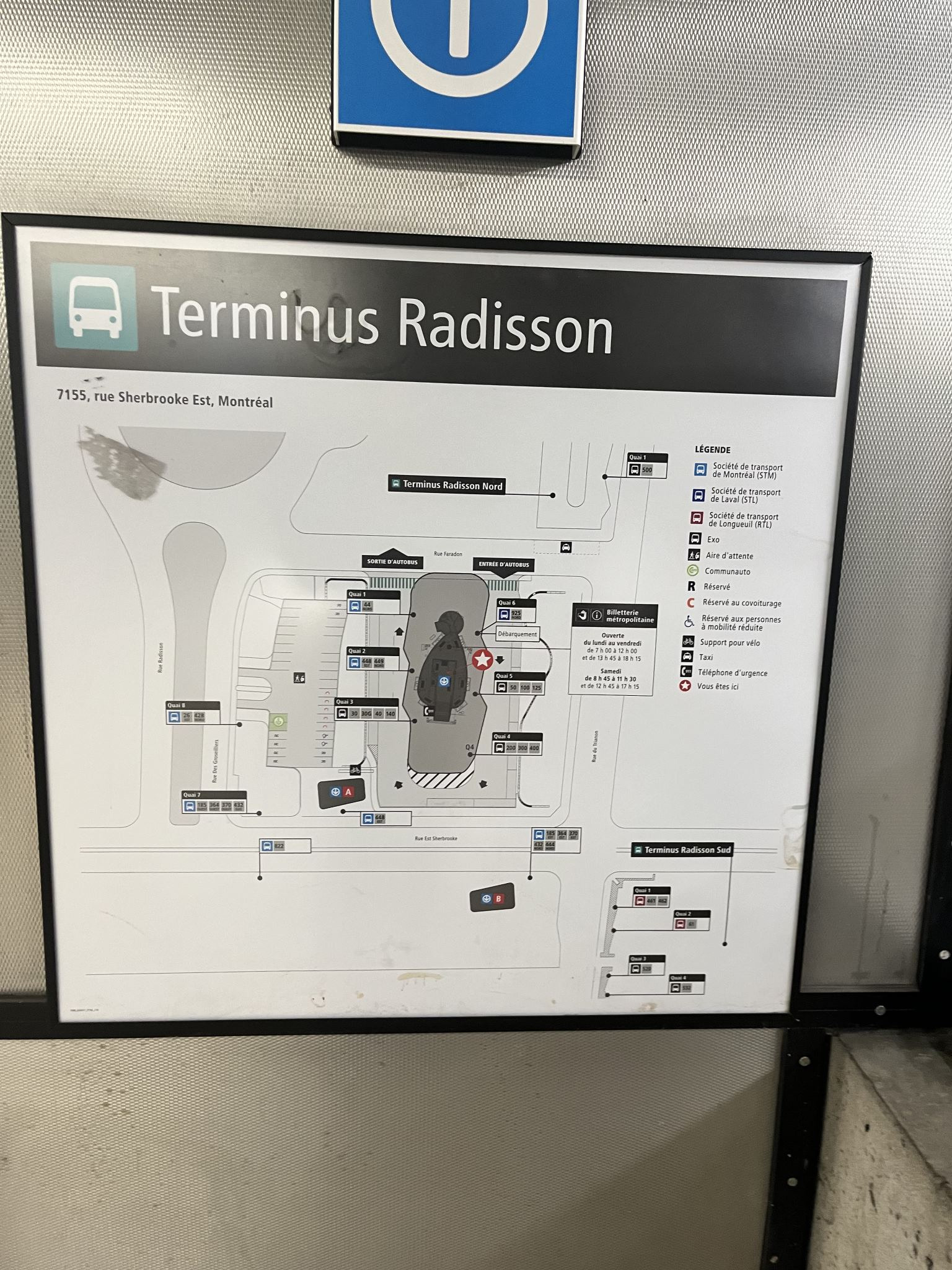
I took a lot of pictures too when I passed by Radisson! One thing I noted was the close-to metropolitain bus stop signs at the Radisson South terminal. I love also the bus terminal maps.
Love this, but I feel people don’t need to know where do buses enter or exit. However, I think useful information such as knowing where each exit are and noting where each doors are (as they now number doors) would be ideal. As well as noting more evidently, which bus service is operated by who, since people who are under the age of 20 or 30 and did not use a physical map in ages aren’t used to using a legend. Information should be presented in a logical way without the need of consulting it, like in Google or Apple Maps.
I also went to visit to see the arrows and it’s placement, and I found inconsistencies.
In fact, it’s the only signs in the terminus that have this weird arrow placement (both of them together). It still looks odd to me, since there is no nearby other door to confuse the arrows with. All the others, have an arrow pointing left or right. So they should have kept with the consistency, and either made the last door (as shown below) also straight, or make both showing the left or right door. Again it really does feel there is no standard for such signage, and it is nidpicking, but I’d say when signage is being put designed by professionals, it really feels weird to have these inconsistencies. Someone please fill me in here…
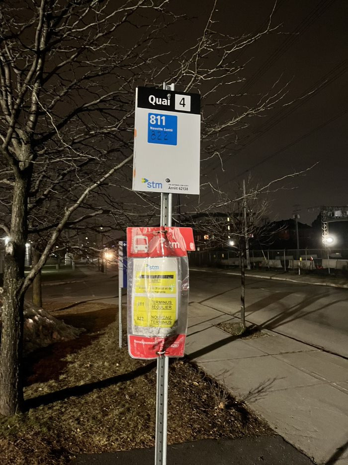
Oh and in addition to that, the 30G was not in service in 2021 and the 61 does not stop there anymore (it was moved to Radisson South terminal since it had opened).
Opposite side of the terminus:
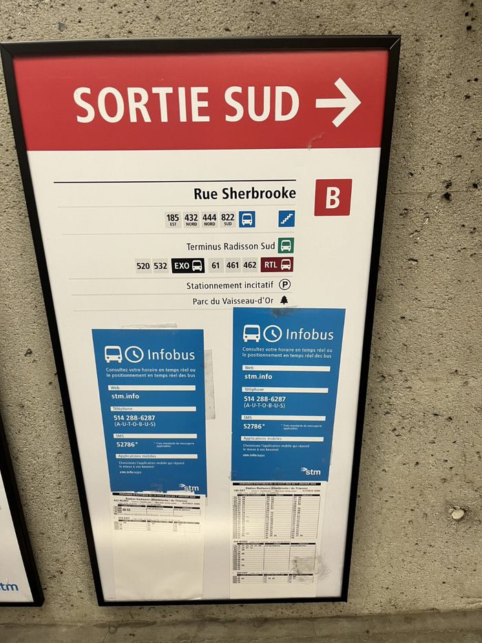
I like however, how they better distinguish what is an OPTC and what is a bus route.
This in contrast to existing signs, which for newcomers (or new users of public transport) who are not familar with the STM, STL, RTL, EXO can now better distinguish between them with the new design of Radisson.
My only complaint is that the font is rather small on some signs:
Side note : I also would have wished to have the similar arrangement with individual bus logos accompanying the OPTC like they have on other signs. On top of that, do a lot of people understand that the blue buses are STM? In this case it does not matter, since there is no duplication, but perhaps I can see this becoming a point of confusion in other places.
Side note : Notice the varying sized arrow, like I noted above. Thinner on darker signs, thicker on lighter signs.
I think the better solution to show direction rather than using small font is what was originally shown in the ARTM signage video:
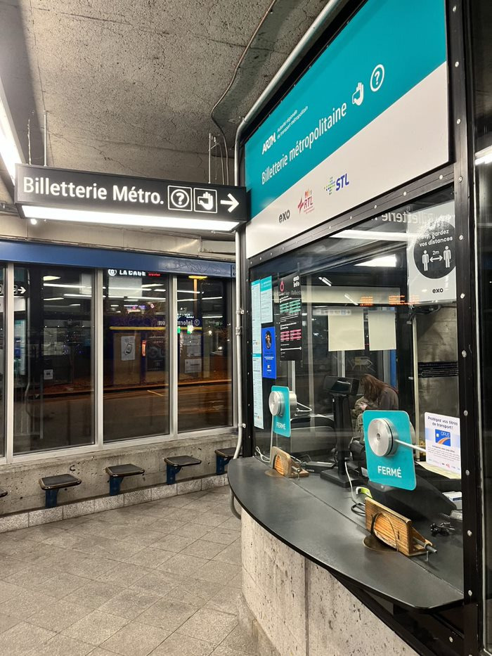
Oh and how it is mentioned billeterie métro.:
I honestly, do not know what is the best way to fix this, but if you don’t see that little dot, makes it seem like the ticket office for the métro. Also, why do you need this sign here, since the ticket office is right here?!?
J’aime votre proposition. Par contre, j’avais réfléchi un peu et je pense que l’ARTM ne veut pas que les gens achetènt les titres de la STM au billeterie métropolitaine.
Je pense une signalétique avec Guichet métropoltaine (guichet puisque c’est des titres et de l’informations) avec le logo RTL et EXO. Je vais faire une conception de la signalétique bientôt et je vais le mettre ici.