Because it is outdoors, it will be all white, for outside services.
If there was a structure, it would be in black mostly, with outside bus stops and streets at the bottom in a separate section (white with black text).
Because there are buses in the bus loops, and others on the street, I had to clearly display what is where in a unique way not seen anywhere else in the system, but I think people will understand it right away
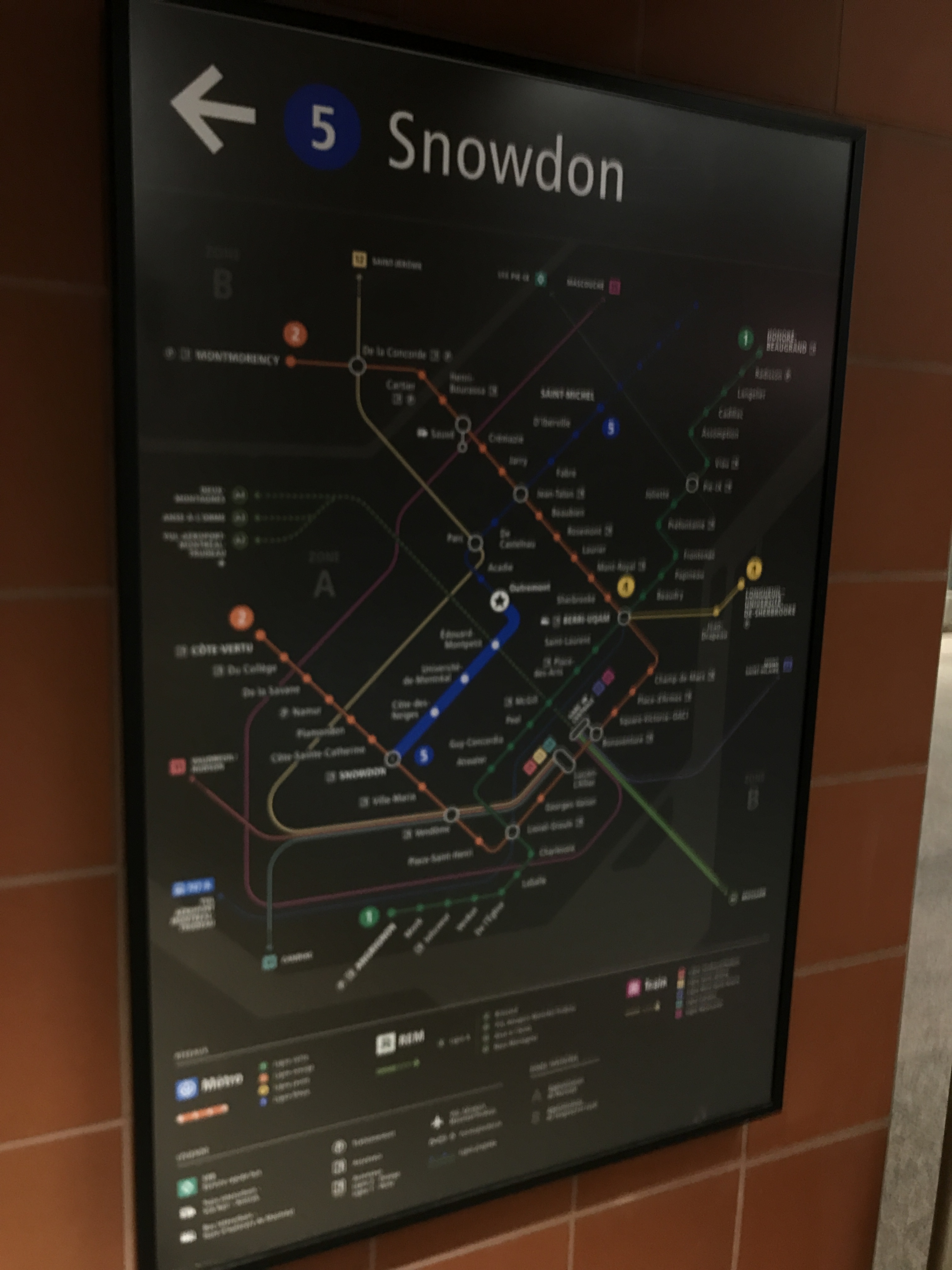
Now we’re just missing the tertiary (Mansfield/Rene-Levesque), secondary secondary (Rene-Levesque facing 1 PVM) and secondary tertiary (Robert-Bourassa/Belmont) exits…
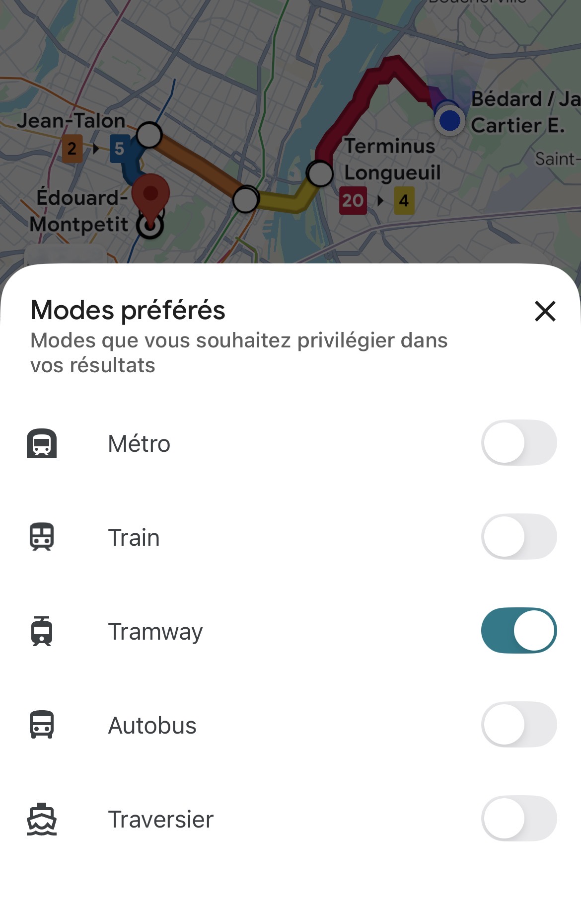
Je sais pas si Google se fie aux moyens de transport locaux mais… heille! On peut indiquer vouloir privilégier le tramway!
Quand le logo du REM sur Google est aussi un tramway, on se demande si c’est vraiment judicieux pour le REM de s’annoncer comme un « light rail » dans GTFS.
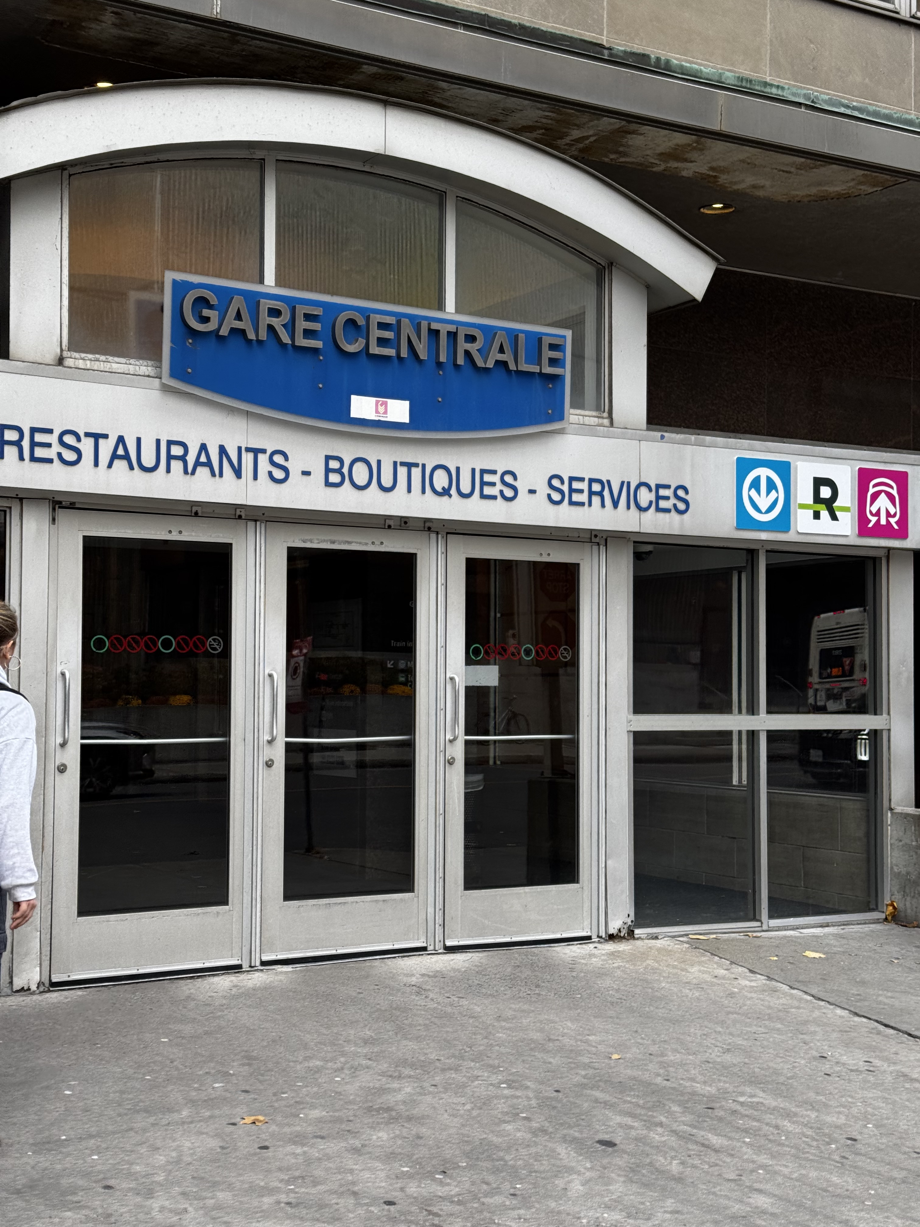
Something I’ve learned that will be interesting is the new Blue Line Extension exit signage will be green, not red like elsewhere in the metro, due to exits legally requiring green signage.
Additionally every red exit sign in every other station will need to be updated to this new green
I was under the impression that existing red signage was grandfathered? I would imagine they’d only need to add the green running man above all doors, but keeping the red Sortie signs would also make sense
Yes they can keep the existing red signs, because legally you need to change all the signs in the same “structure” to be consistent and can’t change just one or two to be green. But for the new stations, the exit signs will probably look identical to the red signs but made green (similar to how exo displays exits)
Concordia breaks this rule, the Hall Building uses different types of exit signs depending on the floor
Concretely, how will this impact the signage? Will red “Sortie” signs will be green and incorporate the ISO running man, or will the redesign be more significant?
Juste à temps pour que le style de tracé du REM change à nouveau Mais c’est une très bonne chose, c’était étrange que ça n’avait jamais été mis à jour!
I’m not sure how much of the design will change, if it will include the running man or not, but I know because of budgets they can’t change existing metro station signs. If there was money for it, they would however, it be in one swoop at once for the station
Je serais curieux de savoir d’où vient l’information.
La STM n’est pas soumise au CNB et respecte plutôt la norme NFPA 130, et n’est donc pas tenue de respecter la norme ISO 7010 du petit bonhomme sur fond vert tant que c’est écrit «Sortie» à des endroit précis et à certaines conditions.
Penses-tu que le choix du CNB plutôt que les normes NPFA a eu une grande influence sur la forme des stations du REM ?
Je penses notamment aux escaliers qui me semblent vraiment sous-dimensionnés par rapport à ce qui se fait dans le métro. Je ne sais pas si les normes NFPA dictent une largeur minimale d’escalier.
Les normes de largeurs d’escalier doivent probablement suivre le code du bâtiment. Je ne suis pas super familier avec la norme NFPA 130, mais beaucoup de normes et éléments du code sont similaires ou souvent référent à ces normes.