Ouch. Je croyais que ça voulait dire que le départ de train était remplacé par un service de bus…
La 125 se rend jusqu’à St-Donat. Elle a des arrêts à Rawdon, Ste-Julienne, St-Esprit, L’Assomption, Terrebonne puis métro Radisson.
La 125 ne s’arrête pas à L’Assomption. Aussi, pour avoir pris la 125 de nombreuses fois, je déteste les tronçons de Saint-Roch-de-l’Achigan et d’Entrelacs.
Mon erreur. C’est à St-Rock de L’Achigan.
Ce n’est pas un problème unique. La qualité du braille dans le stations initiales est en effet très mauvaise. Les points se détachent au toucher. Le problème semble être connu puisque j’ai vu une vidéo où on voit une personne tester la qualité du braille dans une des futures stations.
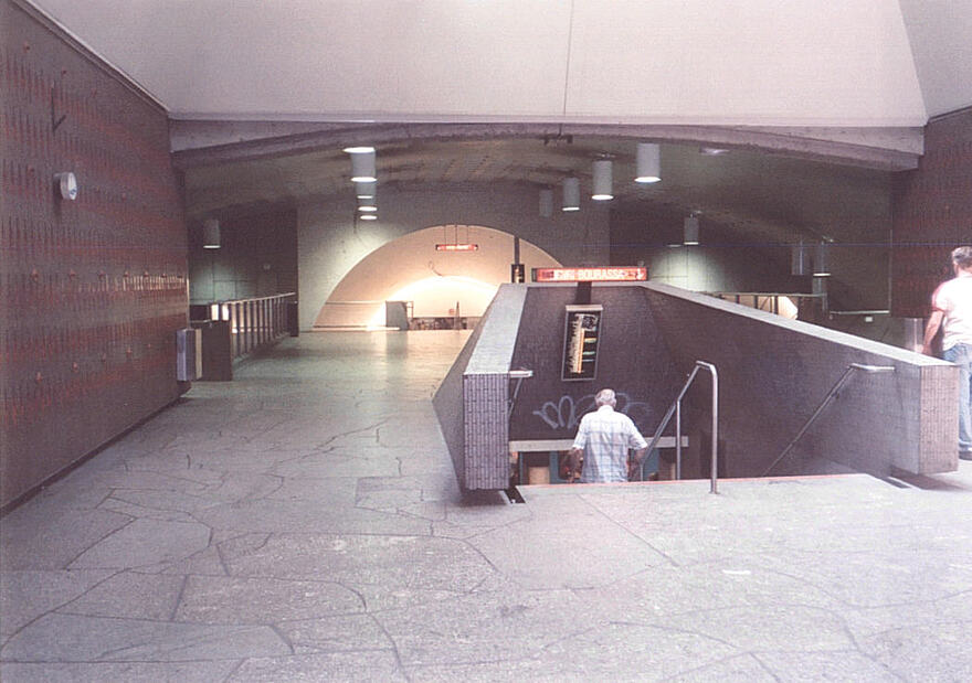
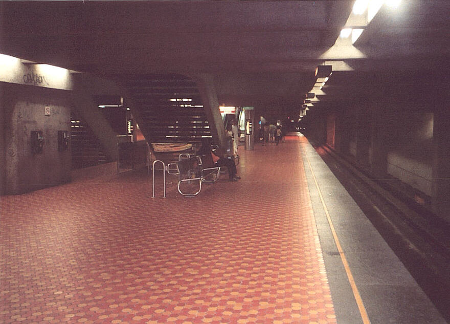
I was looking through some old photo collections and remembered that the metro used to have verical platform-level line maps, like here
Does anyone know what year they were removed? This photo is dated 2003 and still has them, so I’m guessing between 2003 and 2006 is when they were removed. I’m wondering if anyone has higher resolution photos of them for different lines since they’re hard to find
With the pilot project of the new signage in 2012, they made a new version of it. It’s somewhere in this page, I will try to find it.
(Follow-up message) Found it !
They look like pool balls with inversed colors (2 is blue and 5 is orange) on that sign for Jean-Talon haha… I prefer how they’re going about it now with just the line number and no white circle.
J’ignore si ça a déjà été signalé ici (désolé si c’est le cas) mais Richard Lee vient de partager un look des écrans des prochains départs de REM qui s’alignent avec ceux des terminus et trains … je dirais même plus clean qui celui des trains dans l’intégration de l’icône de la ligne.
I think they were removed in 2006-2007, with the Orange line extension.
@mashdash I think Katie on Facebook wants you to fix… something? Get on it, you’ve only got one evening!
Sadly I do not know programming enough to do this, but I do hope the REM could take my comments regarding signage.
The lead designers of the signage standards are working for the STM, but the REM has been quite separate, got an older version of the standards, and is implementing them in their own way. This is fine but they should be looked over by the advisor of the signage standards for the STM, just to make some final corrections. The only reason why buses were added at Île-des-Soeurs, for example, was because I pushed them to add it, and the advisor at the STM pushed them a LOT for it.
- Many people that see the signage at McGill already installed are already confused with how you can access all the platforms from the stairs, because it doesn’t clearly indicate that just the elevators are separate. I just have been showing people the signs and asking which way to access Quai 1 by the stairs, and people choose the elevator.
- Maybe the signs have already been updated from the photos, but the signs installed at Côte-de-Liesse use the wrong arrow. I’ve commented before but they should be a slight angle to the right/left, not straight, especially because you have to go down stairs.
- The train logo on the same sign also should be on its own platform. It’s currently labeled as if it’s a platform in the green section, they can simply call it Quai 4, and the “Train” below in the grey area like what is done for the branches on the REM
Finally, please GPMMOM, have live train time ready for the opening. If the live time doesn’t match the scheduled time, someone who schedules their train to match a bus connection, then see it’s not matching for a train every 10-15 minutes would really negatively affect a lot of people.
Are you aware if they’re planning on improving signage at the new stations like they have at the South Shore in the recent months? They’re seemingly hinting at more “checks” being performed on signage in the new stations, but so far, it’s not really showing
Funny enough, I sent my father the McGill ceiling sign picture just to innocently show him the progress being made (I get my train nerdiness from somewhere), and he answered:
“Strange. The sign actually says Metro for the metro info but it does not seem to mention REM anywhere.”
This highlights two comprehension issues:
- He assumed everything on the right hand side of the sign referred to the metro because the word “metro” aligned with the “quai 2” information.
- He didn’t find it obvious that the dark background and lime green accents automatically referred to the REM. That also contributes to the issue in (1).
I’m curious to get your take on this. I think that it’s a prime example of how when you’re too deep into a project/topic, you simply cannot see it from the perspective of someone who has absolutely no prior knowledge or context.
I have no idea, they’re quite separate from all the other agencies and essentially do their own thing
I think this is a significant problem of recognition of the REM in general.
I’ve helped new travelers at Central station find the stairs down to the REM. The big R̶ with a green line through it wasn’t identifiable enough as being the REM.
When the metro launched, all the signs outside said “MÉTRO” in big upper-case Univers typeface. Sixty years later, the arrow/roundel has enough “brand equity” in Montreal that it could get away with not including “MÉTRO” (at least among Quebecers, I’d wager) and still the new signage standards say to put “Métro” with the logo when entering the édicule.
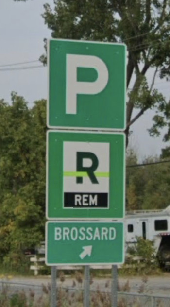
MTQ signage for drivers puts “REM” in white on black below the logo, like the historical “MÉTRO” signs. It feels incongruous, but it has the benefit of telling drivers who are unfamiliar with the REM of what this is.
From what I heard, a standard bus terminal map will be made which will follow the signage standards design language, and be redone for existing terminals like Panama and Brossard. The currently design isn’t to the standards and will be updated, but the new system will allow easy changes using a software for the operators.
Because switching to this new software will take some time, the estimated time we should see these new maps will likely be in 2027 or even after.
So if the terminus maps require software, are these interaction kiosk maps like in fancy malls?
Pet peeve : no standard terminus terminology. Examples:
| Terminus | Part of terminus | Where you get your bus |
|---|---|---|
| Brossard, Panama | Aile | Quai |
| Longueuil | Aile | Porte |
| TCV | Quai | Porte |
The maps I’m referring to would still be physical. The software I’m referring to just allows the OPTC’s to change the maps without needing to use Adobe Illustrator, they just generate a new map, similar to how the neighbourhood maps are made for the STM (which uses OSM, GTFS, etc), and print and install them.
There is a separate project similar to what you mention, where RTL wants kiosk maps (like those in malls) installed at Longueuil. This would have a map of the terminal with departures, as well as Chrono built in to let users do directions directly, and see how to get to the specific bus. This is very early request of RTL, but if it happens it would be very exciting! To go with this, new signage is coming as well which includes a premium metropolitan standard, upgraded in unique ways only for this bus terminal (such as floor signage).
As for the difference terminus terminology, this is because of the architecture of the stations. Longueuil and TCV both use physical doors to the buses, while the others don’t. It’s a bit confusing though because at Brossard and Panama, Porte is used to refer to the exits instead.
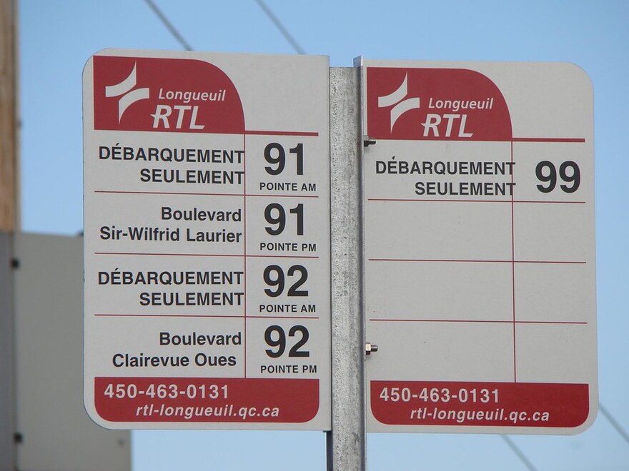
Also relating to RTL bus stop sign designs, since they have the new branding now I’m trying to push them to change the design to be similar to the new STM or exo signs, following the metropolitan standards instead of the current very dated design:


