Bref… Rendez-vous au 17 novembre. On croise les doigts.
1 « J'aime »
Entrave sur Gouin sous les voies
- Date de début prévue
31 octobre 2025
- Date de fin prévue
2 novembre 2025
- Horaire des entraves
Semaine de 9 h 00 à 15 h 00
Samedi de 7 h 00 à 16 h 00
Dimanche de 7 h 00 à 16 h 00
- Responsable des travaux
REM
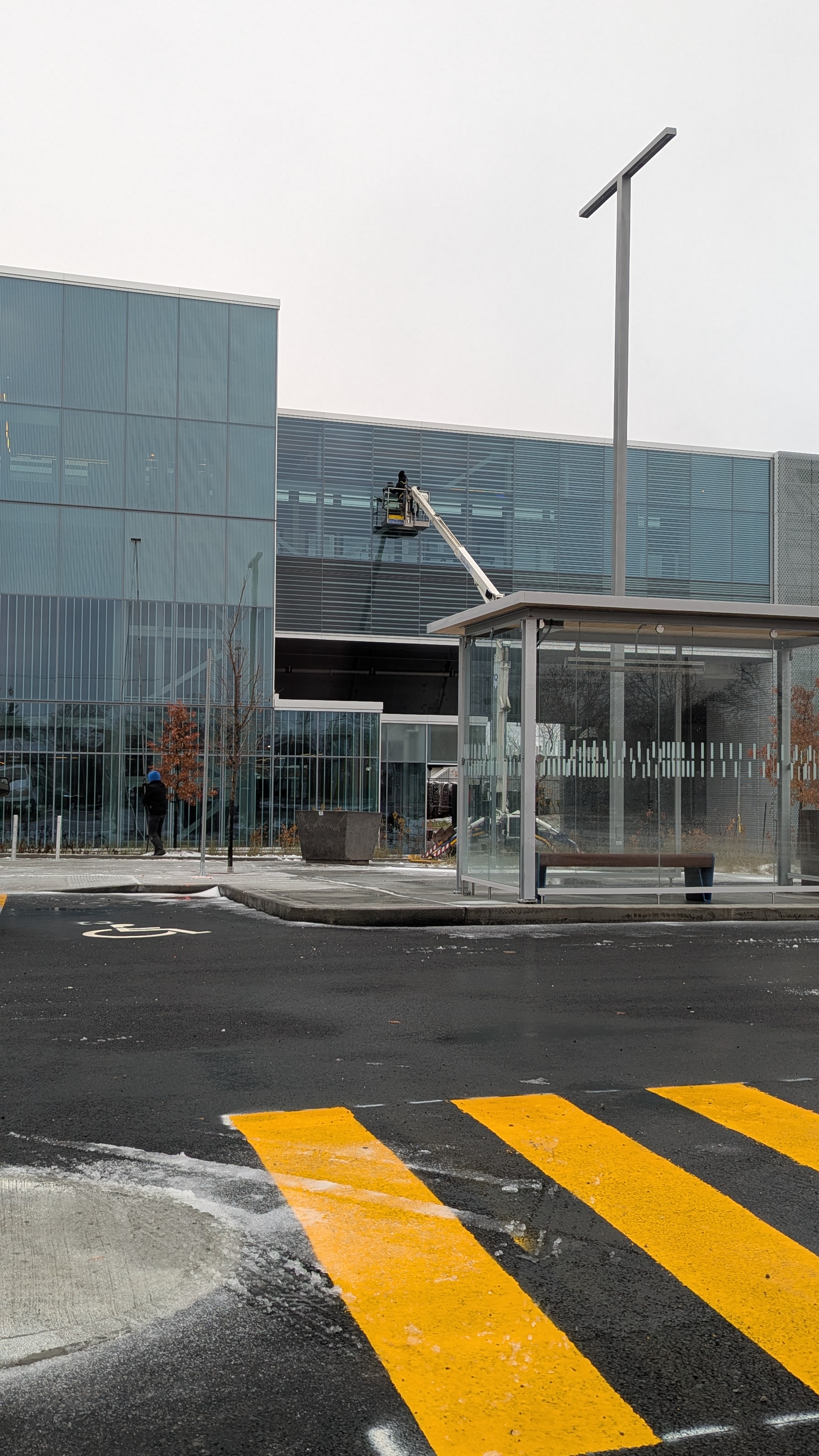
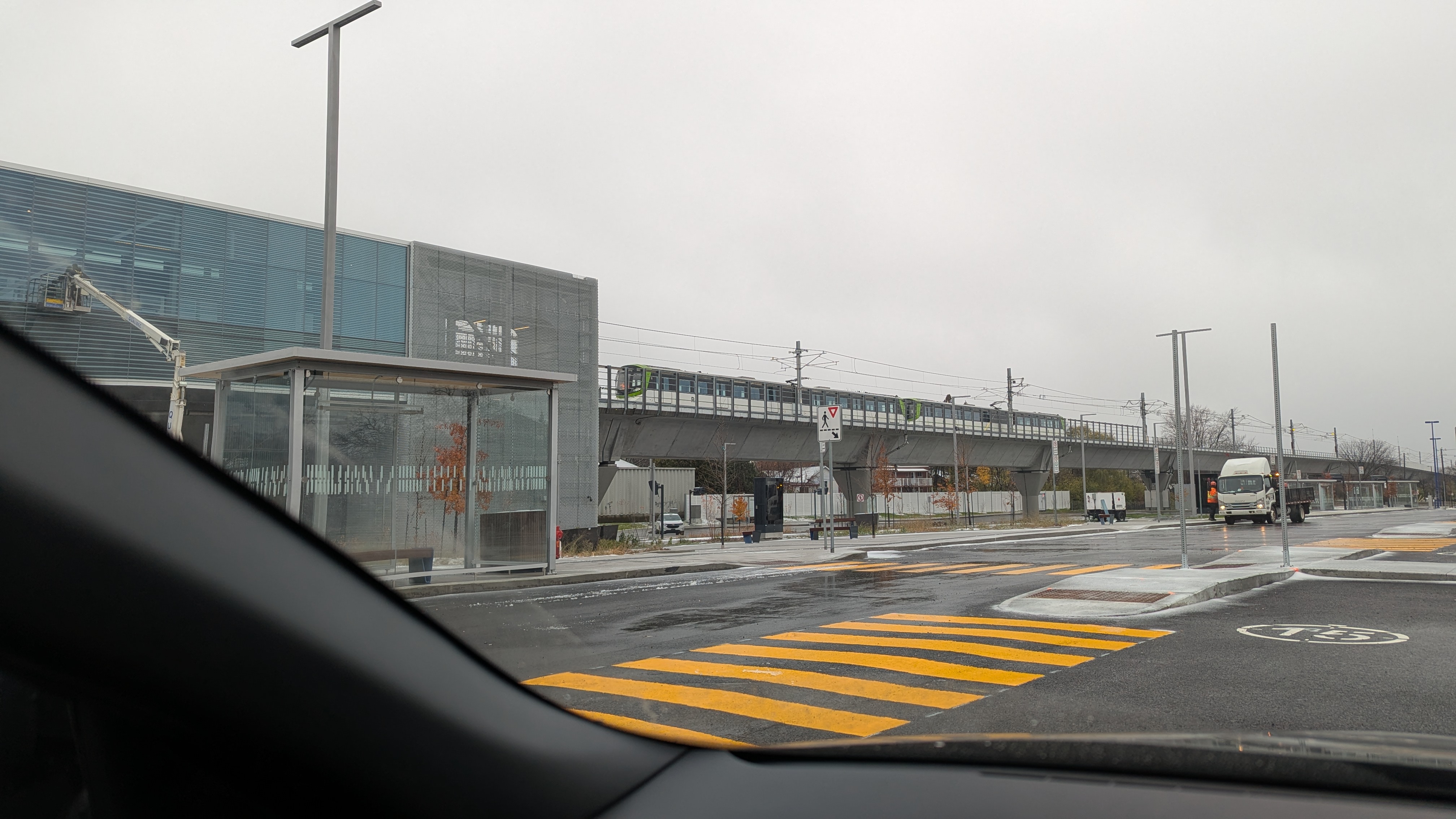
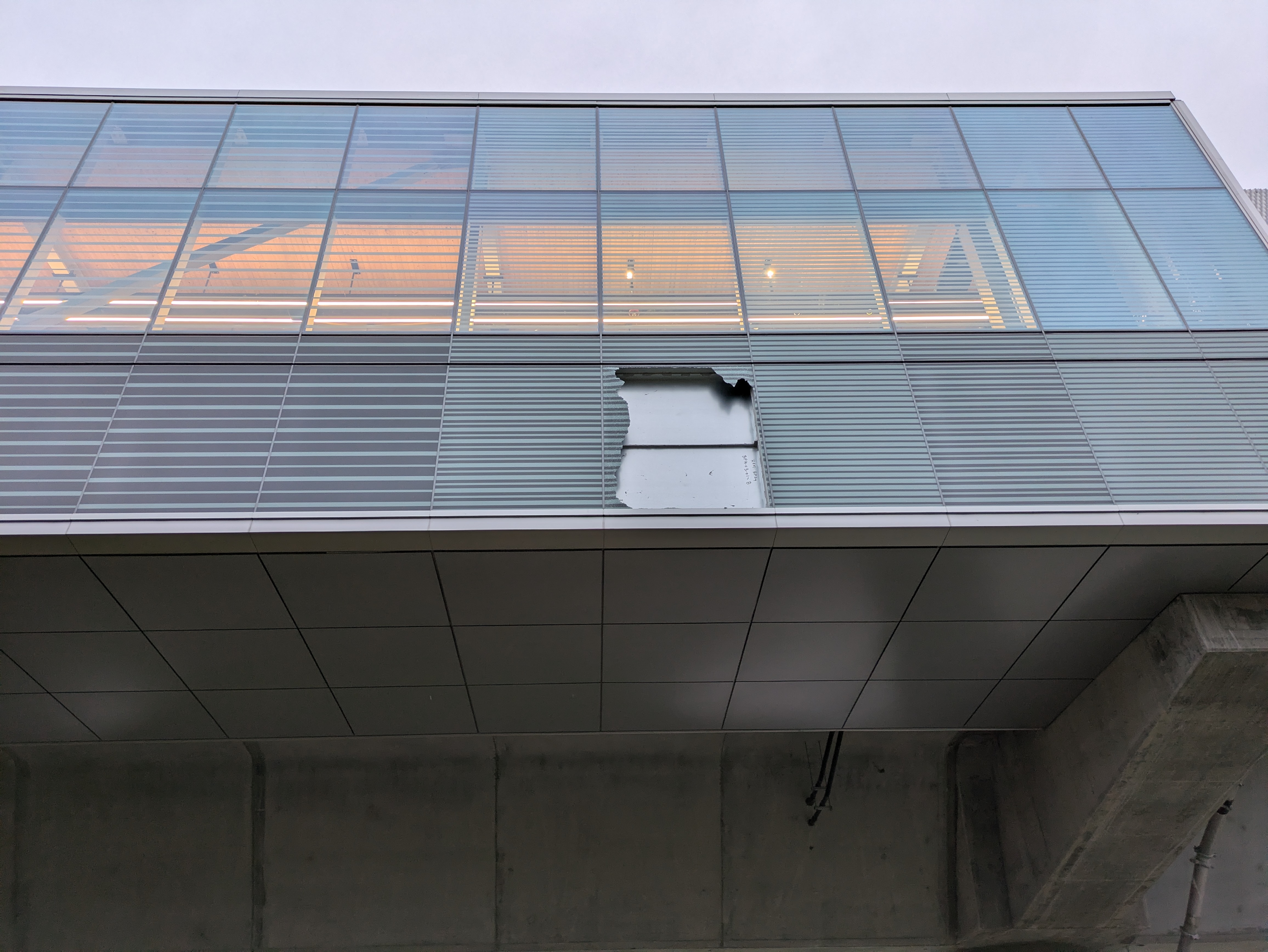
First-look at the finished Station Pierrefonds-Roxboro…maybe!
8 « J'aime »
Not sure if it’s been mentioned, but clicking the Itinerary on the Pierrefonds-Roxboro station page takes you to “100 Boul Gouin O #11, Montréal, QC” on Google Maps.
1 « J'aime »
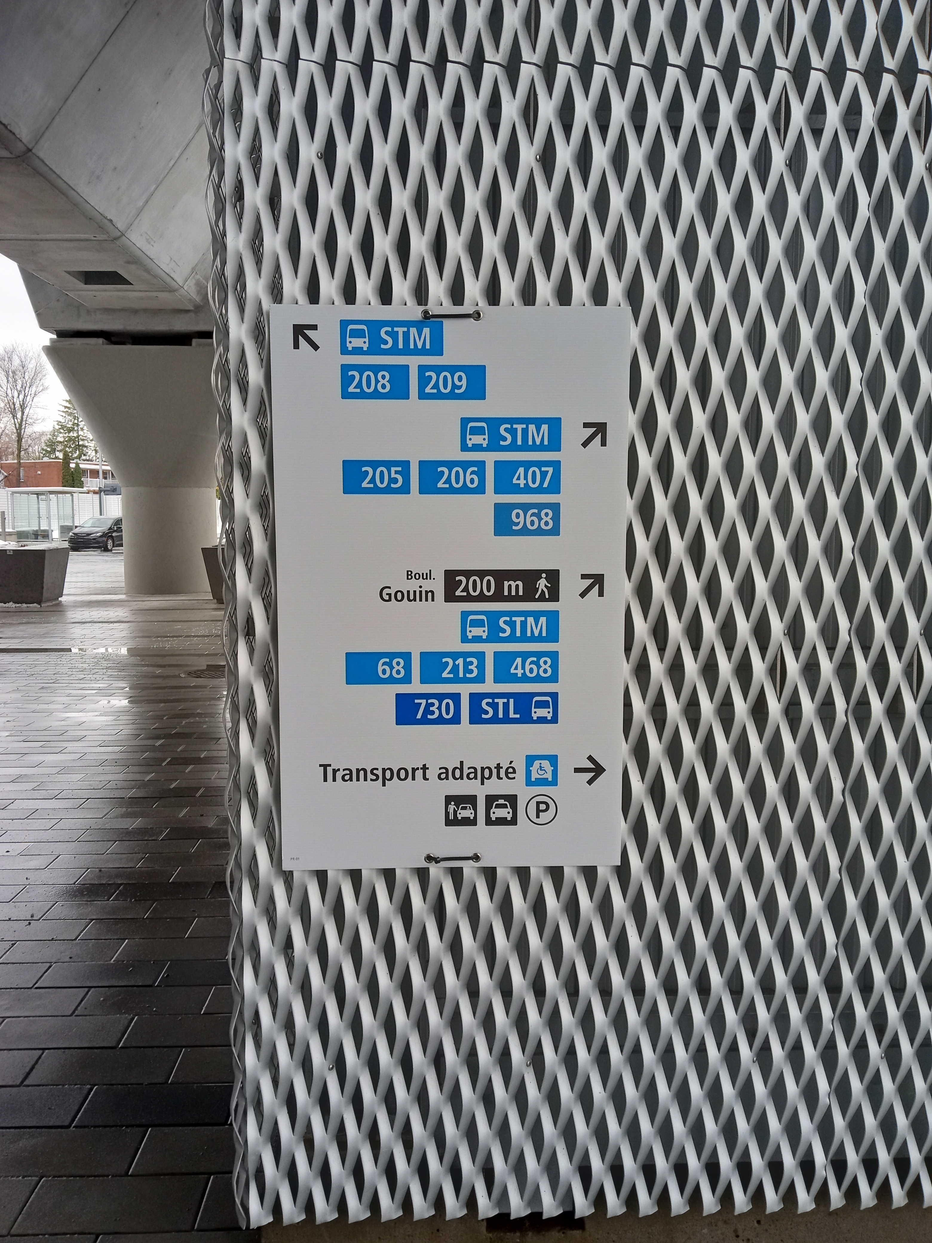
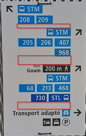
Ils ne se sont même pas dérangé pour avoir des lignes séparatrices entre les sections?
J’ai vu des paneaux indicateurs plus chargés qui étaient plus lisible…
Il me semble que les lignes séparatrices ne font pas partie du standard de signalétique métropolitaine. La panneau est très lisible selon moi…
10 « J'aime »
Les espaces ne sont pas consistantes, surtout celui des 2 premières sections, qui irrite mon côté OCD.
Les 2 plus bas sont beaucoup plus dégagés. En fait, pourquoi avoir séparé les 2 sections du milieu, chacun avec sa section STM, qui pointent vers la même direction?
Aussi, “STM” précède les numéros de bus, mais “STL” suit son numéro.
2 « J'aime »
Like @ComradeMark said, the standards don’t include lines to separate them. The REM does this, but they do what they want with the standards given. I agree however this could be separated better in the future.
The first two are located in the bus loop under the REM so they grouped together. The third set (with the distance) is on the street (indicated by the name) so it is separate.
When the bus is on its own, the bus can be in the same column as the operator. There was also not enough space to fit it below.
6 « J'aime »
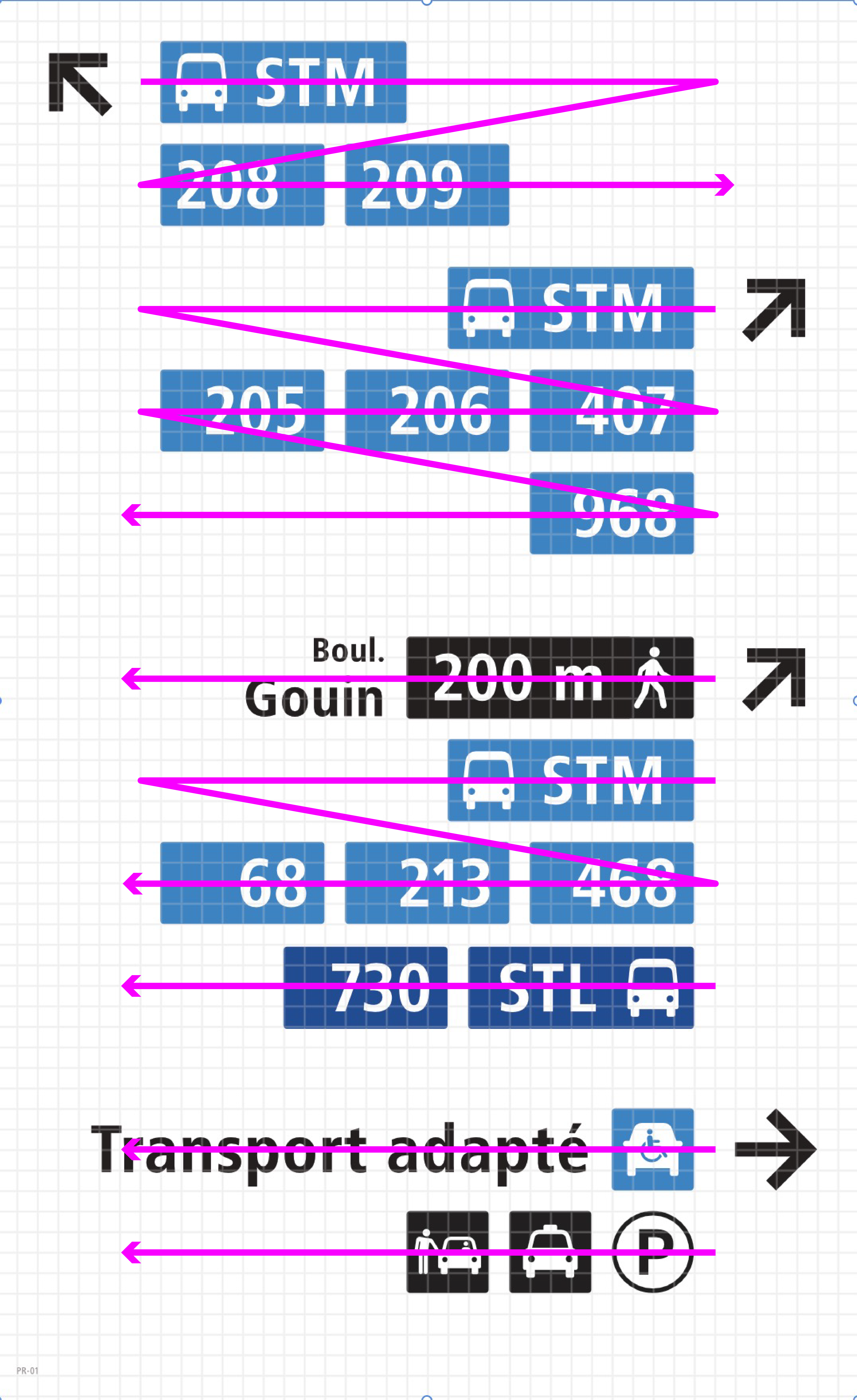
I’m talking about the width of the white space between the sections. Why would the first 2 sections be grouped together if they’re pointing in opposite direction?
Just look at the bus icon next to STM and STL. One is before, one is after. They’re not even consistent on that.
Anyhoo, enough about shoddy design.
2 « J'aime »
Because they’re in the bus loop!
For the STL thing, personally I don’t think it makes a huge difference in the way the sign conveys the information, since the elements like different colors and the fact that there’s only a singular bus line with the operator do their job here.
3 « J'aime »
Like @alik and I said, the first two bus stops are right after the sign, within the bus loop under the REM. Idealy, these would be identified with bus gate numbers, but the bus loop doesn’t use that so it’s on its own.
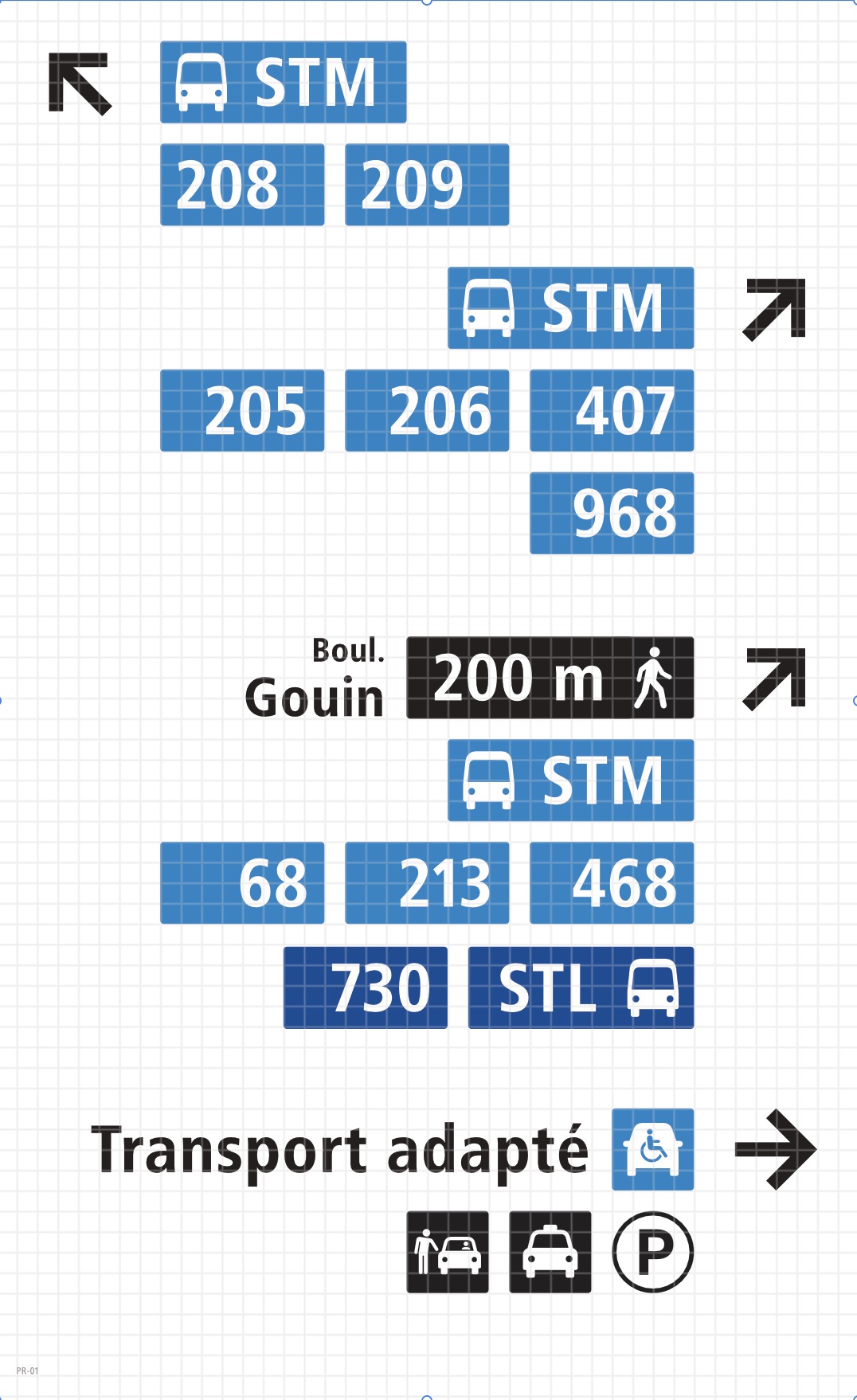
I’ve shared the grid so you can see the spacing, two squares between these two stops within the loop, then 4 squares between other services (on the street, adaptive transport, etc).
What? (I noticed the error)
4 « J'aime »
6 « J'aime »
4 « J'aime »
You read what I wrote. I’m talking about the icons.
![]()
vs
![]()
Why is the bus on the left of STM, but on the right of STL?
4 « J'aime »
Interesting, though Imo it would work better on signage that has more leeway in width.
Edit: The right-to-left and left-to-right are wrong, judging by the order of the bus numbers. They’re always left-to-right, which makes sense since no one reads right-to-left here and would make the signage more convoluted. They’re simply left-aligned and right-aligned according to the arrow.
2 « J'aime »
Oh that’s a genuine mistake, I’ll correct it though, thanks for pointing that out
3 « J'aime »
J’apprécie cette discussion et ça permet aux non-initiés comme moi d’apprendre. Perso, si permis, j’aurais mis les “![]() STM” et “
STM” et “![]() STL” en légende car les deux couleurs sont bien évidentes et les usagers cherchent surtout les numéros de lignes plutôt que les opérateurs. Ça laisserait les numéros de lignes sur la partie principale du panneau, ce qui pourrait rendre le tout plus lisible.
STL” en légende car les deux couleurs sont bien évidentes et les usagers cherchent surtout les numéros de lignes plutôt que les opérateurs. Ça laisserait les numéros de lignes sur la partie principale du panneau, ce qui pourrait rendre le tout plus lisible.
Pour le reste j’essaye d’apprendre, alors désolé si c’est trop hors-sujet. Mais pourquoi “Transport adapté” est inclus en texte à côté de son logo, mais pas Taxi par exemple? Est-ce une norme?