They said before that they’ll announce the new schedule one month before the REM, that would mean the REM will possibly open mid-April, lining up very nicely with the rumoured April 23rd date…
2 « J'aime »
Réseau de transport de Longueuil Le DG quittera ses fonctions le printemps prochain

PHOTO MARTIN CHAMBERLAND, ARCHIVES LA PRESSE | Le directeur général sortant du RTL, Michel Veilleux
L’actuel directeur général du Réseau de transport de Longueuil (RTL), Michel Veilleux, a annoncé mercredi au conseil d’administration de qu’il quittera son rôle « au cours du printemps à venir », afin de relever de nouveaux défis professionnels.
15 février 2023 | Publié à 16h53 | HENRI OUELLETTE-VÉZINA | LA PRESSE
C’est ce qu’a confirmé la présidente du conseil d’administration du RTL, Geneviève Héon, dans une courte déclaration, en fin d’après-midi. Le gestionnaire était à la tête de l’organisation depuis sept ans maintenant.
« Sa feuille de route […] témoigne de son engagement et de sa détermination à développer le transport collectif sur le territoire de l’agglomération de Longueuil. L’ensemble de ses réalisations aura permis au RTL de faire évoluer grandement son réseau et de consolider sa place dans l’industrie du transport collectif au Québec », a d’ailleurs affirmé Mme Héon, en parlant du principal intéressé.
Parmi les « grands projets » du directeur sortant, Geneviève Héon cite par exemple « le plan stratégique Vision 2025, la modernisation de l’organisation et son adaptation à la nouvelle gouvernance métropolitaine ».
En novembre dernier, M. Veilleux avait notamment présenté le vaste « rebrassage » du réseau du RTL, avec l’arrivée du Réseau express métropolitain (REM) sur la Rive-Sud, maintenant prévue au printemps 2023. L’organisme se prépare déjà à modifier 25 lignes locales et à en ajouter 5 autres. Et pour y arriver, il devra dégager des économies supplémentaires de l’ordre de 35 %.
« Il aura su aussi mobiliser les équipes durant la pandémie afin de répondre au mieux aux besoins des travailleurs essentiels tout en assurant une gestion responsable des fonds publics », note-t-elle aussi, en remerciant le directeur général « pour sa riche contribution » et en lui souhaitant « la meilleure des chances pour la suite de sa carrière ». « M. Veilleux pourra toujours compter sur l’appui du RTL pour ses futurs projets », conclut la présidente.
À noter : on ne connaît pas encore l’identité du successeur de Michel Veilleux. Celui-ci sera nommé ultérieurement, après le départ du directeur sortant.
Lisez l’article « REM sur la Rive-Sud : le RTL s’apprête à “rebrasser” entièrement son offre »
1 « J'aime »
2 messages ont été fusionnés à un sujet existant : RTL - Nouveau réseau
Seen yesterday at Desaulniers and Victoria. There was also a colour dot-matrix display on the bus I took, similar to the ones Exo uses, but not active yet.
7 « J'aime »
Je me demande si ça va prendre un style similaire à la signalétique métropolitaine ou un autre spécifique au RTL.
It would be great if they could add the current time on the display…
2 « J'aime »
À date, aucun affichage ou document de la RTL n’a adopté les éléments de la Signalétique métropolitaine (à part les symboles bus / train / REM), donc j’ai l’impression qu’ils vont continuer à utiliser leur propre style.
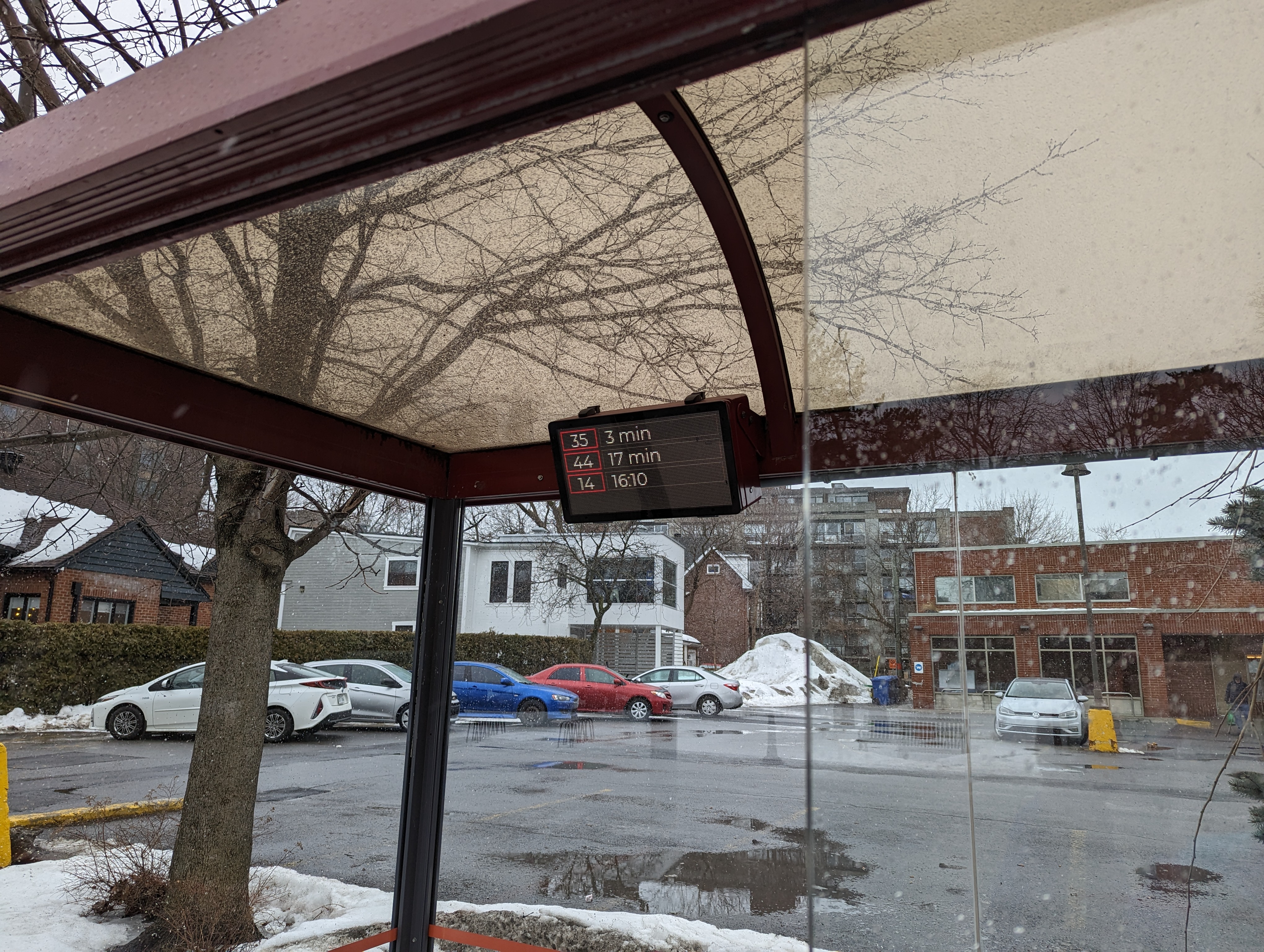
Ça correspond à aucune ligne de cet arrêt. Il y a (ou avait ?) exactement le même afficheur à l’arrêt Rome/Naple à Brossard… avec les lignes 35, 44, 14. Pendant l’hiver l’afficheur était souvent non fonctionnel
3 « J'aime »
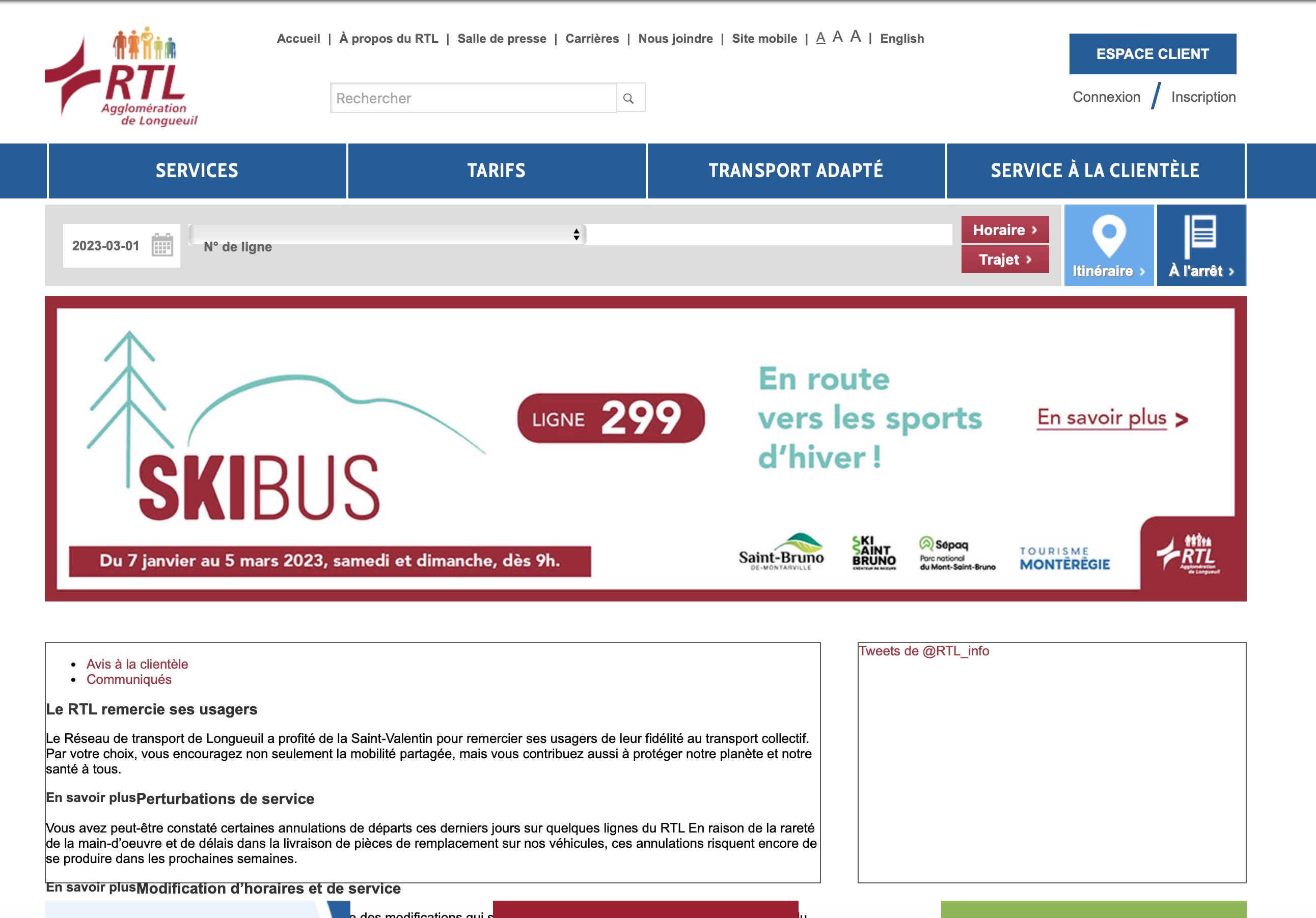
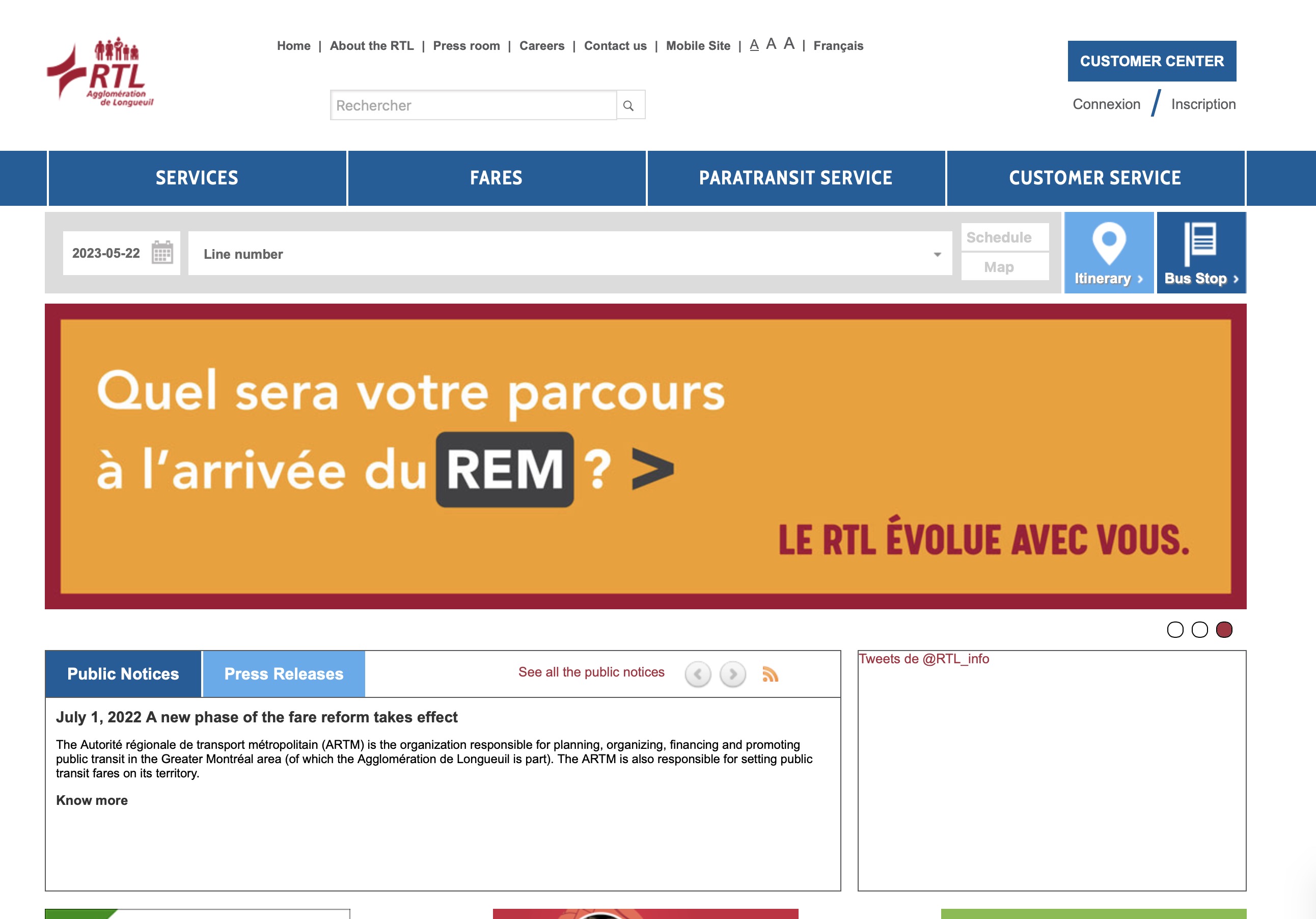
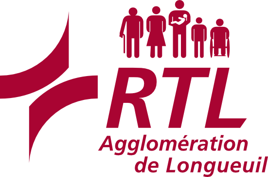
Recently, I’ve noticed the RTL has moved away from their rainbow bus logo, to a new all red logo. I’ve noticed it on documents shared by the RTL (in ads, posters in the buses, etc).
Here’s their website in March:
And now here’s their website in May, updated logo seen on the top left:
On their page which features the logo and pictures, they’ve removed their logos entirely.
Here’s from March:
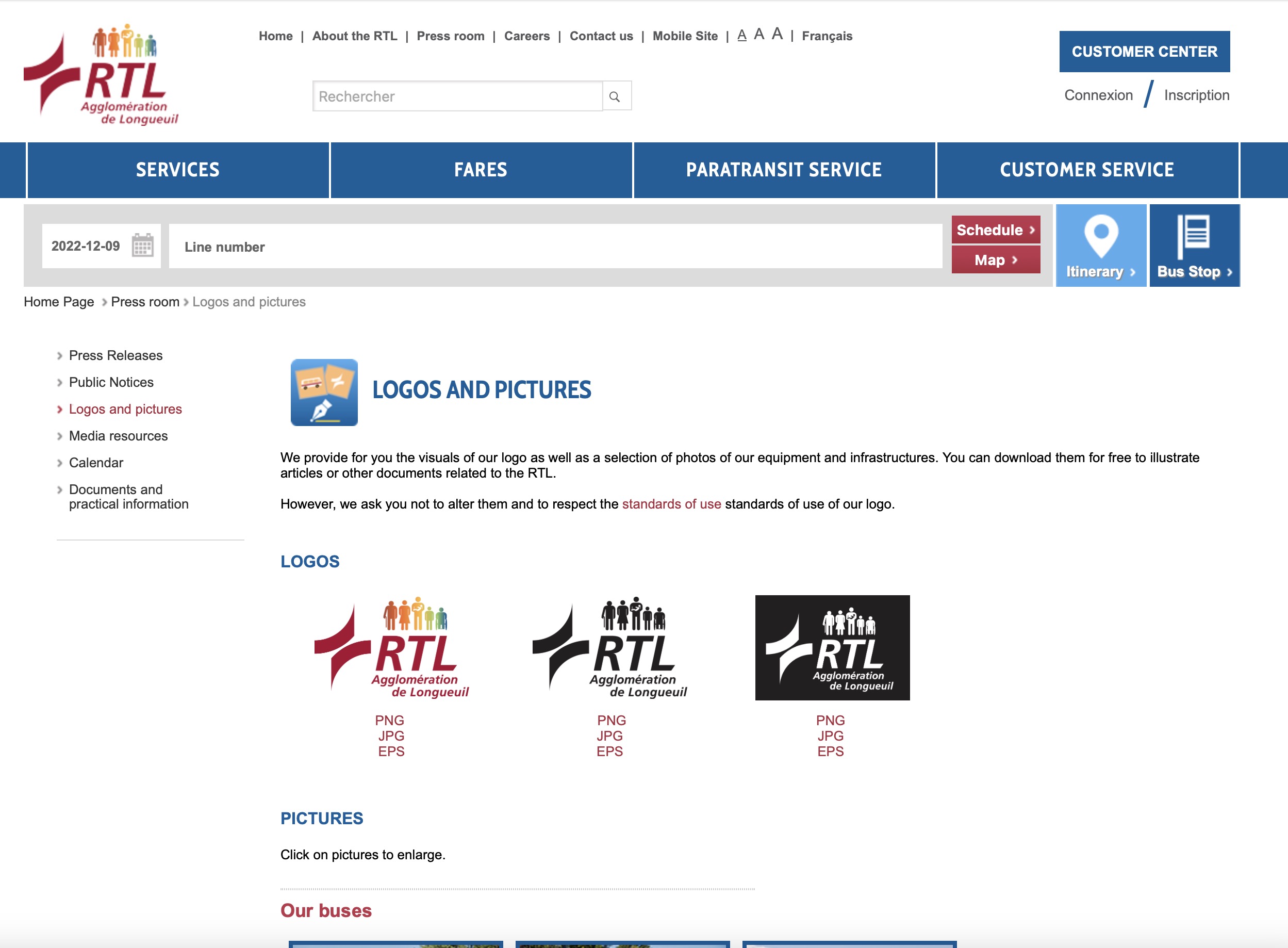
Here’s from May, the logos removed:
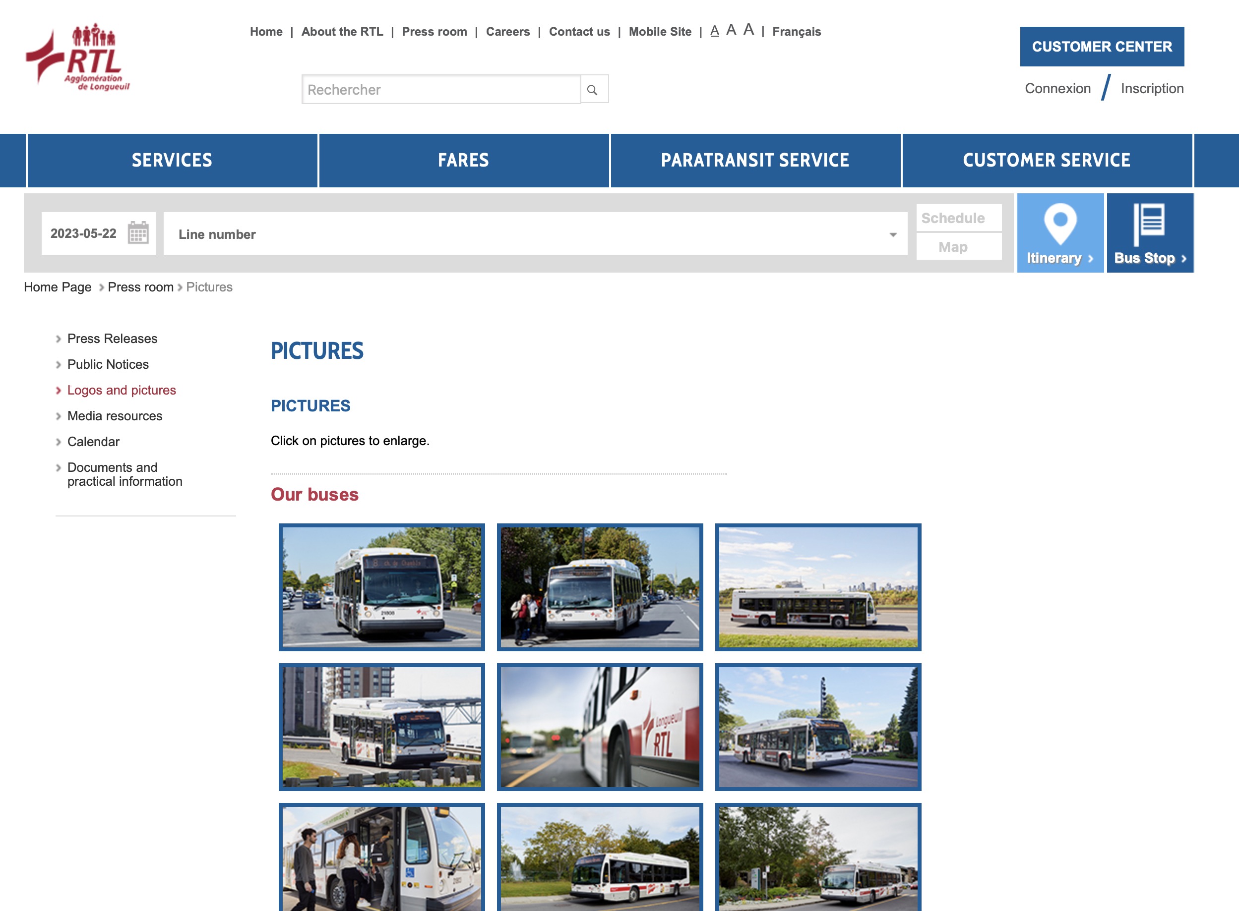
On their new network map, it features a modified RTL logo, with no little people, and just “RTL: Agglomération de Longueuil”
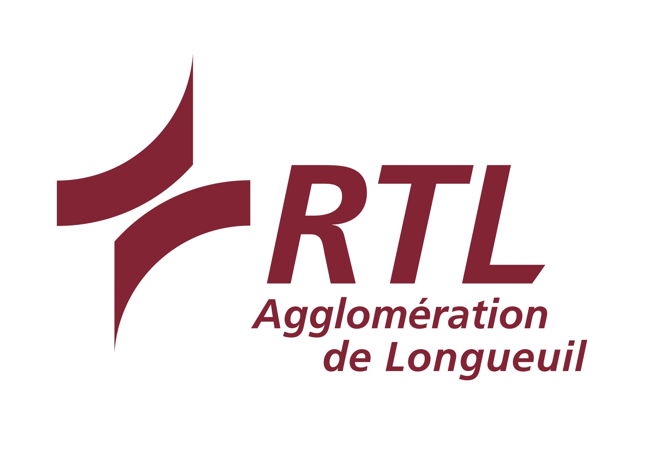
So I’m not sure exactly what their plans are, but because they’ve removed their rainbow logo from everything, it makes me think they’re going to update it somehow
The old logo looks like whoever made it was playing with gradients for the first time. The new one looks much more solid and professionnal.
1 « J'aime »
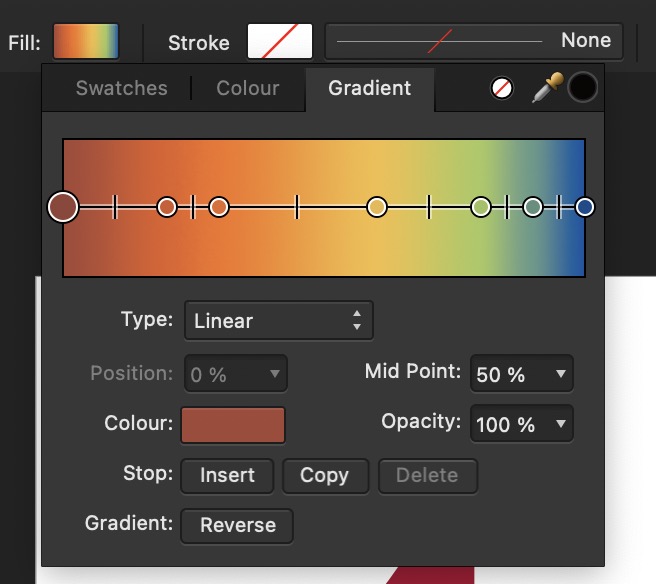
Looking at their EPS document, they literally were messing around with gradients lol
Also here’s a PNG of the new logo, if they ever release the logo publicly maybe eventually the header image could be updated:
When the boss asks for “more color” quite litterally.
My graphic design teacher would’ve been very mad if she saw this.
1 « J'aime »
Je me serais attendu à ce qu’ils profitent du redesign pour se débarrasser du « swoosh ».

1 « J'aime »
I think the current logo’s swoosh comes from the previous logo:
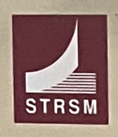
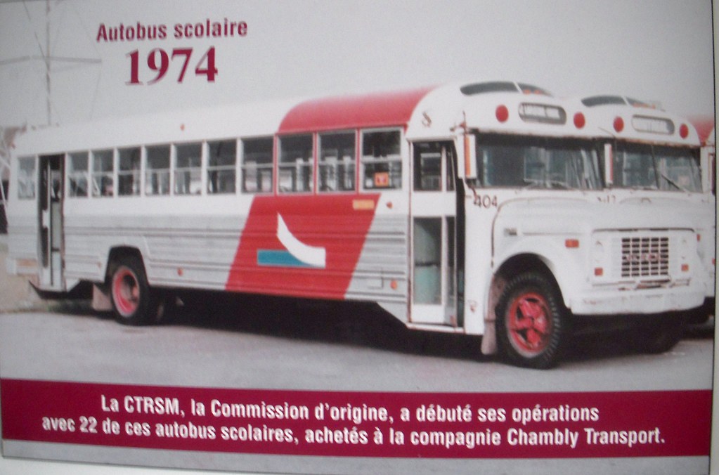
And the STRSM logo is in reference to the previous CTRSM logo:
So it’s actually always been a swoosh of some kind, before swooshes were popular!
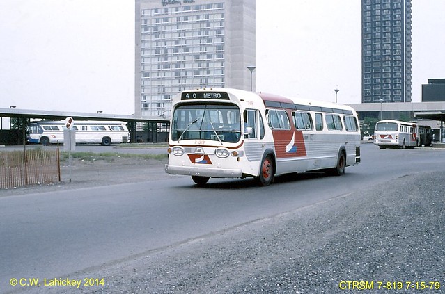
Now if only RTL wrapped their buses like they used to…

6 « J'aime »
Mannn there is so many livery possibilities with this logo.
1 « J'aime »
I think this forum need a Graphic Design thread haha
5 « J'aime »
If the logo is updated, they should’ve done it earlier, as the brand new bus terminals along the REM feature the rainbow version:
2 « J'aime »
The logo is insane, too much text with unnecessary description, random swoosh with no meaning, small people that wouldn’t be distinguishable from distance, random color. Truly a graphic design is my passion moment
At least we have the STM which has remarkably good marketing and graphics. The STL is decent too
5 « J'aime »
#BringBackSTRSMlogo


Yes this is a swoosh but it’s from 1974, one of the first swooshes. It’s transportation, not an internet thing so a swoosh makes more sense, and it doesn’t wrap around the text like some of the CIT logos did. I believe it also might represent the Jacques Cartier Bridge, but I’m not 100% sure of that. In my opinion, this STRSM logo is nicer than the current swooshes, and would look good today, slightly modified like I did above. (Also removing the people on the top, and other text like you said)
8 « J'aime »
Send this to the RTL haha. Let’s hope they change their logo.
2 « J'aime »