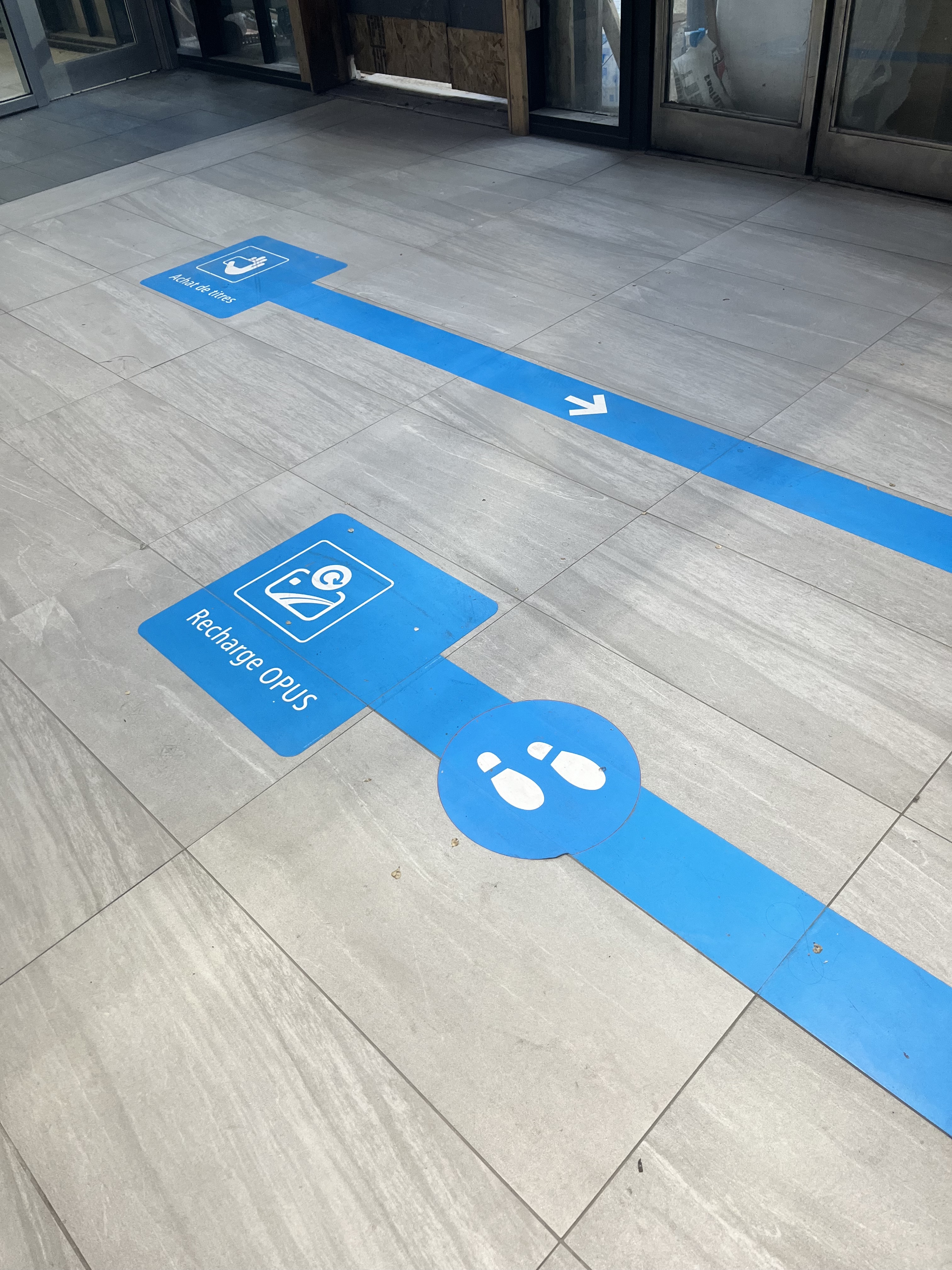
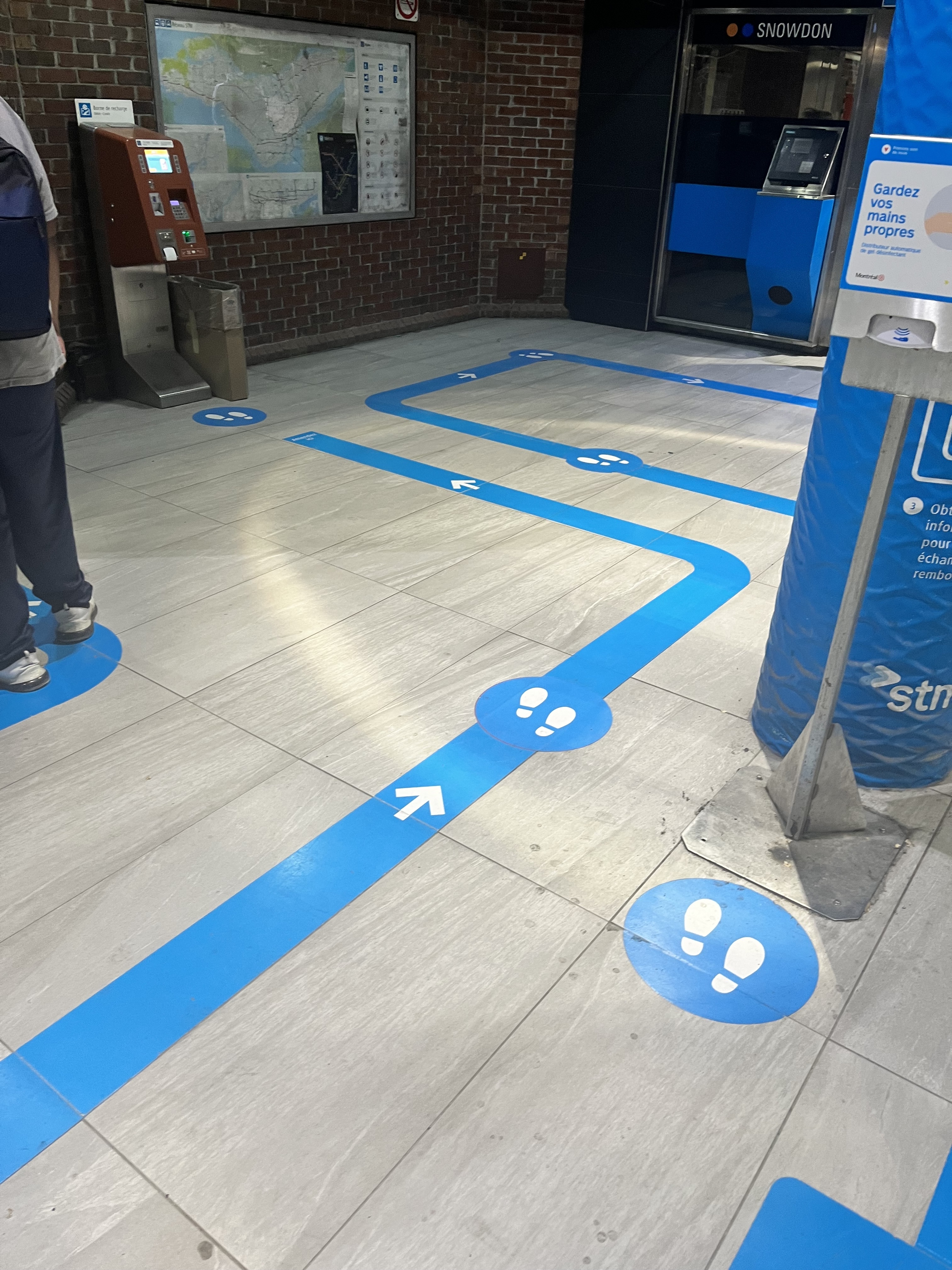
À moins que je me trompe, Snowdon c’est la seule station qui possède une marquage à sol pour l’achat de titres.
Je trouve que c’est réussi et ça devrait être installé à d’autres stations à haut achalandage
À moins que je me trompe, Snowdon c’est la seule station qui possède une marquage à sol pour l’achat de titres.
Je trouve que c’est réussi et ça devrait être installé à d’autres stations à haut achalandage
I dont think pretty much anyone is taking the bus in 2024 without first checking the itinerary through an app or equivalent. I think the only information a bus stop sign should convey is “Hey theres a stop at this location, these are the line numbers that stop here.” Anything else is just distracting from the point.
Even if your design gives me key destinations, I’ll still have to double check the itinerary on an app anyways to know the schedule.
I especially don’t think signage should be designed to accommodate absolutely everyone because thats a hole with no bottom and will only serve to compromise any good design thats being proposed.
I dont think “some people dont have phones/internet” is really a valid excuse anymore as long as paper maps are available to those who might need them. Any disabilities users might have should be remedied with personalized solutions for specific needs, not applied wholesale to all visible signage.
If you’re redesigning anyways, bus lines should be given different numbers for opposite directions. This eliminates any confusion that might be caused by direction of travel ie. standing at a stop on the wrong side of the street.
I agree, and that is especially true considering that nowadays, most of that information is being condensed into easy to use applications that everyone can use on their cellphones.
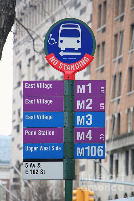
I’ve got to say that I really like what I’m seeing on that first exemple from New York. That looks really clean.
Beaux nudges!
I think this was an excellent concept with a good distribution of information. The totem puts the most important information high up, visible from a distance, with details on a secondary panel at eye level.
A review with more pictures: New bus shelters are so sharp it hurts (UPDATED) | Fagstein
Basically updated to remove Lucien l’allier train
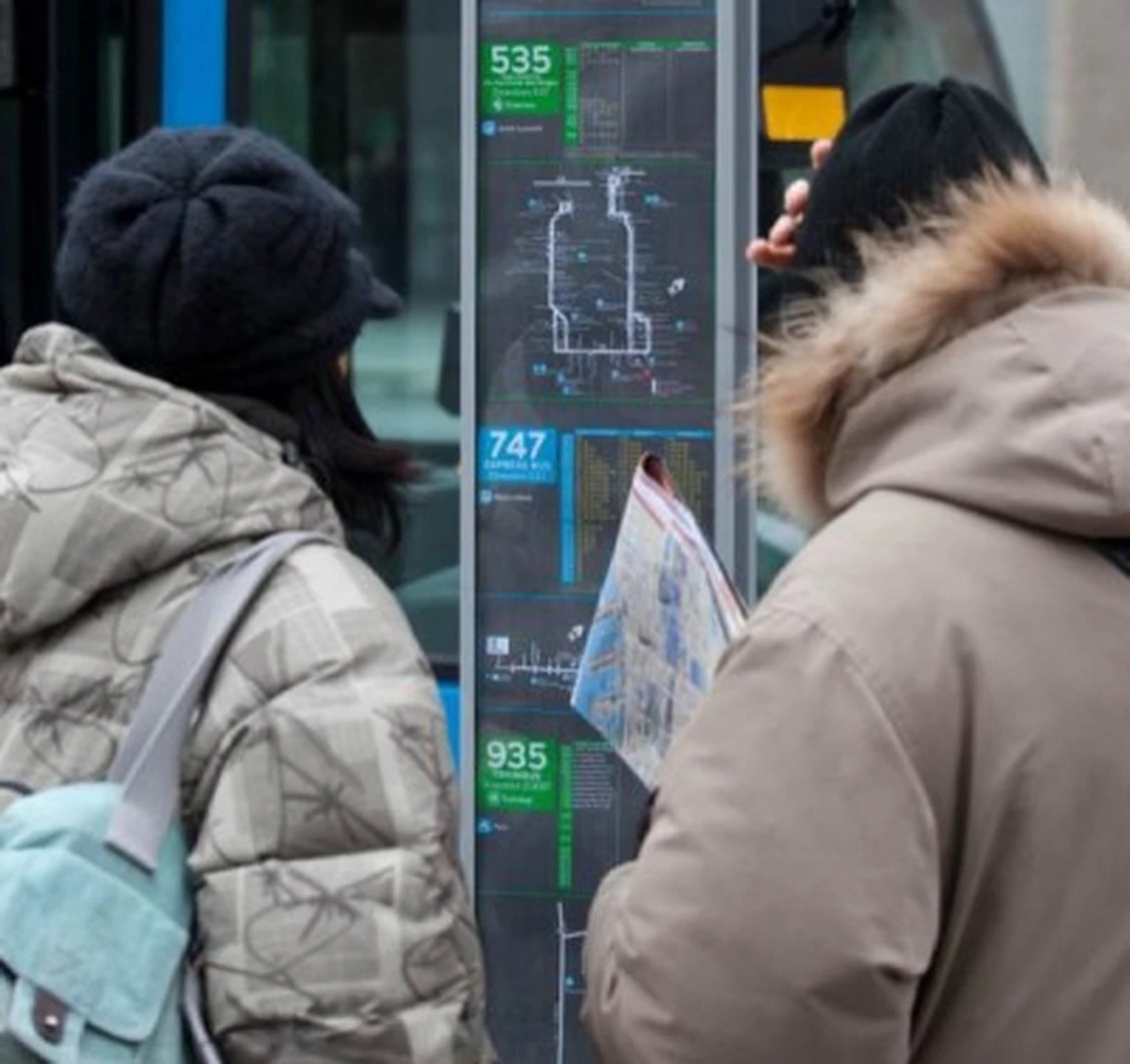
Wait until you see that NYC bus stops have maps in a box under all of these signs:
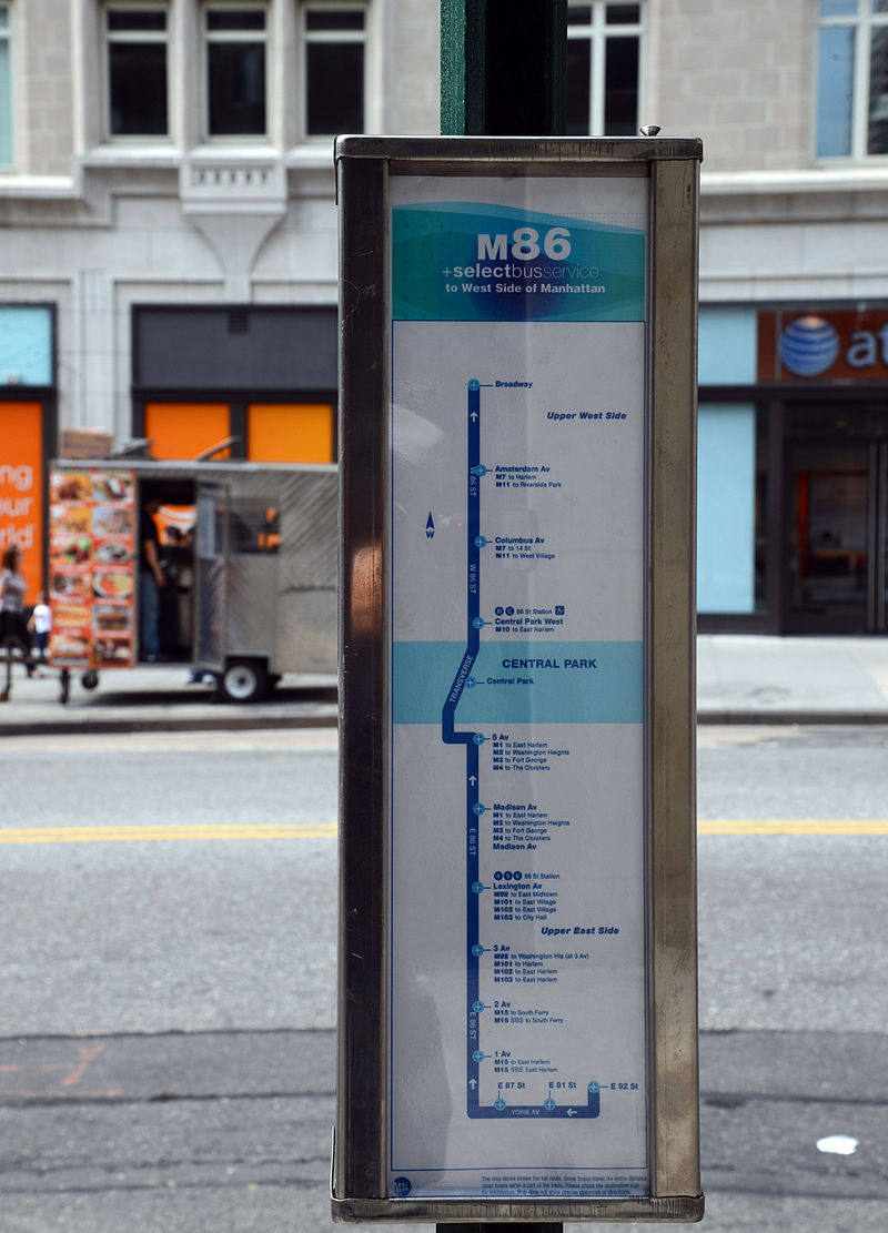
These used to also feature schedules but because they change frequently they switched to QR codes.
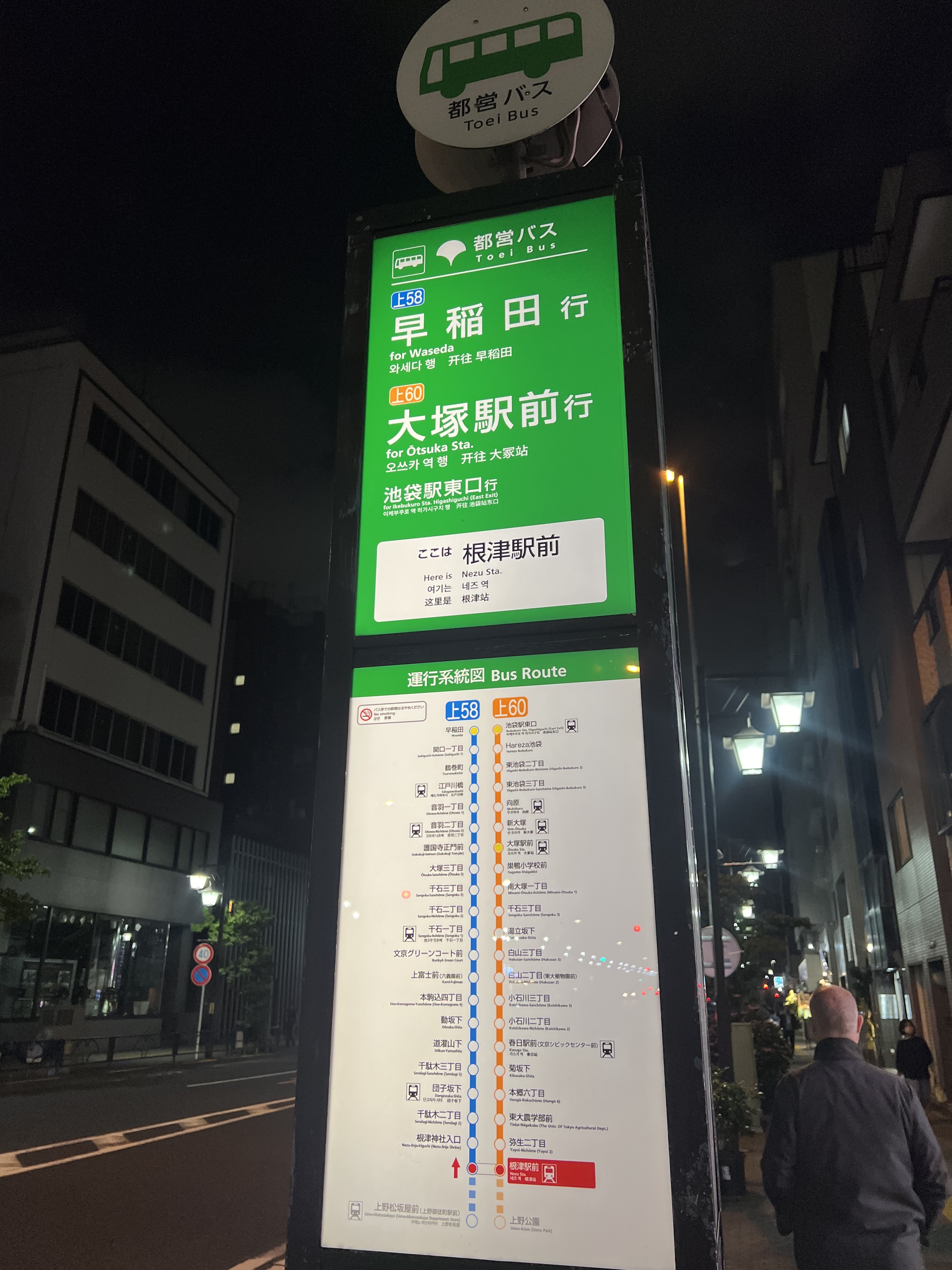
To look at Japan, they do something similar but still include the schedule:
I think Montreal should do something like this, not in the small rectangular sign that is used currently. What @coledev and I were doing was trying to redesign the signs without using a whole new design of metal signage which would cost way more to produce and change. At some point yes it would make sense, but currently just having a new print is easiest
This is exactly what I kept in mind when working on these bus stop signs.
However, I strongly believe that the digital wayfinding, even in 2024 is imperfect. I will give you a few examples below.
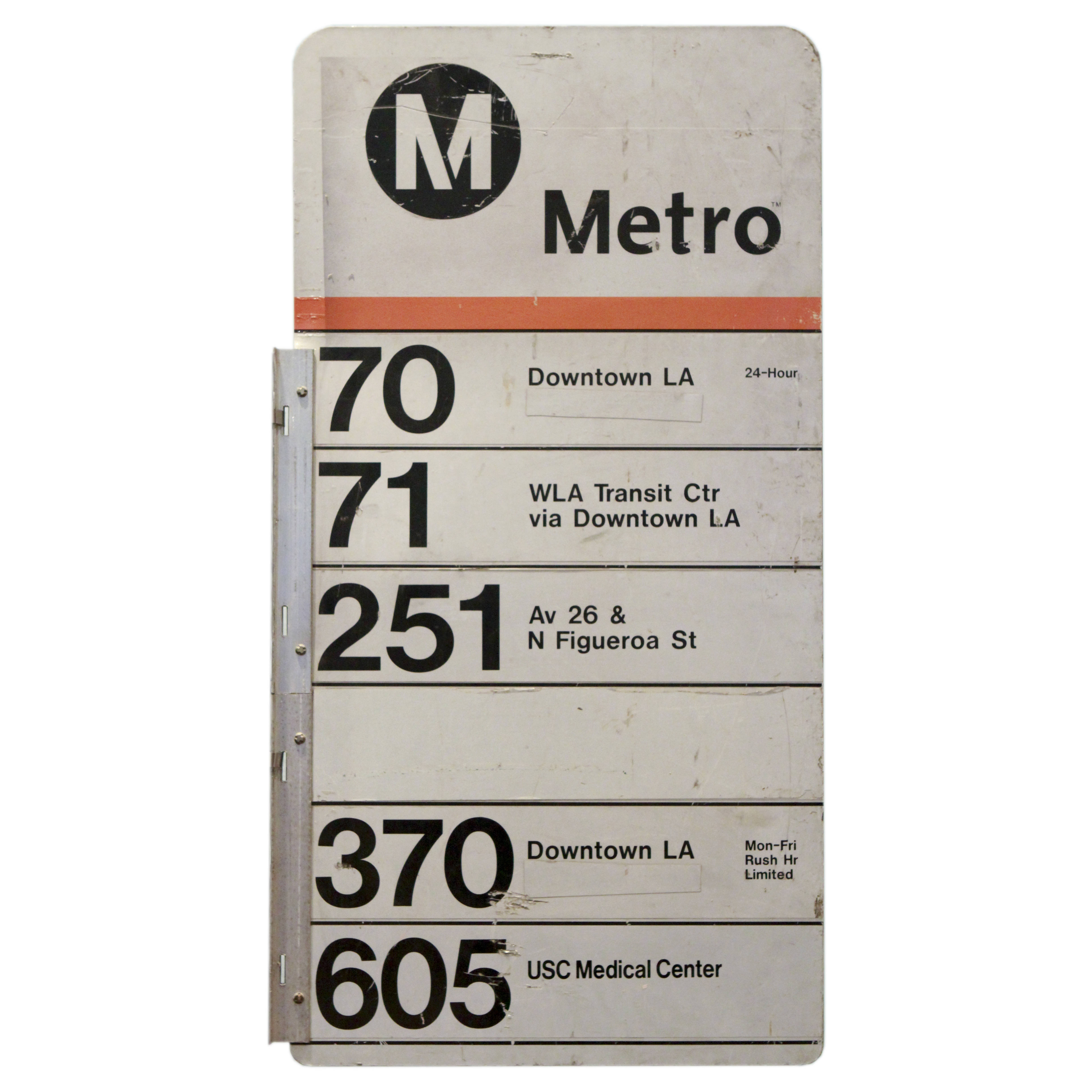
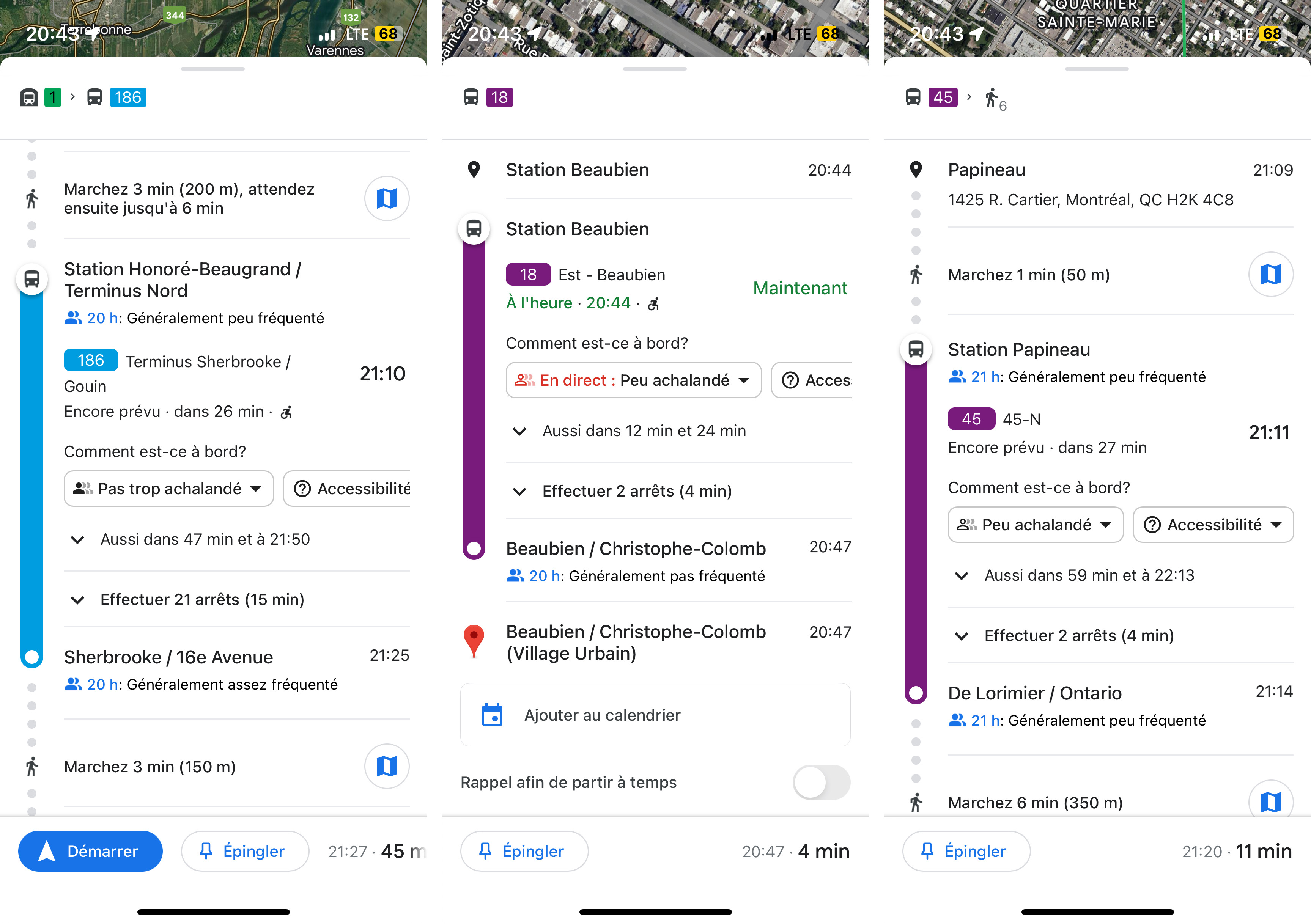
For example, here is 3 different bus examples of the STM. All 3 show the direction in a different manner, one mentions the last stop, one mentions the cardinal direction in a whole, and the last is the cardinal direction, but only the first letter.
Chrono, the official application of the métropolitain region, also has the same problem.
Therefore, especially when you are new, or even used to the transit network, you will still have trouble being reassured you are going in the correct direction, because the sign doesn’t even match what is being claimed on the app (at least with my design, at least one of the destination/direction elements will match). This becomes even more difficult when you are a tourist, in a place that is a foreign language, and don’t understand that N, S, O, E means North, South, West, East. This is why I added both long form and short form with a compass to really make it clear.
This also uncovers a huge problem with the digitalization of wayfinding, and using digital devices as a substitute for physical wayfinding. Often a significant amount of people are using apps that the transit authorities don’t have control over. Think about how many weeks it took for the REM to be added to Google Maps. It’s the same thing for the GTFS data of the STM on Maps, it’s really difficult to change such details as standardizing the destination/direction, because the transit authority does not have control over the data that is displayed. Transit App is pretty good at this though, with the information being generally up to date, but the problem is that the subscription is almost mandatory, with key features locked behind the paywall, but I guess this is the price to having up-to-date information.
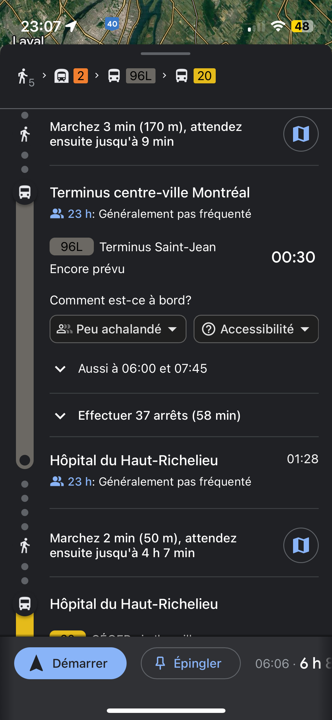
I work at the STM, and I realize how much people are lost, because the absence of good wayfinding, despite using their phone, because often enough, it’s not there the information they need. Such as at Bonaventure metro, the most common question is for the bus that goes to Saint-Jean-sur-Richelieu, the 96. It’s not posted anywhere. They just see on their phone it’s mentioned Terminus Centre-Ville, but it’s not mentioned often on the signs, and instead mentions quais center, north, south or it’s just mentioned as Terminus Bus EXO & RTL.
I would prefer to move a lot of information on to secondary displays (such as schedule holders), but it would be impossible, because not all bus stops have them. I want to do a request for information to get the exact number of stops that have schedule holders, shelters and the exact ridership for each stop of the STM. This is why unfortunately, a bus stop sign has to do a lot of the heavy lifting. For example, this is why Metro Transit in Minneapolis (see attached study in PDF at the end) added metal signs showing the map of the route, instead of putting it inside the schedule holder, since not all stops have schedule holders, because they only have them installed at about 2000 out of the 10000 stops they have.
Many people ask me for why putting the fare zone information. It’s because, one time I was confused which zone I was in (there are some stops in zone B where exo buses can pick up, such as in St-Bruno-de-Montarville). It would have been so handy just to see at the sign and know exactly which fare zone I am in, so I can know if the fare is valid or not, instead of needing to go to ARTM’s website and search it up (the information is not available on any transit app). This would become even more important, when exo, STL, RTL buses will be able to pick up passengers in zone A. It would also ease the use of newcomers in the transit system, since they can see on the sign it’s zone B, for example, and buy the correct fare on their phone.
For those that are interested, Metro Transit in Minneapolis, did a study for information at bus stops.
I asked the STM about if they plan on doing this and they said it’s just a concept and they’re not given a budget to actually change it, even though I agree it is the best. If a bus route has changed they could just put a small sleeve over the specific route instead of on the whole sign
Whole new sign or at best a fully custom sticker to replace on a sign
The problem is that we have a fare zones in the first place. That system just really needs to be replaced by tap in tap out… It would accomplish the same job. If peoples forget to tap out, just charge the largest fare possible on the transit mode being used. Combine that with a cap system that caps out fares for a day, week and month, and you’ve also completely replaced the title system. It would be so much less complicated for users than having to figure out which title they need to get to where they want.
Also, the STM is looking for more revenus. You might think its evil, but this type of system also has the advantage that peoples have an easier time spending because its smaller amounts in a single transaction. It would almost certainly increase the amount of revenu that the STM is getting.
Ideally this is best, but it’s pretty unfeasible because the whole infrastructure is needing to be replaced for this to happen. But tap-in and tap-out is really only feasible on rail transportation (truthfully only Metro & REM). Buses rarely have this, and even with places with zones, fare capping and digital wallets, such as London, have complicated suburban networks of buses with separate and complicated fares. Think about NJ Transit, with fares so complicated, someone made a song of it.

Honestly, I’m glad to have fare zones, because I don’t have to carry change anymore with me, and I can just buy the correct fare at the start of my journey. It’s pretty simple to have a 40km trip for 18$ round trip.
Just price a the bus fare at 3.50 for 2 hours of use. If the user also takes a metro trip, than that right there is your tap out for the bus and tap in for the metro. At that point, you can charge charge a metro fare and consider the bus ride part of that ticket.
You can also make a number of safe assumptions. If a user takes a bus ticket at Pie-IX / Henri-Bourrassa and then, later on the same day, takes another one at Jean-Talon / Pie-IX, its usually a good assumption that’s a round trip. So again, while you technically don’t have a tap in tap out, you have all of the information that you need. This is especially true in cases where the user does the same trip several times a week.
Heck, once you transfer everything to a phone app, you can actually just track a user’s mouvements and don’t even need tap in tap out to know where a user got off. The fact that the user tapped in and is moving in sync with the bus tells you everything you need to know. Some users might be reluctant to give their positional information, but you could incentivise them by giving them a small 5-10% rebate over those that don’t want to share that information.
If you get one of every opus card kind as well, chrono can actually save on money.
Zone a monthly user, got tickets for every other zone (and bus oot cause why pay abcd when double tapping midway is cheaper)
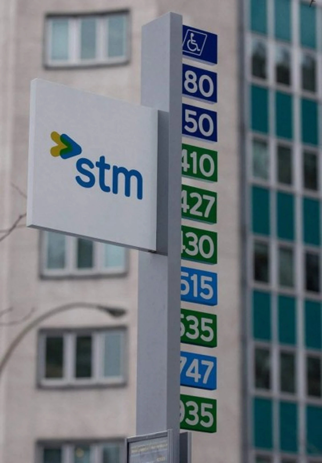
STM bus flags are extremely standardized, I would guess to keep production costs low. At most, one would have six colours[1] (likely Pantones) + black, with a limited number of possible positions for text and icons.
I don’t know their exact printing techniques, but one possible issue with this redesign is that the much larger number of colour/text/icon variables would lead to a production cost increase that, depending how significant they are, could negate the benefits of maintaining the current format.
On the topic of the redesign as a whole, the main challenge it faces is Information Overload.
I saw this a lot when I was working in retail, especially at the height of the pandemic. Placing too much signage at the order/checkout counter or having even slightly too many details on a specific sign meant that no one absorbed any of it.
The store had equipment and management that made it possible to produce official-looking signs and experiment with different ways of simplifying customers’ paths through the department I worked in, so I got to see different principles of information design in action. Two things that stood out were how
I understand the reasoning, but the STM’s stop flags cannot do the heavy lifting. They’re too small and too high up for most of the smaller text to be legible, even under ideal lighting conditions.
At Dorval, for example, bus drivers are constantly asked whether they’re going to Lionel-Groulx or to the West Island. This is already marked on the stop flags and printed signs installed by supervisors, but if people aren’t able to see where a bus is going at a glance, they’re not going to look closer. They’ll ask the driver or someone waiting in line because that person will have a direct, definitive answer.
Also, a demographic that would benefit from the added information is seniors, but this design remains inaccessible to most of them because of how far away and how small the text will have to be.
Putting that aside, I think the organization of information could be improved in three ways:
Type — There are too many type sizes and weights. I might be off, but I count 13 different styles on the example sign. Best practice is to avoid using more than three.
Colour — Same here, there are too many. Every time a new colour is added, it risks diluting the meaning of another colour already in use and makes the overall presentation too distracting.
There are no hard rules of course, but for information design it’s essential to keep these to a minimum.
To accommodate the amount of information included, I would recommend cutting down on the stylistic differences between elements to limit visual complexity and using a grid-based layout over one based on nested blocks. If you want to stick with the system you’re using, then I’d suggest using only one or two different amounts of padding.
If you haven’t already, I find it really helpful to print out a sign at 100% and test it under the same conditions it would be installed in. I hope this feedback is useful!
Blue, Purple, and Métro / REM / Train icons ↩︎
I used to think this as well, but then when they started producing the newer signs with the REM, they included the green, and also updated the metro logo to use the lighter blue. I don’t think there’s an actual difference in the way they print besides the initial set up (which in @coledev signs would be standardized, with just the numbers and line sections being different).
I do want to figure out in detail with the STM how they produce the signs though becsue then we’d know the actual answer!
Something to note is even though RTL signs are the same size (I believe), they’re reflective so the bus drivers can see the stops at night. This would have to be solved with a standard sign, which base metal they should use and follow
The process is probably rather similar to this. They don’t actually print on the sign itself. Its a plastic sheet that is cut and adhered to the sign.

Specific number designation for each direction usually means a poor coverage; an abundance of available designations because of an actual limited number of routes to use them.
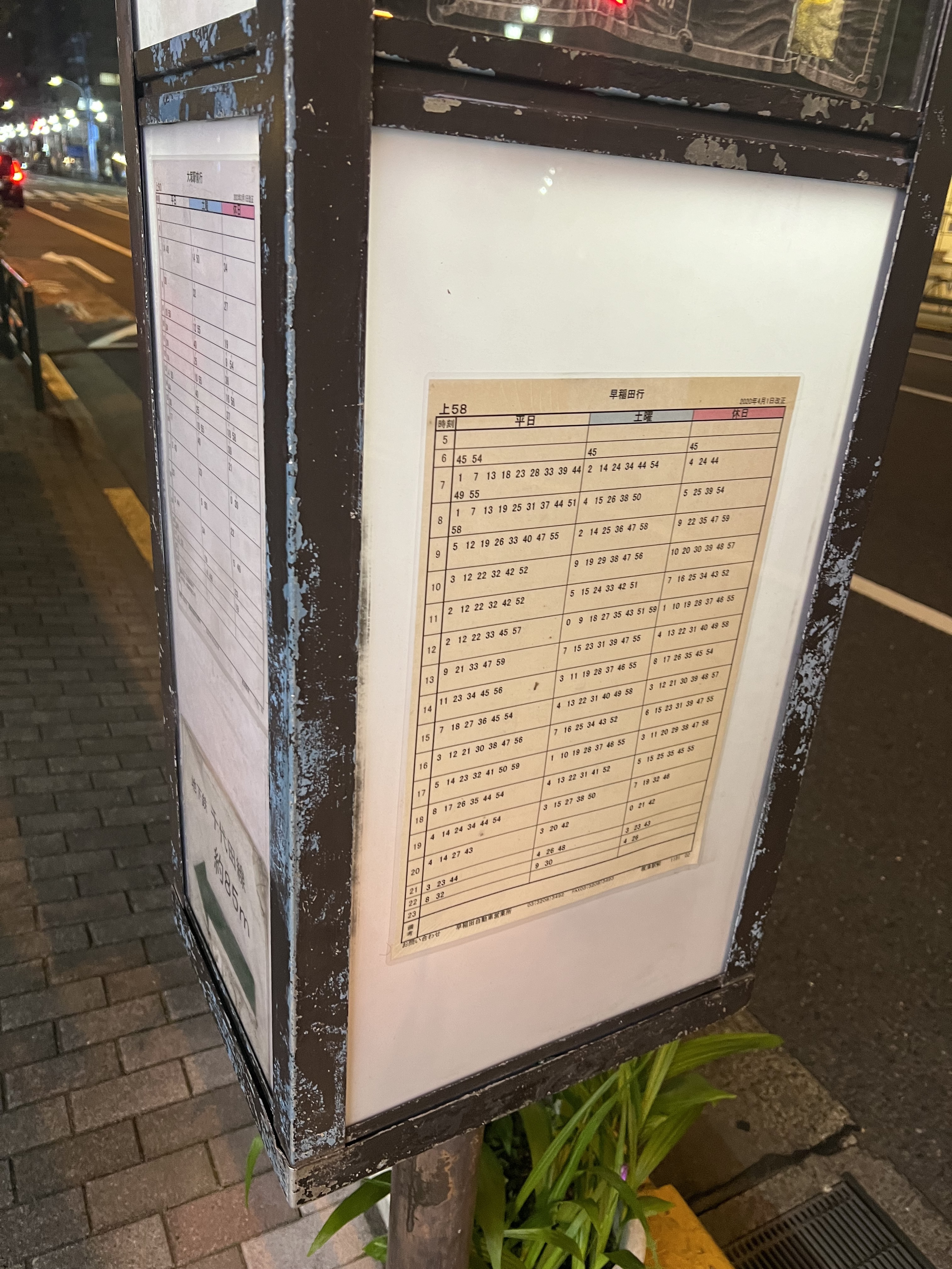
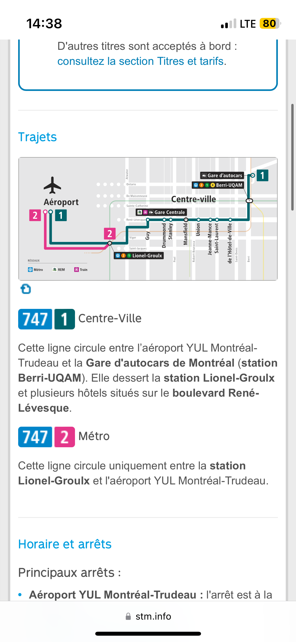
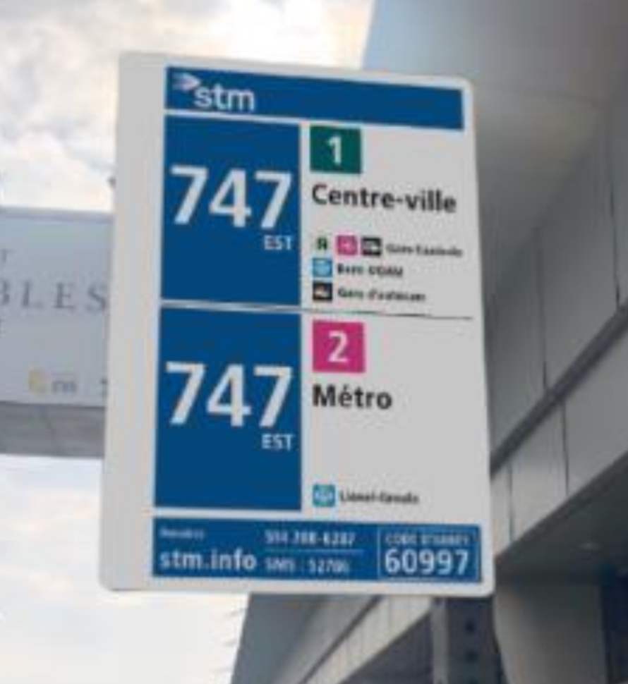
Le 747 aura des nouvelles panneaux d’arrêt de bus, suite à plusieurs plaintes des clients des panneaux d’arrêt déficients.
Il aura également le 747-1 et le 747-2.
Dès que j’ai des photos des panneaux, je vais les mettre.
Le 1 et 2, sont choisis puisque la STM utilise déjà cette nomenclature, comme sur les divers cartes.
X ligne courte et longue n’est pas une terme facile à apprendre par les nouveaux clients, comme des touristes et nouveaux arrivants.
A et B sont impossibles, puisque les girouettes sur les anciens autobus (2019 et plus ancien) n’ont pas assez de mémoire pour avoir les lettres en gros.