Et qu’il reste des besoins importants côté fret et passagers intercité qui sans être strictement incompatible à du métro, ne sont certainement pas aisés à combiner dans ces rares exceptions.
2 « J'aime »
As much as I love the metro logo, the fact that it’s an arrow makes it quite difficult for tourists to understand it as being a metro. A bigger issue with it though is how hard it is to implement into signage. An arrow pointing to the left beside an arrow in a circle pointing down (representing the metro) can be confusing to people, I hope that the route numbers are used more to identify it as a transit system.
The fact that the text “Métro” in all capital letters, in a generic font that doesn’t follow any other signage, also bothers me as well. I wish that space could be used to identify which line is at that stop like other systems do around the world
2 « J'aime »
And yet, the down arrow is the second most use symbol to indicate a metro, after the letter «M». If I was shown all those logo, I doubt I would be able to tell they are metro for most of them !
7 « J'aime »
Personally, I really like the genius of the Roundel that is in use in London. The rounded is colored based on the transit service while the line going through the roundel is colored based on the line being served. It is such a simple and yet brilliant way to communicate information with a minimalistic design.
Good design does more than just make a statement. It communicates information. I really wish we could update the metro signage in Montreal along those lines. The arrow could play the same role as the line in the roundel.
C’est ce que fait le REM pourtant.
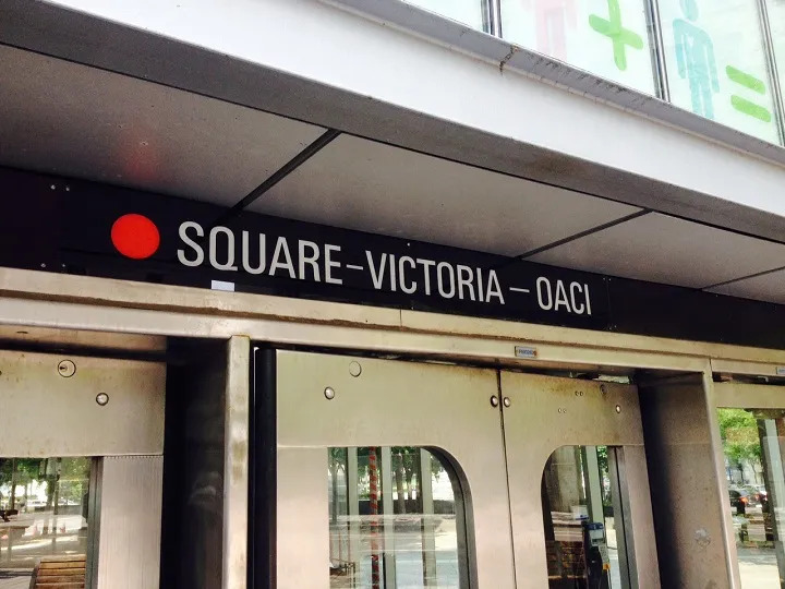
Actually, Mashdash, the font used for exterior metro signs is the same used for the station name plates above the doors AND on the black plates on the platforms.
A modified version of the UNIVERS font.
As for telling people which lines stop at that metro stop… Look above the door? Those colour circles are there for a reason.
1 « J'aime »
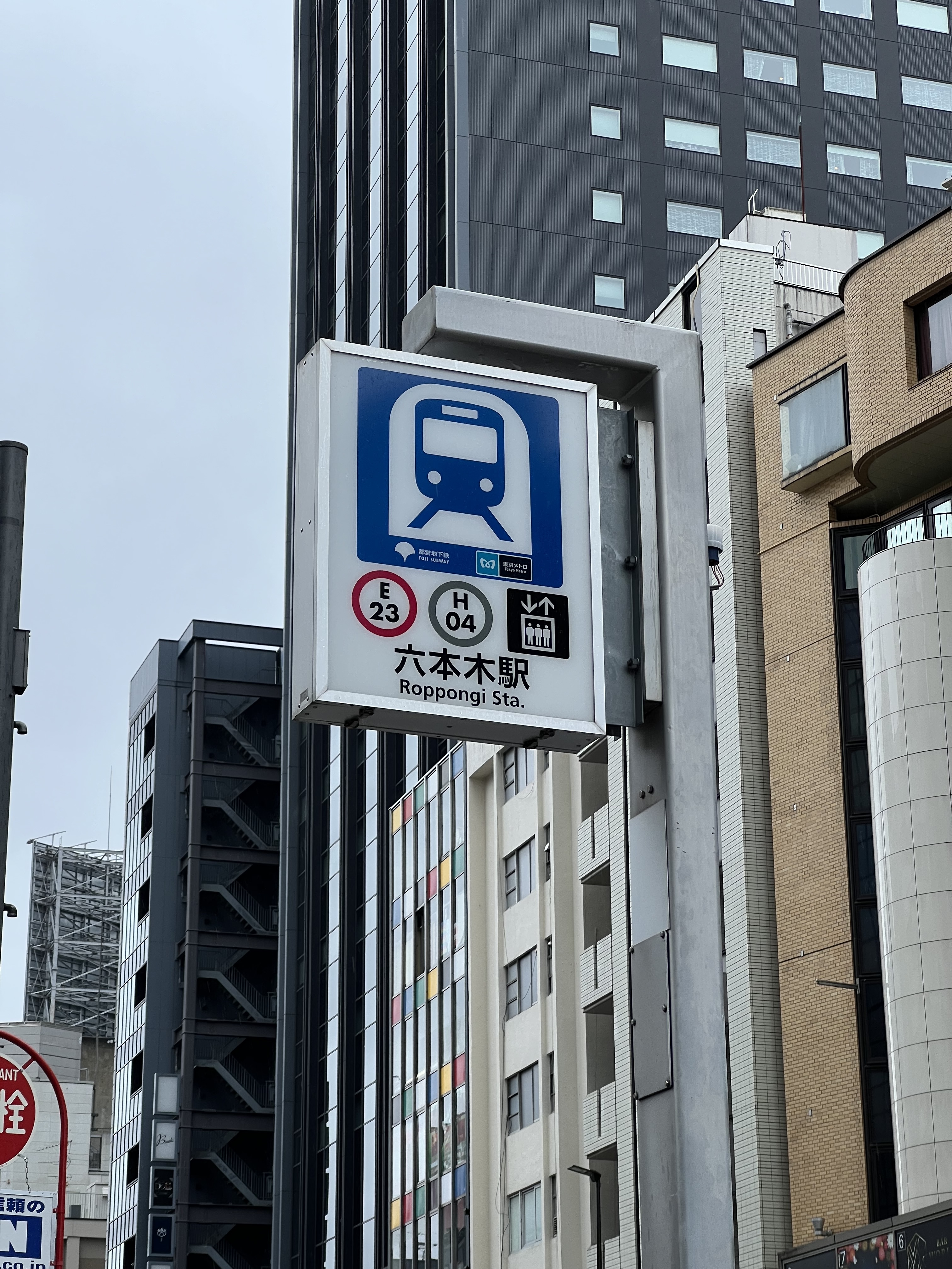
Yes it’s above the door but I feel this information should be accessible from a further distance. Thankfully with only one entrance per station it doesn’t get too confusing, but sometimes not all entrances have elevators. If we look at what’s done in Tokyo, they use a similar size sign but way more information, the lines, if it has an elevator, and even the station name under it:
1 « J'aime »
Except that Tokyo’s Metro looks like THAT
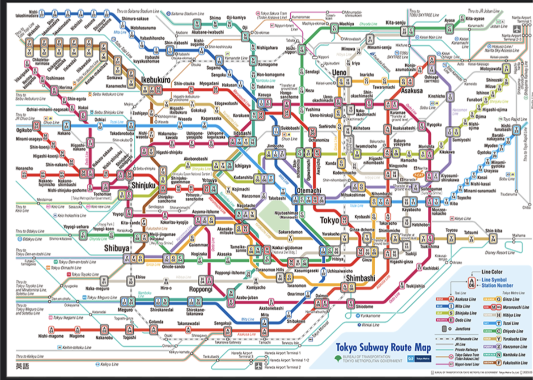
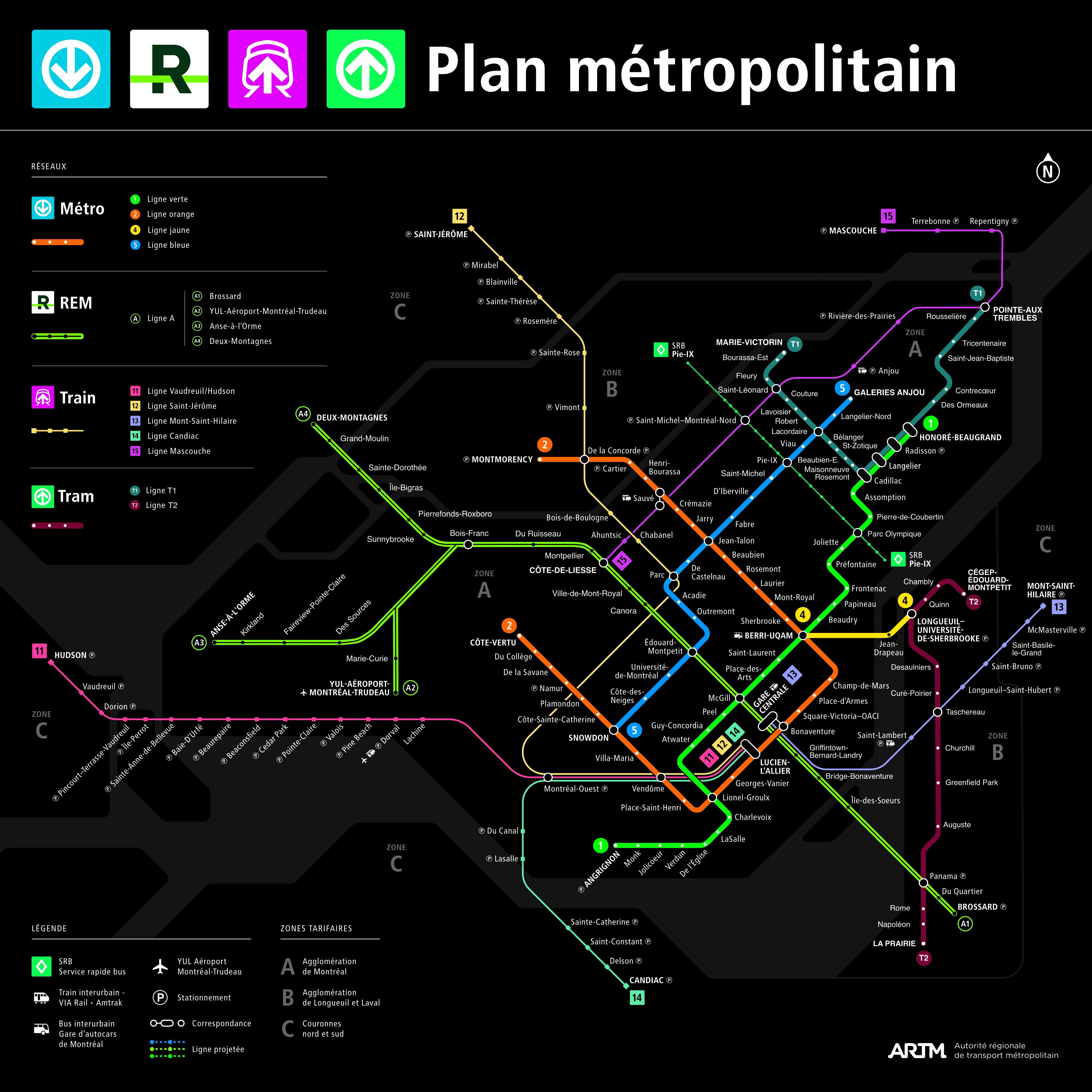
Meanwhile, on our system, only four stations connect to more than one Metro line
Yes but the information helps identify people’s location in the city, especially for those with poor directions and tourists that might not have cellphone service. Being able to see, “the station over there has an elevator and is the orange line,” is useful information without needing to travel the extra distance just to find out the line and if it’s even accessible.
We have to begin thinking about those with additional needs, tactile paving in metro stations, braille signage, audio announcements in stations to identify the direction of the train/next stop (which could be announcement on the platform). People with visual impairments have to just guess currently the entrance and hope they’re going in the correct direction, because there are zero physical or auditory announcements that state the direction until AFTER the train leaves.
I simply hope they add a tactile and braille map that users can touch to read, with announcements in the station to announce the arrival of trains (with a sound or voice) and state the direction for those that need it.
3 « J'aime »
I know you’re a signage guy so thats your angle but I really think cities should be aiming to reduce visual and auditory pollution. Less signage could honestly be a good thing.
Regular voice announcements should be a thing of the past really. We definitely have the technology to enable auditory cues for people who need it through personal devices.
Also, every time i hear “CODE 61 SUR LA LIGNE ORANGE” I die a little inside. It’s called a phone STM, you dont need to bother thousands of people at a time.
1 « J'aime »
Apologies in advance, this is going to be a long message.
I agree that they shouldn’t have announcements over the intercom with STM codes that should just be on the radio they already use. It’s not useful to people waiting, it’s really for workers only.
I also agree on visual pollution being more confusing for people, I’m actually currently visiting Japan for signage for a class so I’m focusing a lot on this right now, it’s surprising how even though every surface has signage it really does help users.
Almost every surface has useful information, like massive signs above hallways pointing what they are, and on the floor if you’re not looking up (like big arrows for connections between networks, I’m looking at you Bonaventure connection…), All the pillars say the stations, and track numbers, the route names, all necessary for a complex system. I don’t think Montréal needs most of these things as it’s not nearly as busy and complicated, but certain elements from it would greatly improve how people use the system:
-
Boarding tunes: This is pretty well known, but a lot of stations in Tokyo have boarding songs that play for visually impaired people to know that the doors are open and ready to board. If there’s two trains, they sometimes make the songs harmonize together to sound nice. I don’t think this is necessary for Montréal, and it would make more audio pollution especially in the larger more cavernous stations. I think instead there should be a door opening sound (which they also have) similar to the REM added to the métro.
-
Station name and next station announcements: Something I was surprised by was how when the doors of a train opened, they had a speaker announce the name of the station multiple times, to make it clear what station this is. They also announce what the next station is either before the train arrives, or during, as the trains themselves only make announcements between stations (like in Montréal). I think for Montréal, just saying the next stop using speakers on specific sides of the station would be good as it would be clear which direction the train is heading, although not entirely necessary except maybe at Lionel-Groulx and Snowdon as they’re more complicated. I do hope the REM receives something like this when the other branches open though, because I’m not sure how someone would know which train is what without visual info on the screens.
-
Stairway birds: In some stations in Tokyo, they use bird sounds that repeat somewhat quietly above the staircases, for people with visual impairments to easily identify the closest way out. Because birds repeat sounds over and over, it honestly wasn’t even noticeable, I thought it was a real bird. I’m in the middle on if this is needed, it’s nice to identify the stairs but I think tactile paving is better at doing this.
-
Tactile Maps: In most stations in Japan, they have a stand that has a physical map users can feel to understand the walls, and even buttons below that can help describe what is what. I think Montréal should receive something like this in stations, NYC is already doing a pilot project for their own version.
-
Tactile Paving: We’re used to this on the REM, but there are noticeable differences. Firstly, all of it is yellow as they’re easier to see with the darker ground. For the REM, the black works because the ground is light, but outdoors it should be maybe a yellow, something easier to identify than almost the same colour as the ground. Going to where the tactile paving is, they should’ve run the tactile paving closer against the doors to the train cars. Currently they lead you to the middle of the platform, not to the door. Additionally, where it is currently is where people would stand to wait for the train, which is not where it should be, as people could be standing on top getting in the way. Running it closer to the doors prevents this as well. Also, this was brought up in a recent article, but the tactile paving needs to guide to the handrails, not middle of the staircase. When there is construction, it shouldn’t just run into a wall, temporary tactile paving should be added on top. We need to be inspired by Japan. Did you know, that tactile pedestrian crossing bumps began in Japan, and is what inspired the whole world the follow? The same should be true for the tactile pathways.
There so much more, but I’m not going to say all of it here but this is most of it. From what I can see, the transit system in Tokyo is the most accessible system in the world, and Montréal has many steps needed to improve. We need explicit legislation in Canada, or at least Quebec to make public infrastructure more accessible to everyone, from a separate budget (not eating into transit).
4 « J'aime »
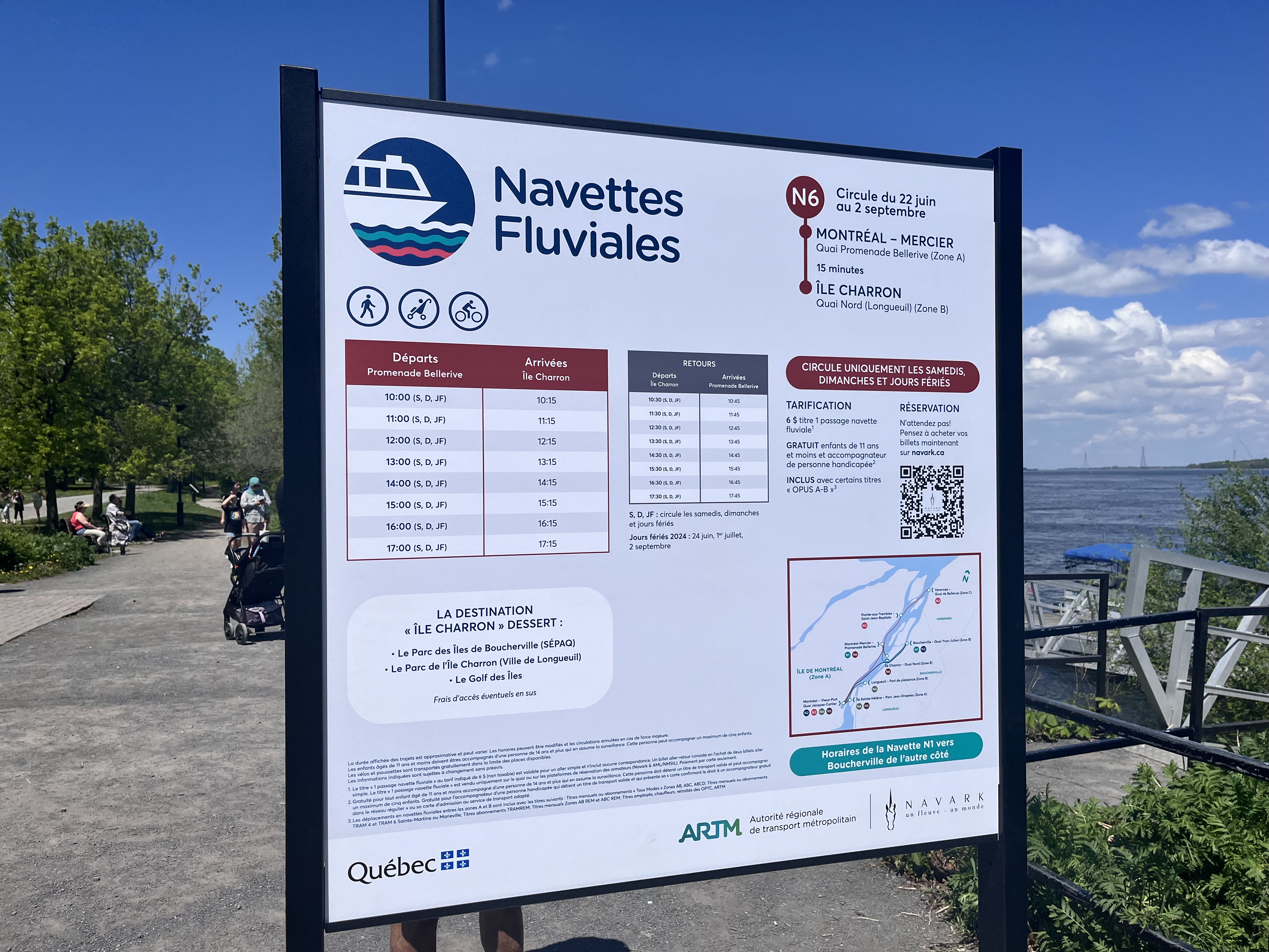
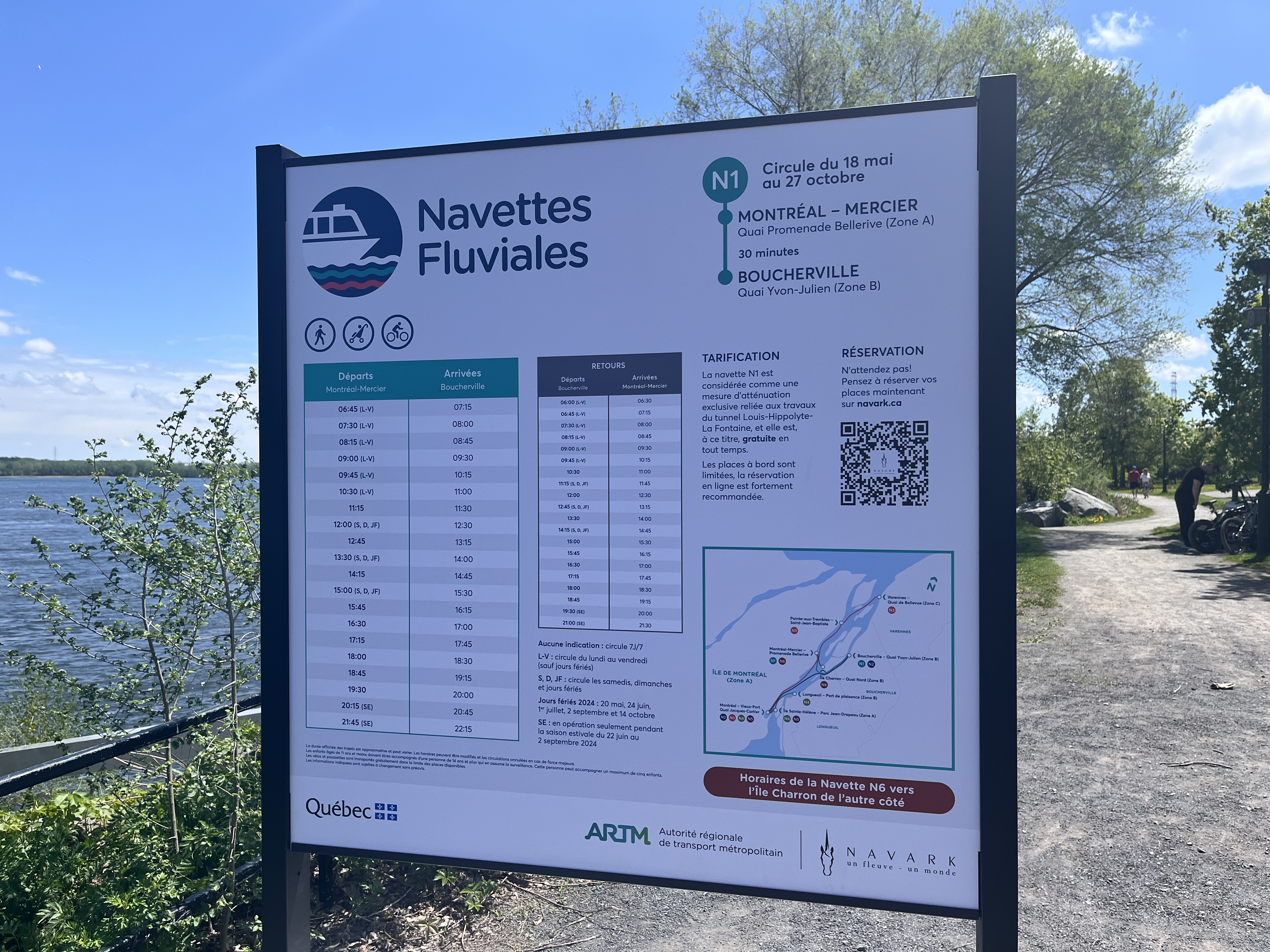
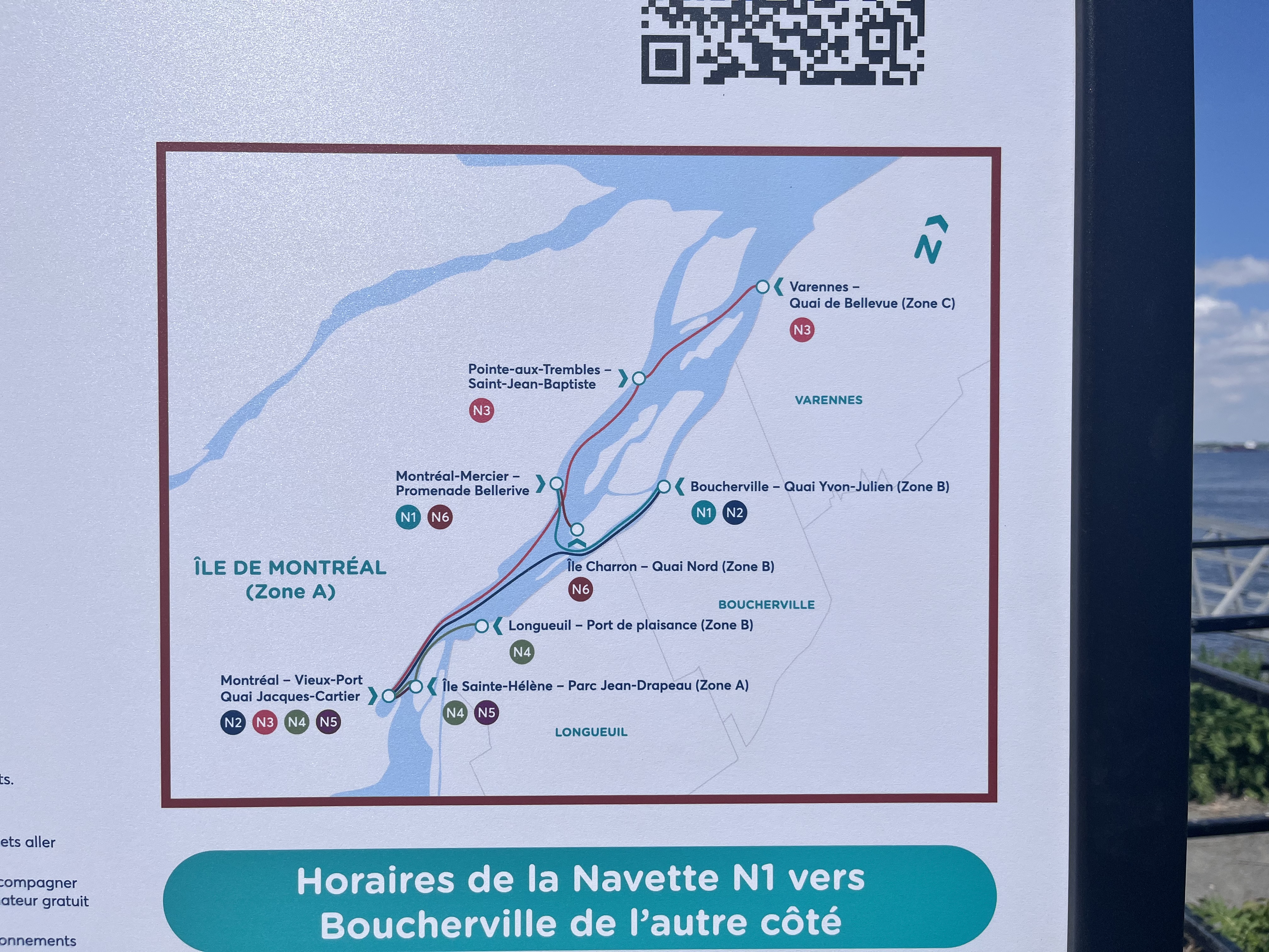
Belles cartes pour un projet pilote ![]()
1 « J'aime »
À Boucherville, de l’autre côté, il y a même un plan du quartier. Malheureusement, il ne suit pas les normes.
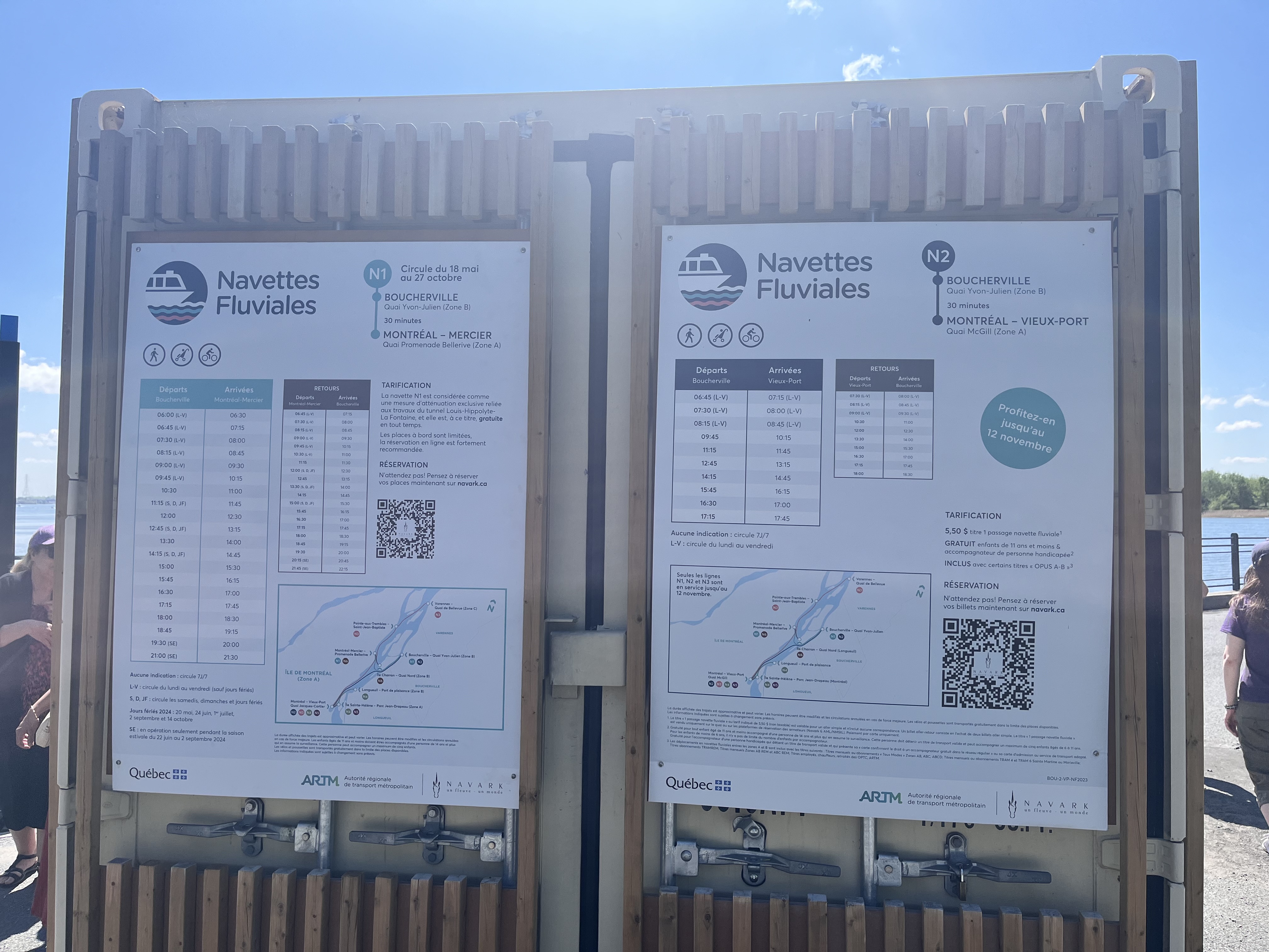
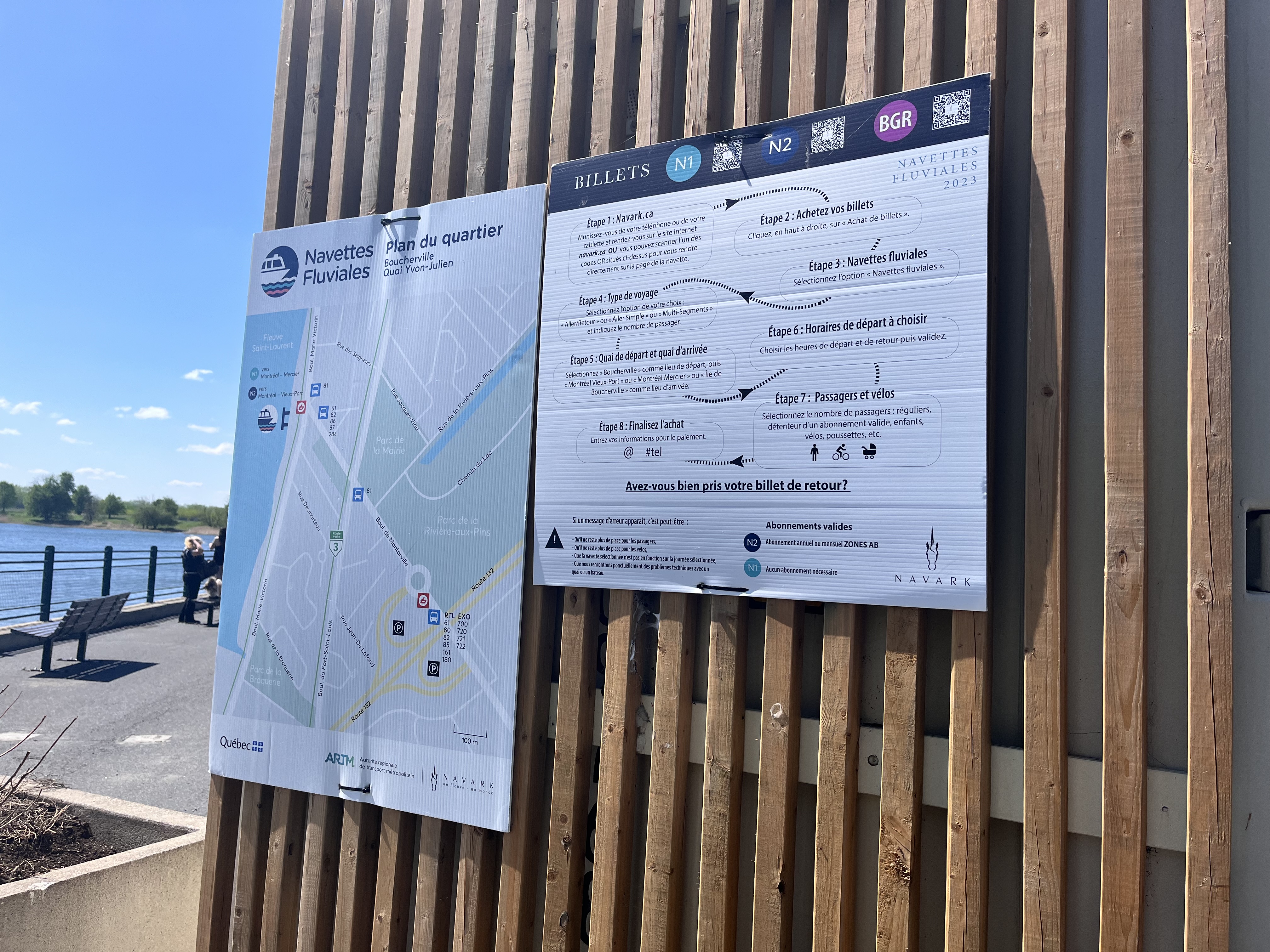
6 « J'aime »
There’s an easy answer as to why they are doing it. Even with the antennas that were installed, there’s still going to be plenty of dead spots in some stations. Reinforced concrete has a way to block signals, and the concrete of the stations can be rather thick.
That is to book overtime. Those interested than call the phone number to know when and where it is. Much easier than giving everyone a cell phone to reach them !
2 « J'aime »
Additionally, maintenance and cleaning personnel do not have radios, so the only way they know that there is a problem in the station, a particular area to clean, etc, is through the auditory announcements you hear. On top of that, some of these employees have many stations to look after, hence the need to announce it at many stations.
3 « J'aime »
These all seem like terrible excuses that dont hold up if you give it any thought. Cell service is reliable throughout the network these days, BYOD is a super common low cost soultion, etc.
I won’t discuss it any further on my end, this is getting out of the scope of the thread.
2 « J'aime »
En 2024 c’est quand même très bizarre que d’offrir du temps supplémentaire en dérangeant toute la clientèle … il y a quoi, une vingtaine d’employés impliqués alors que le message est entendu par des dizaines de milliers de clients?
2 « J'aime »