Pensez à la ligne orange comme point de référence: elle est aplatie et ses deux branches se sont étirées/étalées des deux côtés (donc Saint-Jérome, étant liée avec la branche est de la ligne orange, va à la droite). Un nom qu’on pourrait donner à ces cartes: La floraison de la ligne orange!
Mais je suis d’accord avec vous, ça aurait plus de sens géographiquement! Les stations Côte-Vertu et Montmorency ont bien l’air loin dans ces schémas.
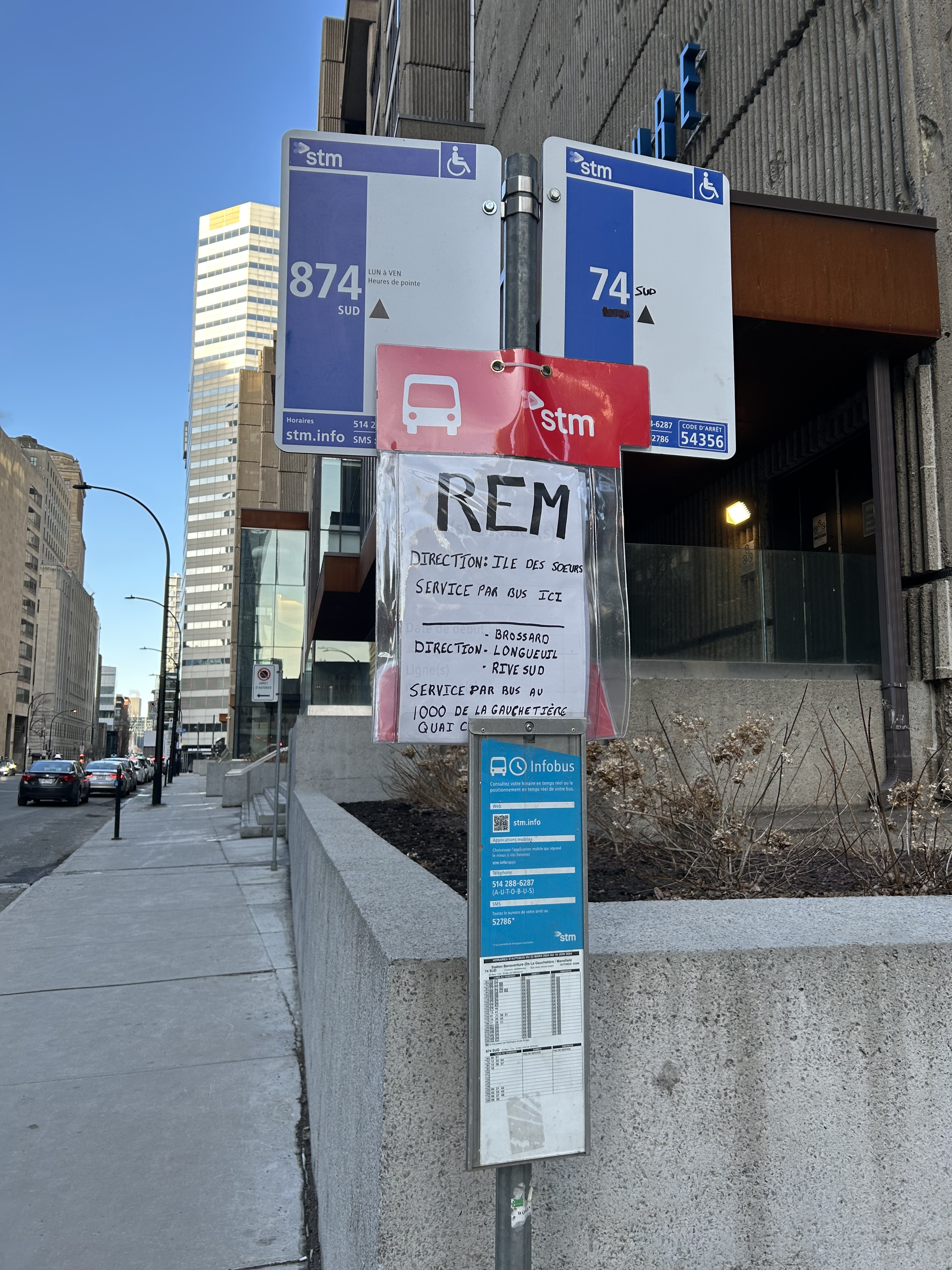
The sign looks almost brand new and its already been vandalised. Seriously, what is society coming to? Part of me is starting to think that we should adopt Japanese schooling methods where students are the ones that have to clean their own school. When you have to cleanup your own mess, you end up with a much stronger respect for the work that goes into maintaining things.
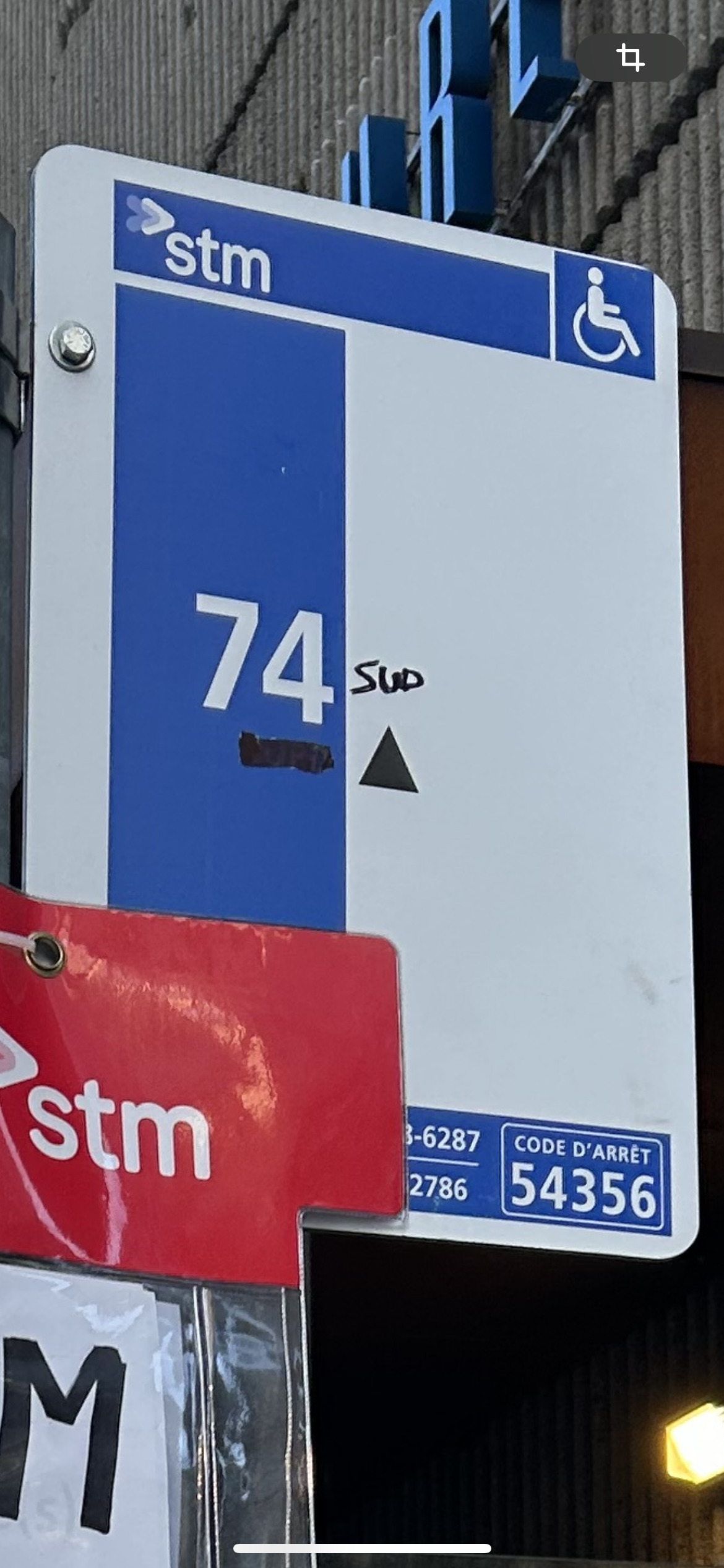
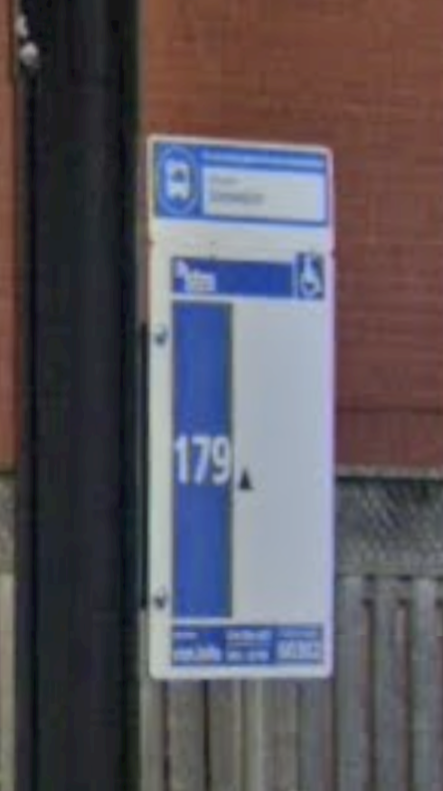
I don’t think it has been vandalized. I think it was modified by a STM employee. That stop is the first stop of the 74 Sud and the last stop of the 74 North at the same time, and there probably was never a 74 Sud stop sign.
Well, I’ve always understood the abbreviation Sup as a kind of greetings. I don’t use it, or know peoples who use it on a regular basis, but I’ve been crawling around the web for long enough that its pretty much automatically where my mind goes when I see those 3 letters.
Exact, c’est juste un CO qui a corrigé manuellement l’erreur sur le panneau
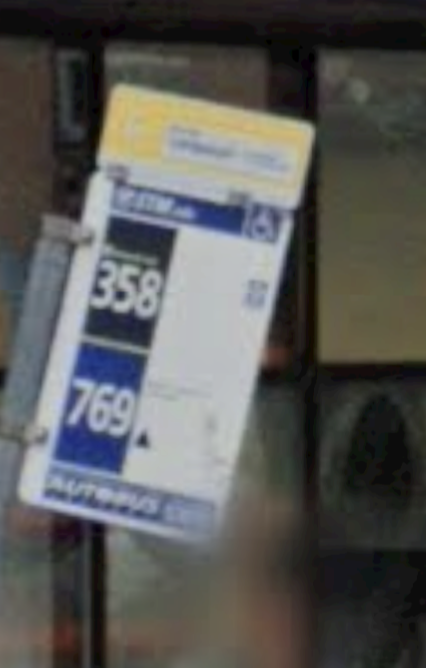
Je ne me souviens plus trop mais je crois que le triangle noir vers le haut veut dire « embarquement seulement » (@berlude connait certainement la réponse).
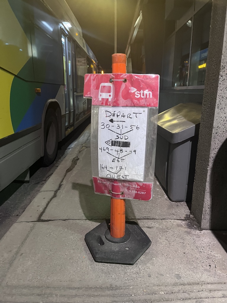
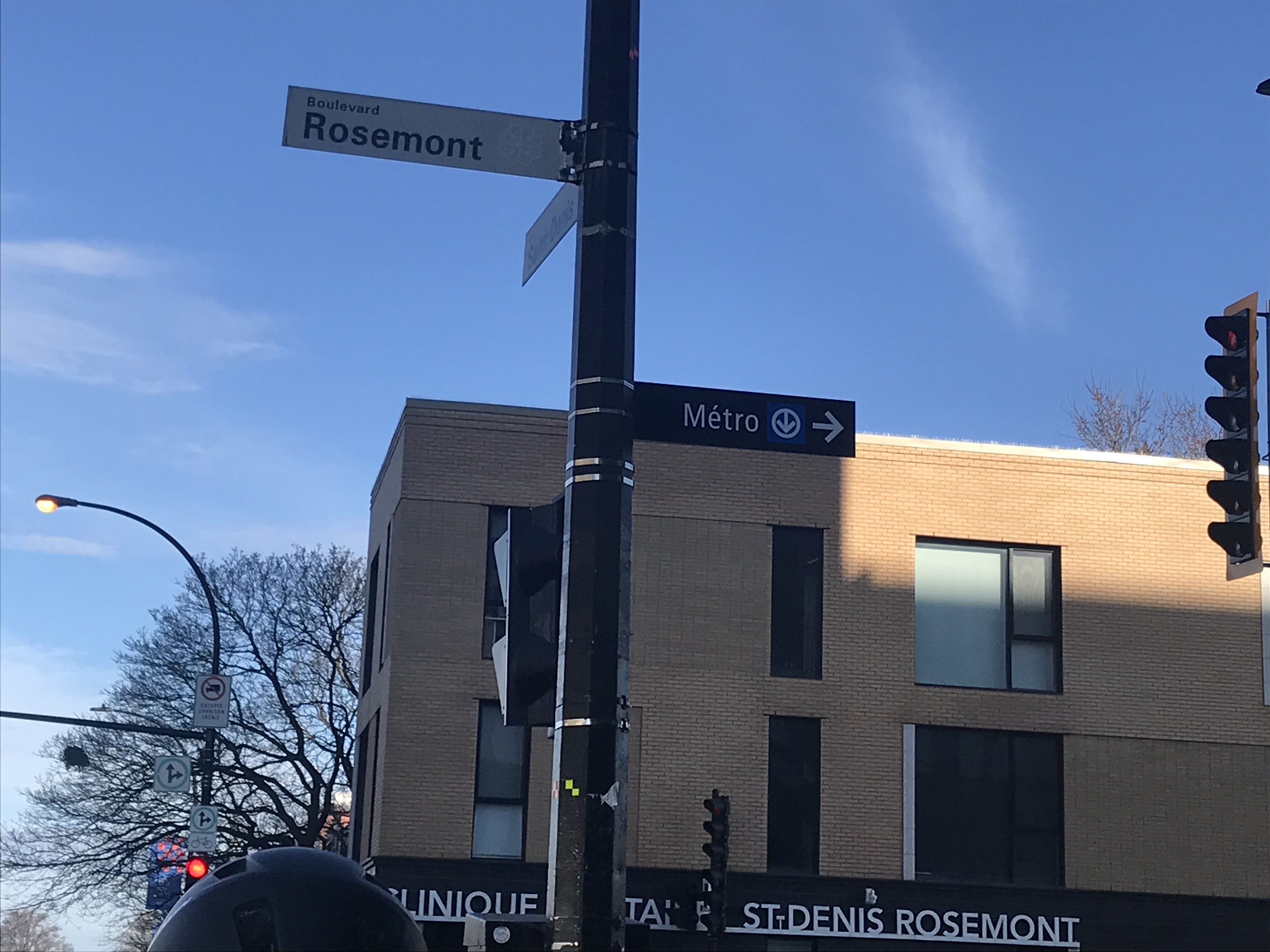
C’est la première fois que je vois ça, faudrait en mettre à tous les intersections majeures autour des stations de Métro et du REM. Je l’ai déjà mentionné sur le forum, mais ça me rappelle de ce qui a été fait à Ottawa.