EN:
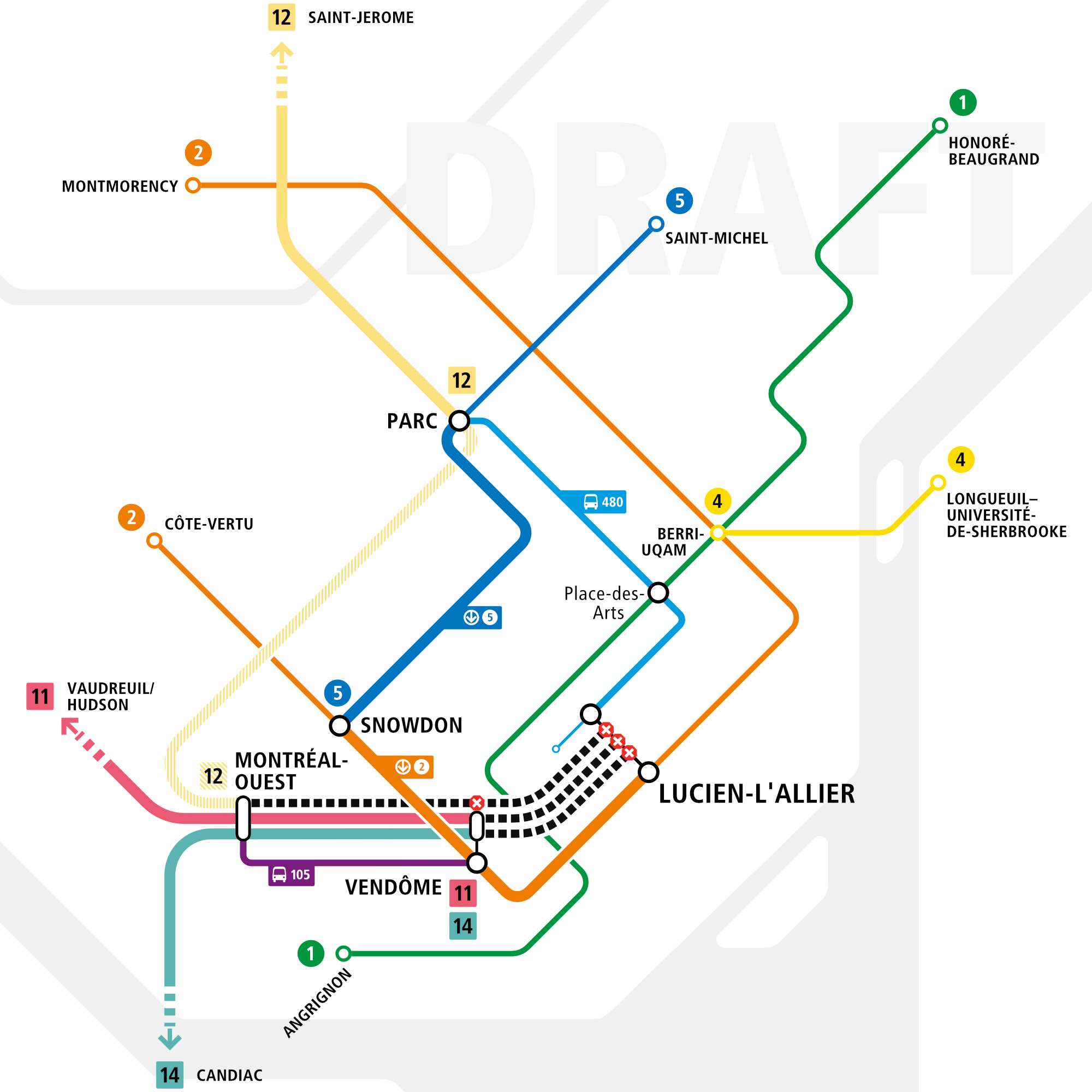
I noticed that there is one month left (April 5th to be exact) before Lucien-L’Allier shuts down for 2 years. I went there today, no signage advertising the closure is yet up at Lucien-L’Allier. For now, I’ve started working on a portion of a potential sign, if nothing is done (or if their sign is just a bunch of words, without diagram, like on their website).
This is a draft diagram, and it will fit into a greater page. I would like to know what do you think of the diagram and if the MTL-West/Vendôme area is too busy?
Some notes:
De la Concorde has no interchange blob on purpose, exo does not want people interchanging there.
I will add grey boxes filled with precisions in this map, to explain the slashed line 12.
FR:
Il reste un mois avant la fermeture de la gare Lucien-L’Allier (5 avril pour être exact). J’étais à la gare aujourd’hui et il n’y avait aucun signalétique ou papier pour annoncer la fermeture de la gare pour deux ans. Pour l’instant, j’ai commencé à travailler sur un diagramme potentiel et jamais s’ils font rien ou leur signalétique c’est juste un mur des mots et phrases (comme sur le site web), je vais peut-être l’afficher.
Ceci est un brouillon et le diagramme s’inséra dans une page.
J’aimerais avoir vos commentaires et savoir si la zone entourant Montréal-Ouest et Vendôme est trop occupée?
Des notes :
De la Concorde n’est pas indiquée comme un pôle de correspondance. Exo ne souhaite pas que les gens font la correspondance à cette gare.
Je vais ajouter des précisions dans des encadrés gris, surtout pour expliquer la ligne hachurée 12.
Cette carte fait quasiment trop de sens !! J’ose espérer que EXO va en produire une similaire, c’est extrêmement clair, direct to the point, facile à lire et à comprendre dans toutes les langues et même si on n’est pas familier avec le réseau
Au contraire, Exo recommande explicitement aux passagers de la ligne Saint-Jérôme de transférer à de la Concorde si leur destination est au centre-ville ou sur la ligne orange.
Je pense que leur raisonnement a du sens ici, puisque c’est presque un temps identique pour se rendre à la gare Parc que à la gare De la Concorde depuis Lucien-L’Allier.
Ouch ca va etre en effet beau sur la branche “est” ou dans ce qui fut le 935!
S’ils avaient attendu que le REM soit ouvert ca aurait donné une meilleure option de mitigation.
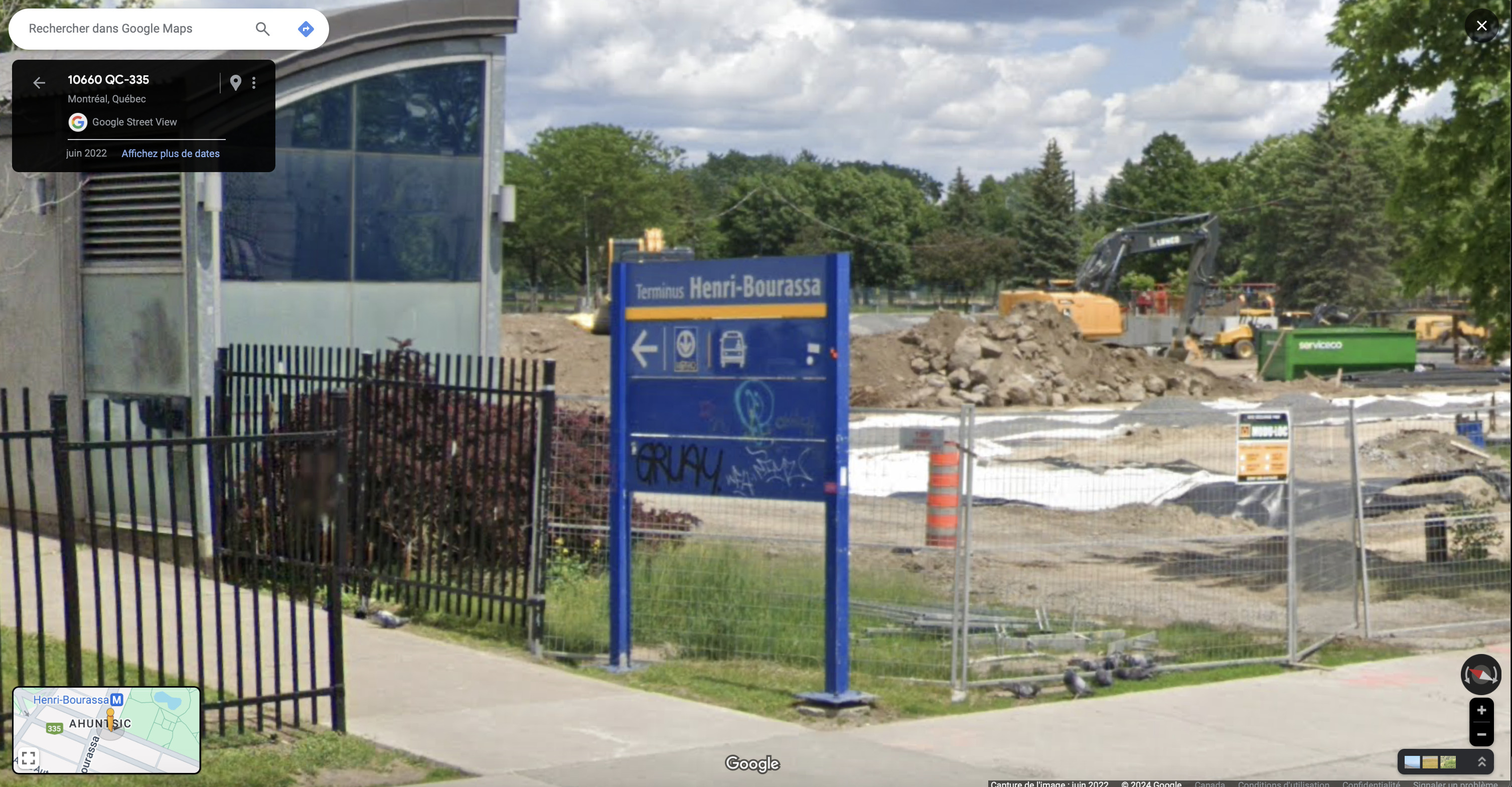
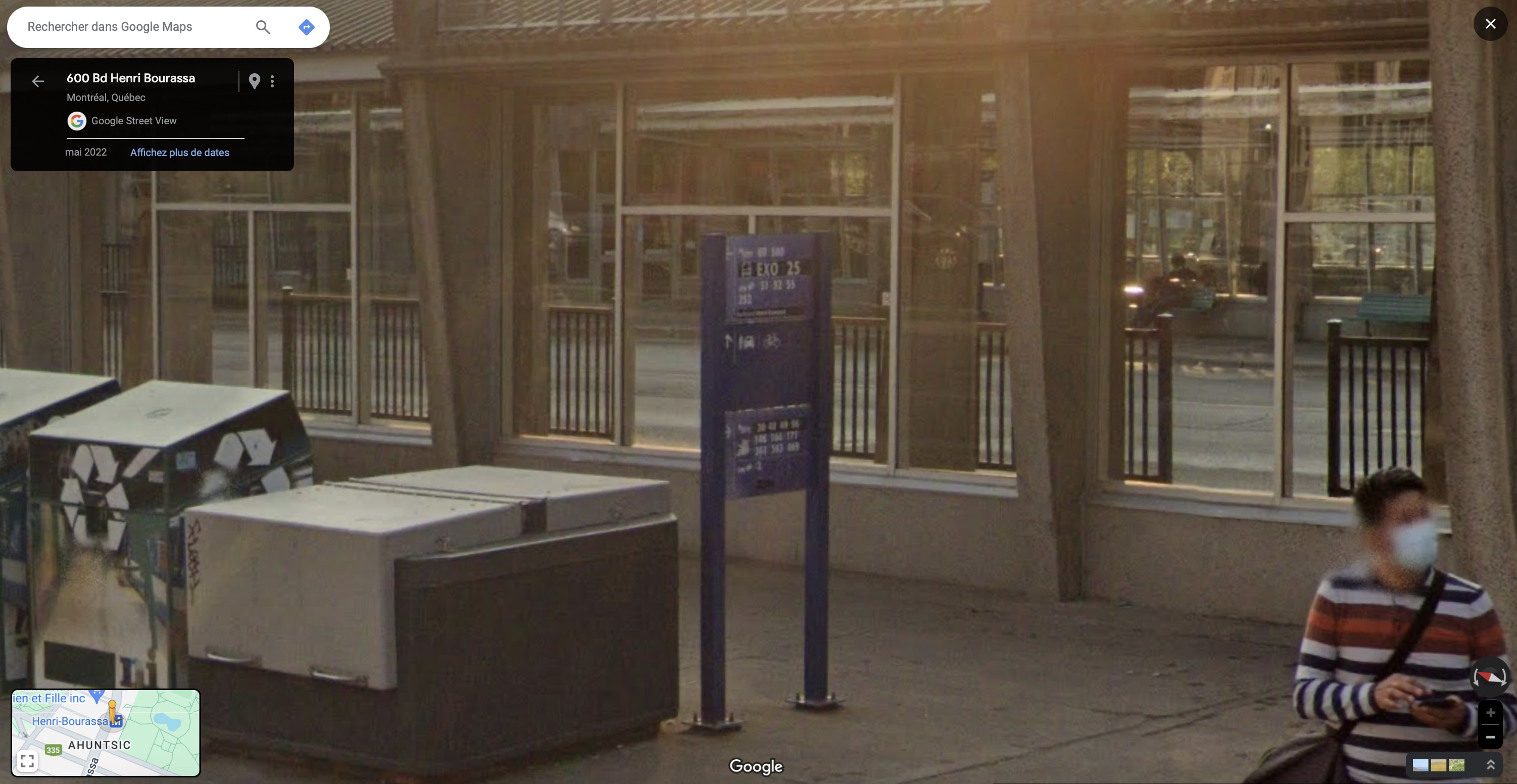
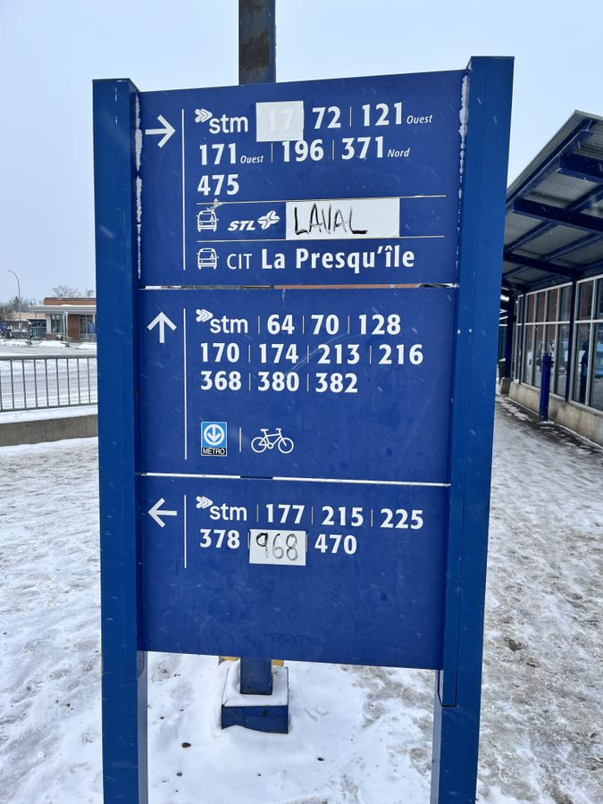
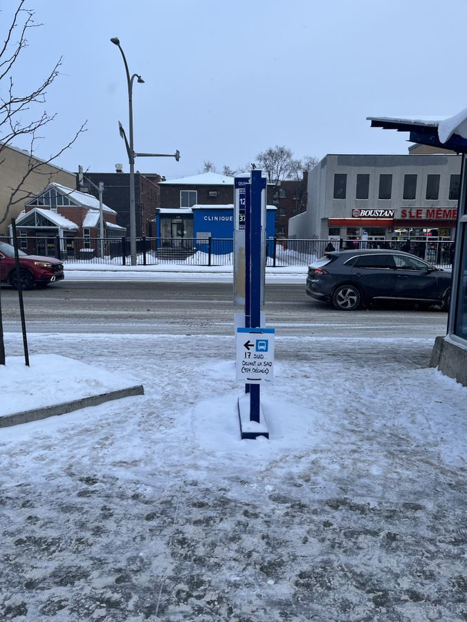
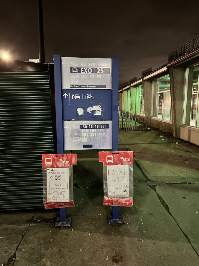
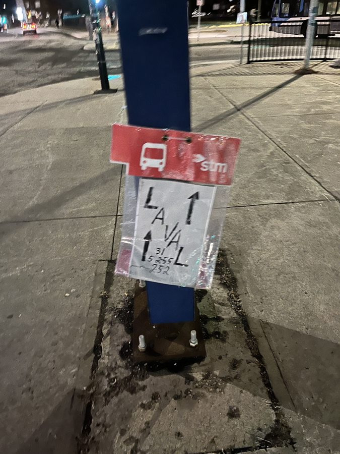
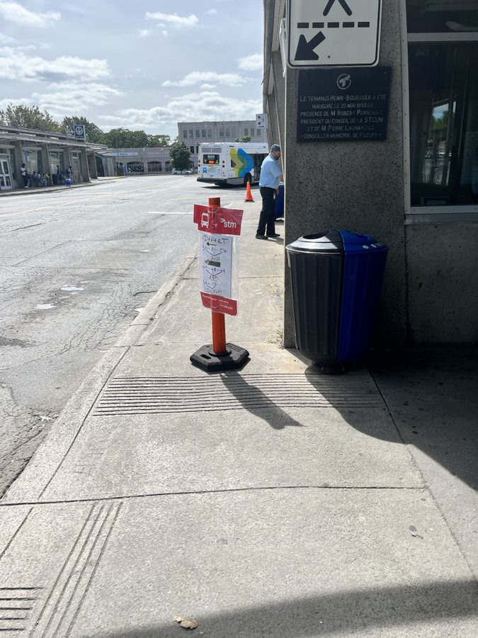
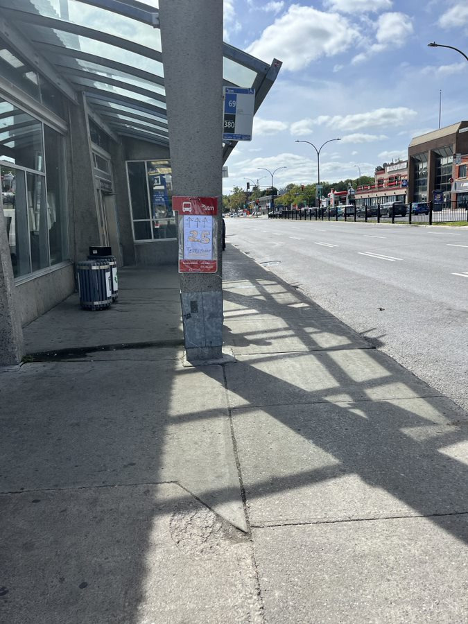
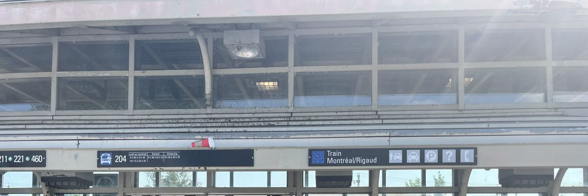
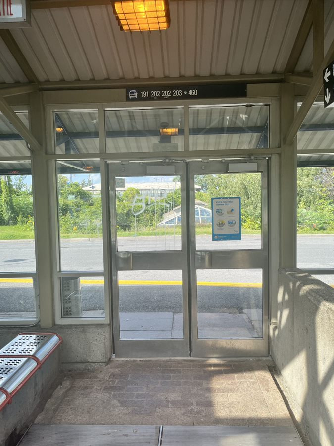
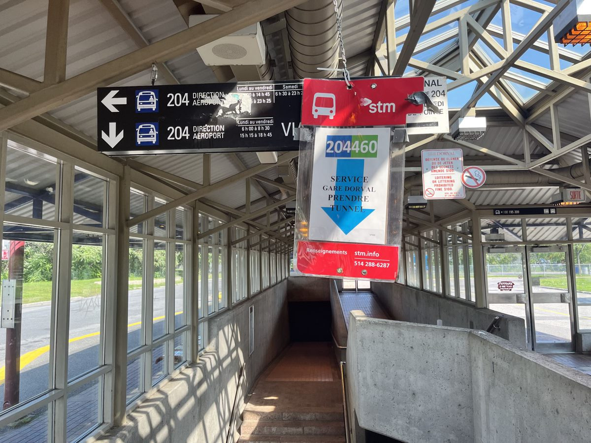
I don’t know who takes the cake. Dorval? It has some signage that is just plain wrong. Côte-Vertu? It has tape with handwritten signage on it. Henri-Bourassa? It has so much STM detour signs, with hilariously done LAVAL signs haha.
It’s a tough one!
(Sorry for the long message, I just have so many photos of the bad cases of signage)
Basically all the bus terminals around the island, Fairview, Dorval, Angrignon, Terminus Centre-Ville (somewhat), and this one too. It’s a shame projects like this aren’t focused on, actual user experience.
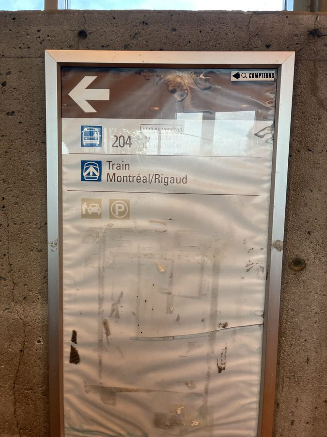
Radisson has incomplete wayfinding that makes everything so confusing. Gare Centrale is still meh in my opinion. Dorval still has Rigaud wayfinding. Brossard has paper wayfinding.
Gare Centrale is not too bad anymore, it could use a more permanent look but at least it’s up to date.
Changing signage is usually integrated with major renovation projects but there should definitely be exceptions. In some cases (the ones mentioned) it just makes public transit look bad IMO.
I also want to take the time to mention some problematic wayfinding in the Métro too.
They had the time and resources to update it, yet still made a mistake.
In both cases they replaced one sign correctly, but the other has an error.
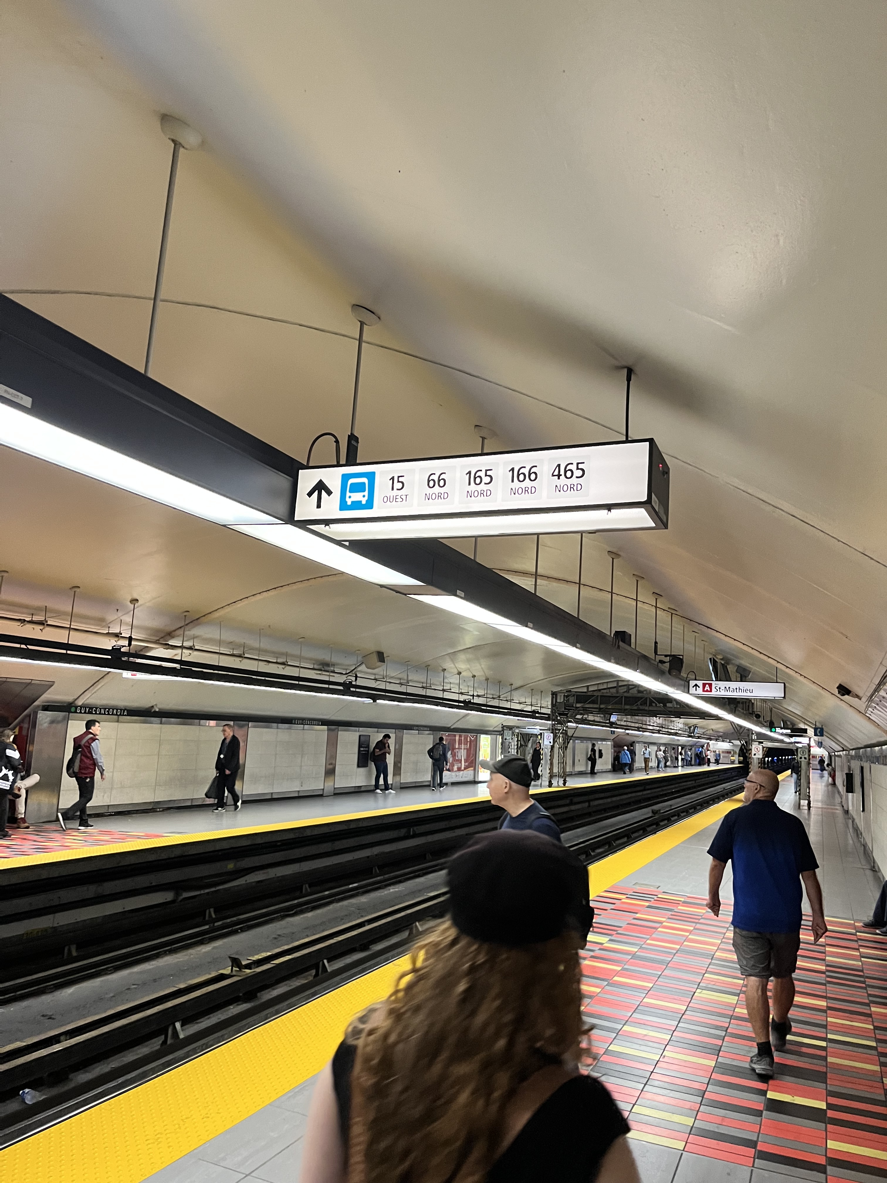
For example Guy-Concordia leaving out the 427. The other sign, about 75 meters after it, is correct.
Or, Henri-Bourassa, one sign was updated to remove a defunct route, the 53, but the sign 20 meters away, still has the 53.
However, I’d like to give the STM some slack for Côte-Vertu & Henri-Bourassa, for now, since within a year, the signage should be updated to match the bus network redesign. Dorval is also going to wait until major renovations, which are scheduled soon, to change out the signage and bring the terminal up to today’s standards.