Cartes, plans et signalétique métropolitaine

Compared to previous signs, the latest new signage of the STM has a variable stroke arrow. It makes more sense now than before, for legibility reasons, the thicker arrow on light signs and thinner arrow on darker signs.


(Sorry for poor quality on the last picture.)

For contrast, here is the older design:

9 « J'aime »

Apple Maps is currently being updated so now it will include the new frequent buses,

There is a new purple bus labeled “Frequent” to differentiate it with just “day” buses (previously it was “Express” and “Shuttle,” also the blue 165 is just because it is still being adjusted):

They also will FINALLY have RTL, exo, and STL correctly display their network route colours, instead of the default blue!


Screenshot 2023-12-14 at 1.12.37 PM

The logos for all the Montreal area, excluding the REM have been updated:
image0
image1
image2

21 « J'aime »

image

:ghost: :ghost: :ghost: :ghost:

11 « J'aime »

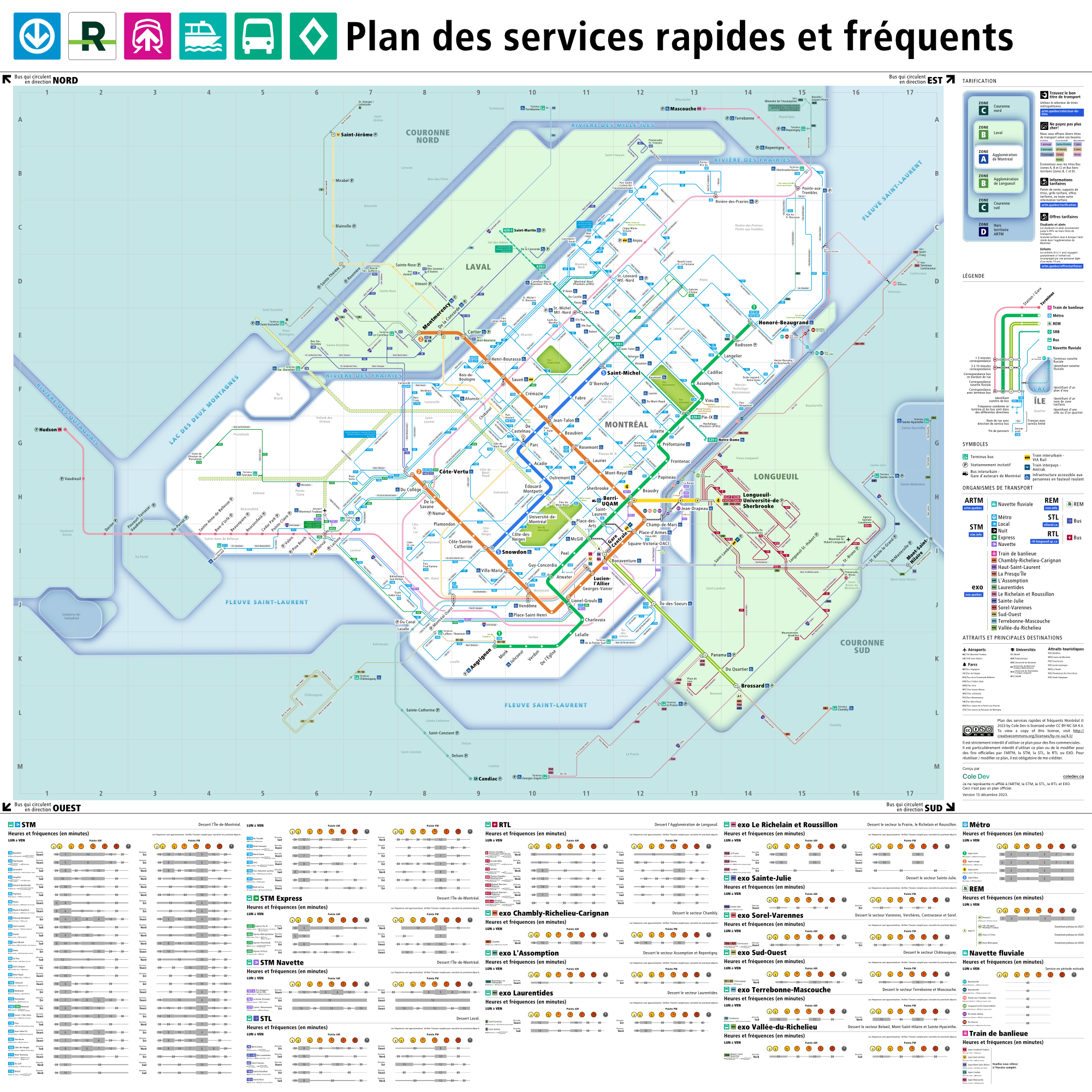
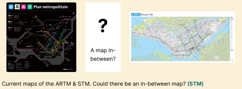
A regional fast and frequent service map.

As you can see with my previous message, I have also been working on this project with the free time I had for the past year on and off.

Download:

I have 4 versions of the map: Light & Dark of the entire Greater Montreal frequent routes, Light & Dark of just STM’s purple/frequent buses.
Download PDF & SVG versions

Goals

image
The main goal with my map is that I wanted to highlight all the frequent bus routes in the entire region, including STL’s, RTL’s and EXO’s frequent bus routes/corridors. I probably have missed some, but I tried to include the majority of them. The reason behind this is because ever since 2012, STM’s bus ridership has been dwindling, and perhaps giving some more prominence to them, could spark some additional ridership and as well show that transit can get to more places then people think.

Some improvements I want to highlight.
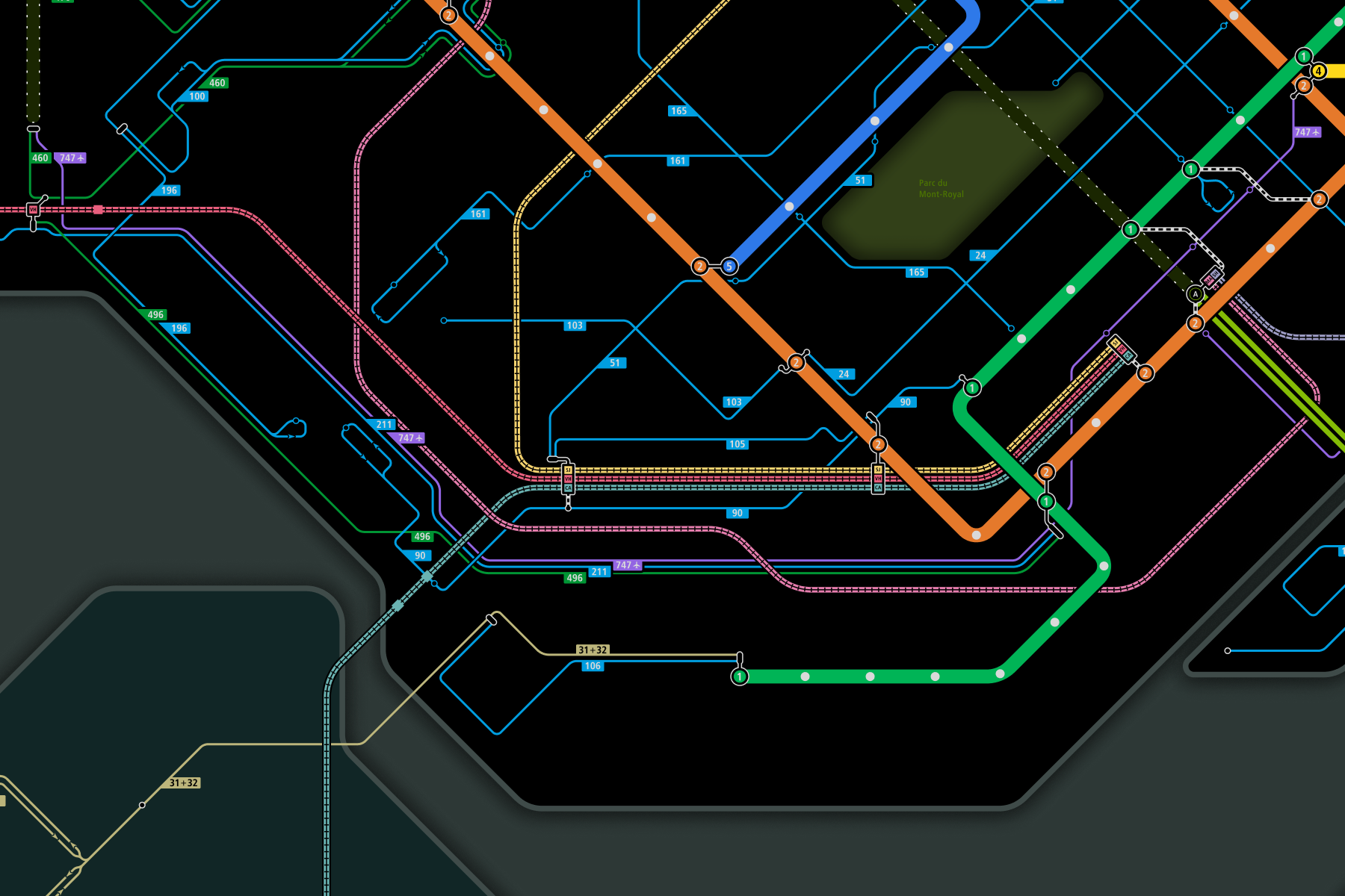
Interchange Blobs

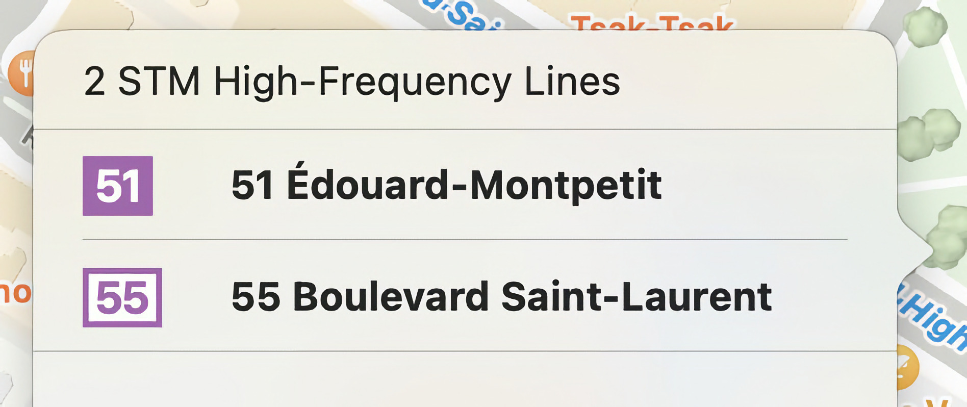
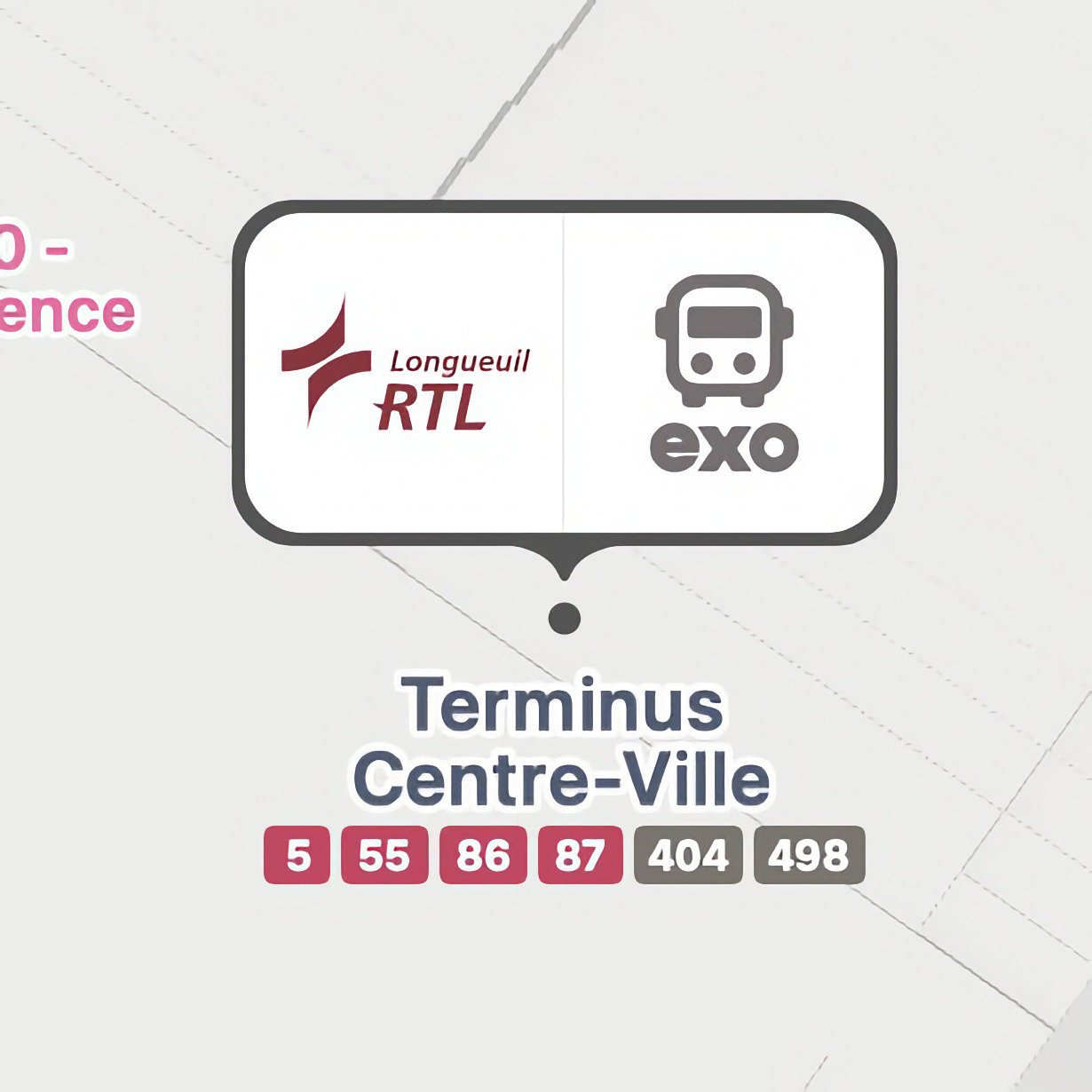
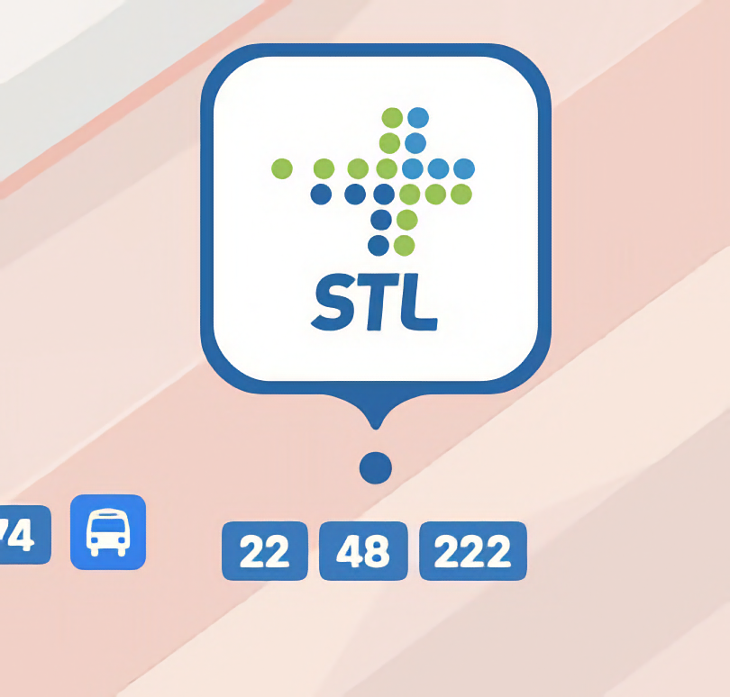
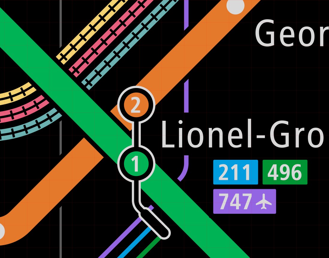
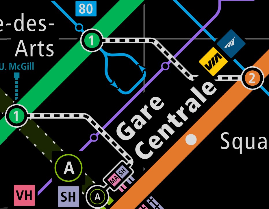
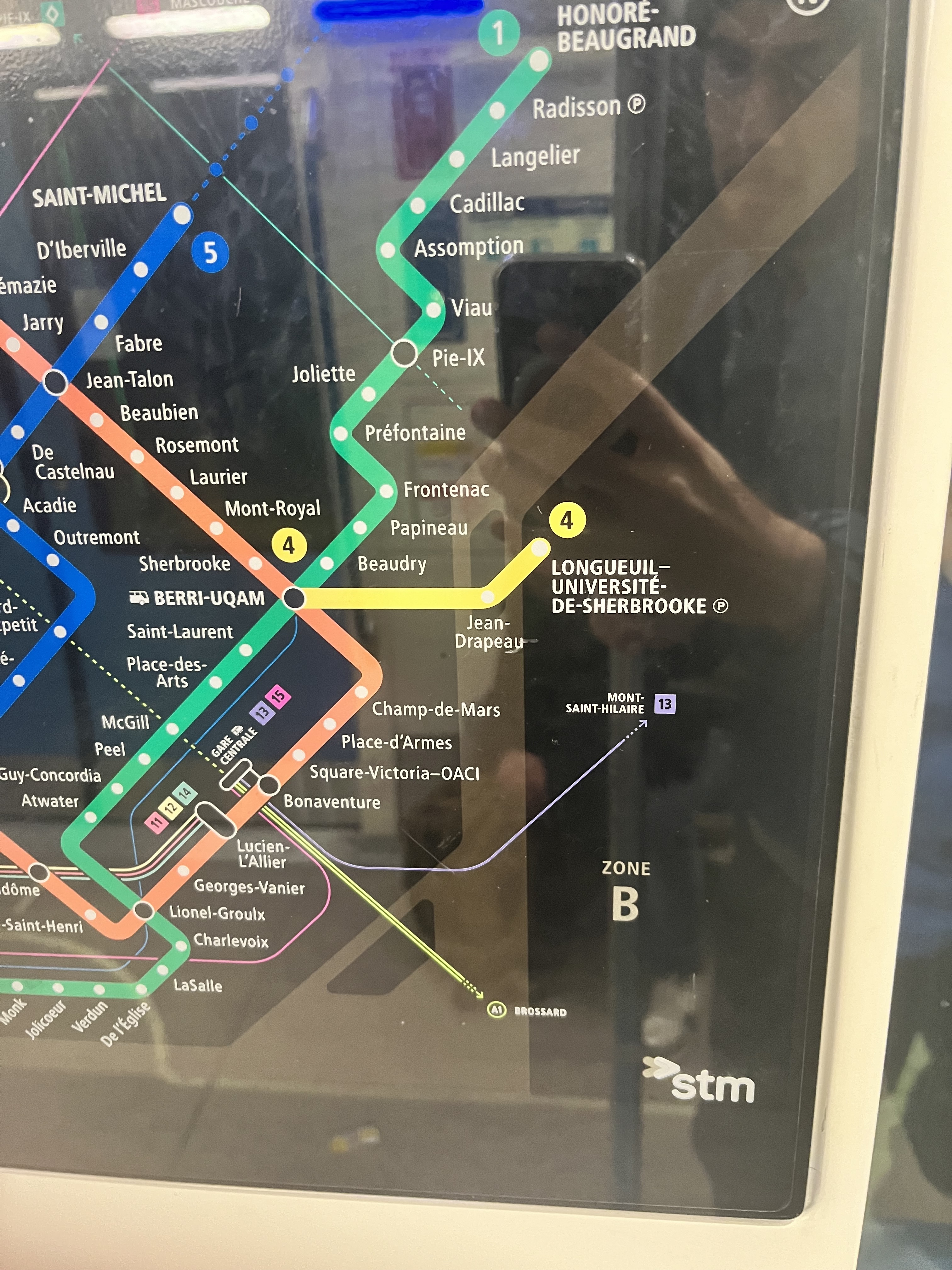
I’ve added blobs that include the line numbers/names that they correspond to, as well as showing a connected bus blob if there is a bus terminal or just a circle if there is just a on-street bus stop.


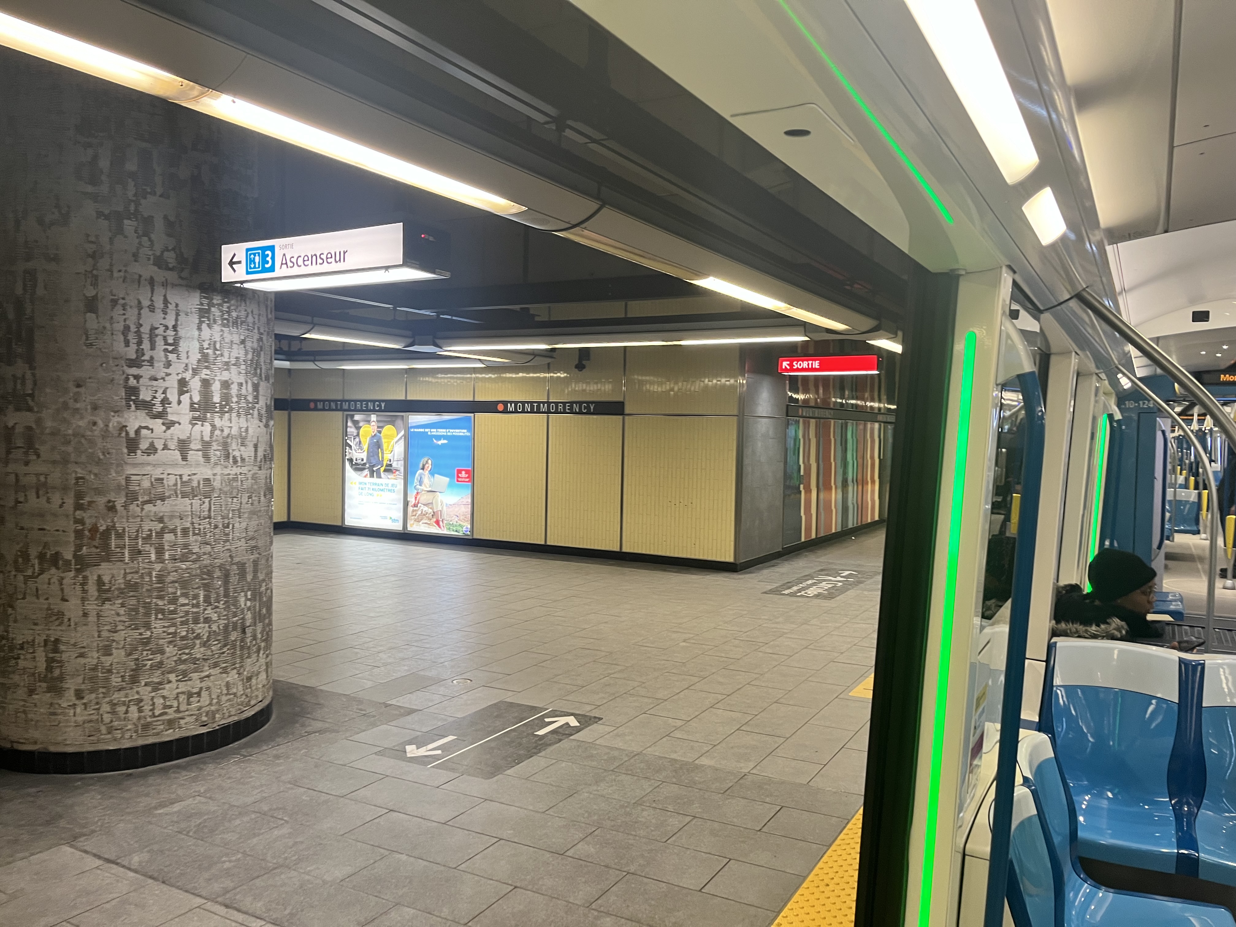
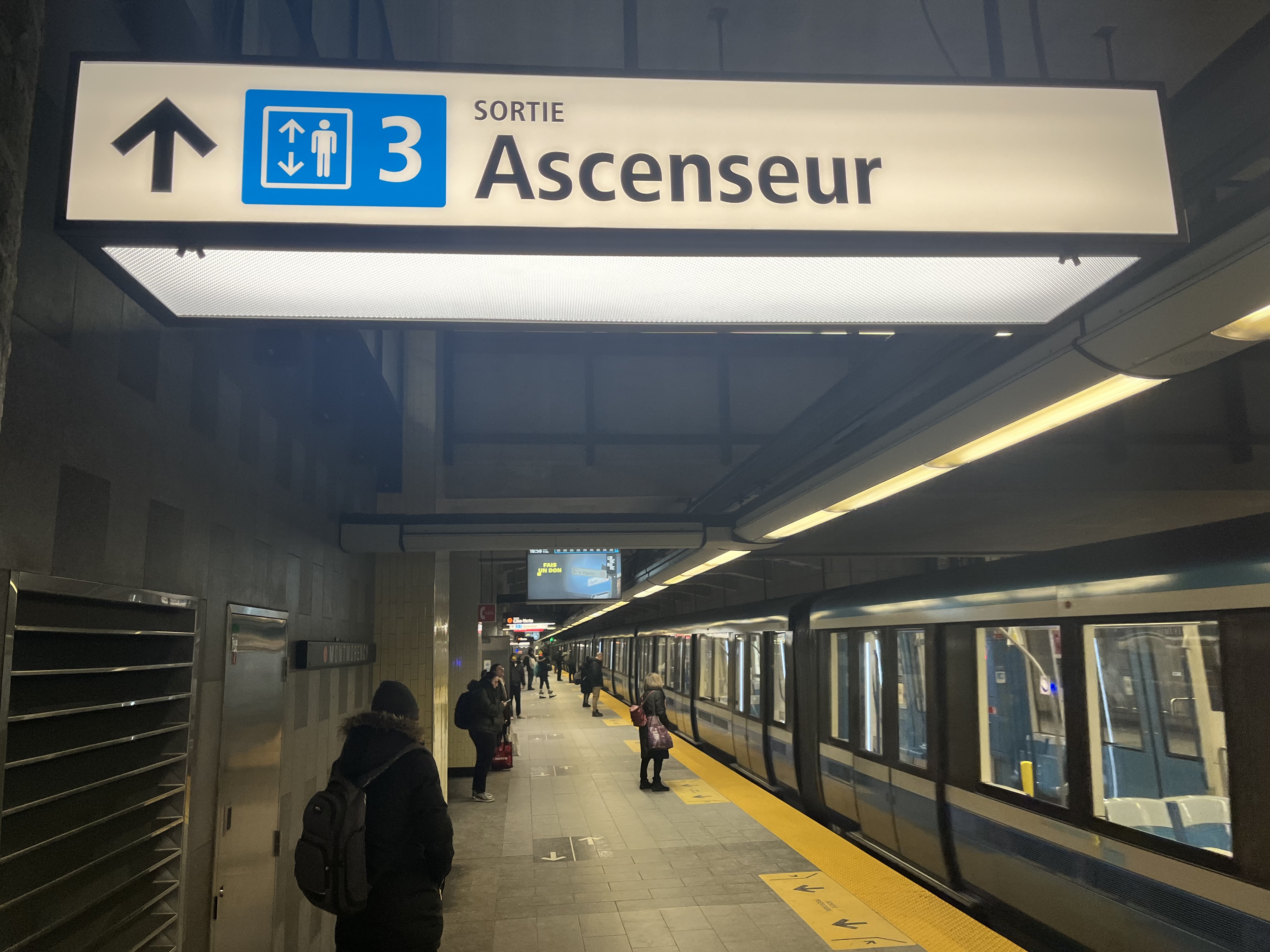
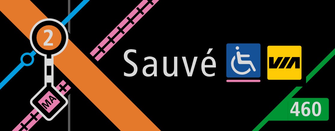
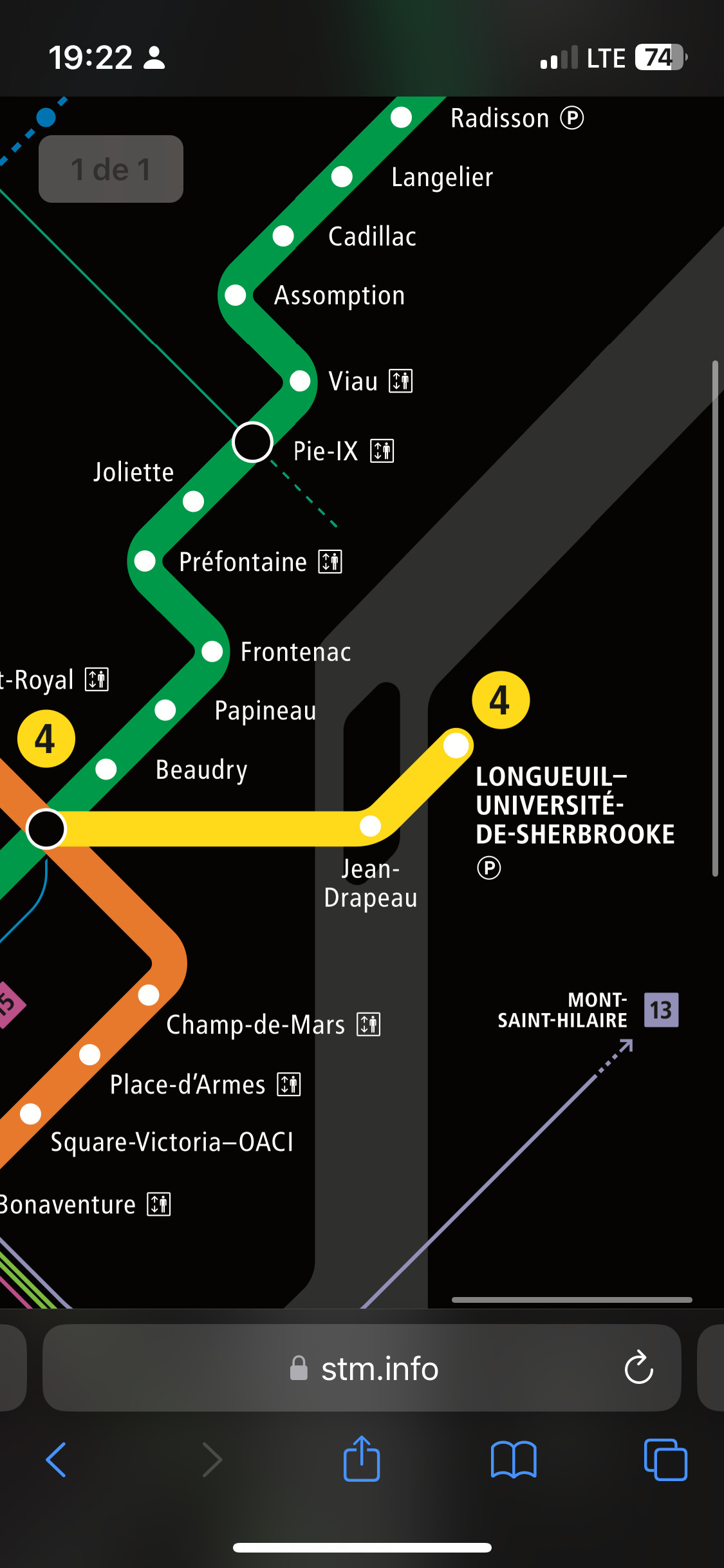
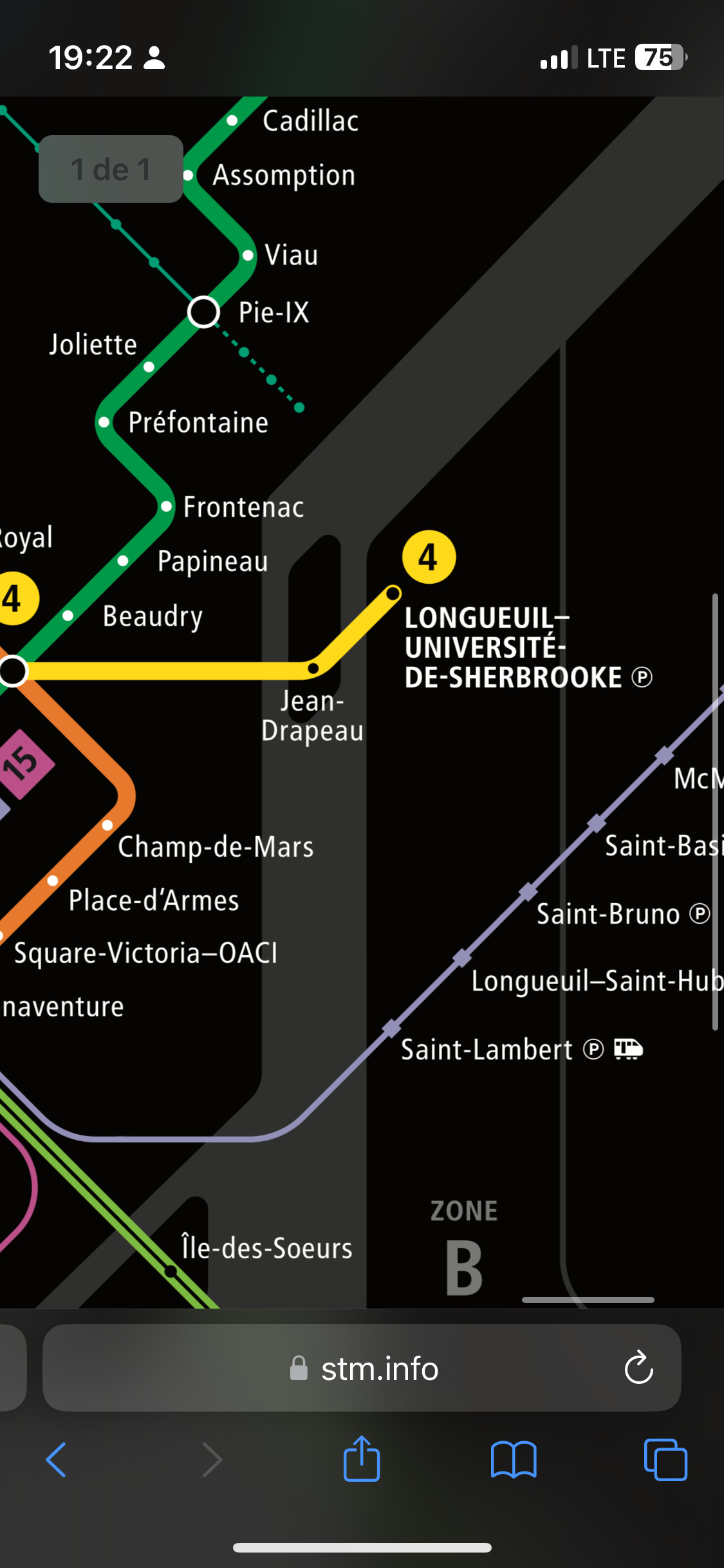
Many asked why does Sauvé has a disconnected two-part blob. It’s because it is a long transfer (about six to seven minutes to go between platform to platform). I wanted to better highlight this feature (as well add it to the legend), where a dashed line (such as Sauvé) meant that the connection time is more than 3 minutes, and the solid connection line (such as Lionel-Groulx) means that connection time is less than 3 minutes. This information I thought was quite useful, as people can’t expect the same transfer experience at Lionel-Groulx between metro and bus lines, and Lucien-L’Allier, because the transfer time is well north of five minutes, and they could miss their train because they did not budget enough transfer time since they did not know the transfer length.


Some downtown stations are connected through the underground city. Therefore, I placed two of these connections on the map, as sometimes it could be faster than taking the metro via Lionel-Groulx or Berri-UQAM.

Fare zones.

There is some ambiguity in the official Plan Métropolitain map where you don’t quite know if Île-Bigras and Île Bizard are in zone A or B. I have cleared up this through slightly different shaded areas.
Capture d’écran 2023-12-14 122251

Correcting the color hierarchy

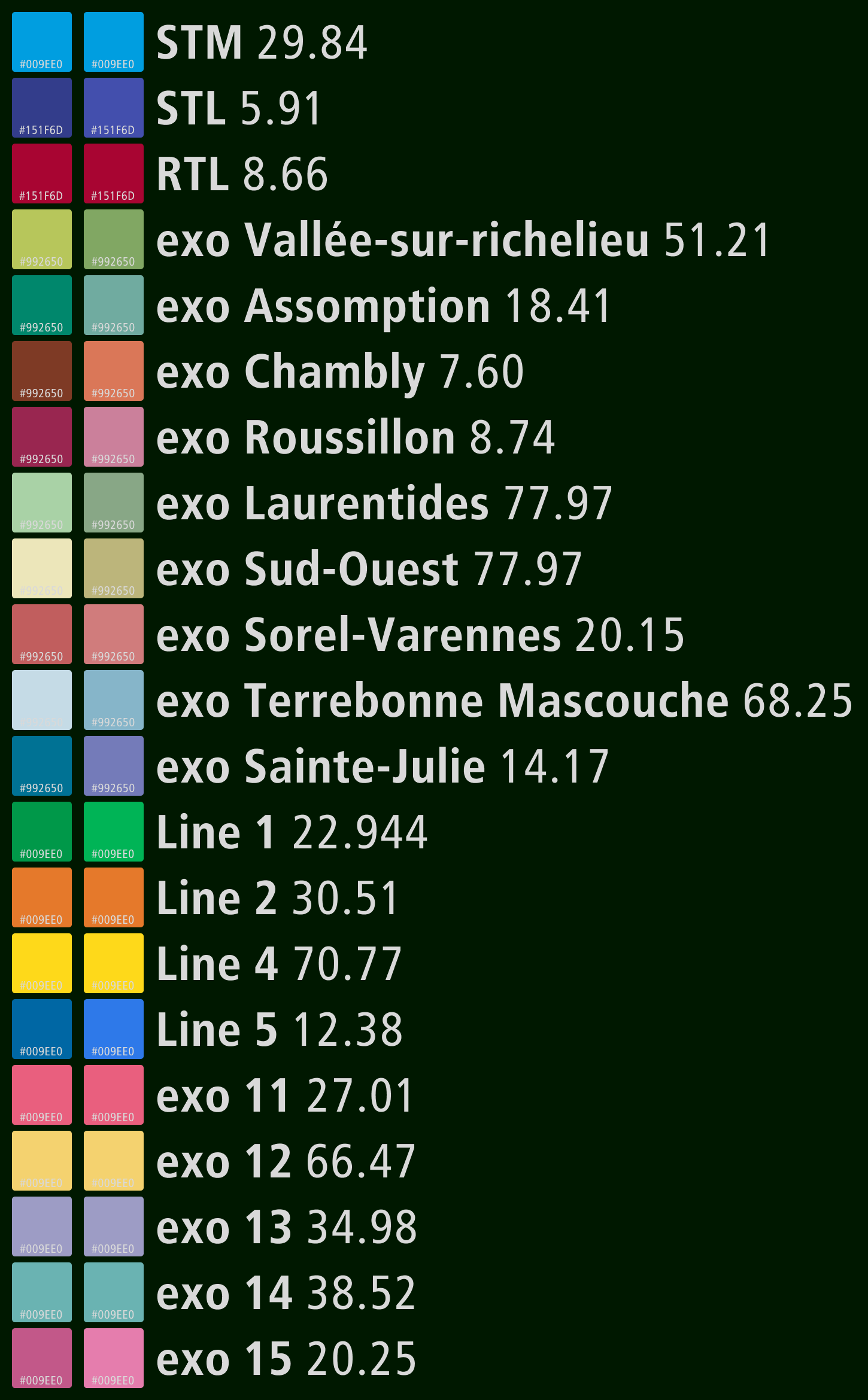
Colors can affect the prominence of certain lines. For example, when you look at the official map, it seems that the yellow line has more prominence than the blue line. I also adjusted the color of almost every OPTC (and giving each exo sector it’s own color), so that they appear less prominent and do not take over the map.


Far left is original color, just to the right of that is the adjusted color and to the far right is the original perceived luminence of each line.
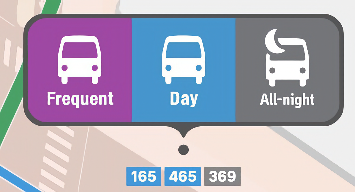
Frequency legend

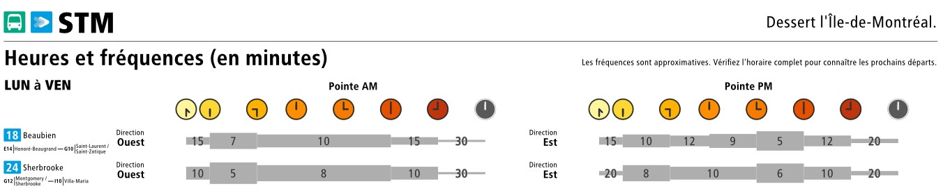
One important thing that is missing, in my opinion, from a lot of frequency maps is that they do not show how frequent the bus actually comes. For example, the bus can come every 5 to 10 minutes mid-day, but on evenings every 30 minutes or there is no service at all. This is useful, especially when the user needs to reroute themselves if something goes wrong, so they can know quickly if there is a bus coming soon or not without the need to look at a schedule. I wanted to create a way to communicate this simply, per route.


STM 18 and 24 bus routes are some of the most popular, yet they run only every 30 minutes in evenings.

Continue reading

If you want to read the entire story behind my different versions and want some tips and tricks to start your own map, well I have compiled an article that hopefully someone will find helpful:
The case for a regional fast and frequent service map. - Cole Dev

What do you guys think of the idea of having this in between map? Which possible bus corridors I should have left off/added? What should I have improved/did less effectively?

(Si tu veux lire l’article en français, il suffit de cliquer sur la globe en haut à droite du page)

25 « J'aime »

I really like the map a lot! The detail is incredible! Something I think should be adjusted slightly, although I’m not sure how really, is adjusting the hierarchy in services. Perhaps organizing the different networks in separate boxes (dark grey backgrounds, instead of one after another with a thin line), as it can be a bit overwhelming the large lists of buses. Additionally, there could be some extra padding against the edges of some of the shapes in the key, just to give more breathing room.

I just was wondering, why did you adjust the bus terminal logo to be similar to the older version, with the shelter and person figure?
Screenshot 2023-12-16 at 12.28.00 PM

Additionally, when you show the different bus networks, you use the green bus icon, instead of a colour-coded bus that matches the network (for example red for RTL, blue for STM, etc). Why did you do green bus for all buses?
Screenshot 2023-12-16 at 12.29.00 PM
Screenshot 2023-12-16 at 12.28.55 PM

Here’s what they look like on signs in real life, to compare:
Screenshot 2023-12-16 at 12.30.11 PM

When there are multiple agencies, this is when the signs use the green bus icon (which is the ARTM colour). It’s used on bus terminals, but also used at bus loops, like Nun’s Island station.

5 « J'aime »

I really like the general design language of that map. Its really clean. The train line are really well differentiated from everything else unlike many other diagrams I’ve seen which have several services that use thin lines with the only difference being the color of the line. That’s a much better option for peoples who are daltonien, or color blind. I feel that the grid lines could be a bit more discrete. My eye turns toward them a bit too much for my personal taste.

1 « J'aime »

Thank you so much for your feedback!

I will be honest, I do not like that much how the ARTM/STM currently shows buses. Firstly, every mode is consistent, there is a mode and there is lines. However, the ARTM bus symbol is not a mode but a bus terminal! Why?

This is why in my map, I tried to create this mode-line/agency hierarchy, to be consistent amongst all modes. The only difference for buses, since you cannot give a unique color to each and every 600 bus lines. Therefore, I preferred agency (except exo, which I really wish every sector had it’s own color, as they each have different attributes, fares, and services. If EXO becomes just north and south sector, it could be reduced to two colors, but now it is not).

Frame 818

This is why the bus logo I chose not per agency, but it’s to show that this color is the mode and the color along with the agency logo is the agency. Additionally, I feel having different colors and the agency name very similar to the bus pill seem like a bus route of itself. I had a friend who never took transit before, and did not know what are the different agencies: So what is the difference between EXO and 498 routes? I had to explain to him that RTL and EXO are agencies, not actual bus lines. That’s what inspired me to differentiate better what is the mode, agency and bus route. Now you might say that he just did not do his research, but what about tourists? Do they know that SJSR is not a bus route, yet on the sign, it seems like a bus route…

Frame 820

Therefore, in an ideal world, this would be the signage (on the bottom). It clearly shows what is a bus, what is an agency and the mode.

Now the reason behind the coming back to the old AMT terminus style logo, is partially the reason above, but also for another reason: consistency of amenities. You are lucky if you have a shelter and a bus stop schedule. Therefore, I felt having a terminus icon ensures some sort of consistency, along with a shelter that shows to new customers: Hey, here you will be taken care of and you will have consistent amenties. Again the bus is different than other modes, where all or the majority of stops have a very consistent experience (hence no need for a symbol to highlight there is extra amenities).
Frame 819

In hindsight, should I have put all bus terminals on the map as Terminus with the bus terminal icon as I did on this map? No, because some STM bus terminals, such as Sherbrooke/Gouin only has bus shelters, and feels more like a normal stop than a bus terminal. I’m debating on changing this, and only keeping those that have shelters and a real time display.

4 « J'aime »

The goal with the redesign is so each exo bus will have unique numbers (to not have duplicates) so by then, everything being just black and white “exo” would work, as they are all the “same,” at least for the user, even if technically they’re operated by different companies.

For the train logo, it might actually be future proof. The magenta train covers exo trains currently, but it could technically allow another company to operate a train, it would just be branded with the magenta train logo. That’s why it’s always referred to as “Train” and not “exo Train” … possibly

For the bus, it’s similar, the green represents bus terminals because different agencies use it, then inside the bus terminal, the bus logo is colour specific to the agency (with the name beside it to remind users). So while it represents the mode, it can also represent a place multiple agencies stop at. If the AMT bus stop signs were redesigned, similar to what you shared in another article, it could use a green bus which covers all of them!

3 « J'aime »

Je trouve ça vraiment impressionnant! Quel travail! C’est à la fois clair et très chic. Bravo!

2 « J'aime »

Exactly, and I have heard some speculate that just want to have couronne nord and couronne sud. Once we get to that point, redesign is complete (because anyways the numbers of some of the signs they are putting up will need to get changed again due to the redesign of the network), all old fares are removed, then I’d go for a unified or two colors (to denote south and north).

But unfortunately, in the current situation it is not the case.

1 « J'aime »

If you browse the default symbols on Google maps, one of the things that you quickly find out is that there is very little distinction between the bus, the train and a few other modes. Theses symbols all look very similar with just a few differences. I do feel that there is a need for further distinction, and although I’m not a fan of the “terminal”, I do think that it is a better solution than what Google map uses by default.

Honestly, I think that the map should just do a complete abstraction of networks such as the RTL, the STM and STL. That’s extra information which the user really does not need to be aware of. The average person only really cares about getting from A to B. If it does not help you getting from A to B, it does not need to be represented on the map.

1 « J'aime »

I agree a 100% with you on the trains! Ferries are already operated by multiple companies, so this could carry forward to other modes as well. I agree it is an inconsistency in my explanation of the relation between modes-lines.

It makes sense the color change of the bus terminal logo in the bus stations, and bus stops. However, we have to remember that logos are not just limited to bus stations and signs, but also online, brochures, maps, etc. I just think having a more consistent method to differentiate between route, agency and mode is desirable especially for buses, and there is for sure improvements that could be done even upon my way I thought of it, but I’m not too sure what is the best way. I think the only way to get a conclusion is to do user testing and compare what is more effective.

1 « J'aime »

Completely agree, the bus networks appear too visually different as you say, if this was integrated with an ARTM standard style, it would make everything have better integration

2 « J'aime »

In an ideal world, every single bus route has a unique number. However, there is currently 7 different 22 routes.

With exo’s bus network redesign, like @mashdash said, this will be greatly reduced but not eliminated. STM, STL, RTL and EXO can still have each of their own route 22. This is what I pointed out in my bus signs article, and I found it disappointing while almost all the OPTC are doing bus network redesigns, they couldn’t all come up with a Greater Montreal area standardized bus numbering system, to have a standardized family of buses, and no numbers repeat. Then here it would great to have everything the same color too!

Now, with that being said, I still think retaining STM, STL, RTL and EXO is pertinent, as the user, when they see other bus lines, they can quickly understand, this bus runs in Laval, this one in Longueuil, and so on…

When designing the map, what I had hoped is that line thickness can be used to define each mode. On top of that (which is what I am surprised that STM did not do this on their system map), what is considered standard for complex map is that each bus route has an assigned color, so that it is easier to follow. If you look at MBTA’s system map, MTA bus maps, or Chicago’s RTA maps (not always, but in complex mapping situations), they use a palette of equivalent colors to depict the bus network.

3 « J'aime »

There’s an easy fix to that. One agency gets all the numbers in the 100 range, the next one gets all the numbers in the 200 range, etc… Just add that extra digit and all of the numbers are now different. Seriously, that needed to be done yesterday.

1 « J'aime »

Vraiment impressionnant! As-tu pensé à soumettre ton travail sur le site de Transit Maps?

5 « J'aime »

Wow, quel travail! C’est absolument incroyable. Bravo!

As-tu envoyé ça à la STM et l’ARTM?

2 « J'aime »

Tu sembles avoir inversé les tracés des lignes 410 et 417 à Longueuil.

1 « J'aime »

Oui je suis au courant, merci beaucoup quand même ! Une version mise à jour, avec le nouvel tracé 69 et 439 et en ajoutant EXO 459 et 651 avec Terminus Candiac-Montcalm sort ce soir. Je vais mettre une mise à jour ici dès que je les ai mis.

2 « J'aime »

I’ve just noticed an interesting inconsistency on the metro and plan métropolitain maps.
The yellow line stations are white on the Metro maps while the stations are black on the Plan Métropolitain.

Metro map:

Plan métropolitain:

4 « J'aime »