I think it’s important that they make clear which route is accessible and inaccessible. REM has done this, and has a staircase icon to “Place Bonaventure,” to show it’s inaccessible for those with reduced mobility
2 « J'aime »
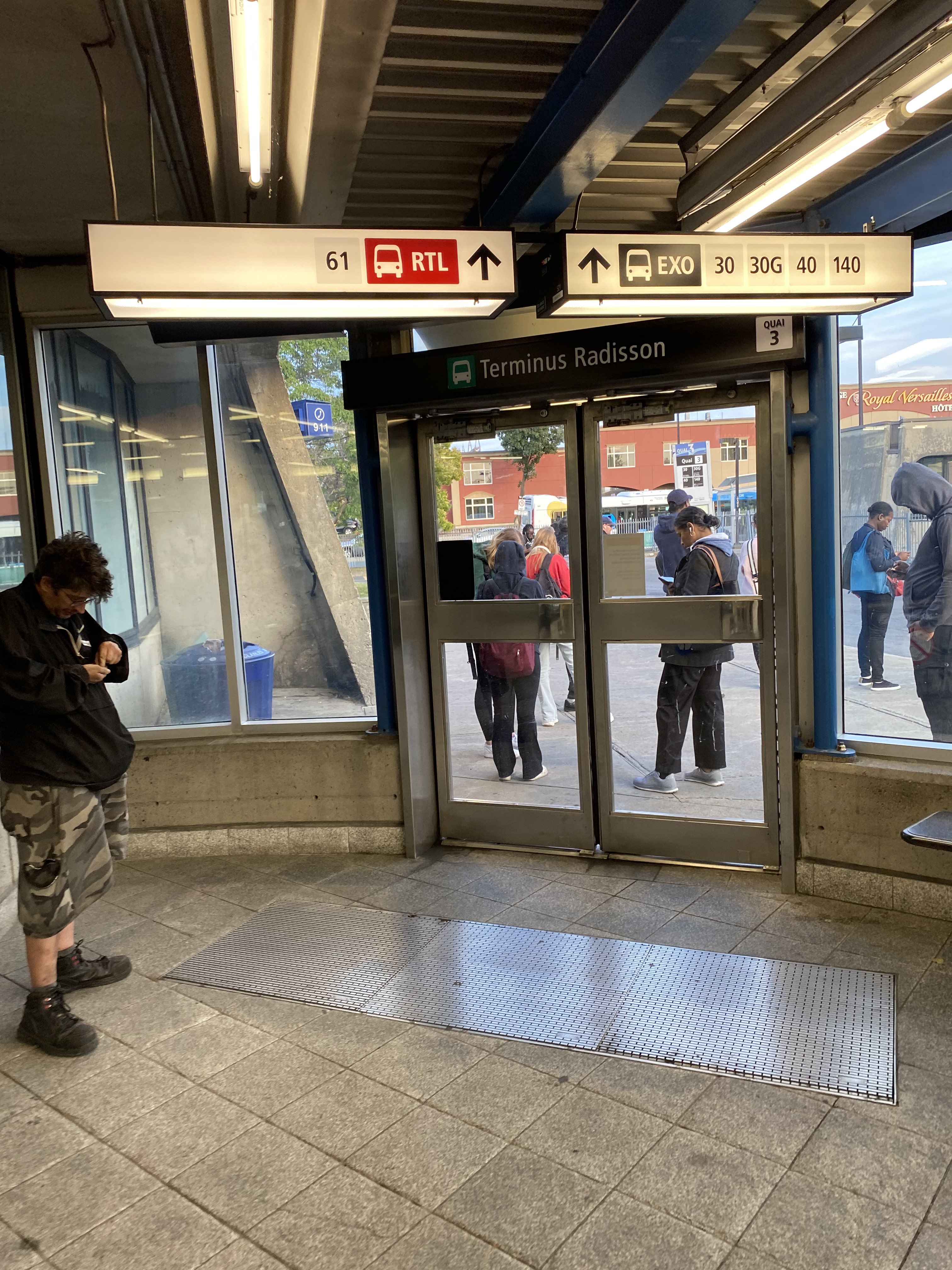
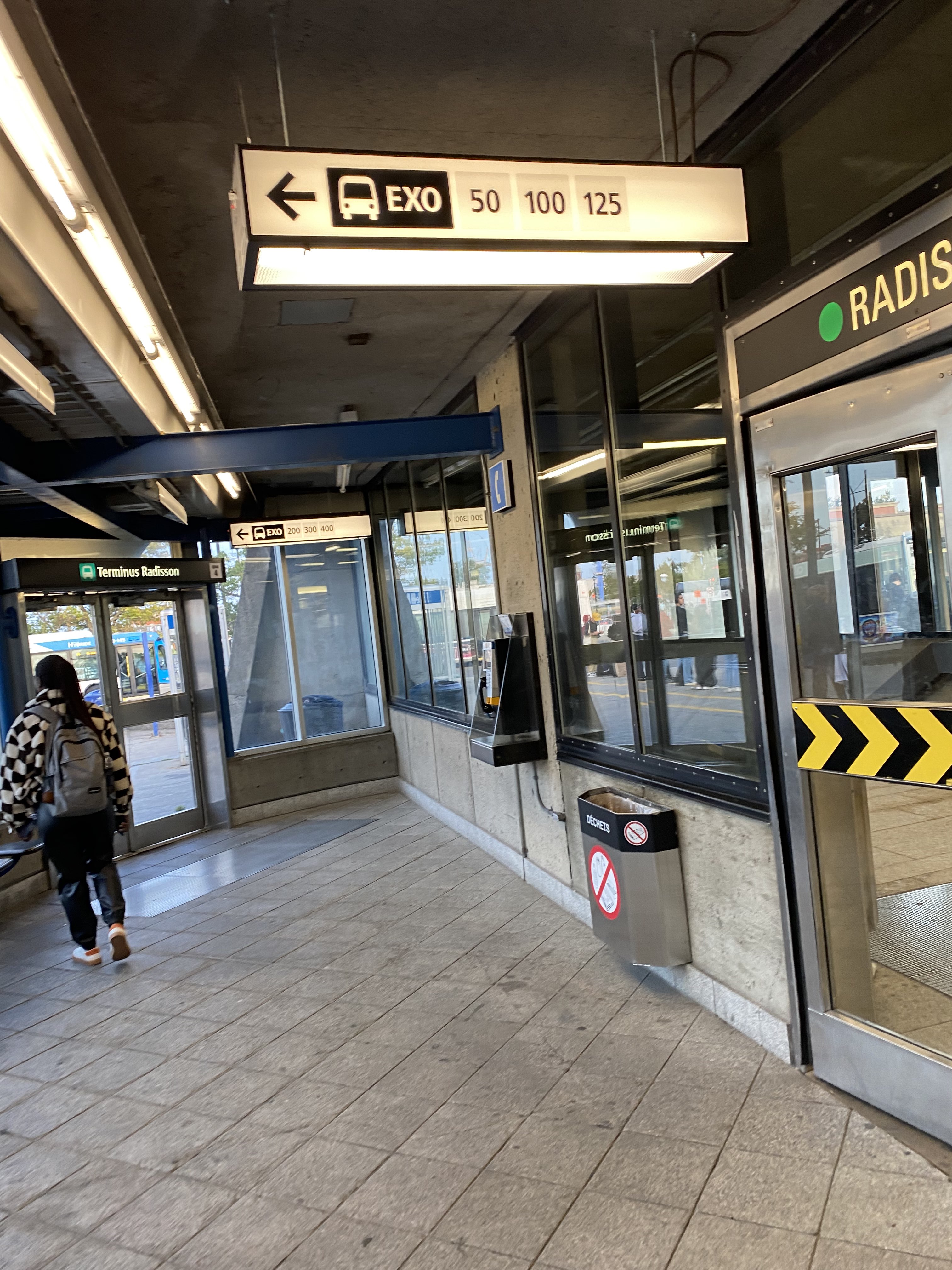
Terminus Radisson has its signage updated. The bus logo now matches the colour of the network, with the name beside it. This looks quite good and easy to differentiate the companies in my opinion, I just wish the bus logo sat on the side of the arrow, like for the RTL sign:
11 « J'aime »
Great catch! I noticed also Montmorency is getting a sign change, albeit in black?
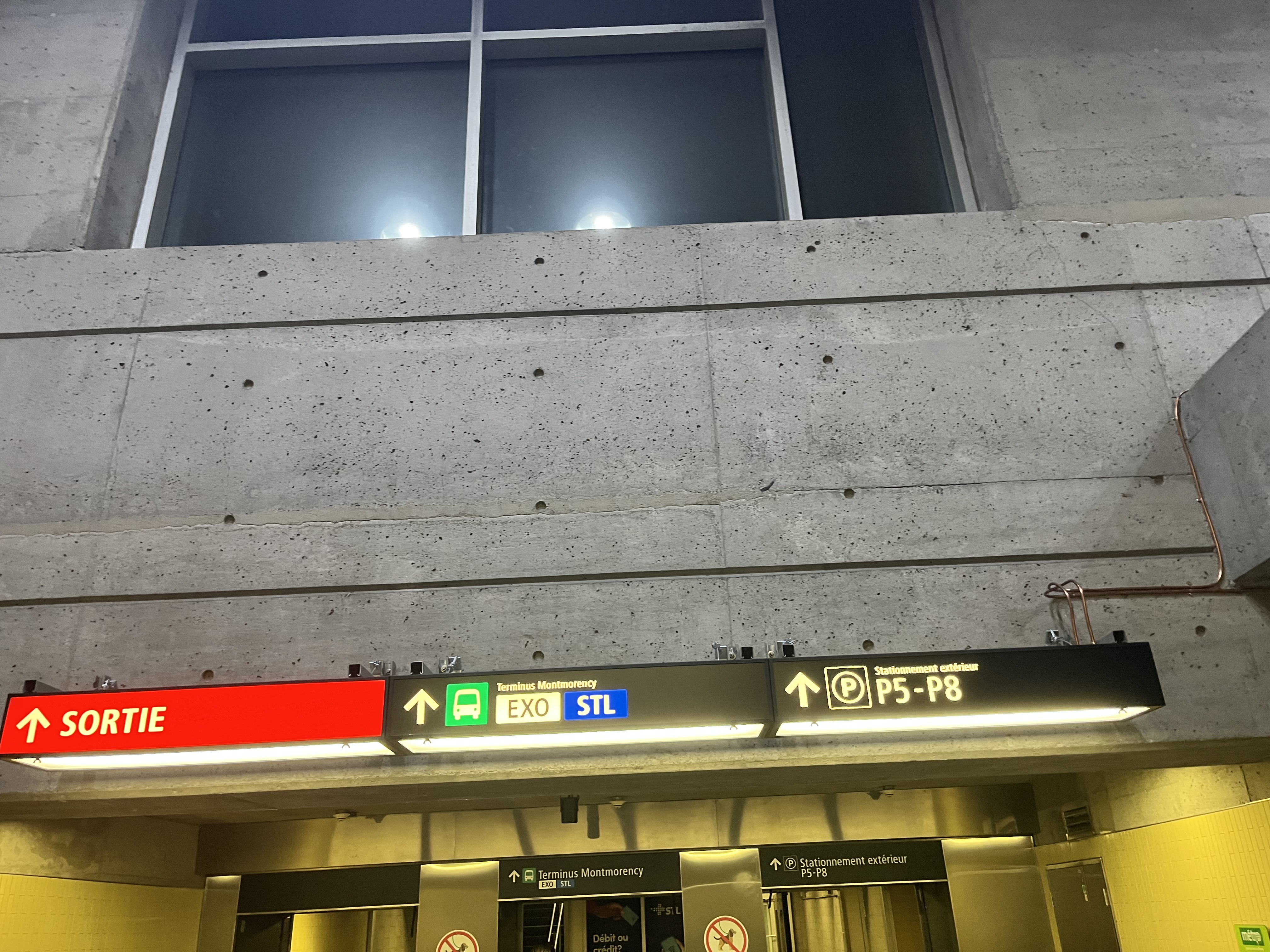
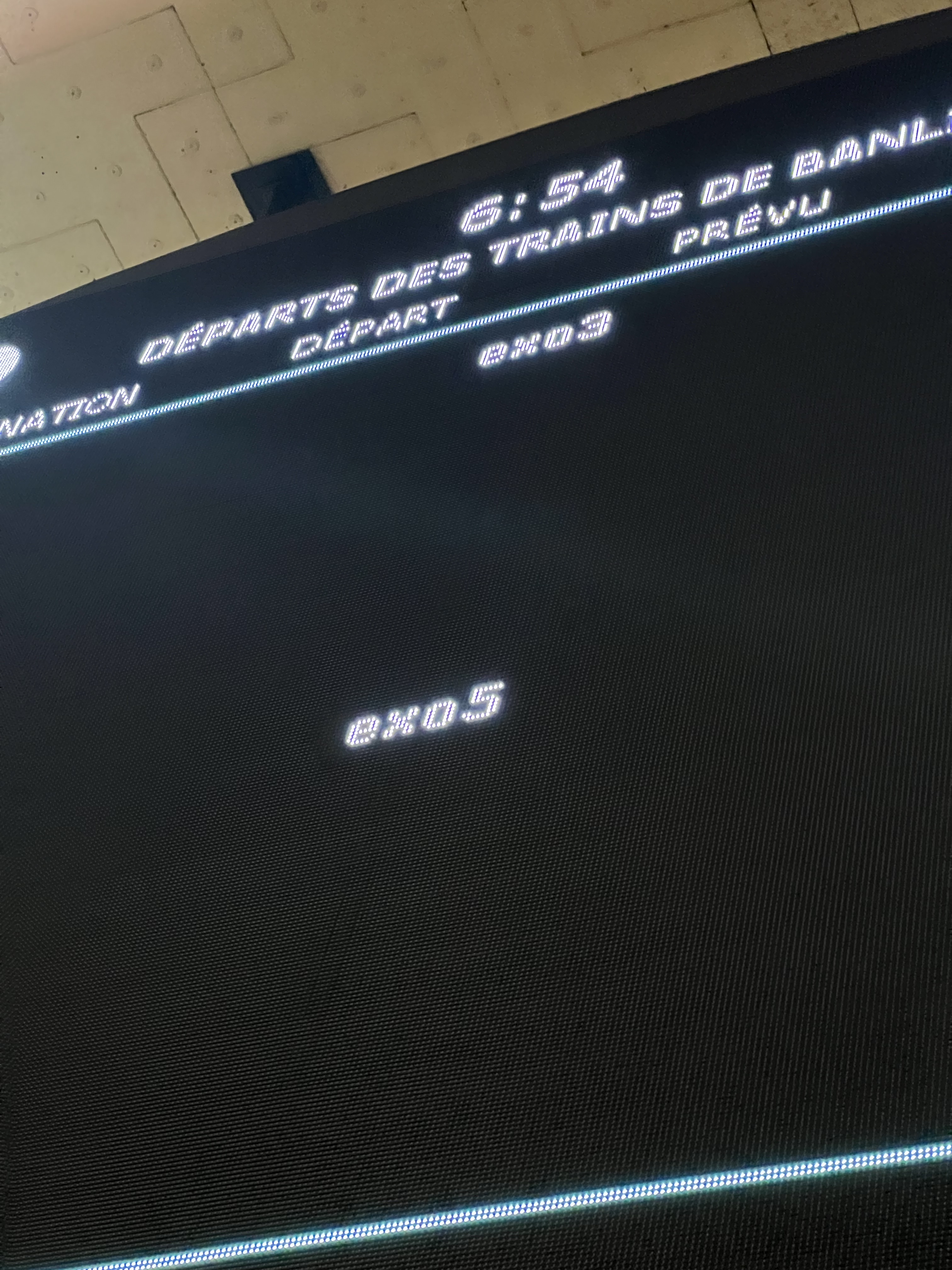
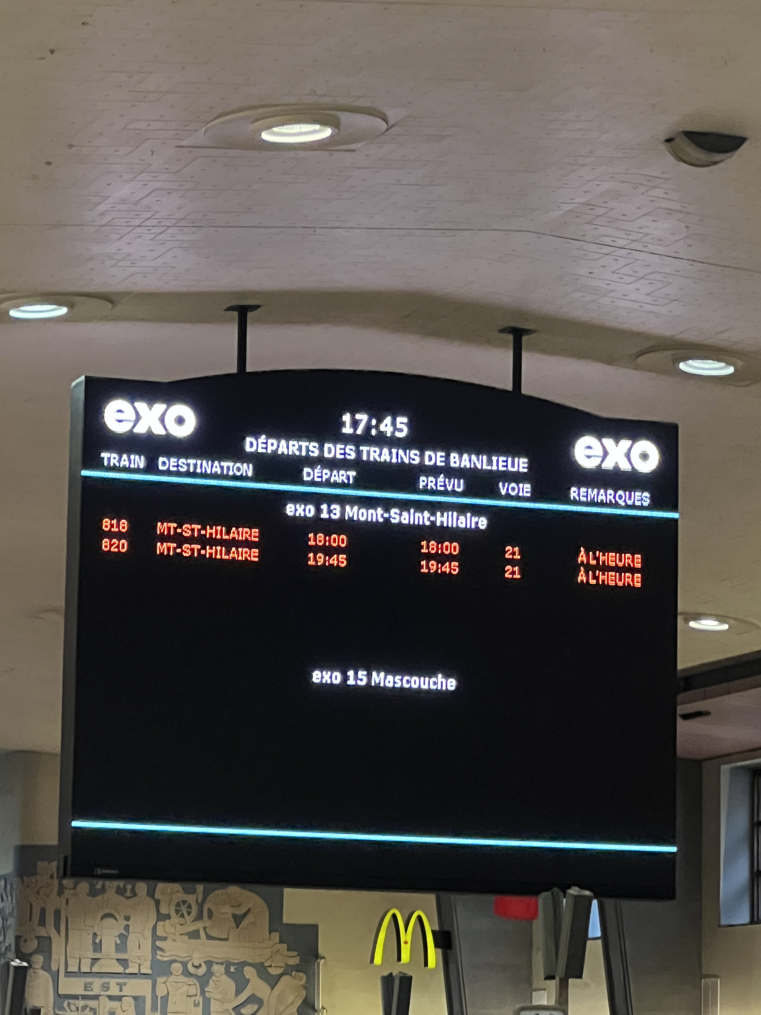
Also, how old are these signs? Because, the 30G was not in service since 2021, to my knowledge.
6 « J'aime »
Strange they have the parking logo located inside of a box, instead of just using the circle it’s already in
7 « J'aime »
Est-ce que l’ARTM s’est sortie les doigts du nez en décidant de mettre à jour la signalétique?
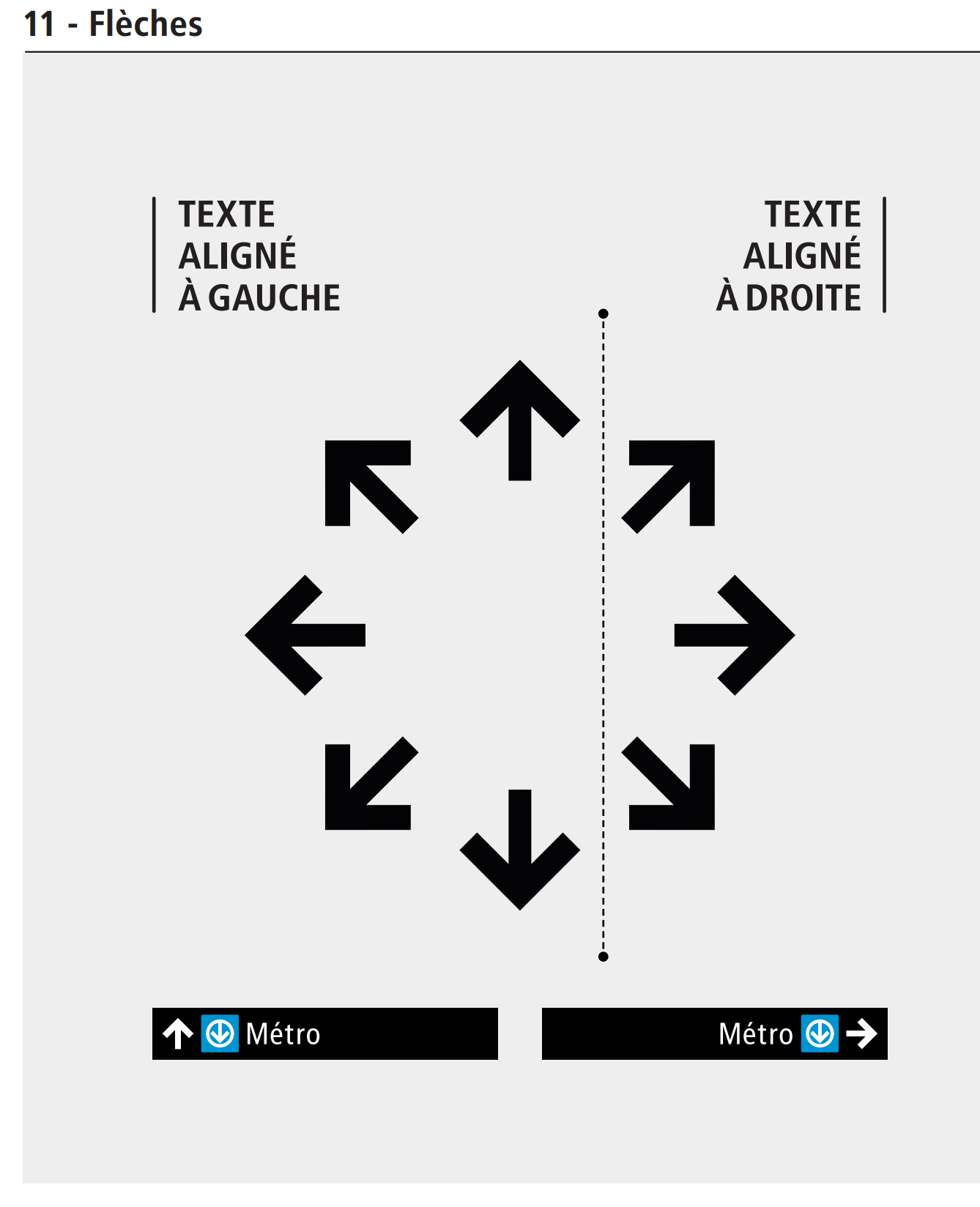
I’m fine with arrows being on either side of the sign, depending on what’s clearest, but I’d rather we always had “mode logo, agency name/initials, routes” in this order. Right now, if they were to add la STM, I feel like they’d have to either clutter the space with a third sign for just la STM lines or add their line on the same sign as RTL. That makes it just a bit more confusing.
En fait je crois que c’est fait progressivement, en priorisant certaines stations chaque année… Ce n’est pas une question de paresse.
1 « J'aime »
Je disais ça vu le dernier “scandale” de signalétique à l’ARTM. Je ne sais pas si cette saga a fait changer leur attitude face à l’installation des panneaux.
Actually, I just realized that this in violation of STM own signage guide (straight arrow on right side instead of left side).
4 « J'aime »
This is a case where judgement dictates that the straight arrow be placed on the right. It helps unify the signage and clearly mark both routes as going out the same door. However, mashdash’s comment about the bus logo position still stands.
1 « J'aime »
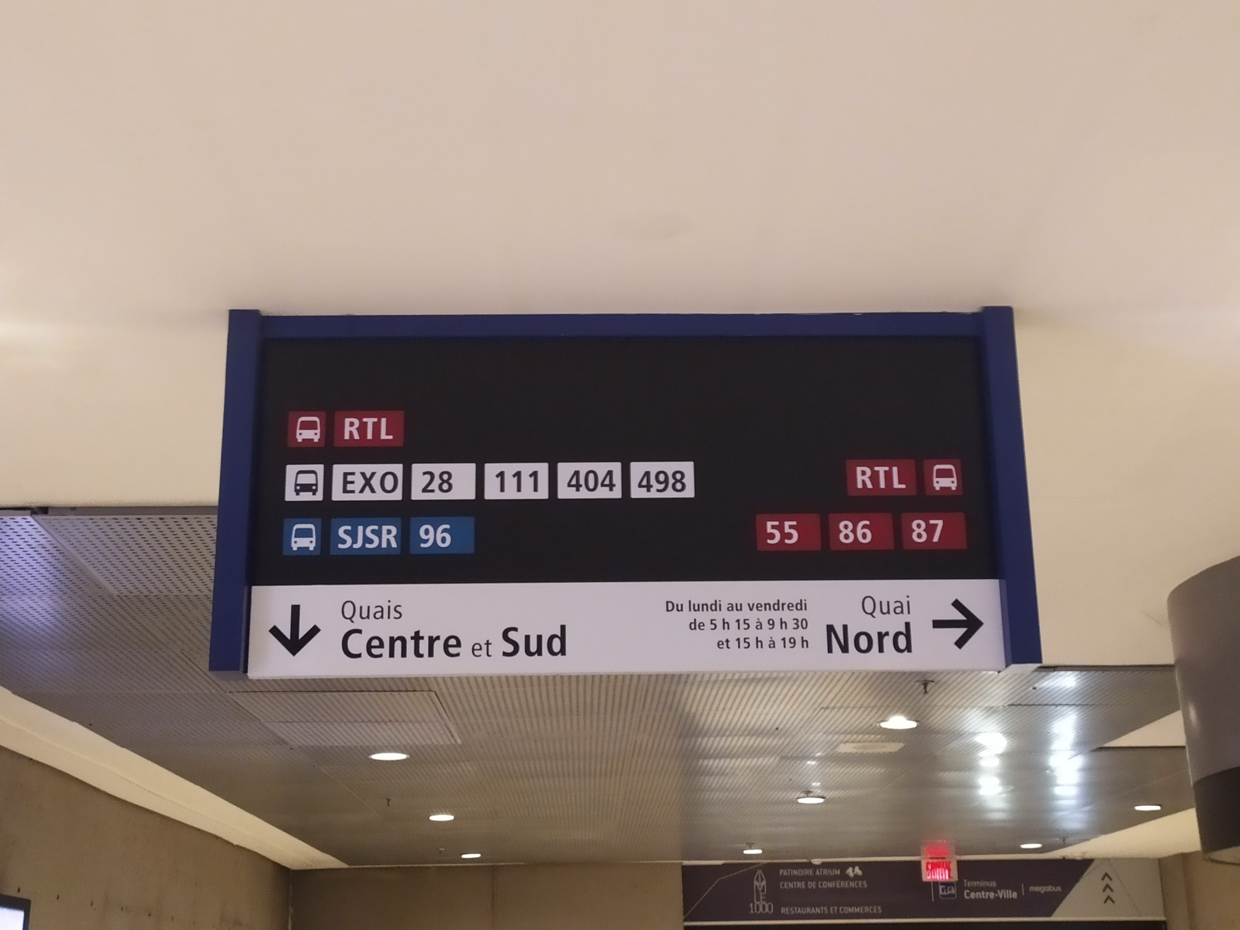
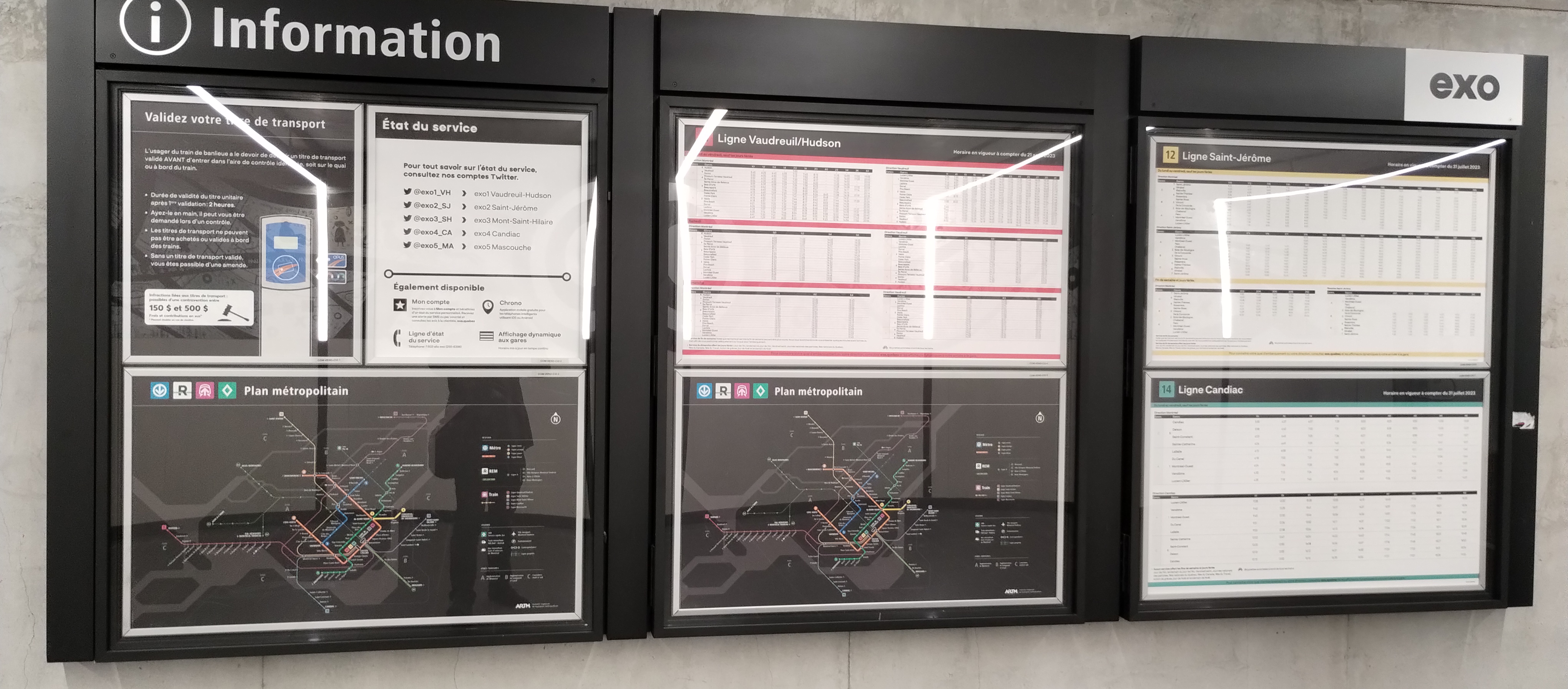
La signalétique dans le TCV est maintenant à jour avec les lignes d’exo. Par contre, la RTL y est affiché à 2 endroits différents pour une quelconque raison.
Aussi, à la gare Lucien-L’Allier, on y retrouve encore une carte datant de plusieurs années puisqu’on peut y voir la ligne Deux-Montagnes et l’AMT.
5 « J'aime »
Il semble que le quai sud soit exclusivement à l’usage du RTL
Ceux du Quai Nord ont été installés quand le REM a ouvert et les autres, pour les Quais Centre & Sud ont été rajoutés par après, lors de la fermeture du terminus Mansfield
11 « J'aime »
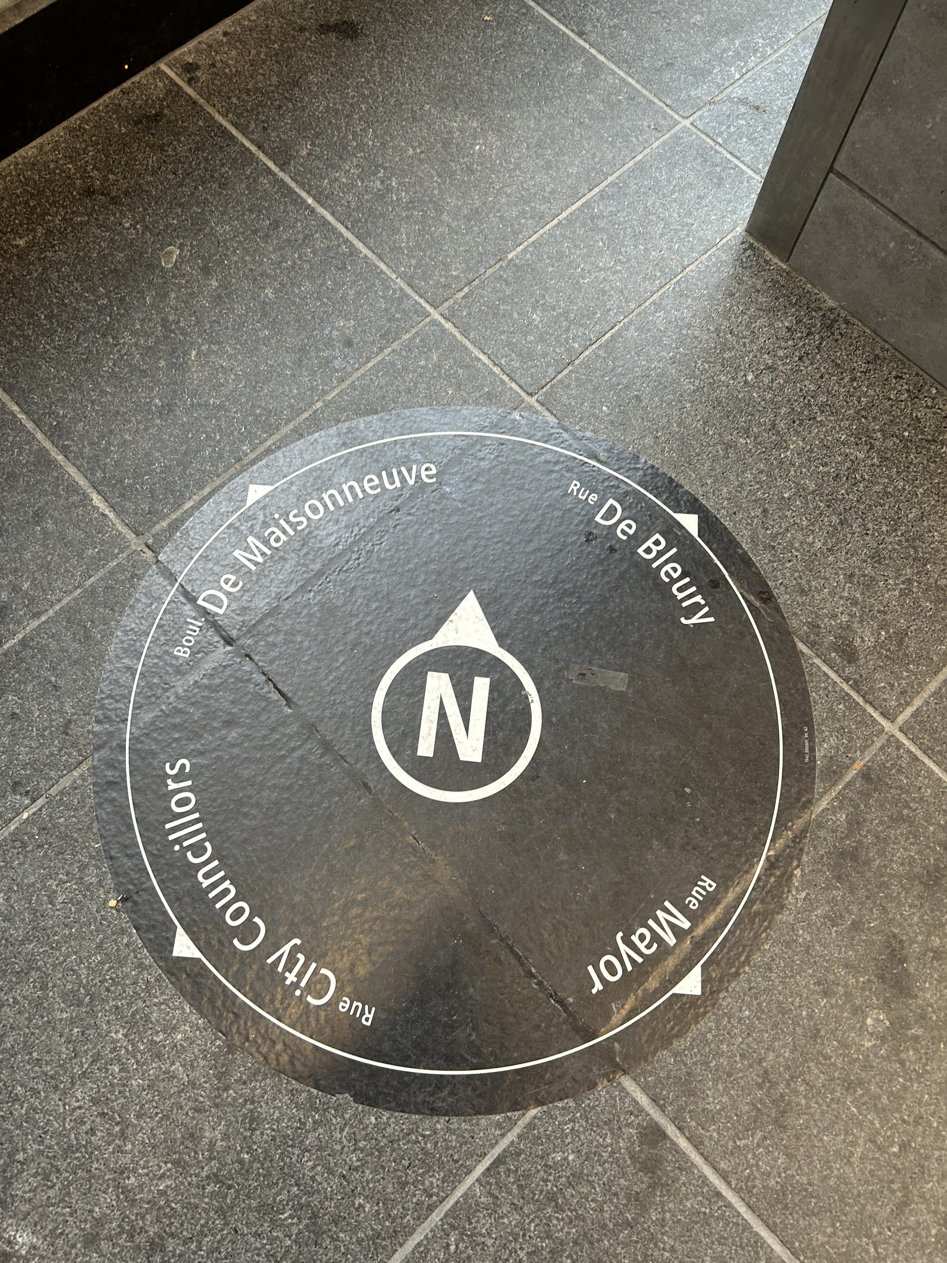
Vu au métro Place-des-Arts. Intéressant pour s’orienter. Encore que beaucoup de gens ne savent pas distinguer les 4 points cardinaux… mais bon, c’est utile aux autres!
9 « J'aime »
Intéressant. C’est supposé d’être déployé dans chaque station qu’ils refont la signalétique, mais je le vois très rarement (je l’ai juste vu quand ils ont refait la station Beaubien et pas vraiment après). Par exemple, la station Crémazie, n’en possède aucun.
Est-ce-que ça fait encore partie des outils signalétiques de la STM?
Ça pointe le nord géographique ou le nord montréalais? ![]()
10 « J'aime »
Nord géographique.
1 « J'aime »
sinon il pointerait drette sur de Maisonneuve ![]()