Bref, on comprends que ce panneau de signalisation nous dirige vers l’Ontario et qu’il faudrait passer à travers Ottawa pour aller à Gatineau.
Tout à fait d’accord avec cette partie là.
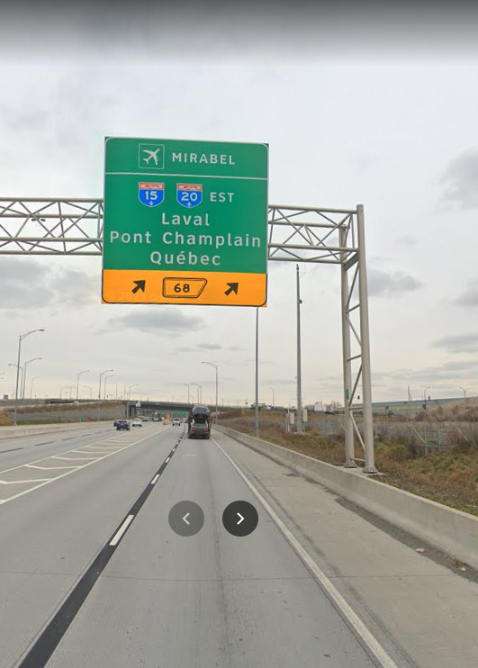
Ce qui n’est pas clairement indiqué, c’est la disposition des voies qui vont à quelle rampe.
La voie de gauche ne permet pas d’aller sur l’A520 et l’aéroport (sans avoir à prendre l’autoroute Transcanadienne/A40). Il faut être sur la deuxième à partir de la gauche (qui ne donne entre autres pas accès à l’autoroute Transcanadienne). Or, c’est à la première pancarte que l’on devrait connaître notre voie pour pouvoir faire le changement de voie de manière sécuritaire.
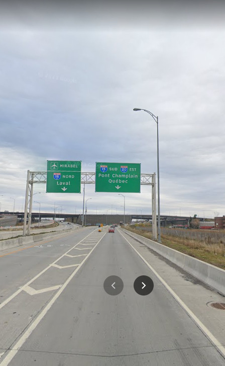
D’ailleurs, même mon deuxième exemple n’indique pas la quatrième rampe, qui amène sur la R117 et le boul. Décarie, qui est la deuxième voie à partir de la droite. Seule les pancartes au loin révèlent la véritable configuration.
I hope the branding will be consistent across other bus companies too, like with RapidBus and Metrolinx
4 « J'aime »
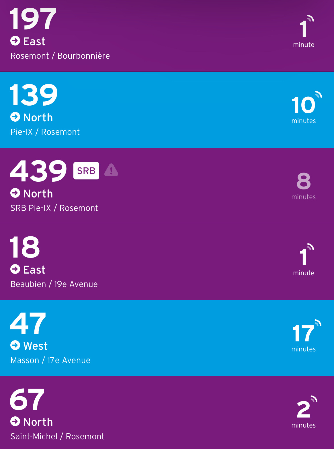
Mon exemple favori:
Aucun autre panneau entre les deux, cette bretelle d’autoroute est flambant neuve, et les conducteurs sont obligés de zig-zaguer à la dernière minute.
4 « J'aime »
Ça m’est arrivé cet après midi à cet endroit même ![]() . Je me suis retrouvé voie de gauche et au presque dernier moment j’ai vu qu’il fallait que j’aille voie de droite.
. Je me suis retrouvé voie de gauche et au presque dernier moment j’ai vu qu’il fallait que j’aille voie de droite.
Au moins j’ai passé tout le trafic de la 20 ahah.
I never understood why l’ARTM never publicly released their design guide. When I asked their social media managers, they just replied that I’d be able to see it in action as they gradually deploy it in their system.
Meanwhile, the STM’s entire guide is available in pdf form since day one of them announcing their signalétique.
3 « J'aime »
Because I don’t think there is one (correct me if I am wrong). It’s just the font, icons and colours that are standardized.
2 « J'aime »
I really hope not. That is not a complete design system.
I’m surprised, the STM actually responded to my question! They refer to the coloured circle as the “dot” (so blue dot, orange dot, etc). The number (and letter in the case for the REM) is referred to as the “line code.” Together, it is the Line Nomenclature system.
9 « J'aime »
STM is branding the metro with the route now too:
6 « J'aime »
There is one, it is currently being updated and finalized. They told me they’ll share it if it is available to the public.
4 « J'aime »
Cette capture provient de quelle application ou site?
It comes from the new 874 bus article:
2 « J'aime »
Frequent buses are here!
It’s a downgrade of service, compared to 10 min max service (eg it ends at 8pm instead of 9pm). In addition, it really shows how the STM is only catering to a particular type of commute, that is peak-hour away/to downtown.
Massive let down, especially compared to Boston, which has half the amount of resources of the STM, 30 proposed high-frequency 5am - 1am, Monday to Sunday, 15 mins max routes.
I’ll be working on an article soon about this.
4 « J'aime »
It’s also seemingly (in the case of the 470) only peak direction as well. What does this really add to the end user? I suppose its helpful to know that a bus comes frequently, but it’s not like this is a superior/different mode of transportation that necessitates a new colour.
Buses that go express (like really express, not like I skip every other stop… cough cough 468), that use heavily prioritizing/dedicated infrastructure, sure. A local bus that comes a lot getting a different colour just seems confusing to me.
2 « J'aime »
I agree a 100% with you. I critiqued this in the proposed vision of the STM in my article by saying this:
“I acknowledge it is good to separate frequent and reliable bus services out from the pack, but the way that the STM wants to do this, is perplexing at best. I believe it is useless to mention even their proposed “800s” since those routes are only reliable for a few hours during weekdays and not all the time.”
For context, the 800s was STM’s original idea to display only peak direction routes.
I just think that colours is not enough to differentiate routes, because, for example, when you say out loud or by text, it’s hard to understand that a frequent route is frequent when you just say “18.” At least, that was my logic to add a letter, such as the “M” so when you say out loud or text the route it’s “M18” and thus it is understood it is frequent even without the colour present.
It’s also perplexing that the Pie-IX BRT/SRB has no differentiation, as it’s a completely different class of service with dedicated infrastructure. Again here, that’s why I introduced a “R“ notation for that route, specifically to separate it out.
2 « J'aime »
cette mauve ne devrait s’appliquer qu’aux corridors SRB actuels et futurs. c’est du désordre présentement en plus d’être tout simplement laide. aucun usager n’a l’avantage de savoir quelle ligne a un service à peine utilisable (uniquement en semaine, uniquement dans le “peak direction”). Surtout pour le 55. Cette ligne est une blague
1 « J'aime »
Seen at Côte-Vertu, they seem to like stickers:
From: https://instagram.com/chrissymessy_transit?igshid=MzRlODBiNWFlZA==
Transit App is working on adding the outlined buses, vs the filled in ones, but couldn’t do all those changes fast enough. In the meantime, all the buses are solid purple on the map. I wonder how long it will be till Google and Apple Maps implement these changes.
Also just want to note, these colours are VERY similar to NYC:

Here’s Montreal to compare:
6 « J'aime »
@mashdash I wonder how long they will stay up haha. There are still a few of the number changes back in 2012, but faded by now.
2 « J'aime »
New York has it right IMO in having the 4 distinct services.
Local - Slow, Excellent Coverage
Limited - Same as local, skips some stops, Marginally Faster (gets a little note on buses and in apps, not a full colour)
SBS - Off-Board Fare payment, all door boarding, upgraded infrastructure, decently fast for short trips.
Express - Makes very few stops, Comfortable/Faster for long trips. (personally found the BxM2 excellent when I visited and found that this type of service would be hugely valuable on-island in certain applications)
The only frequent bus that gets special treatement is the SBS. The speed matters, not the frequency because the frequency of the bus doesn’t matter when the bus is in front of me, though I might want to know if it’ll get me there faster.
I’m looking at you TGF…
2 « J'aime »