I think it’s fine for them to use numbers, but you’re right, to differentiate maybe they could use 3-digit line numbers for buses with the system that someone mentioned a while ago (I think with 1XX being sub-10-min frequent buses, 4XX being express, 3XX being night buses? … etc).
I personally am not a fan of double-letter line signs, but single letter could have been good, although the REM taking “A” messed that option up.
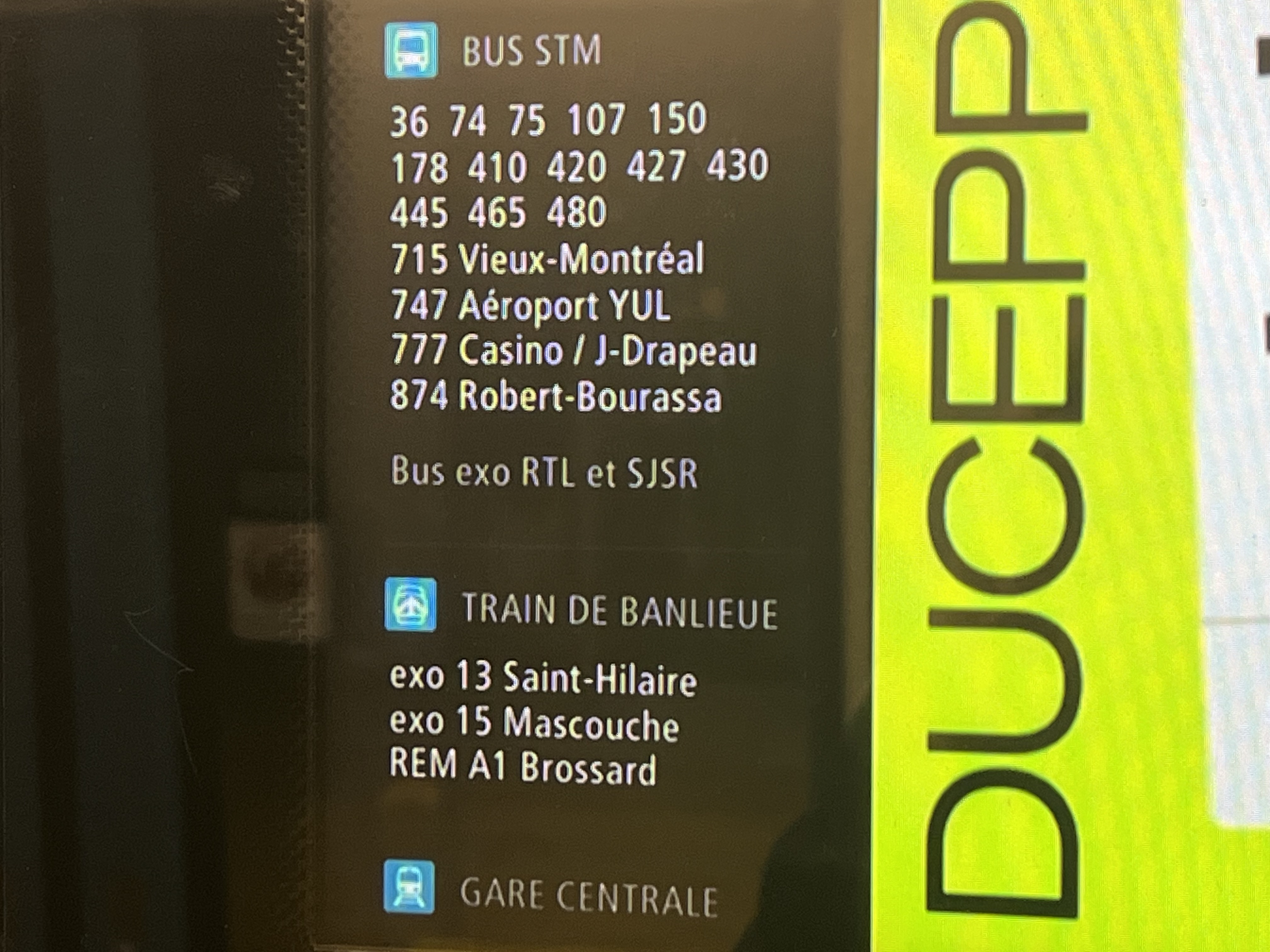
Connections the AZUR trains currently say for Bonaventure. Not sure what 874 bus is (REM night bus?), also the REM is under the commuter trains lol
1 « J'aime »
It does list the 178, which was abolished.
If I recall correctly, 800-series were shuttles. No idea what that shuttle would be though.
Also, for a moment, I thought that the 480 linewas the one that was renumbered to 178 in 2012 ![]()
Edit: It could be the 74X, as mentioned here:
It is, and 800 seems to be for shuttles that are temporary, such as the 811 which ran over the mountain when it was closed to cars. This makes me think it was a planned shuttle bus till Griffintown station opened maybe
1 « J'aime »
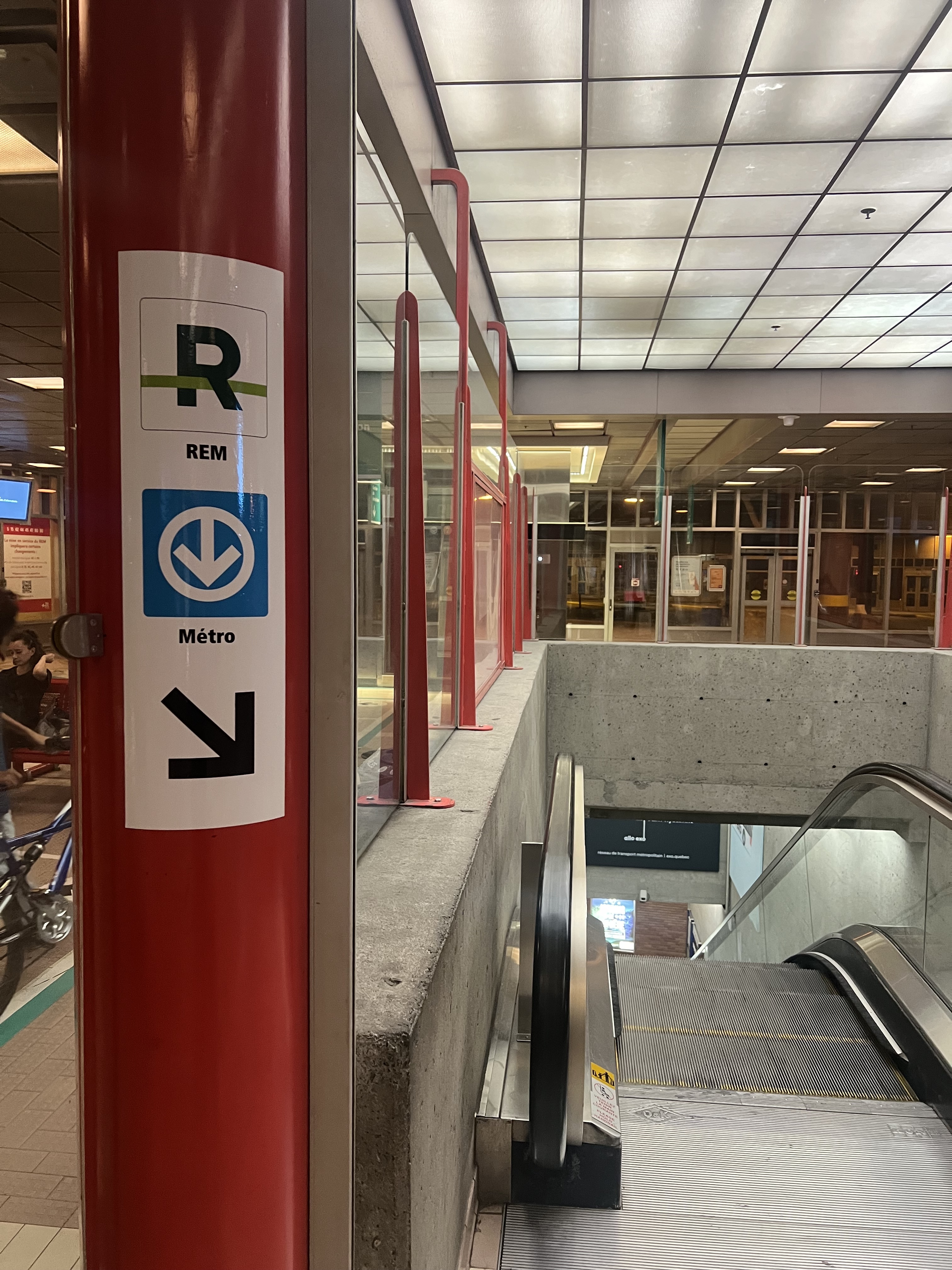
Interesting that they have added (exo) (line number) (line name) for Gare-Centrale. At Sauvé, it was not mentioned exo. Perhaps it’s just because the REM is marked there?
I think the reason for the logo not being updated and the REM being under commuter trains, is because the AZUR software does not allow for this flexibility. I hope soon they will revamp the interface!
1 « J'aime »
Looks like the lines are just sorted by alphabetical order. If exo’s line 9 was a train, it’d probably be listed after line 15.
STM told me several things about the image I shared. Firstly, this was done through a simple express update. Their IT department is currently working on updating the logos and organizing the REM as its own category. Additionally, the 874 bus will be real starting October 2nd, and the 178 will be removed with the next update.
13 « J'aime »
This is the first sign I’ve seen with Line 2 - Orange marked with the number, it’s interesting:
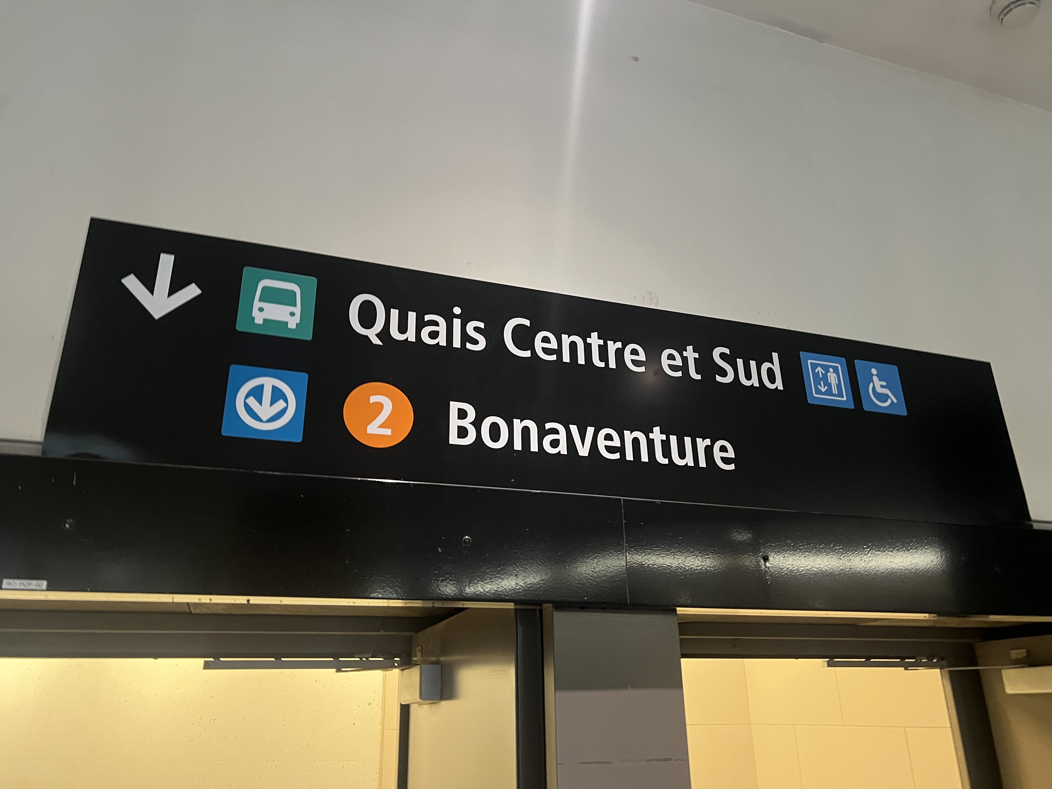
Additionally, signs at TCV now point to the REM and Métro, they seem to be rushing to add them before I do (I was noticing no sign to the Métro here before the REM opened):
15 « J'aime »
The line number inside the coloured disk makes way more sense.
4 « J'aime »
Does the STM/ARTM call this a “bullet,” like in NYC, or maybe more general, route emblem? You used the word disk which also works
1 « J'aime »
I really have no clue what’s the official name for the STM maybe “pastille”, “point” or “disque”?
4 « J'aime »
Ça pourrait être bien de mettre le logo de la ligne A à côté du REM… étant donné que c’est ça qui est indiqué sur les plans dans le métro.
1 « J'aime »
I absolutely hate all of those signs that the ARTM has posted recently. It feels like they are just trying a bunch of things to see what works best and can’t be arsed to look at best practices world wide. There’s a lack of consistency from one sign to the next in the way that information is displayed. They really need to develop a standard set of rules and codify them.
8 « J'aime »
Well said.
They should really inspire from the 300 page behemoth that is Metrolinx Standardized Signage.
Check it out here
1 « J'aime »
Don’t worry, you’re not the only one with this opinion. Quebec is actually one of the few places that doesn’t think of wayfinding as an important aspect, at least according to the people at the company I’m working for, and they’re trying to change that, which is why they hired me (me doing my own signs is exactly their motive, pushing for change to make good signage a standard in Quebec).
In the case I’m working on right now at Concordia, the signage is not the best in many areas, because it’s like you said with the ARTM signs, inconsistent. The signs that aren’t great are temporary though, and permanent ones are being designed and have to be manufactured, which can take about a year for it to be finalized, if not more (depending on how many back and forths it takes between the client and designer). Hopefully this will be worked on, and something permanent will be done in the long term.
9 « J'aime »
Effectivement. Surtout si l’on veut être consistant.
Just looking at how our highways signage is wrong in many places confirms this, especially for telling which lane goes where in advance.
However at YUL and in Canadian airports in general there seems to have a standard, consistent and functional signage.
3 « J'aime »
Merci pour avoir soulever la signalisation autoroutière.
Pour une raison quelconque, la MTQ mette toujours le panneau le plus complexe et détailler sur la rampe déjà, alors ça sert a absolument rien. C’est trop reculer pour que tu puisses l’utiliser pour prendre une décision.
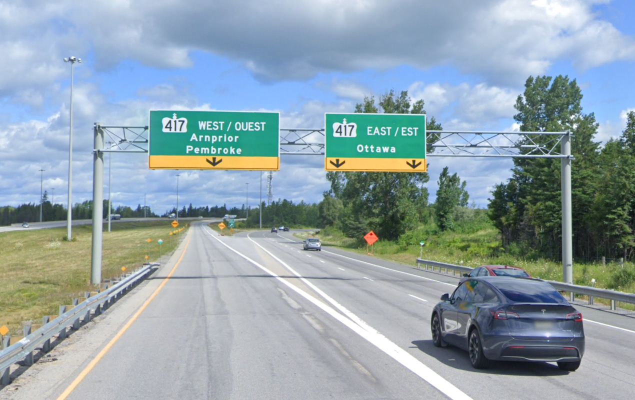
Je ne sais pas pourquoi la signalisation au Québec est moins bon, mais j’ai toujours eu cette impression. En Ontario, les panneau sont beaucoup plus simple et mieux placer. Tout ce qui est mauvais avec la signalisation autoroutière au Québec s’applique souvent aussi au signalisation TEC comme tu as dit.
3 « J'aime »
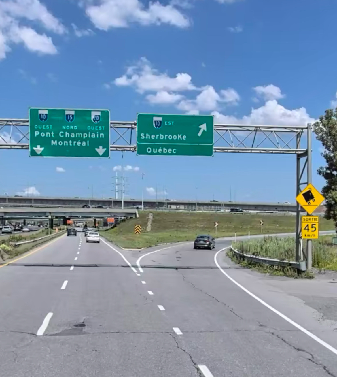
Le panneau du Québec en exemple est en fait de niveau fédéral.
Ça n’en défait pas que la signalisation au Québec laisse à désirer.
De la signalisation confuse, on peut en trouver partout.
Et pourtant, ils sont capables d’en faire des plus claires (même si mon exemple peut également être amélioré).
3 « J'aime »