Bus signage redesign
I have been working on and off (with my little free time) since April 2023 on (re)designing a bus stop sign. Since then, I had done three revisions to get to the version I am at now, where I feel it is at a presentable stage.
I have written a blog post about it if you want to read in-depth about the issues with the current signage, my solution, inspiration and the steps I have taken since last April.
Here: Understanding your local bus network should not be as hard. – Cole Dev Blog
If you want to read major portions of the article, click on the icon next to “Post Navigation” and read the “Recommended Readings.”
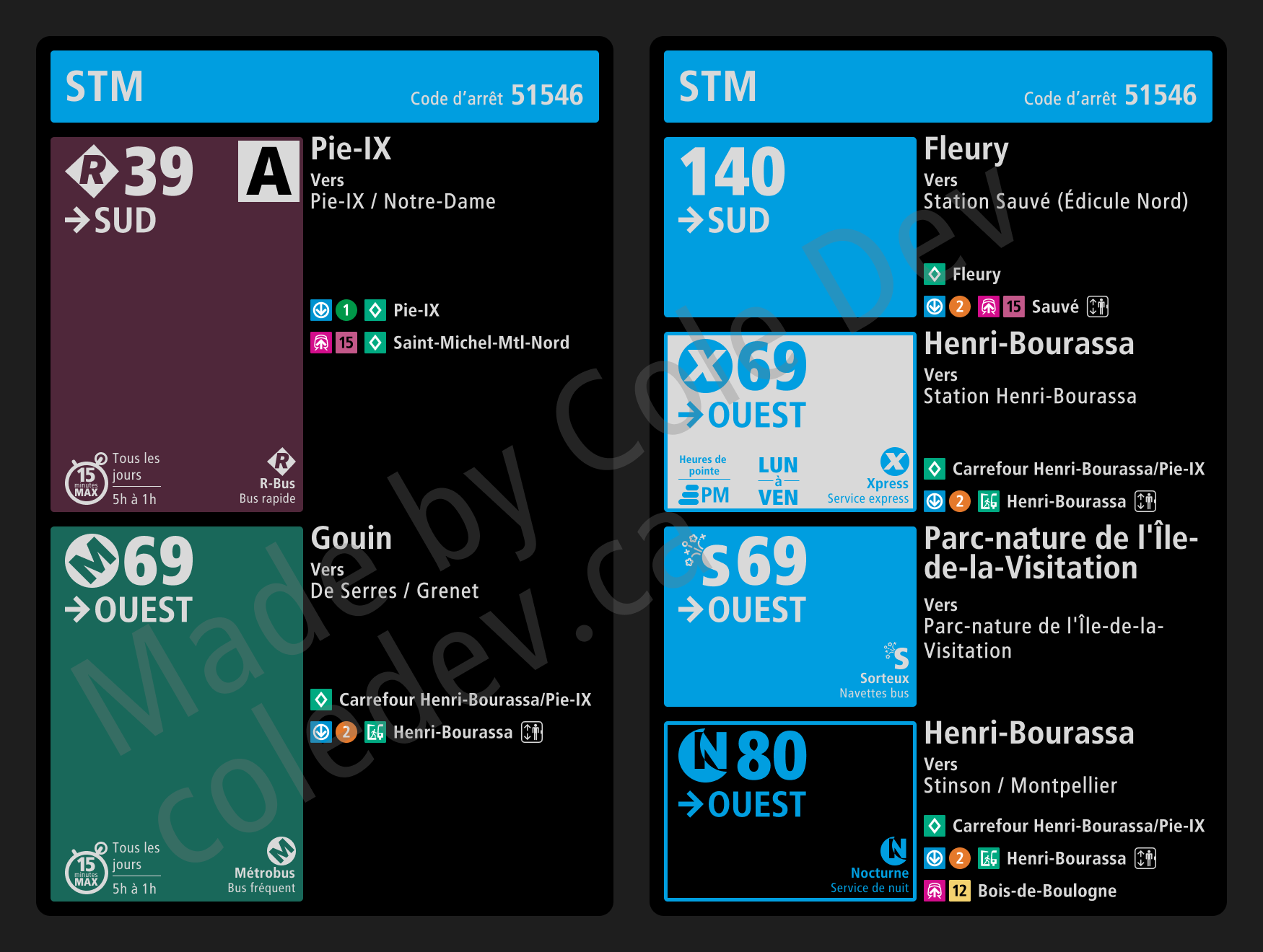
The new sign

See full size here.
More information
Read more about the problem here.
Read more about the solution here.
There is a wealth of new information present on the sign. However, I wanted to show more information than today’s sign. Mainly this is due to a complicated end user journey I had discovered here. Thus it has the current stop, the final stop for each route, the name of each route and the next major stations on the route (up to 3).
Nomenclature
Read more about the problem here & here.
Read more about the solution here.
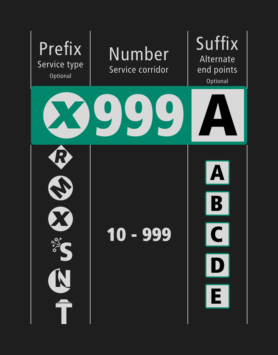
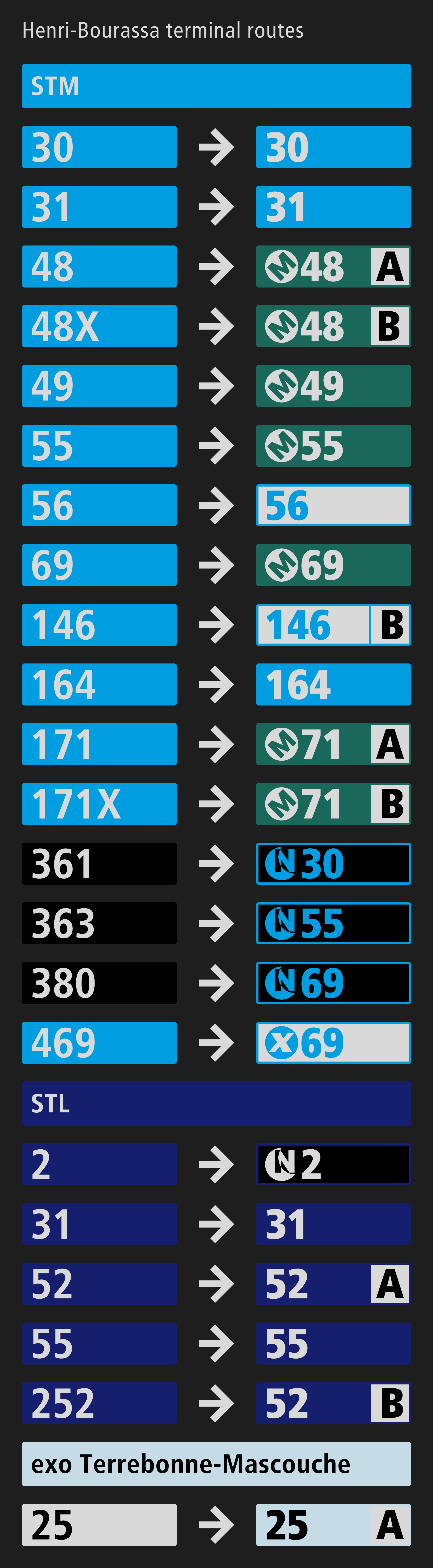
The biggest change is the new prefix-number-suffix nomenclature system. The prefix, vulgarizes the different service types much better. The suffix communicates the route variation rather than just adding the “X.” As I discovered, the “X” could be mean short line, extended line or route variation.
The new prefixes gives way to a better way of organizing bus routes:
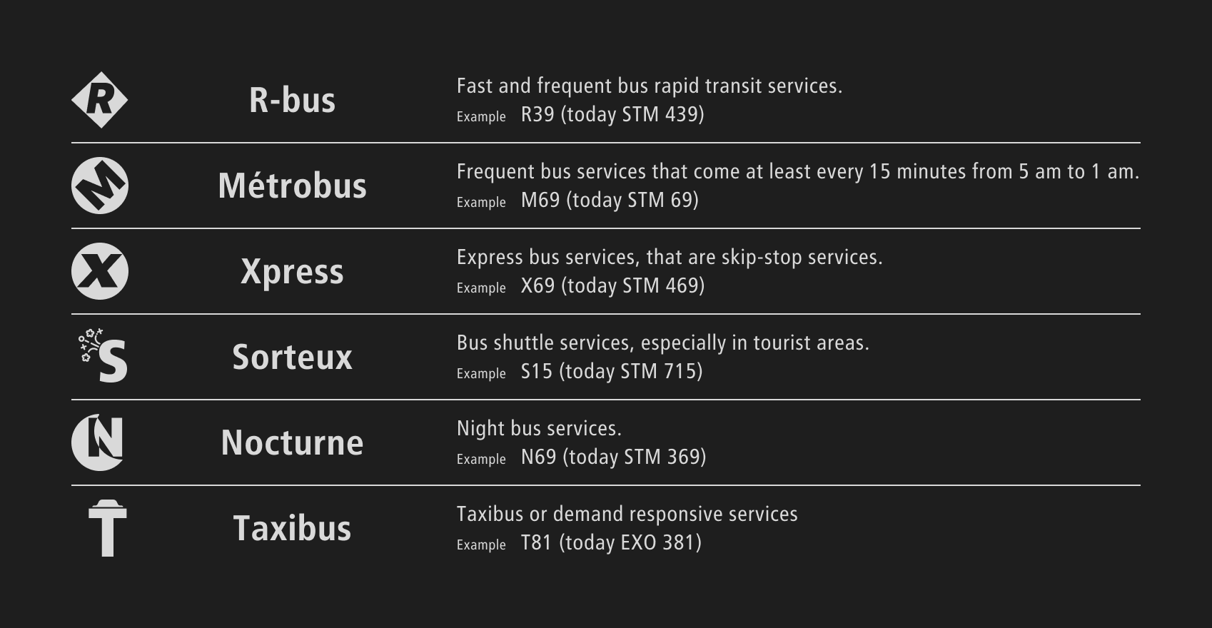
Personal anecdote, I have spoken with a few of my friends, and almost none of them knew that the 400s for the STM are express routes. When I told then what did they think would be the meaning for the route X20 for example, they said immediately it has to be express.
Colors
Read more about the problem here.
Read more about the solution here.
Instead of exo just having a white color, I had decided to break it into many colors for each sector. Additionally, routes that operate during limited hours or days have a colored outline and a white background. Those that operate solely during the night have a colored outline and a dark background.
Schedule & Route Map
Read more about the problem here.
Read more about the solution here.
“But we all have phones,” they said. I respond with what happens if the phone dies, privacy concerns, dependence on phones, accessibility issues, etc. But also a study found that bus riders are looking for two key informations, informations that are hard to confirm with a phone:
- “Find a bus with a similar route;”
- “Make sure the bus was in the right direction.”
I centered my schedule design around these two aspects. Along with that, many agencies are also creating braille + raised tactile lettered bus signs, so I designed that one as well for greater network accessibility.
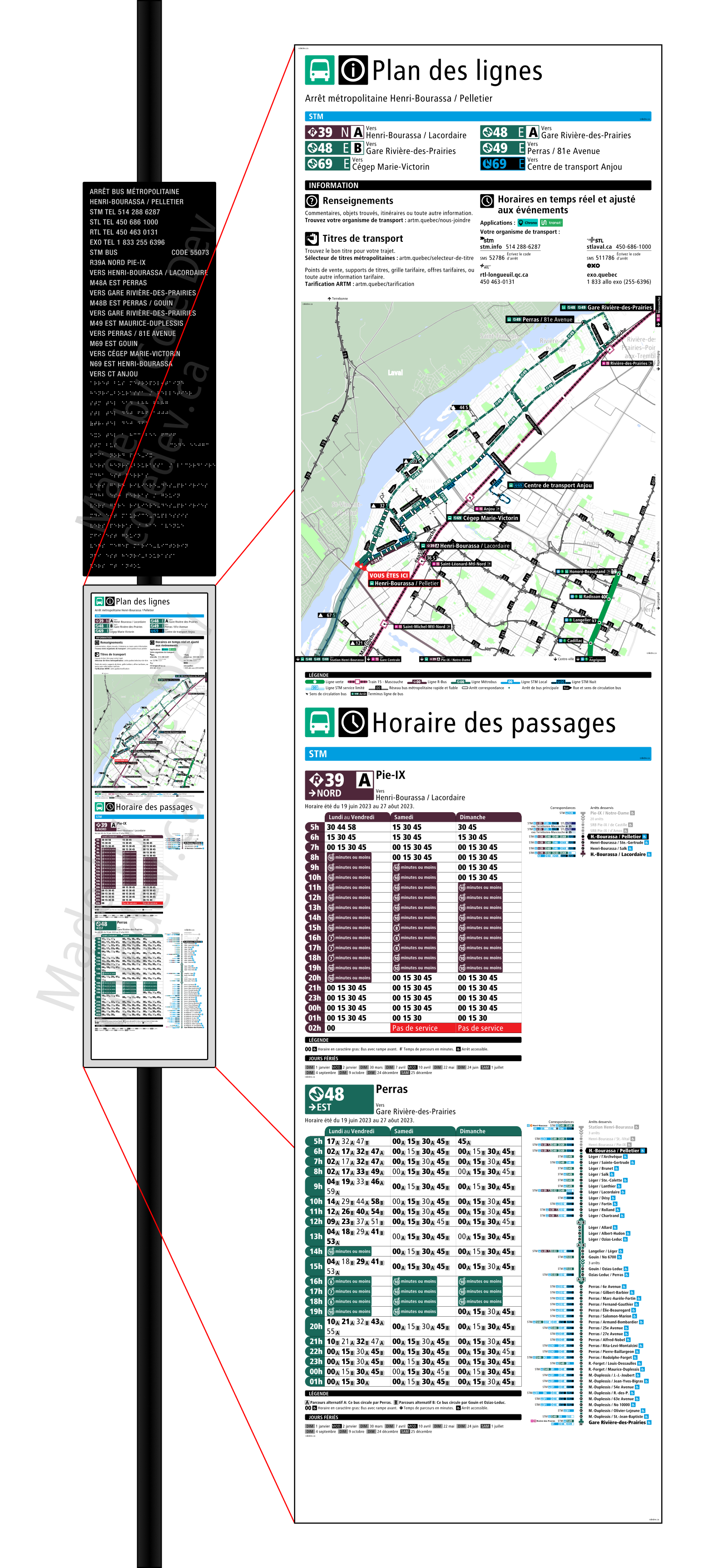
See full version here.
It contains a unified route map, which also displays the frequent bus routes (“R” and “M” type routes; I used GTFS data to map and therefore it does not show the prefixes on the map), so that the user can find routes with a similar route.
A linear map is created to reassure the user is going in the right direction as well as showing the the travel times.
Due to the large effort to create these maps, I expect them only to be posted at major stops. However, it is a far cry from the current signage. Which is disappearing more and more, as the STM is replacing the maps with a suggestion to consult your phone.
Service disruptions
Read more about the solution here.
When service is disrupted, the current signage is lacks hugely. For example, it is common to see people waiting at a stop when the bus does not stop there, and either the bus does not pass or the bus skips the stop and they are left running after the bus or they completely missed it. To better communicate that the bus stop is closed, I had created a “bag” with a pouch that goes over the schedule holder.
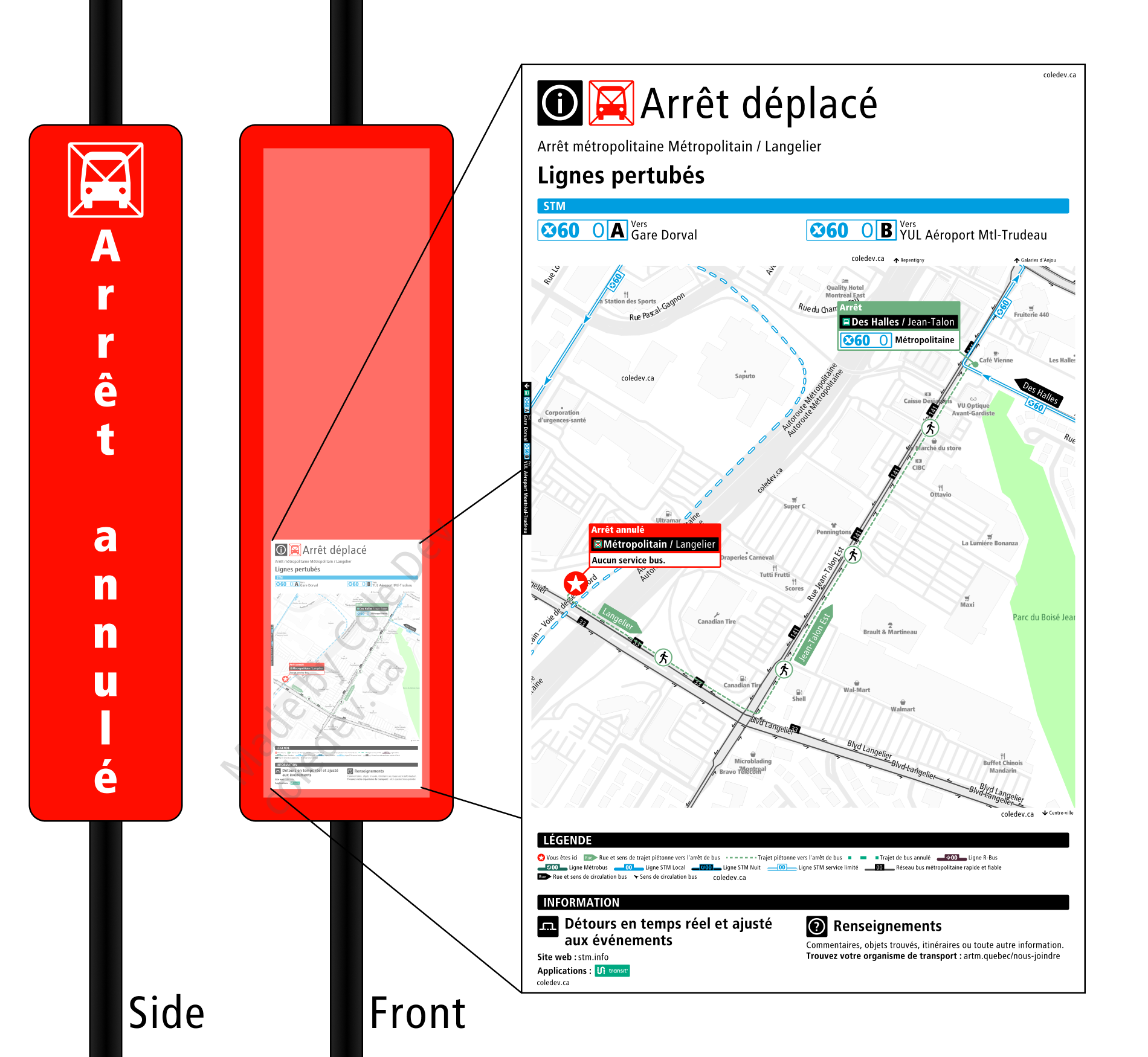
See full version here.
Standardization of signage
Read more about the problem here.
As many know already, a huge issue is that bus stop signs in Montreal vary a lot. My goal with this redesign was to take the best techniques and try to apply them to all four agencies in the area. I think I succeeded quite well.
Concluding thoughts
This will probably never happen. This signage is probably very difficult and expensive to implement, but I believe that there are some good tips that the ARTM and OPTC could take into account once they create a unified bus stop design. What do you guys think?