They don’t really have a choice. Changing the height to accommodate lowercase ascenders and descenders was absolutely the right call, but it leaves them with three options for Bonaventure, Jean-Talon, and Snowdon:
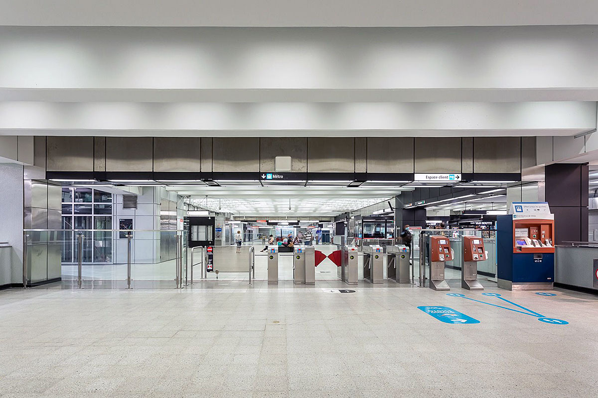
1 — Shrink the type to fit in the old standard. They tried this at Jean-Talon for the Espace client signs, but the type is so small that it’s not legible from any useful distance. I haven’t seen this done anywhere else, so I don’t think they’ll be pursuing it.
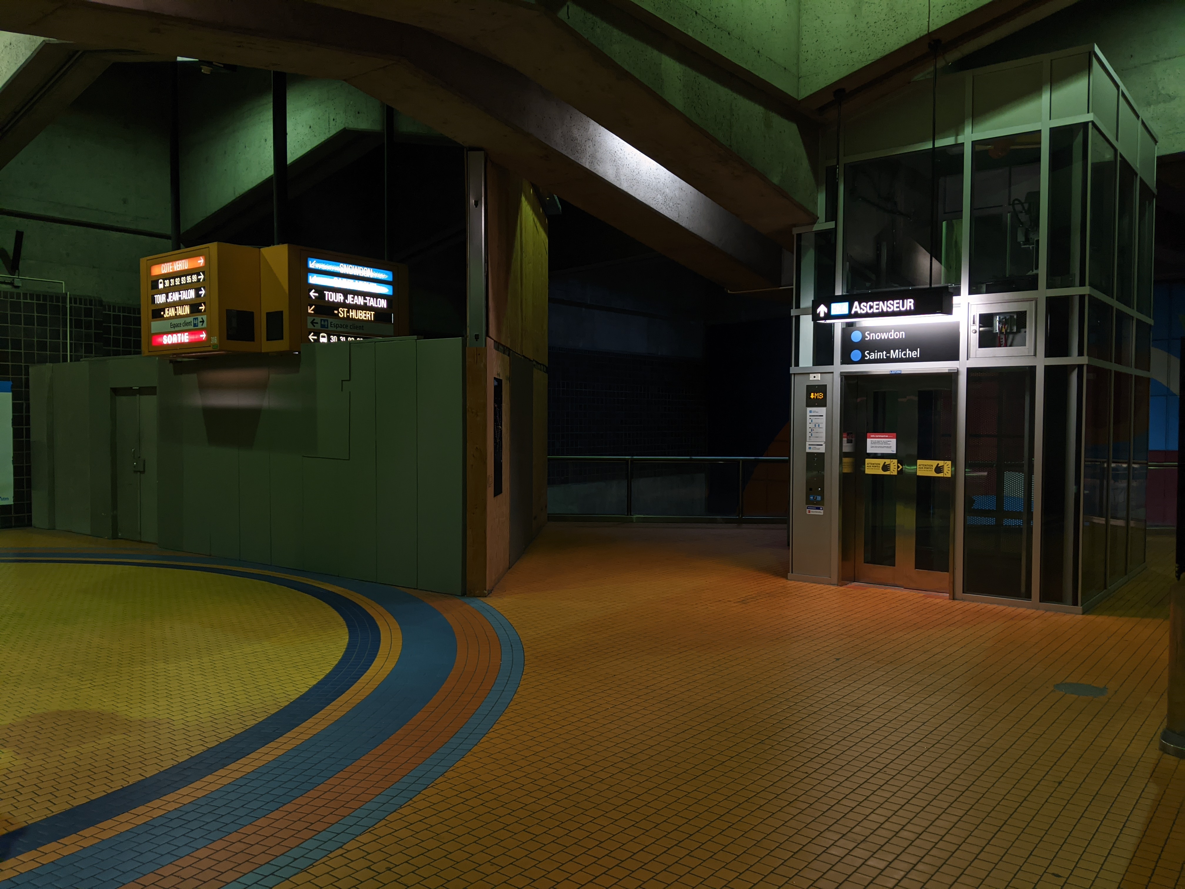
I took this in 2020, the signs are backlit now
2 — Remove the feature signboxes and replace them with standard lightboxes. This would solicit outrage from the architects’ families and heritage orgs, like when the City proposed removing Daudelin’s Agora from Viger Square.
3 — Eventually shell out for new sign housings.
I’m optimistic that they wouldn’t rule it out. When it comes to capital works projects, the STM values adhering to the metro’s design principles, one of which has always been integrating signage into the stations’ architecture. The price difference isn’t as significant, but a recent example is how the updated signage at Acadie has lightboxes with red frames at platform level, respecting the architects’ original decision.
I think we’ll see more like the Berri mezzanine reno, which features something not far off from special signboxes, just without the height restriction.