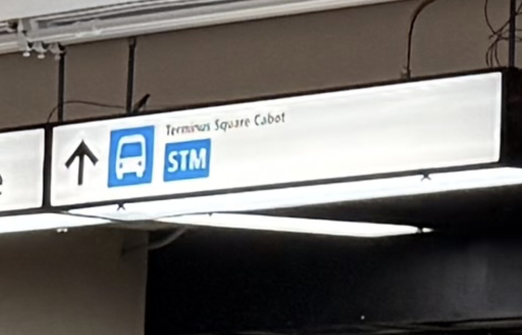
In this image I noticed a newer type of signage standard:
The sign to Terminus Square Cabot features a blue bus logo instead of ARTM green, on a white sign with black text instead of black sign with white text, but also features the text [STM] under it, similar to how it’s displayed at Raddison, where there are too many buses to fit on these signs.
What there should be, is a map on the wall of how to get to the bus terminal and elevators in this station, as well as showing where each bus stops where.
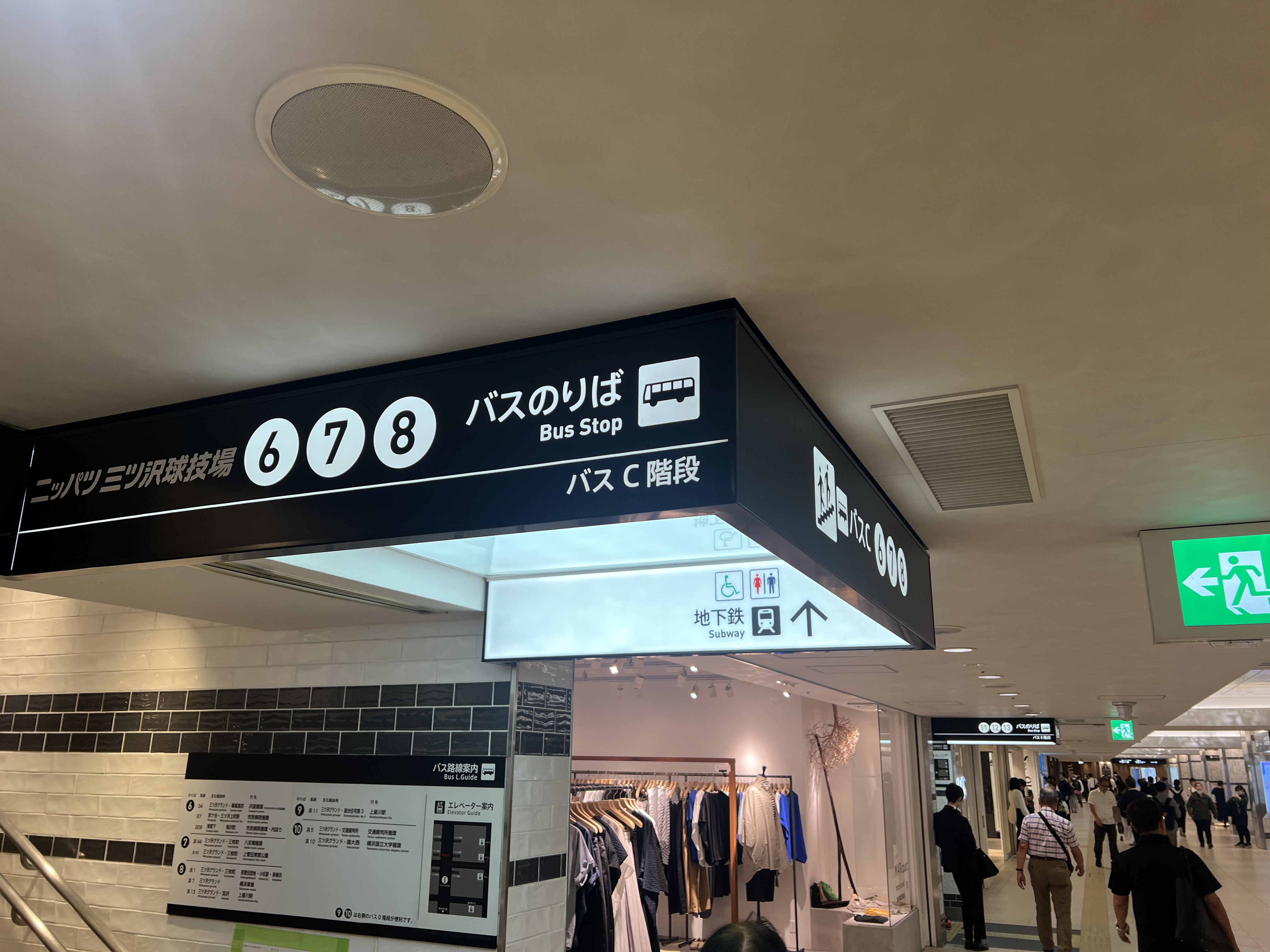
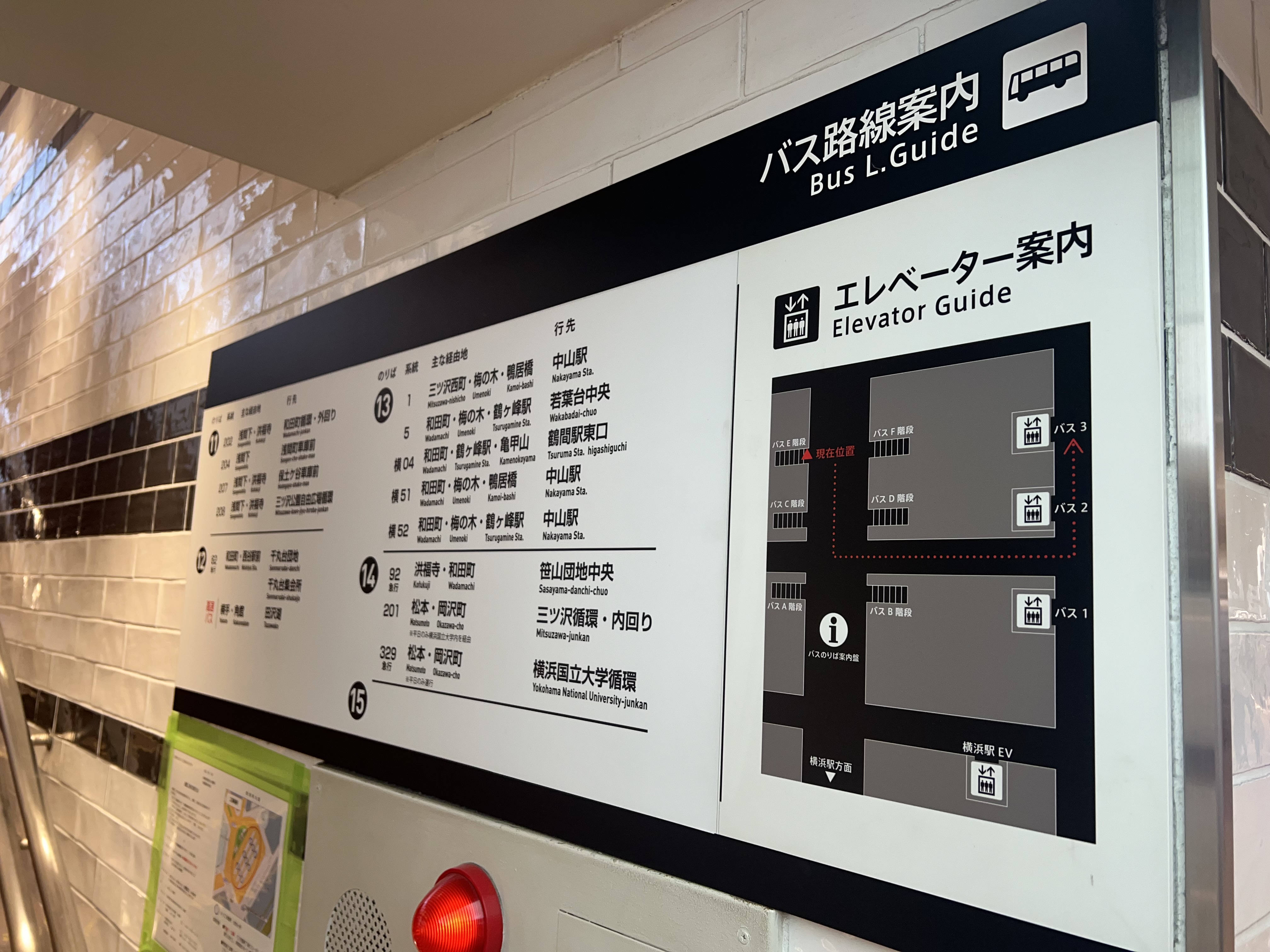
Look here in Yokohama, where there is a mall, attached to a train station, and a bus terminal in one section, like Atwater. There is overhead signage pointing to the services, as well as a map on the wall showing a guide how to get to the elevators, and even what buses are at each bay (Atwater wouldn’t necessarily need this part)