J’ai manqué le prendre en photo en sortant du bureau ![]()
One thing I’ve been wondering myself
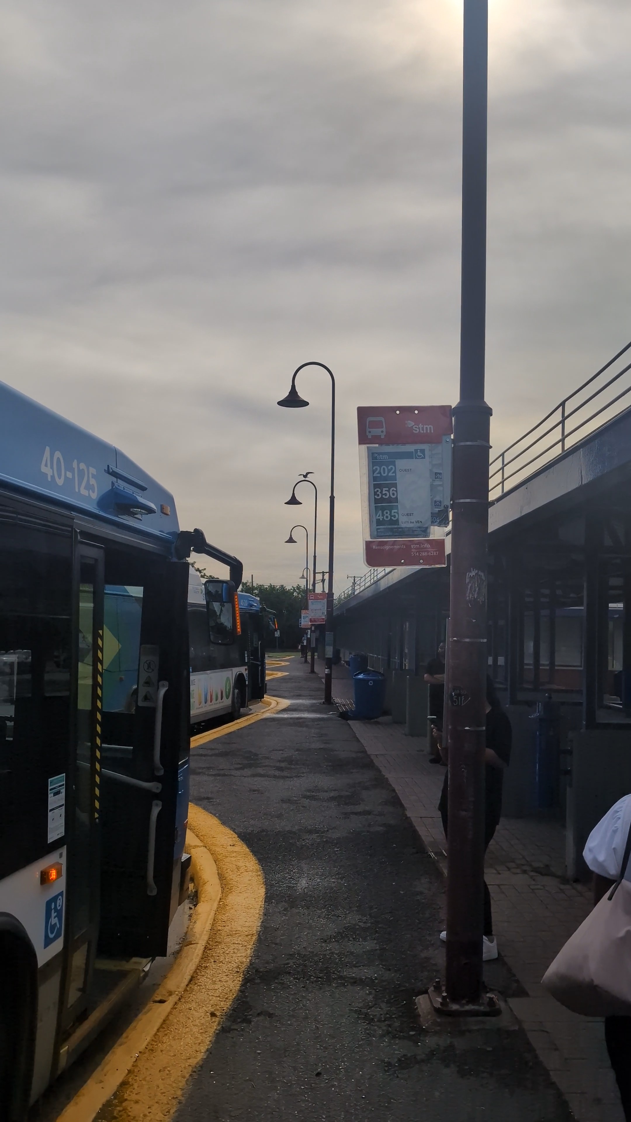
How expensive would it be To coat the bus stop signs with the same retroreflective technology used in stuff like stop signs?
My second question is why were they never installed this way in the first place?
At night in winter, especially those signs are very hard to see
You can clearly see that the car traffic is retroreflective while the one installed by the stm isint
2 « J'aime »
Printer was out of magenta and cyan /s
3 « J'aime »
Also on a serious note, why is Dorval 100% temporary stops… It’s been forever
1 « J'aime »
If someone could ask at there next public meeting about this i would appreciate, i already have some questions that will be taking my 2 slots already
I’m wondering cuz I’m noticing a lot more stm road signs being. Problematic and since the rem would be going in subberbs if they will do it or not
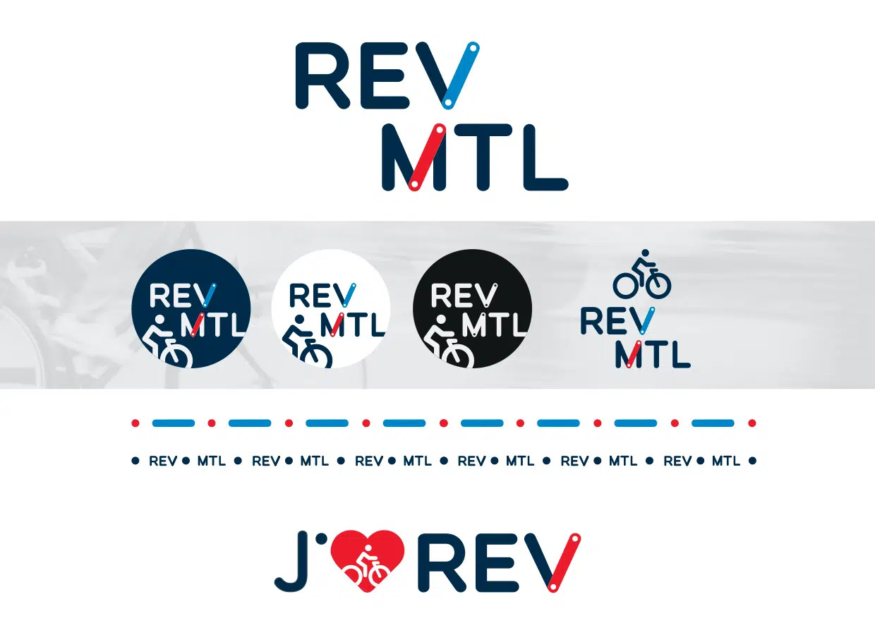
Je veux faire une version «haute résolution» du logo REV avec Inkscape. Est-ce que quelqu’un sait le nom du police (“font”) utilisé? Je sais qu’il y sont quelques experts ici. Si non, je le ferai manuellement.
6 « J'aime »
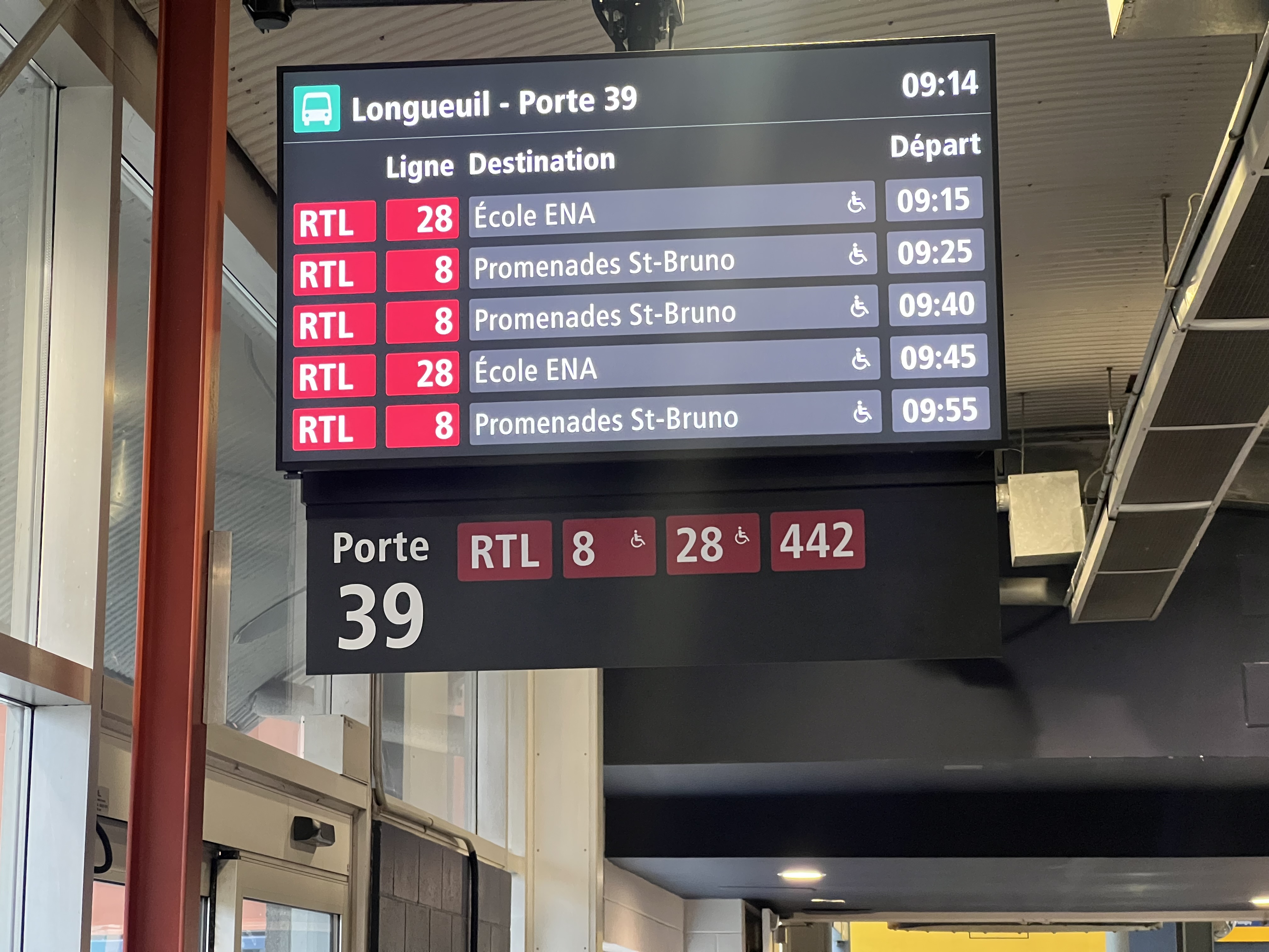
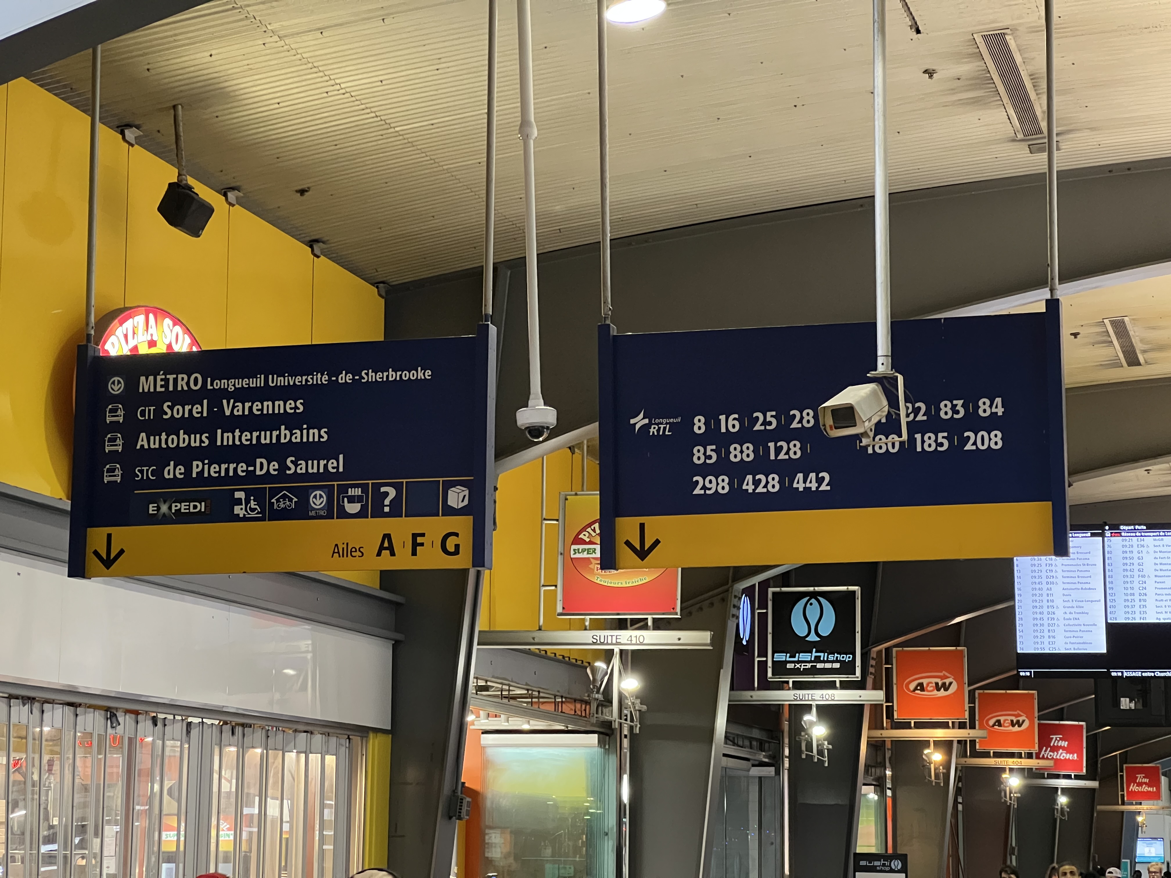
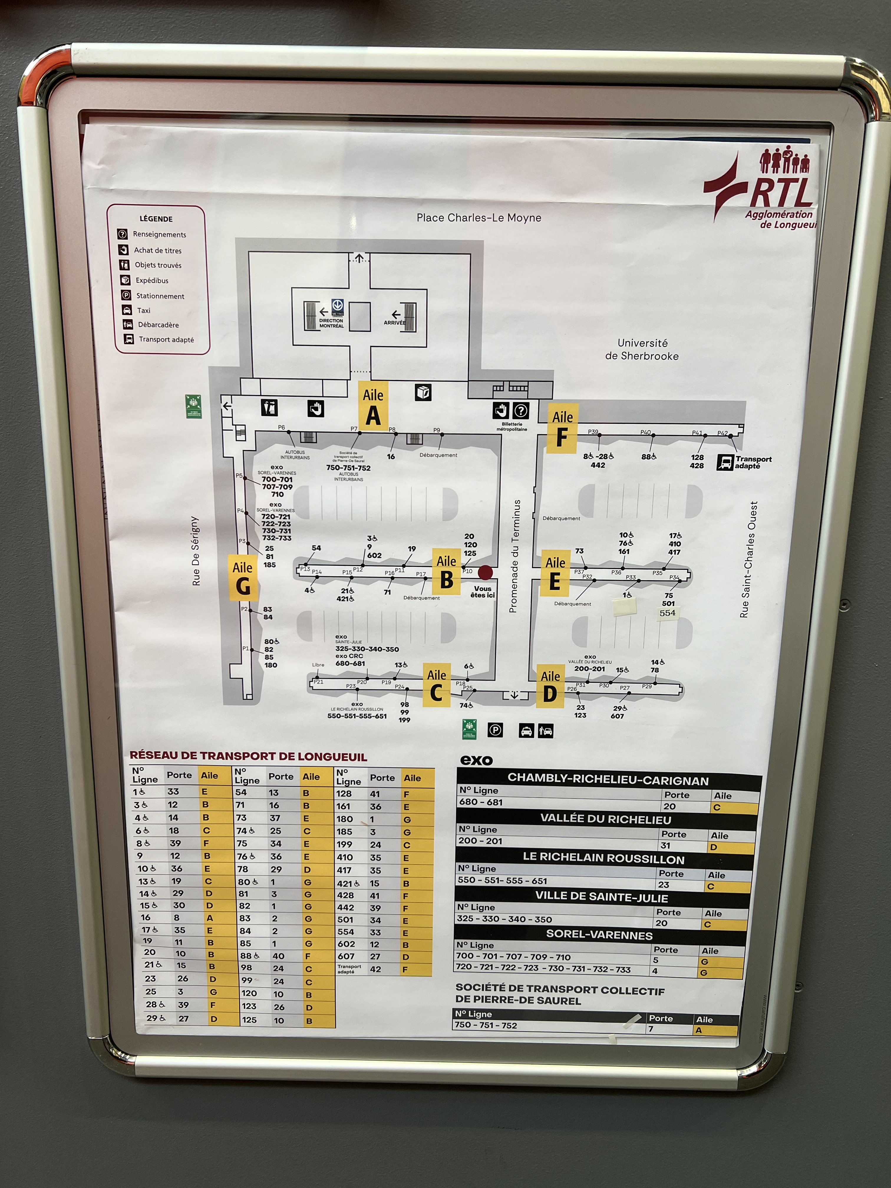
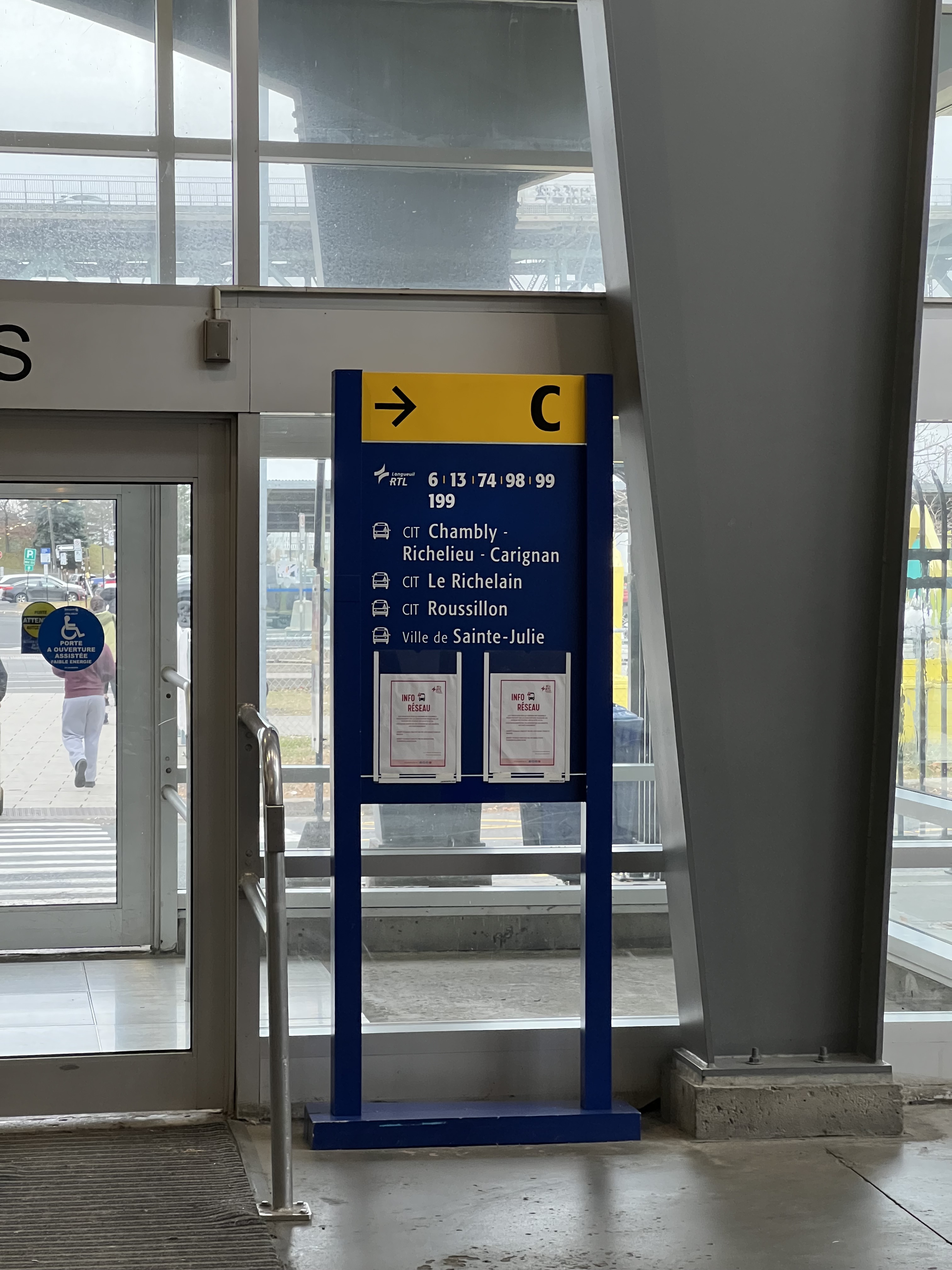
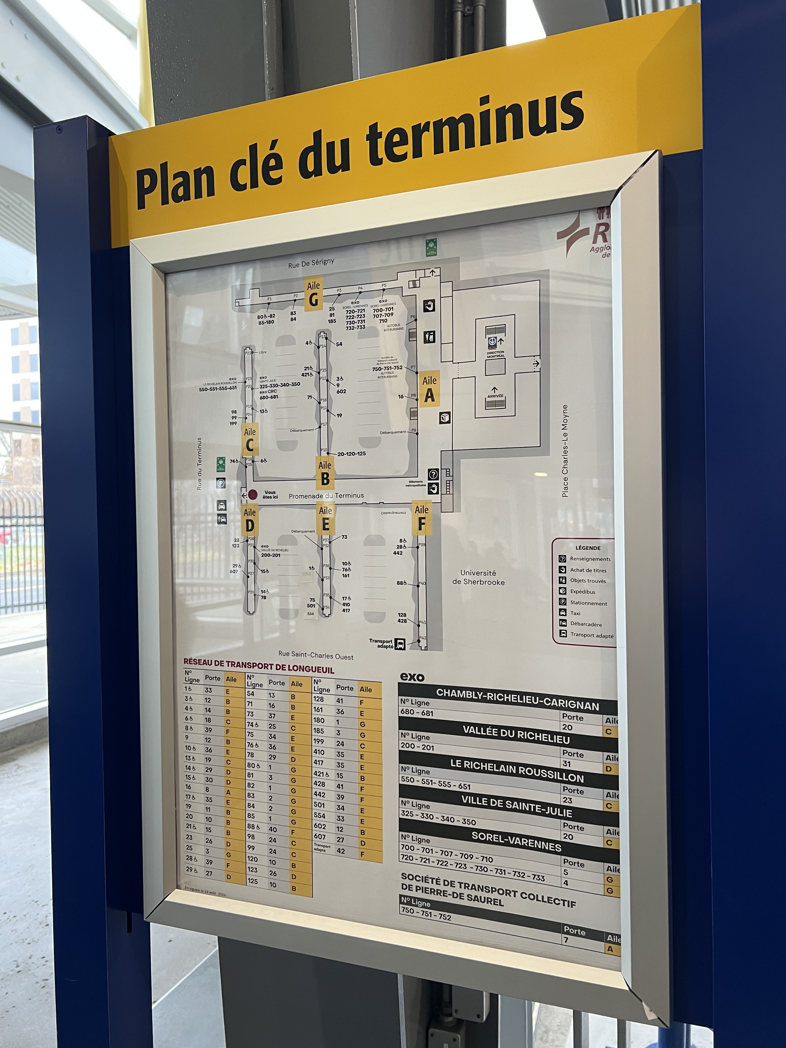
At Terminus Longueuil, the RTL has removed the blue signs and replaced them with double sided black signs with white text attached below the displays. Porte is labeled in small text with the larger text of the number below it, identical to Terminus Panama and Brossard:
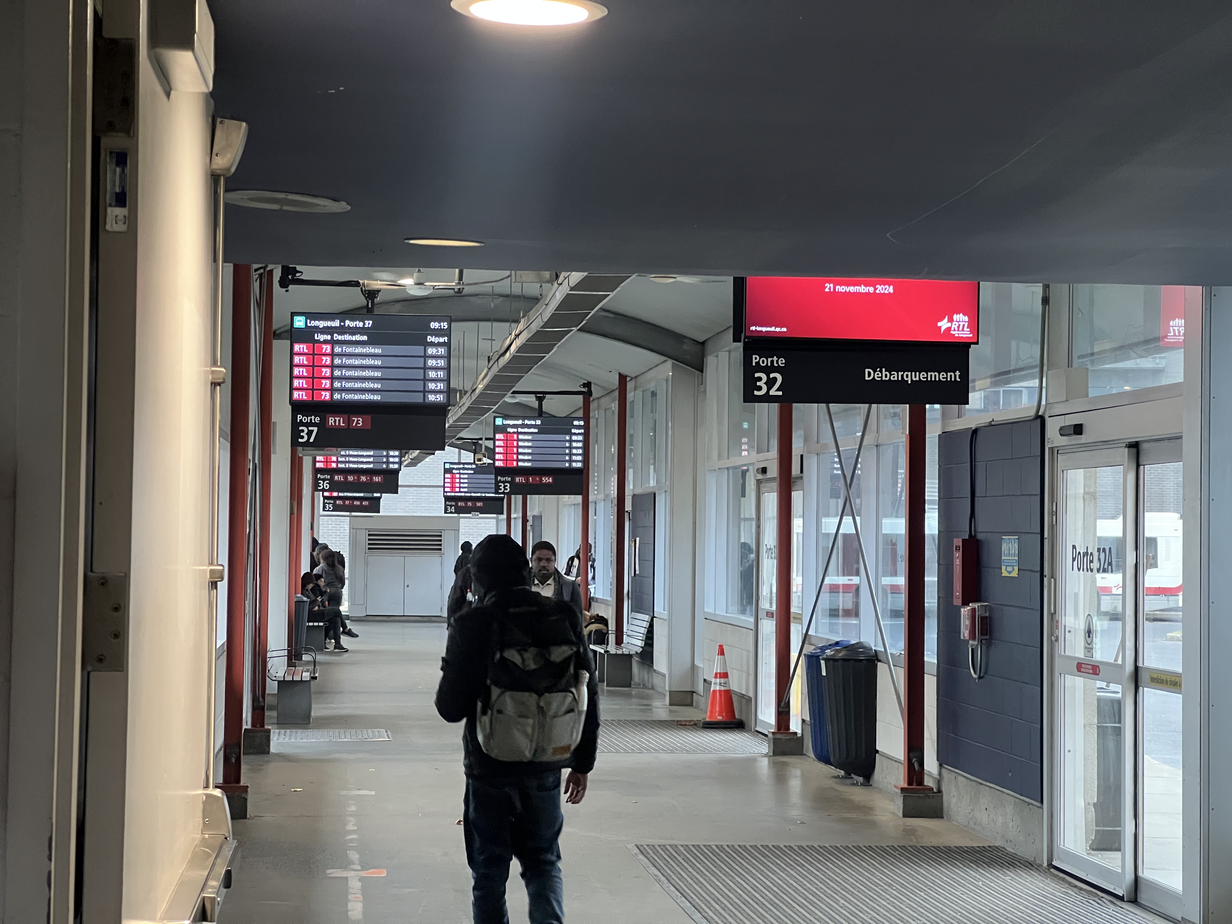
I wish they would’ve gone with letter and number to be even more clear though.
Old signage still remains here, but will be replaced or maybe covered with new signs at some point:
6 « J'aime »
À date, voici quelques polices que j’ai trouvé qui se rapprochent le plus possible du logo REV.
National Forest Print Bold
La géométrie du E et du V varie légèrement.
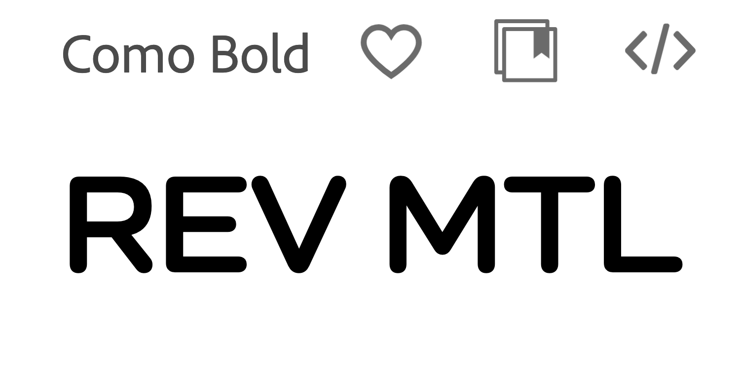
La géométrie du M n’est pas la même et les caractès sont plus étirés horizontalement.
Nunito Extra Bold - Adobe Fonts
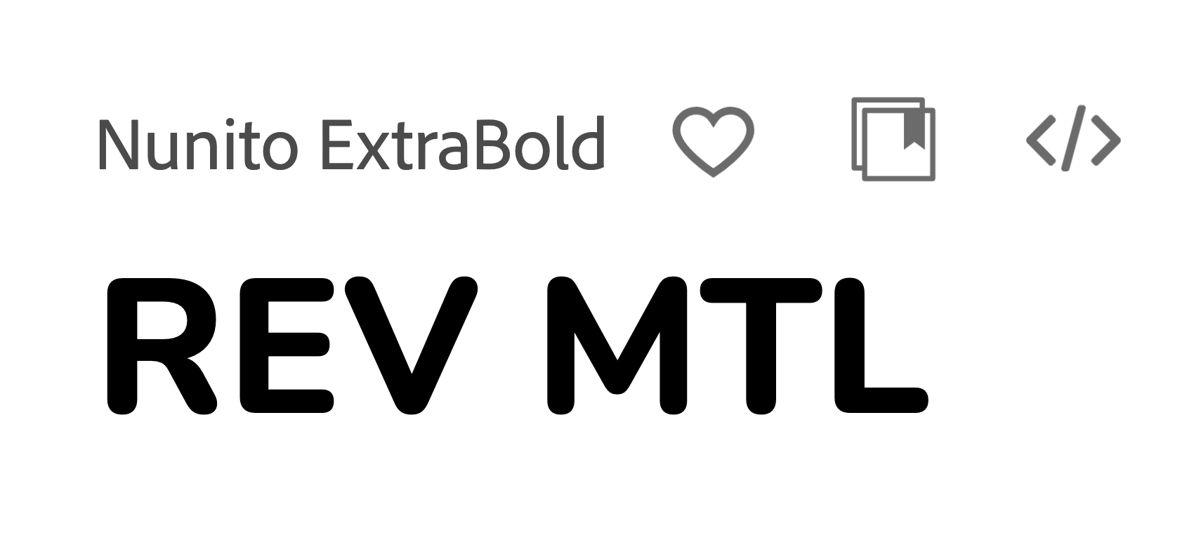
La meilleure correspondance
Bryant Condensed - Adobe Fonts
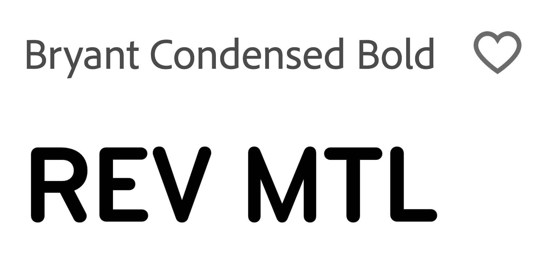
Seul bémol - et non surprenamment - cette police n’est pas libre de droit, il faut une licence pour son usage.
6 « J'aime »
Maybe I’m nitpicking but it seems to me that at Brossard they’re labelled as “Quai” not “Porte”. Even the débarcadère that has an actual door.
I’m guessing that’s because at Panama, “Porte” refers to the exit:
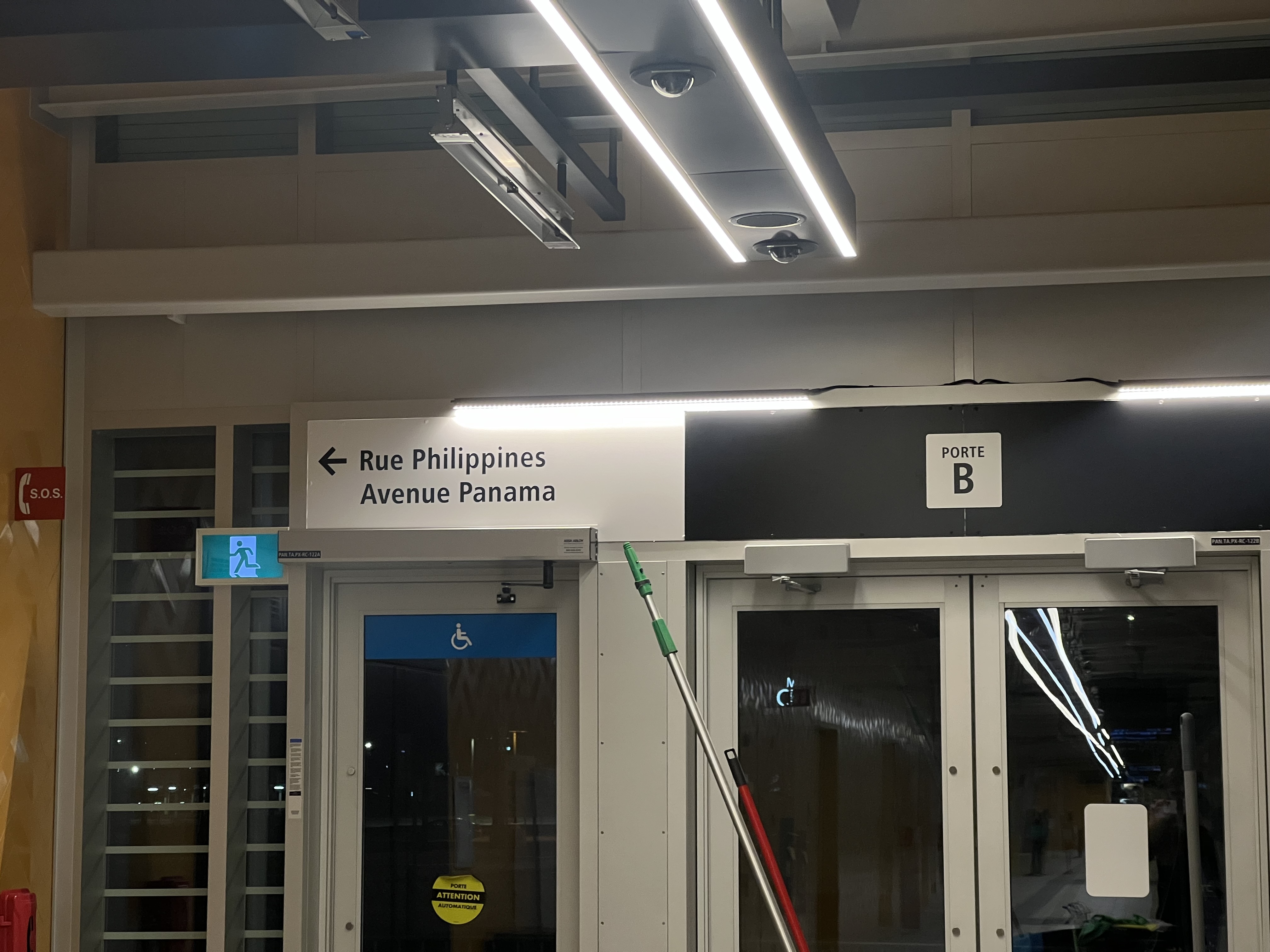
Now I’m not sure what they’ll do at Longueuil if they label the exits because then they’d both be door, unless they label it “Sortie” which makes even more sense
3 « J'aime »
Good to know! The metropolitan signage is making it’s way into major hubs… Long overdue getting rid of the outdated AMT signage.
9 « J'aime »
I’m amused that we are a small community that observes and notes these incongruities, but at the same time we all regale in the minor victories when the authorities take a step or two in the right direction.![]()
11 « J'aime »
Ça ressemble énormément à Gotham Rounded (Medium). Ça se peut que Lemay ait apporté de légères modifications. La qualité des images sur leur site ne facilite pas la tâche de toute façon.


6 « J'aime »
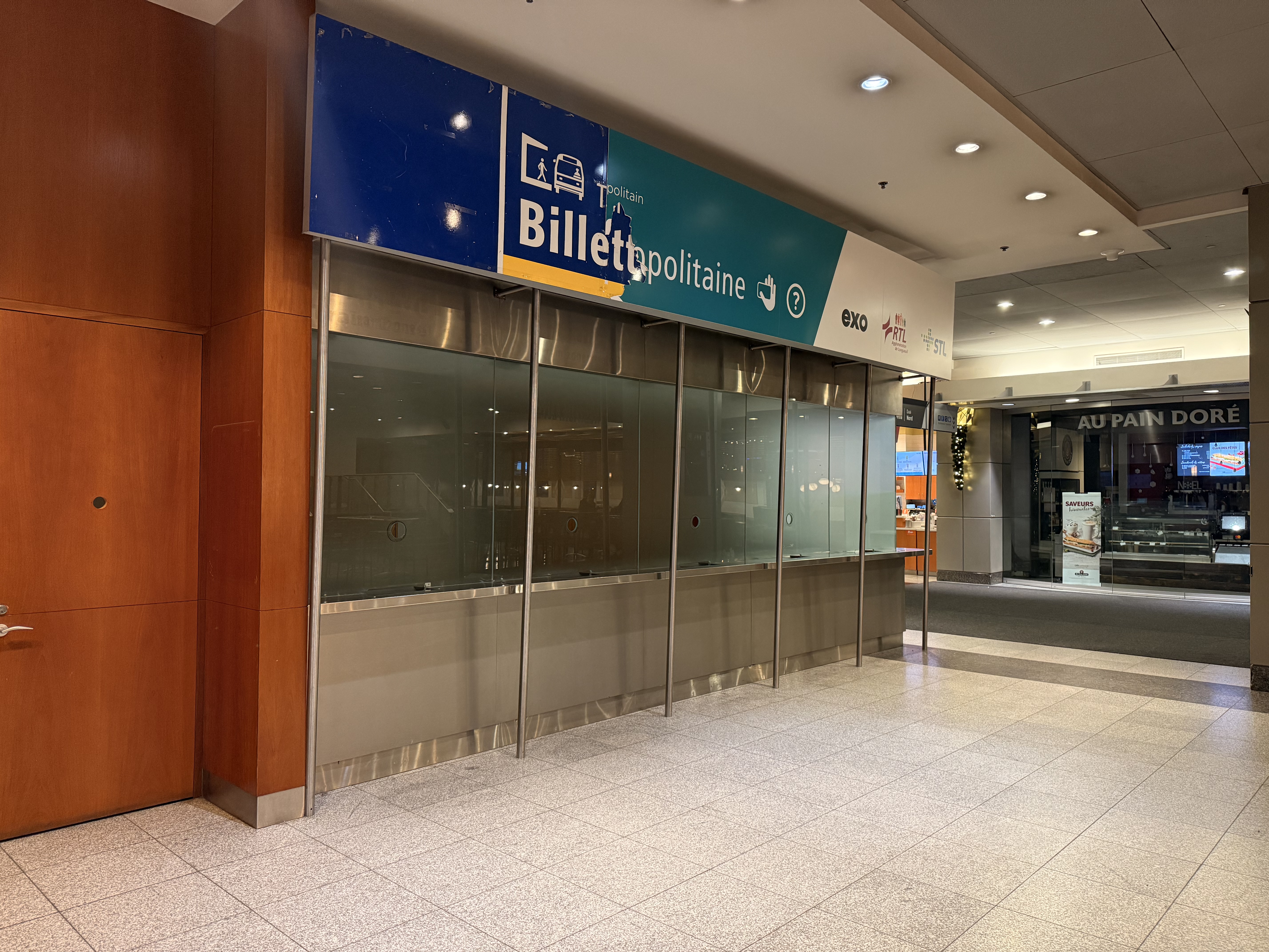
So they are removing the artm branding to go back to the amt branding???
They are removing the sign altogether. The billetterie is closed.
4 « J'aime »